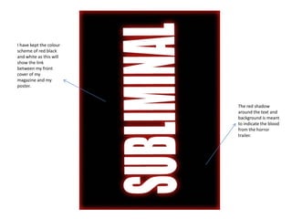
1. I have kept the colour
scheme of red black
and white as this will
show the link
between my front
cover of my
magazine and my
poster.
The red shadow
around the text and
background is meant
to indicate the blood
from the horror
trailer.
2. There has been an
image added behind
the text, however I
have made it
simplistic so it doesn’t
give much away to the
horror trailer. I have
used the rope as a
weapon as this could
suggest there is a
death involved.
3. I have added ‘coming
2012’ as this is a typical
convention of a film
poster.
4. The film production
company is needed I have added a age
on the poster, as this certificate to my poster
creates more as is always needed
popularity in the film when creating a film
industry as well as because there is limits
showing audiences to, which age group can
the area and genre of watch different things.
films they most likely For example, strong
to produce. language and sexual
nature.