The document outlines the key features typically included in a magazine's double-page spread based on an analysis of NME magazine. These features include:
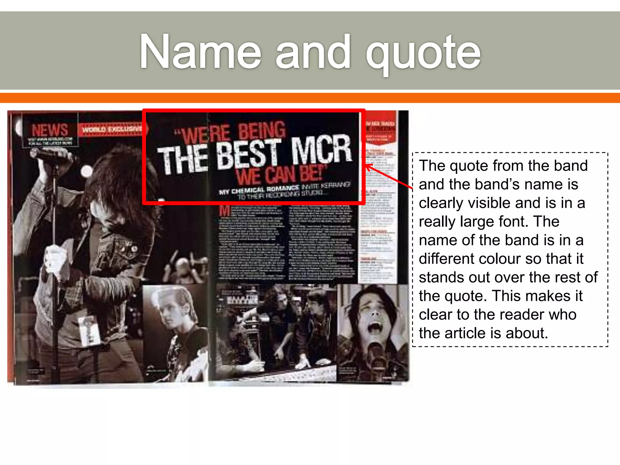
1) A large, colorful quote and name of the band featured.
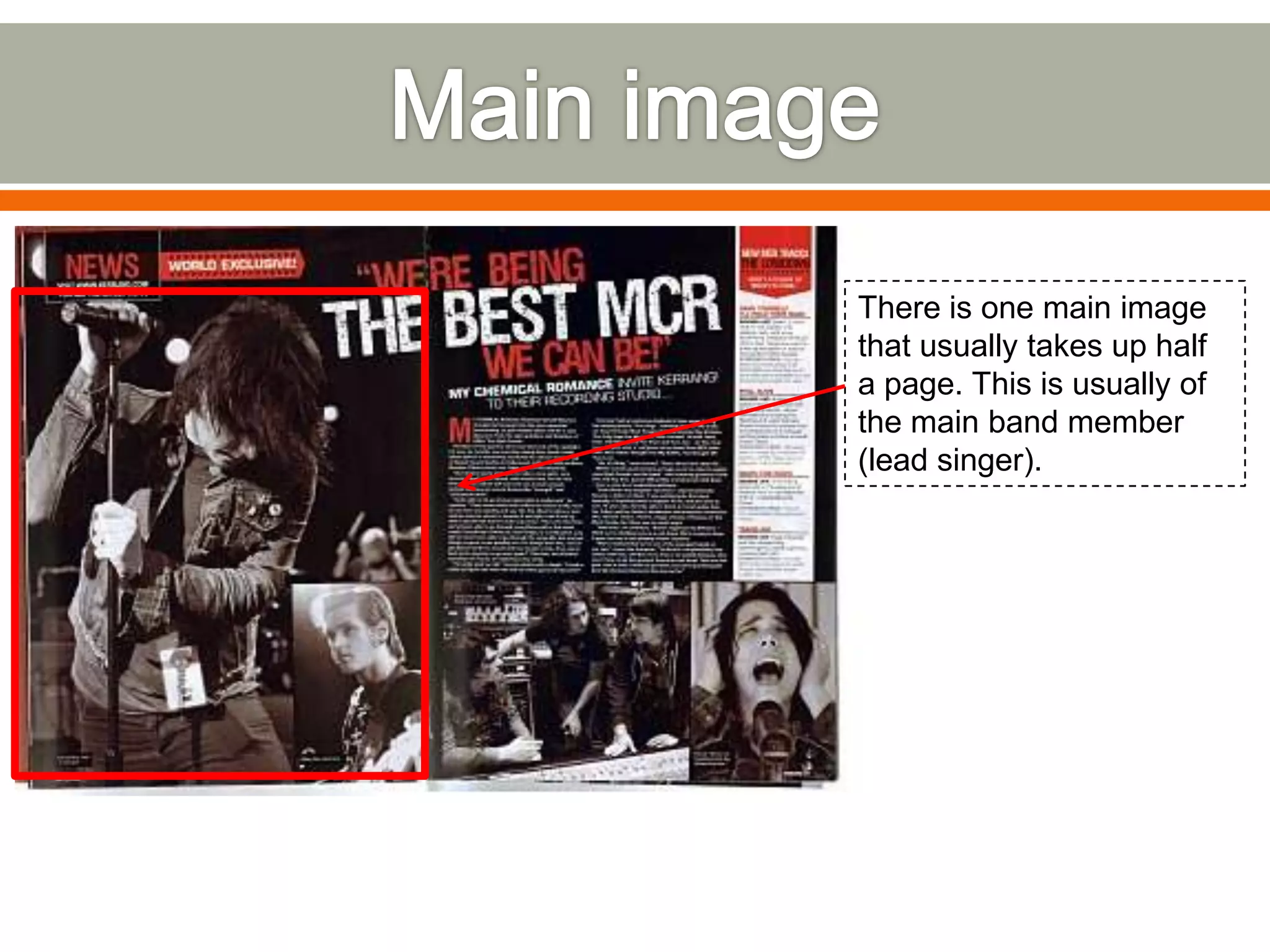
2) A main image of the band/lead singer taking up half a page.
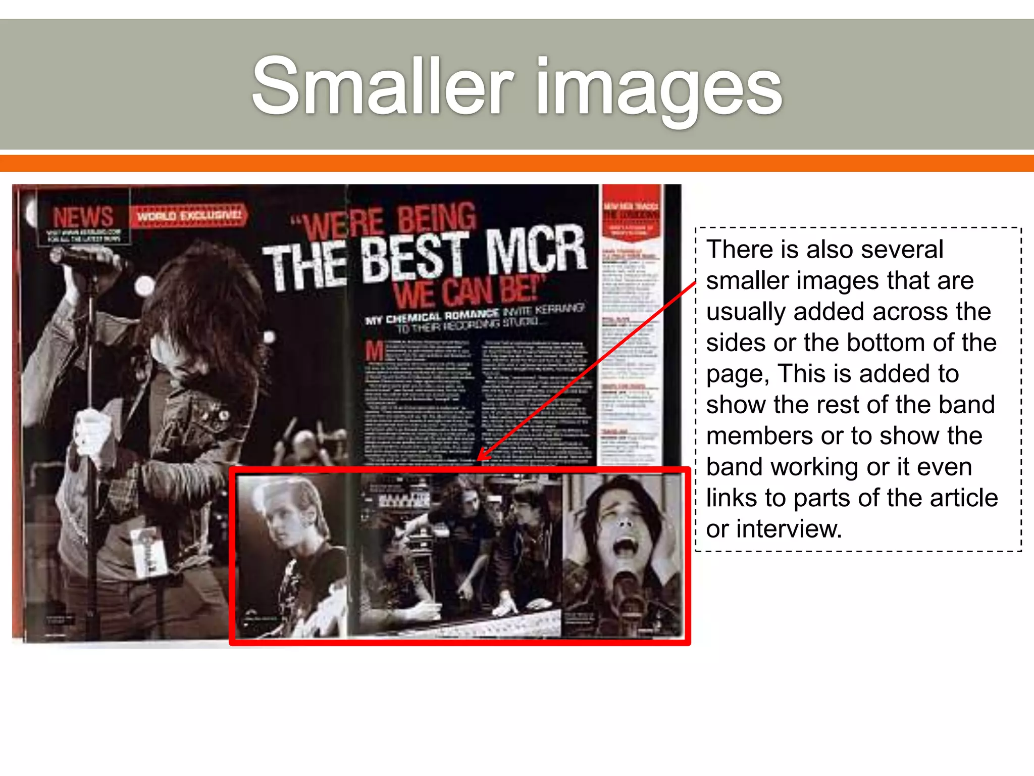
3) Smaller additional images of other band members or related to the article.
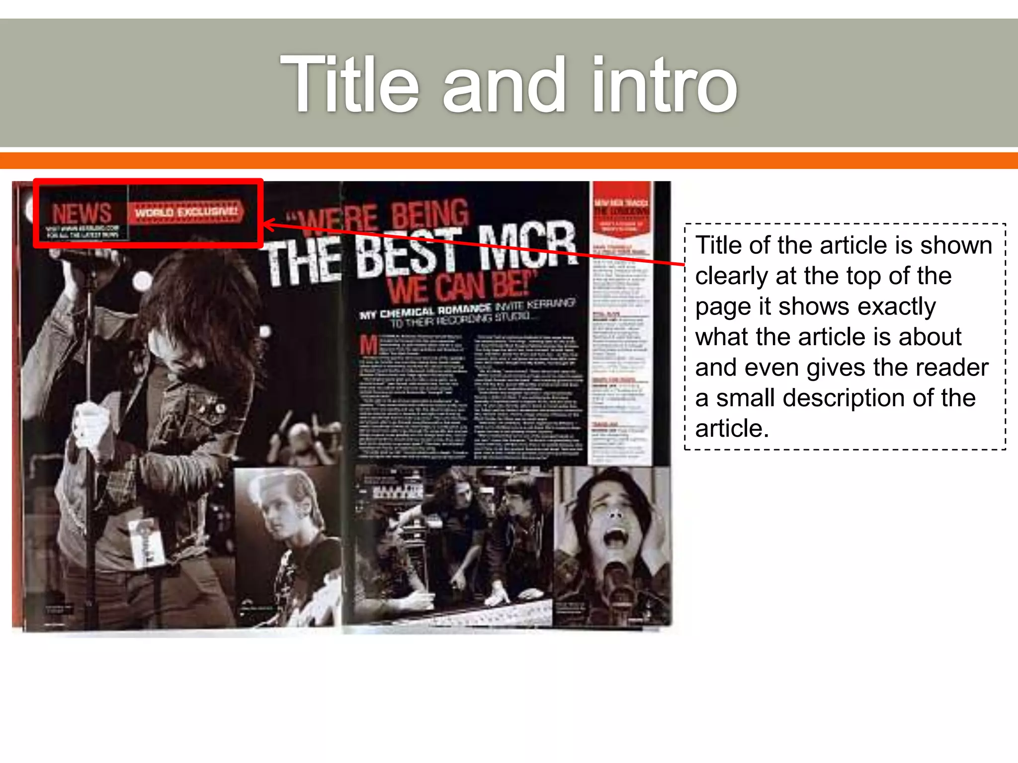
4) The title of the article at the top describing what it is about.
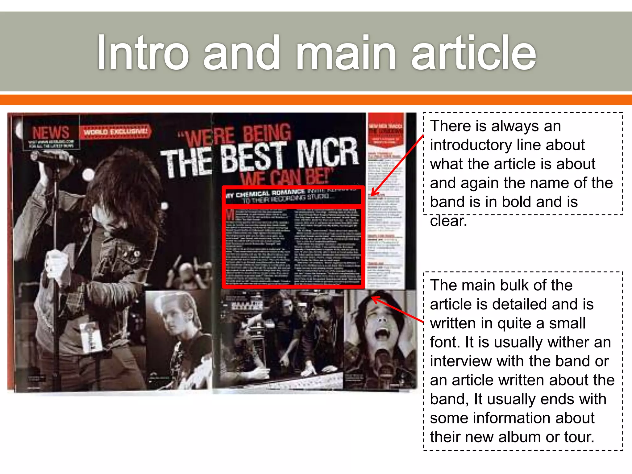
5) An introductory line with the band's name in bold about what the article will cover.