Customer Service Analytics - Make Sense of All Your Data.pptx
Social action evaluation
1. Social Action Evaluation
Henry Buckham
During the course of this project I was contracted by the charity Surfers Against
Sewage to design a range of new promotional materials for their campaign. This
included the creation of a new logo and house style, a campaign poster, a
recruitment form and a range of merchandise such as apparel and accessories
that featured original artwork.
My three initial mood boards each had a different theme such as a tropical beach,
a more realistic beach with grounded colours and finally an underwater/deep
sea theme. I decided to go with the second theme for this project as I felt like it
connected most to what Surfers Against Sewage was about: real, serious marine
issues in the United Kingdom, not some tropical island or under the sea. The
fonts included in this particular theme were sleek, modern sans-serif typefaces
that were chosen by me to contribute to the modern and clean approach, which
was evident in the design of my final logo. It was also my first choice because to
me it looked like the current theme of the SAS with similar colours and fonts. One
thing I did not include from this theme in my final pieces was the inclusion of
group shots of the surfers. This was because I believed that inset images were
intrusive on my final designs and I did not want to detract from the original
message I was putting across.
Logos
I began with the creation of the logo
first as it was the smallest thing out of
the four and having it on hand for the
other tasks meant that I could feature it
on the materials to link the pieces
together. At first I began with a basic
surfboard logo that featured the name of the charity
as well as the motto. It was similar to other existing
surfing logos for apparel and gear, which often
feature surfboards as part of the design. A recurring
trend of my logos was that they were all made to be
modern, easily transferable to new designs and were made to look clean and
modern with simple shapes. I did not use the surfboard logo as my final design
with my reasoning being that it wasn’t very workable in some of the other pieces
as it was two wide and didn’t really have the impact that I had wished for. This
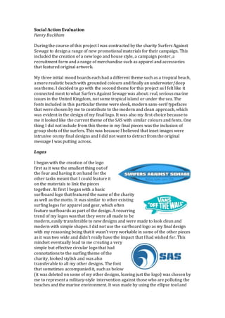
mindset eventually lead to me creating a very
simple but effective circular logo that had
connotations to the surfing theme of the
charity, looked stylish and was also
transferable to all my other designs. The font
that sometimes accompanied it, such as below
(it was deleted on some of my other designs, leaving just the logo) was chosen by
me to represent a military-style intervention against those who are polluting the
beaches and the marine environment. It was made by using the ellipse tool and
2. using the magic wand and rasterizing tools to delete a chunk of the ellipse to
form a curved wave, something that is common on many existing surfing logos as
either a wave or a stylized curve to represent waves. The process itself was
simple to do and I believed that it worked extremely well for an effective logo. It
was able to properly connect to SAS’s surfing theme with the use of a couple of
shapes and being bold and prominent it helps for easy
identification of the charity’s materials. It is not too complicated
and can easily catch someone’s eyes as they walk by if it is
featured on a poster or other advertisement.
Originally I made this logo with a black border before removing
it and trying lots of different variations, including ones that
lacked a border altogether. I soon settled one the variation shown above that had
a thin blue border. I chose this one because to me it felt like the most refined and
fit the style of the graphic perfectly. The others were either mismatched too
simple or didn’t fit the aesthetic.
I consider my efforts with the logo an improvement to my previous logos and
some of my older projects where I would use shapes available on the Internet
and modify them for my own use. In a professional context you must have made
all work by yourself and you cannot use someone else’s designs available on the
Internet unless you have permission from the original author or you have paid
for it. What I do not like about this final logo however is that the simplicity is also
a bad thing in that it does not really show off any serious talent, with that being
reserved for post-processing the logo with shadows and other shading.
Campaign Posters
My campaign poster was done in two separate
stages that resulted in two completed pieces with
one chosen as the final piece. I was partly inspired
by LGBT charity Stonewall’s series of posters that
focus on typography and a simple blank
background to get their message across. My first
attempt at the poster was to do something that
focused heavily on typography which preached a
very serious message. I did this by using words in
a large, heavy typeface stacked on top of each other to create clear visual
hierarchy. The colours I used in this particular piece, in my opinion, did
not really suit the message that was being put across, which was the
threat that certain surfing spots will be ruined by an abundance of litter
and offshore and coastal developments. It had a background of a
seemingly pristine beach save for a few wind turbines that were added
to the horizon in post-production. I did like this piece for the message
and the very effective use of the font coupled with the theme but I feel
as if it is disembodied with the rest of the image as there a weak
attempt at visual imagery on the poster.
3. My second piece took the typographic idea and improved on it, going through
several iterations until I was happy with the idea. It began as a very
heavy piece crammed full of information until I settled on the idea of
having the same message without a tonne of meaningless text
surrounding it. This tied in to my original mindset of creating a style
for SAS that was clean, sleek and didn’t have a load of unneeded
elements to detract from the message at hand. The cigarette graphic
was created using the shape tools on Photoshop and then resized to fit
the length of the text. Technically this poster was simple to make but it
required a lot of planning and thought until I managed to get the idea of
where to place individual element and follow the hierarchy.
The usage of 4.5 trillion to begin the message is a way to improve the shock value
and get people to read on in the hops that they now have a desire to help out. My
colour choice was the same as the shade of blue used in my final logo included in
the bottom right and I used it in an effort to make it the visually representative
colour of Surfers Against Sewage where people can see this colour on the poster
in the corner of their eye and know who has published it without looking. I
designed this poster with the mindset that it appealed to more of an older
audience because of cigarettes being the core issue (and you wouldn’t want
children to start picking up cigarette butts at the beach) It uses a mature
typeface and structure so that it preserves the threatening message somewhat
and is designed not to appeal to children by excluding any heavily visual aspects
making it seem less exciting.
On the poster itself I didn’t include links to the actual profiles of the charity but
rather just the shortened version that can be added on to the end of the site
address and the logos of Facebook and Twitter. This was to prevent crowding
the bottom of the image and I did it knowing that both logos are universally
known and people will know what sites SAS is active on without needing to be
told. Including the logos for the social media sites is also common in modern
professional campaigns as it provides another step in the process by getting
people to visit the SAS online and find out much more than a simple poster can
convey. The rise in sites like Facebook means that information can be spread
quickly and easily between millions of people helping to increase awareness for
this particular campaign.
What I like about this final piece is the usage of colour matching to blend the
background in with the SAS logo and the effective typographic elements that
have a clear hierarchy to help the viewer’s eyes move down through the message
being conveyed. I like that the original typographic idea has been expanded on to
be much more visually effective and simplified without relying too much on
pointless information that is better kept of the charity’s website. However, if I
was to improve this poster in the future I would like to include some sort of
visual element in order to increase its prominence to people passing by, such as
adding more cigarette graphics to the background or adding some sort of inset
pictures that highlights this particular issue. To preserve the original idea of this
poster I would likely have two different versions published: one with just the
4. message (as it is now) and one that has included a lot more visual elements as
well as changing the positioning of the text to descend from one side to the other.
Recruitment Forms
My recruitment forms focused on one single final piece that
was continuously improved until I was satisfied. My flat
plans for the form were a simple A5 sheet with a front and a
back, and initially focused on one large image for the front
cover and having the reverse side split into two columns: one
for the payment options and one to introduce the charity and
list its aims and goals, as well as offering a promotion for any
new members joining in a certain time frame. This was
slightly inspired by my previous recipe card project from the
first year that also followed a style of a large picture on the
front and having all the copy on the rear side. My aim for the
recruitment form was to not describe the charity in large
amounts but rather use several small sentences on the front
accompanied with a picture of a polluted beach to drum up
interest. The sentence ‘All we need is you’ is used to make
the viewer feel as if the form is directly addressing them and
hopes that they feel urged to make a difference because of
that. It is similar to military recruitment posters that address
people directly in order to drum up interest which ties back
to my house style’s underlying military theme. The short
sentences keep to my simplistic yet effective theme by
condensing the message enough that it leaves the reader
wanting more, which makes them flip over the form to find
the space to join up.
Early drafts of my recruitment form included several bullet
points on the front side of the form that listed the aims that
SAS had and mentioned that SAS had the capacity to save
Britain’s coastlines. The changes I eventually made to this
design meant getting rid of the bullet points and replacing
them with short and impactful sentences. I changed the font
from Cambria to a font matched to the rest of the form. In
addition to this, I replaced the picture of the beach used for
the background to reinforce the idea that it was a UK charity
- the original picture was taken in India. On the reverse side I
originally had a footer that was to contain the charity’s
address and contact details. On later revisions I removed this
and added said information to the main body of the form,
replacing the footer with the SAS logo and the registered charity number which
made the entire piece look much more refined.
Part of the visual aesthetic of this recruitment form was that the front side
includes a picture of a dirty, polluted beach, which the viewers can then flip over
to find a clean and pristine beach on the other side. This helps to highlight the
5. work that SAS does and implies that all beaches would look like the front side if
it were not for SAS. The logo appears on both sides and I used it with great
prominence on the front side so that it caught the attention of people, while on
the reverse side it is confined to the bottom right to tie it in with the colours of
the form itself. The font used on the front side is the same font used throughout
the campaign poster that helps to create a sense of unity between the two
publications. In professional publications for the same charity it is not
uncommon for two different pieces of material to share fonts, which is evident
with Stonewall’s posters and recruitment leaflets that have the same bold
typeface.
On the reverse side of the recruitment form I used part of the space to include an
enticing offer that would give people more incentive to join Surfers Against
Sewage. This is included next to the fields to fill in so that people read it while
scanning that area of the form, which gives them more incentive to being filling it
in. Finally, I included the Direct Debit form at the bottom as it is an optional bit to
fill in and has been highlighted as such. In terms of technical aspects, this form
was created using tools such as opacity, the shape tools and colour overlays. The
form on the reverse has had the opacity decreased so that the image behind is
much more visible. On the front side of the form I have added drop shadows to
the sentences above the footer to increase their visibility against the lightly
coloured background. Without them they would be quite hard to make out to
someone reading the form.
The main content used to entice people into joining up, the sentences on the
front and the paragraph on the rear, are in my opinion quite effective in this
regard. Describing the charity as ‘friendly’ and ‘passionate’ helps to create the
image that the SAS is welcoming and eager to recruit new members to the cause
that gives further motivation to those looking to join. Professional recruitment
forms will always include similar persuasion tactics in order to entice people to
join up, an example being one of SAS’s existing membership forms which
includes quotes by famous people attached to the surfing scene in order to justify
why it is worth joining the charity. Having someone they know endorse
something means that people will feel more comfortable using it.
Merchandise
For my range of SAS merchandise I decided to do a collection of apparel and
some different accessories with lots of different designs that were made to
appeal to a range of different age groups. My mind map for the merchandise
mainly listed a range of different articles of clothing and accessories that could
all bear the SAS logo or some sort of original graphic that tied in to one of their
campaigns. The mood board strengthened this by having a collage of the same
logo included on lots of different mediums: a polo shirt, a hoody and a T-shirt,
which was something I did for one of the SAS logos.
My intention for the merchandise was to break free from my structured and
uniformed styling and create pieces that had elements outside of the grid and
tried something new. However, I still retained my colours and styling of the
6. fonts, making them bold and sans serif to tie in to my original theme set out by
the first mood board. One particular example of this was one of my polo shirts
that had the wave graphic wrapped around the bottom instead of in a typical
position such as the back or the breast. I believe that this came out well but the
shirt itself I quite simple and I believe that I could have done more with it such as
adding more graphics and perhaps distorting them a little. My polo shirts in
general were made to be similar to team polo shirts, which feature a badge or
emblem on the breast and sometimes the name of the team on the back. One of
my polo shirts features the round SAS emblem and ‘Surfers Against Sewage’ on
the back that, with a lot of people wearing this particular shirt, would create an
atmosphere of unity and cooperation.
The fonts I used were chosen to represent an oppressive
atmosphere because of the clogged up beaches and polluted
waters and one of my T shirts used this in conjunction with a
hard hitting message, ‘how can we crave the waves if there
are none left’ to great effect. The font used is cracked and
distorted and this helps to create the feeling that it is from
many years in the future and implies that the problems is
much worse than it is now. One of my other designs was a
shield that modelled after naval emblems, which was
used to tie the charity with the marine environment.
Included is a way banner with the charity name that is
meant to emulate a flag. Then techniques used to create
this included the shape tool, overlaying and masking for
the grunge effect. This is an extension onto the piece
discussed above and I believe that this is effective
because the grunge gives the impression that the logo has
been washed up on a beach, similar to the sewage that
SAS hopes to eliminate.
As well as the apparel I also created a range of gear that would be useful to
surfers, the culture that the SAS is based around. Among these is a range of SAS
branded surfboard carry bags. The design on these is based on the slogan, ‘Crave
The Waves’ which I wrote in a very stylized
graffiti-like font that symbolizes the wild and
carefree culture of surfers. I shortened the phrase
to just ‘Crave.’ Which gives the design an impactful
appearance. As people may not recognize that it is
SAS branded simply by the slogan I included the logo on the right side of the bag.
I believe that the technique of shortening this phrase and using a heavily stylized
font makes it very noticeable and gives it a trademark look that creates a brand
identity for SAS merchandise. What I do not like about this design however is the
blank background and the fact that the logo itself seems a little out of place.
Improvements that I could make to this design include finding a more detailed
background for the bag and keep it relevant while also using a variation of my
logo that is more suited to accompany the messy text.
7. Finally I designed a range of accessories to compliment my range of merchandise
for the charity. I created a range of mugs that primarily featured the SAS circular
logo with a corresponding colour for effect. Although I believe that they are quite
simple aesthetically I think that this works better for a mug, as a busy design
would be a little bit too much for such a small item. A simple logo means that it is
connected to the charity simply and effectively. As well as this I designed a range
of towels that primarily feature the SAS logo. There is one design I created that
used typography to proclaim that surfing terms were good and different types of
trash were bad. I believe that this piece is particularly effective as it links back
heavily to my other design pieces with the same font and similar layout as well
as being a very impactful design that could catch the eyes of anyone who saw it
on a beach.
All in all I believe that I had some strong pieces of merchandise but I wholly
believe that there was room for a lot more variety in my pieces. Compared to lots
of pieces of apparel I only had one item, the surfboard bag that was related to
actual surfing. If I were to go back and create more pieces I would try and create
more designs for surfing equipment, such as grip pads and maybe even wetsuits.
This will allow me to better connect my charity with the sport itself and having
the logos and emblems on surfing equipment will let other people in the sport
know about the SAS and its efforts to keep the coastlines safe and clean.
Schedule
In terms of how I managed this project over the weeks, I would say that I
followed the schedule well but I feel as if there could be some improvement. For
example, I had planned on my schedule to start my planning for the campaign
poster and begin designing some preliminary layouts. However I found that I
neglected to check this schedule before I was due to start this and found that I
overran into the next day with designing logos. This disrupted the flow of the
schedule and I found that everything was out of sync, which meant that I was
sometimes hard to manage my time effectively to maintain a steady workflow. In
a professional context a schedule is extremely important as it ensures that there
is a steady workflow and the time you have for the project has been planned out,
meaning that you do not start to default on the work itself or miss a strict
deadline. In the future I will try and ensue that there is a little more leverage in
my schedule and that in the case of me overrunning into a different task I will
make sure that there is sufficient contingency time to make up for it.