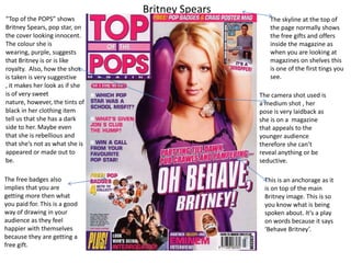
1. Britney Spears
“Top of the POPS” shows
Britney Spears, pop star, on
the cover looking innocent.
The colour she is
wearing, purple, suggests
that Britney is or is like
royalty. Also, how the shot
is taken is very suggestive
, it makes her look as if she
is of very sweet
nature, however, the tints of
black in her clothing item
tell us that she has a dark
side to her. Maybe even
that she is rebellious and
that she’s not as what she is
appeared or made out to
be.
The free badges also
implies that you are
getting more then what
you paid for. This is a good
way of drawing in your
audience as they feel
happier with themselves
because they are getting a
free gift.
The skyline at the top of
the page normally shows
the free gifts and offers
inside the magazine as
when you are looking at
magazines on shelves this
is one of the first tings you
see.
The camera shot used is
a medium shot , her
pose is very laidback as
she is on a magazine
that appeals to the
younger audience
therefore she can’t
reveal anything or be
seductive.
This is an anchorage as it
is on top of the main
Britney image. This is so
you know what is being
spoken about. It’s a play
on words because it says
‘Behave Britney’.
2. Lily AllenNME has Lily Allen as the main
focus if it’s front cover. In this
cover Lily Allen’s attire
suggests that her personality is
rebellious and dangerous, we
deduce this from the red on
her shirt. Red also represent
seductiveness and
intimacy, however, this is not
the case in this magazine
cover. From the attire we
assume that the magazine is
aimed at a younger audience
range, teenagers, as they can
link in with the type of person
she is .
Her make up, is very messy
and possibly a tad sinister
which shows that she does get
into some kind of trouble. Also
from how the shot is
taken, her looking up at us
, suggests that she’s
down, depressed and not a
very optimistic kind of person
but it also suggests
mystery, like she’s done
something but we’re not
exactly sure of what.
The Skyline on this offer
things which link in with
this. This magazine also
has a ‘Pug’ it is in the
corners of the magazine
like dogs ears.
The puffs on this
magazine are mainly
advertisements. They
mainly promote certain
things within the
magazine., these are
mainly bold and
colourful so they can
pull the audience in
with the offers. The
puffs are to do with
music in this
magazine, as it links in
with the genre of the
magazine.
3. On the Q magazine , Madonna is
the main focus as she is the
biggest image on the page. The
camera angle is a medium close
up shot this captures her facial
expression shows
mysteriousness and her body
language shows hostility which is
not what you’d expect for a front
cover of a magazine.
Madonna is dressed in a
black and silver hood and
the rest is distorted this is
a representation of her
age as she’s in her 50’s it
shows the magazine is
respectful to her age by
not putting her in
revealing clothes , as she
wouldn’t need to be
anyway because she is
such a big icon.
The black background
contrasting with the red
text makes the word
“MADONNA” more visible
to the human eye. The
red text connotes with
the devil or danger as
usually we associate red
with danger or bad things.
This could show that her
interview reveals a dark
and sinister side of her we
have never seen before.
Her facial expression also
matches the theme of the
magazine and it has been
adjusted to Madonna.
Madonna