SlideShare a Scribd company logo
1 of 2
Masterhead: 
Tells the reader what on the magazine page. Written in a large font 
in order to stand out from the actual information of the page. 
Placed in the top third to allow room for the rest of the information. 
Pictures: 
Relating to the text that they are 
next to, they act as a visual aid for 
people who don’t want to read 
the text. They help to break up 
the page and make it more 
appealing to the young target 
audience of collage kids, who 
don’t want to read a page of 
block text. The background image, 
of a wall, looks like a stereotypical 
school wall which is a subtle 
reminder it’s a college magazine. 
Font and colour scheme: 
The font is a “fun” font which is good for the 
young “fun loving” target audience. The 
font is consistent all over the page giving 
the magazine a style that would appear 
though out. The colour scheme of green 
and white also helps to give the magazine 
an identity. The colours contrast each other, 
and for the Master head, having the green 
behind he white makes the white stand out. 
The green and white give the impression of 
peace and happiness which is something 
that is appreciated at the start of a new 
school year. 
Text: 
The rhetorical questions (“lost in the college”) 
help to engage the reader and makes the page 
more personal to them. This is a great way to 
strengthens he relationship between the 
magazine and the reader, making them more 
likely to get the next issue. 
Layout: 
The layout is done so the master head “Contents” 
takes up the top third with the rest of the page is split 
in half vertically. This is effective as it helps to show 
that both of the columns are part of the contents 
page. On the left column is the page number, with 
that’s on it underneath. I don’t like this, I feel what's 
on the page should be first because people will look 
for the content they like then find the page- not the 
other way around. The picture is opposite the 
relevant information on the left, I think there could 
be a more inventive/ interesting to look at structure, 
as this doesn’t look natural and looks cramped. 
Conclusion: 
I like the font and colour scheme as It gives the magazine a good and unique identity- making it recognisable. It reflects the target audience well and the white stands out 
more because of the green. I don’t like, however, the layout of the page. Having the cover line under the number doesn’t make sense as the reader will want to find out 
what’s on the page before they find out what page it is. The page looked cramped because the font is a bit to big and pushed to gather opposite the less important pictures 
which are the same size of the cover lines. The background image doesn't look good, the righting would be clearer and stand out more with a plane image not patented.
Masterhead: 
Tells the reader what on the magazine page. Used as a Rhetorical question to sum up what's on the page. The 
rhetorical question helps to engage with the reader, meaning there is a better relationship between the reader and 
the magazine. Because the reader feels a closer connection with the magazine, they are more likely to by it again. 
Pictures: 
Relating to the text that has the same number as 
them. The image helps to bring the text to life and 
will encourage the reader to read the article 
because the will want to know “why the sheep” on 
page 8. lots of colours are good for a young 
audience and helps to contrast the white 
background. 
Text: 
Pug: 
Stands out as the 
background contrasts the 
colour scheme. Rewards the 
reader for buying the 
magazine and gets them to 
read articles inside as they 
find the page where they can 
“win” 
The short description under the text helps 
to give extra information on the article for 
people who like the sound of “my 
photography”. The small taste of 
information will engage the reader and 
make them want to read the whole article. 
Colour scheme: 
The colour scheme of blue and green helps to 
give the magazine an identity. The Master head is 
the green colour to help fit in with the colour 
scheme while the numbers on the pictures are 
green contrasting. The bright colours contrast 
with the plain white background and help to 
engage a young target audience. 
Layout: 
The line a third of the way across the page is 
positioned to be look good (rule of thirds) and help 
break up the page. There are to sections ”regulars” 
for the recurring articles. This will please fans of the 
magazine who return for every issue to read there 
beloved regular articles, comparatively the “features” 
are there to excite the new people to he magazine as 
this is where more interesting or crazy stories will be 
placed. The features are higher up as this is used to 
hook the reader while the regulars are there to keep 
the reader entertained. 
Conclusion: 
I think the condense page looks good, Its looks full but not congested and the righting stands out. Using the white background helps the images and righting 
to “pop” and line a third of the way across helps to show of the colour scheme. The way the pug contrasts the colour scheme draws more attention to it and 
helps it to stand out. The page doesn’t look to formal which is good in helping to attract there teen target audience but it looks formal enough (eg having the 
sponsorships in the corner) to show it’s not a kids magazine. The page looks structured and iconic- all of which is important to give the magazine an identity.

More Related Content

More from Charris369

In what ways does your media product use
In what ways does your media product useIn what ways does your media product use
In what ways does your media product useCharris369
 
State target demographic
State target demographicState target demographic
State target demographicCharris369
 
Insidious advertising campaign analysis
Insidious advertising campaign analysisInsidious advertising campaign analysis
Insidious advertising campaign analysisCharris369
 
The woman in black advertising analysis
The woman in black advertising analysisThe woman in black advertising analysis
The woman in black advertising analysisCharris369
 
Location reece
Location reeceLocation reece
Location reeceCharris369
 
Screenshots of the production process
Screenshots of the production processScreenshots of the production process
Screenshots of the production processCharris369
 
Trailer, poster, magazine and 2nd general questionnaire results analysed
Trailer, poster, magazine and 2nd general questionnaire results analysedTrailer, poster, magazine and 2nd general questionnaire results analysed
Trailer, poster, magazine and 2nd general questionnaire results analysedCharris369
 
​In what ways does your media product use, develop or challenge forms and con...
​In what ways does your media product use, develop or challenge forms and con...​In what ways does your media product use, develop or challenge forms and con...
​In what ways does your media product use, develop or challenge forms and con...Charris369
 
In what ways does your media product use, develop or challenge forms and conv...
In what ways does your media product use, develop or challenge forms and conv...In what ways does your media product use, develop or challenge forms and conv...
In what ways does your media product use, develop or challenge forms and conv...Charris369
 
Blair Witch Project Advertising Campaign Analysis
Blair Witch Project Advertising Campaign AnalysisBlair Witch Project Advertising Campaign Analysis
Blair Witch Project Advertising Campaign AnalysisCharris369
 
Train wreck trailer breakdown
Train wreck trailer breakdownTrain wreck trailer breakdown
Train wreck trailer breakdownCharris369
 
UNFINISHED Screenshots
UNFINISHED ScreenshotsUNFINISHED Screenshots
UNFINISHED ScreenshotsCharris369
 
Film classification research
Film classification researchFilm classification research
Film classification researchCharris369
 
Horror film subgenre
Horror film subgenreHorror film subgenre
Horror film subgenreCharris369
 
Sherlock holmes trailer breakdown
Sherlock holmes trailer breakdownSherlock holmes trailer breakdown
Sherlock holmes trailer breakdownCharris369
 
Hunger games mockingjay part 1 advertising analysis
Hunger games mockingjay part 1 advertising analysisHunger games mockingjay part 1 advertising analysis
Hunger games mockingjay part 1 advertising analysisCharris369
 
Location recce
Location recceLocation recce
Location recceCharris369
 
Draft contents page
Draft contents pageDraft contents page
Draft contents pageCharris369
 

More from Charris369 (20)

In what ways does your media product use
In what ways does your media product useIn what ways does your media product use
In what ways does your media product use
 
State target demographic
State target demographicState target demographic
State target demographic
 
Insidious advertising campaign analysis
Insidious advertising campaign analysisInsidious advertising campaign analysis
Insidious advertising campaign analysis
 
The woman in black advertising analysis
The woman in black advertising analysisThe woman in black advertising analysis
The woman in black advertising analysis
 
Location reece
Location reeceLocation reece
Location reece
 
Screenshots of the production process
Screenshots of the production processScreenshots of the production process
Screenshots of the production process
 
Trailer, poster, magazine and 2nd general questionnaire results analysed
Trailer, poster, magazine and 2nd general questionnaire results analysedTrailer, poster, magazine and 2nd general questionnaire results analysed
Trailer, poster, magazine and 2nd general questionnaire results analysed
 
​In what ways does your media product use, develop or challenge forms and con...
​In what ways does your media product use, develop or challenge forms and con...​In what ways does your media product use, develop or challenge forms and con...
​In what ways does your media product use, develop or challenge forms and con...
 
In what ways does your media product use, develop or challenge forms and conv...
In what ways does your media product use, develop or challenge forms and conv...In what ways does your media product use, develop or challenge forms and conv...
In what ways does your media product use, develop or challenge forms and conv...
 
Blair Witch Project Advertising Campaign Analysis
Blair Witch Project Advertising Campaign AnalysisBlair Witch Project Advertising Campaign Analysis
Blair Witch Project Advertising Campaign Analysis
 
Train wreck trailer breakdown
Train wreck trailer breakdownTrain wreck trailer breakdown
Train wreck trailer breakdown
 
UNFINISHED Screenshots
UNFINISHED ScreenshotsUNFINISHED Screenshots
UNFINISHED Screenshots
 
Cover draft
Cover draftCover draft
Cover draft
 
Poster draft
Poster draftPoster draft
Poster draft
 
Film classification research
Film classification researchFilm classification research
Film classification research
 
Horror film subgenre
Horror film subgenreHorror film subgenre
Horror film subgenre
 
Sherlock holmes trailer breakdown
Sherlock holmes trailer breakdownSherlock holmes trailer breakdown
Sherlock holmes trailer breakdown
 
Hunger games mockingjay part 1 advertising analysis
Hunger games mockingjay part 1 advertising analysisHunger games mockingjay part 1 advertising analysis
Hunger games mockingjay part 1 advertising analysis
 
Location recce
Location recceLocation recce
Location recce
 
Draft contents page
Draft contents pageDraft contents page
Draft contents page
 

Recently uploaded

Kisan Call Centre - To harness potential of ICT in Agriculture by answer farm...
Kisan Call Centre - To harness potential of ICT in Agriculture by answer farm...Kisan Call Centre - To harness potential of ICT in Agriculture by answer farm...
Kisan Call Centre - To harness potential of ICT in Agriculture by answer farm...Krashi Coaching
 
Grant Readiness 101 TechSoup and Remy Consulting
Grant Readiness 101 TechSoup and Remy ConsultingGrant Readiness 101 TechSoup and Remy Consulting
Grant Readiness 101 TechSoup and Remy ConsultingTechSoup
 
Z Score,T Score, Percential Rank and Box Plot Graph
Z Score,T Score, Percential Rank and Box Plot GraphZ Score,T Score, Percential Rank and Box Plot Graph
Z Score,T Score, Percential Rank and Box Plot GraphThiyagu K
 
Interactive Powerpoint_How to Master effective communication
Interactive Powerpoint_How to Master effective communicationInteractive Powerpoint_How to Master effective communication
Interactive Powerpoint_How to Master effective communicationnomboosow
 
Measures of Central Tendency: Mean, Median and Mode
Measures of Central Tendency: Mean, Median and ModeMeasures of Central Tendency: Mean, Median and Mode
Measures of Central Tendency: Mean, Median and ModeThiyagu K
 
Call Girls in Dwarka Mor Delhi Contact Us 9654467111
Call Girls in Dwarka Mor Delhi Contact Us 9654467111Call Girls in Dwarka Mor Delhi Contact Us 9654467111
Call Girls in Dwarka Mor Delhi Contact Us 9654467111Sapana Sha
 
microwave assisted reaction. General introduction
microwave assisted reaction. General introductionmicrowave assisted reaction. General introduction
microwave assisted reaction. General introductionMaksud Ahmed
 
1029-Danh muc Sach Giao Khoa khoi 6.pdf
1029-Danh muc Sach Giao Khoa khoi  6.pdf1029-Danh muc Sach Giao Khoa khoi  6.pdf
1029-Danh muc Sach Giao Khoa khoi 6.pdfQucHHunhnh
 
Contemporary philippine arts from the regions_PPT_Module_12 [Autosaved] (1).pptx
Contemporary philippine arts from the regions_PPT_Module_12 [Autosaved] (1).pptxContemporary philippine arts from the regions_PPT_Module_12 [Autosaved] (1).pptx
Contemporary philippine arts from the regions_PPT_Module_12 [Autosaved] (1).pptxRoyAbrique
 
BASLIQ CURRENT LOOKBOOK LOOKBOOK(1) (1).pdf
BASLIQ CURRENT LOOKBOOK  LOOKBOOK(1) (1).pdfBASLIQ CURRENT LOOKBOOK  LOOKBOOK(1) (1).pdf
BASLIQ CURRENT LOOKBOOK LOOKBOOK(1) (1).pdfSoniaTolstoy
 
1029 - Danh muc Sach Giao Khoa 10 . pdf
1029 -  Danh muc Sach Giao Khoa 10 . pdf1029 -  Danh muc Sach Giao Khoa 10 . pdf
1029 - Danh muc Sach Giao Khoa 10 . pdfQucHHunhnh
 
SOCIAL AND HISTORICAL CONTEXT - LFTVD.pptx
SOCIAL AND HISTORICAL CONTEXT - LFTVD.pptxSOCIAL AND HISTORICAL CONTEXT - LFTVD.pptx
SOCIAL AND HISTORICAL CONTEXT - LFTVD.pptxiammrhaywood
 
Web & Social Media Analytics Previous Year Question Paper.pdf
Web & Social Media Analytics Previous Year Question Paper.pdfWeb & Social Media Analytics Previous Year Question Paper.pdf
Web & Social Media Analytics Previous Year Question Paper.pdfJayanti Pande
 
Arihant handbook biology for class 11 .pdf
Arihant handbook biology for class 11 .pdfArihant handbook biology for class 11 .pdf
Arihant handbook biology for class 11 .pdfchloefrazer622
 
Q4-W6-Restating Informational Text Grade 3
Q4-W6-Restating Informational Text Grade 3Q4-W6-Restating Informational Text Grade 3
Q4-W6-Restating Informational Text Grade 3JemimahLaneBuaron
 
A Critique of the Proposed National Education Policy Reform
A Critique of the Proposed National Education Policy ReformA Critique of the Proposed National Education Policy Reform
A Critique of the Proposed National Education Policy ReformChameera Dedduwage
 
Introduction to AI in Higher Education_draft.pptx
Introduction to AI in Higher Education_draft.pptxIntroduction to AI in Higher Education_draft.pptx
Introduction to AI in Higher Education_draft.pptxpboyjonauth
 
mini mental status format.docx
mini    mental       status     format.docxmini    mental       status     format.docx
mini mental status format.docxPoojaSen20
 

Recently uploaded (20)

Kisan Call Centre - To harness potential of ICT in Agriculture by answer farm...
Kisan Call Centre - To harness potential of ICT in Agriculture by answer farm...Kisan Call Centre - To harness potential of ICT in Agriculture by answer farm...
Kisan Call Centre - To harness potential of ICT in Agriculture by answer farm...
 
Grant Readiness 101 TechSoup and Remy Consulting
Grant Readiness 101 TechSoup and Remy ConsultingGrant Readiness 101 TechSoup and Remy Consulting
Grant Readiness 101 TechSoup and Remy Consulting
 
Z Score,T Score, Percential Rank and Box Plot Graph
Z Score,T Score, Percential Rank and Box Plot GraphZ Score,T Score, Percential Rank and Box Plot Graph
Z Score,T Score, Percential Rank and Box Plot Graph
 
Interactive Powerpoint_How to Master effective communication
Interactive Powerpoint_How to Master effective communicationInteractive Powerpoint_How to Master effective communication
Interactive Powerpoint_How to Master effective communication
 
Measures of Central Tendency: Mean, Median and Mode
Measures of Central Tendency: Mean, Median and ModeMeasures of Central Tendency: Mean, Median and Mode
Measures of Central Tendency: Mean, Median and Mode
 
Call Girls in Dwarka Mor Delhi Contact Us 9654467111
Call Girls in Dwarka Mor Delhi Contact Us 9654467111Call Girls in Dwarka Mor Delhi Contact Us 9654467111
Call Girls in Dwarka Mor Delhi Contact Us 9654467111
 
microwave assisted reaction. General introduction
microwave assisted reaction. General introductionmicrowave assisted reaction. General introduction
microwave assisted reaction. General introduction
 
1029-Danh muc Sach Giao Khoa khoi 6.pdf
1029-Danh muc Sach Giao Khoa khoi  6.pdf1029-Danh muc Sach Giao Khoa khoi  6.pdf
1029-Danh muc Sach Giao Khoa khoi 6.pdf
 
Mattingly "AI & Prompt Design: Structured Data, Assistants, & RAG"
Mattingly "AI & Prompt Design: Structured Data, Assistants, & RAG"Mattingly "AI & Prompt Design: Structured Data, Assistants, & RAG"
Mattingly "AI & Prompt Design: Structured Data, Assistants, & RAG"
 
Contemporary philippine arts from the regions_PPT_Module_12 [Autosaved] (1).pptx
Contemporary philippine arts from the regions_PPT_Module_12 [Autosaved] (1).pptxContemporary philippine arts from the regions_PPT_Module_12 [Autosaved] (1).pptx
Contemporary philippine arts from the regions_PPT_Module_12 [Autosaved] (1).pptx
 
BASLIQ CURRENT LOOKBOOK LOOKBOOK(1) (1).pdf
BASLIQ CURRENT LOOKBOOK  LOOKBOOK(1) (1).pdfBASLIQ CURRENT LOOKBOOK  LOOKBOOK(1) (1).pdf
BASLIQ CURRENT LOOKBOOK LOOKBOOK(1) (1).pdf
 
1029 - Danh muc Sach Giao Khoa 10 . pdf
1029 -  Danh muc Sach Giao Khoa 10 . pdf1029 -  Danh muc Sach Giao Khoa 10 . pdf
1029 - Danh muc Sach Giao Khoa 10 . pdf
 
SOCIAL AND HISTORICAL CONTEXT - LFTVD.pptx
SOCIAL AND HISTORICAL CONTEXT - LFTVD.pptxSOCIAL AND HISTORICAL CONTEXT - LFTVD.pptx
SOCIAL AND HISTORICAL CONTEXT - LFTVD.pptx
 
Web & Social Media Analytics Previous Year Question Paper.pdf
Web & Social Media Analytics Previous Year Question Paper.pdfWeb & Social Media Analytics Previous Year Question Paper.pdf
Web & Social Media Analytics Previous Year Question Paper.pdf
 
Arihant handbook biology for class 11 .pdf
Arihant handbook biology for class 11 .pdfArihant handbook biology for class 11 .pdf
Arihant handbook biology for class 11 .pdf
 
Q4-W6-Restating Informational Text Grade 3
Q4-W6-Restating Informational Text Grade 3Q4-W6-Restating Informational Text Grade 3
Q4-W6-Restating Informational Text Grade 3
 
A Critique of the Proposed National Education Policy Reform
A Critique of the Proposed National Education Policy ReformA Critique of the Proposed National Education Policy Reform
A Critique of the Proposed National Education Policy Reform
 
Introduction to AI in Higher Education_draft.pptx
Introduction to AI in Higher Education_draft.pptxIntroduction to AI in Higher Education_draft.pptx
Introduction to AI in Higher Education_draft.pptx
 
Mattingly "AI & Prompt Design: The Basics of Prompt Design"
Mattingly "AI & Prompt Design: The Basics of Prompt Design"Mattingly "AI & Prompt Design: The Basics of Prompt Design"
Mattingly "AI & Prompt Design: The Basics of Prompt Design"
 
mini mental status format.docx
mini    mental       status     format.docxmini    mental       status     format.docx
mini mental status format.docx
 

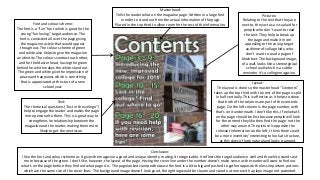
My Analyse of Two Magazine Contents Pages

  • 1. Masterhead: Tells the reader what on the magazine page. Written in a large font in order to stand out from the actual information of the page. Placed in the top third to allow room for the rest of the information. Pictures: Relating to the text that they are next to, they act as a visual aid for people who don’t want to read the text. They help to break up the page and make it more appealing to the young target audience of collage kids, who don’t want to read a page of block text. The background image, of a wall, looks like a stereotypical school wall which is a subtle reminder it’s a college magazine. Font and colour scheme: The font is a “fun” font which is good for the young “fun loving” target audience. The font is consistent all over the page giving the magazine a style that would appear though out. The colour scheme of green and white also helps to give the magazine an identity. The colours contrast each other, and for the Master head, having the green behind he white makes the white stand out. The green and white give the impression of peace and happiness which is something that is appreciated at the start of a new school year. Text: The rhetorical questions (“lost in the college”) help to engage the reader and makes the page more personal to them. This is a great way to strengthens he relationship between the magazine and the reader, making them more likely to get the next issue. Layout: The layout is done so the master head “Contents” takes up the top third with the rest of the page is split in half vertically. This is effective as it helps to show that both of the columns are part of the contents page. On the left column is the page number, with that’s on it underneath. I don’t like this, I feel what's on the page should be first because people will look for the content they like then find the page- not the other way around. The picture is opposite the relevant information on the left, I think there could be a more inventive/ interesting to look at structure, as this doesn’t look natural and looks cramped. Conclusion: I like the font and colour scheme as It gives the magazine a good and unique identity- making it recognisable. It reflects the target audience well and the white stands out more because of the green. I don’t like, however, the layout of the page. Having the cover line under the number doesn’t make sense as the reader will want to find out what’s on the page before they find out what page it is. The page looked cramped because the font is a bit to big and pushed to gather opposite the less important pictures which are the same size of the cover lines. The background image doesn't look good, the righting would be clearer and stand out more with a plane image not patented.
  • 2. Masterhead: Tells the reader what on the magazine page. Used as a Rhetorical question to sum up what's on the page. The rhetorical question helps to engage with the reader, meaning there is a better relationship between the reader and the magazine. Because the reader feels a closer connection with the magazine, they are more likely to by it again. Pictures: Relating to the text that has the same number as them. The image helps to bring the text to life and will encourage the reader to read the article because the will want to know “why the sheep” on page 8. lots of colours are good for a young audience and helps to contrast the white background. Text: Pug: Stands out as the background contrasts the colour scheme. Rewards the reader for buying the magazine and gets them to read articles inside as they find the page where they can “win” The short description under the text helps to give extra information on the article for people who like the sound of “my photography”. The small taste of information will engage the reader and make them want to read the whole article. Colour scheme: The colour scheme of blue and green helps to give the magazine an identity. The Master head is the green colour to help fit in with the colour scheme while the numbers on the pictures are green contrasting. The bright colours contrast with the plain white background and help to engage a young target audience. Layout: The line a third of the way across the page is positioned to be look good (rule of thirds) and help break up the page. There are to sections ”regulars” for the recurring articles. This will please fans of the magazine who return for every issue to read there beloved regular articles, comparatively the “features” are there to excite the new people to he magazine as this is where more interesting or crazy stories will be placed. The features are higher up as this is used to hook the reader while the regulars are there to keep the reader entertained. Conclusion: I think the condense page looks good, Its looks full but not congested and the righting stands out. Using the white background helps the images and righting to “pop” and line a third of the way across helps to show of the colour scheme. The way the pug contrasts the colour scheme draws more attention to it and helps it to stand out. The page doesn’t look to formal which is good in helping to attract there teen target audience but it looks formal enough (eg having the sponsorships in the corner) to show it’s not a kids magazine. The page looks structured and iconic- all of which is important to give the magazine an identity.