(Best) ENJOY Call Girls in Faridabad Ex | 8377087607
Dvd2
1. Another vital piece of text that was needed
was the songs featured on the album, to do
this we added a layer and then written the
songs in it. Like the title ‘on a mission’ the text
also had a white outline, to relate to other
features of the DVD. However the font for this
related to the promotional poster because it
was the same font we used for the artist name
‘Katy B’. After close expectation, we saw that
the text was not easy to read being it was on
top of the darkly coloured heart.
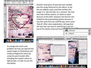
To change the small scale
problem we had, we opened the
saved image on Photoshop and
simply changed the colour by
using the paint bucket after
changing the swatch colour to
light purple, in order to see the
text better.
2. After trialling the newly changed heart on the
background it was an improvement because
we were able to see the text clearly.
On the other hand, we felt as though the heart
blended to much into the background, and by having
the text on top of it only made it worse. Therefore
we changed the colour of the heart on Photoshop
using the same process previously used, and
changed the position of the heart after placing it
back onto Indesign framing it by the words making it
a focal point.
3. At this stage we started we looked at the DVD as whole and seen the font on the front
cover looked out of place as it didn't stand out. To alter the font we changed the size
of her name and changed the outline from blue to white, because it felt more
appropriate. We also added a glow to ‘Katy B’ this was done by pressing outer glow
and the spread to 100%, this made the name more eye catching causing it to be
effective in grabbing the attention of an audience. The outline colour was changed on
‘on a mission’, because at first we wanted the red in the text to link to red in a jacket.
4. Here, the DVD template that we made earlier in the process was now put on a layer and
placed on top of all the other images. Also you can see from the image above, that the
outline colour was changed again on ‘on a mission’ from red to blue the reason for this
was the red seemed to dark to stand out. Also by incorporating the blue, we were
making a connection to the promotional poster. To save the images as a jpeg we had to
export it on Indesign in order to get our finished product.