Creating a Bar Graph in Excel 2016
The means for each group are included in a bar graph and not individual participant data. Be sure to use the data in the “Summary Data for Graph” worksheet contained in the Data 1 workbook. The means have already been calculated and organized appropriately for each condition.
To create a bar graph in Excel 2016, complete the following steps:
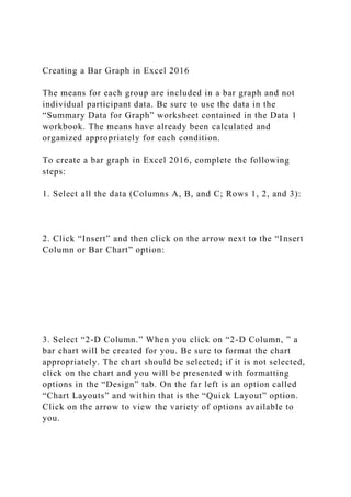
1. Select all the data (Columns A, B, and C; Rows 1, 2, and 3):
2. Click “Insert” and then click on the arrow next to the “Insert Column or Bar Chart” option:
3. Select “2-D Column.” When you click on “2-D Column, ” a bar chart will be created for you. Be sure to format the chart appropriately. The chart should be selected; if it is not selected, click on the chart and you will be presented with formatting options in the “Design” tab. On the far left is an option called “Chart Layouts” and within that is the “Quick Layout” option. Click on the arrow to view the variety of options available to you.
4. Select “Layout 5” because it gives you the option to label the x-axis and y-axis and allows labels for the levels of the independent variable. The independent variable is called “Drug Condition” and the two levels are “Placebo” and “Drug A.”
The text “Axis Title” constitutes text boxes and you can click on to change the label for the x-axis and y-axis; remember, the BDI score is on the y-axis and the name of the independent variable is along the x-axis.
You have the option to remove the horizontal lines that appear across the graph. You can remove those lines by clicking on one of the lines, which should select all lines. Then, you can press the delete key on your computer to remove lines.
You can also change the font type and size of the font by selecting the entire graph and then selecting the appropriate font style and size.
Creating a Bar Graph in Excel 2010
The means for each group are included in a bar graph and not individual participant data. You should use the data in the “Summary Data for Graph” worksheet contained in the Data 1 workbook. The means have already been calculated and organized appropriately for each condition.
To create a bar graph in Excel 2010, complete the following steps
1. Select all the data (Columns A, B, and C; Rows 1, 2, and 3):
2. Click “Insert,” and then click on the arrow next to the “Column” option:
3. Select “2-D Column.” When you click on “2-D Column,” your bar chart will be created for you. Now, format the chart appropriately. The chart should be selected; if not, click on the chart and you will be presented with formatting options in the “Design” tab. Click on the arrow next to “Chart Layouts,” and then you will be presented with a variety of options.
4. Select “Layout 9” because it gives you the option to label the x-axis and y-axis and allows labels for the levels of the independent variable. The independent variable is called “Drug Condition” and the two levels are “Placebo” and “Drug A.
· The text.
Creating a Bar Graph in Excel 2016The means for each group are.docx
1. Creating a Bar Graph in Excel 2016
The means for each group are included in a bar graph and not
individual participant data. Be sure to use the data in the
“Summary Data for Graph” worksheet contained in the Data 1
workbook. The means have already been calculated and
organized appropriately for each condition.
To create a bar graph in Excel 2016, complete the following
steps:
1. Select all the data (Columns A, B, and C; Rows 1, 2, and 3):
2. Click “Insert” and then click on the arrow next to the “Insert
Column or Bar Chart” option:
3. Select “2-D Column.” When you click on “2-D Column, ” a
bar chart will be created for you. Be sure to format the chart
appropriately. The chart should be selected; if it is not selected,
click on the chart and you will be presented with formatting
options in the “Design” tab. On the far left is an option called
“Chart Layouts” and within that is the “Quick Layout” option.
Click on the arrow to view the variety of options available to
you.
2. 4. Select “Layout 5” because it gives you the option to label the
x-axis and y-axis and allows labels for the levels of the
independent variable. The independent variable is called “Drug
Condition” and the two levels are “Placebo” and “Drug A.”
The text “Axis Title” constitutes text boxes and you can click
on to change the label for the x-axis and y-axis; remember, the
BDI score is on the y-axis and the name of the independent
variable is along the x-axis.
You have the option to remove the horizontal lines that appear
across the graph. You can remove those lines by clicking on one
of the lines, which should select all lines. Then, you can press
the delete key on your computer to remove lines.
You can also change the font type and size of the font by
selecting the entire graph and then selecting the appropriate font
style and size.
Creating a Bar Graph in Excel 2010
The means for each group are included in a bar graph and not
individual participant data. You should use the data in the
“Summary Data for Graph” worksheet contained in the Data 1
workbook. The means have already been calculated and
organized appropriately for each condition.
To create a bar graph in Excel 2010, complete the following
steps
1. Select all the data (Columns A, B, and C; Rows 1, 2, and 3):
2. Click “Insert,” and then click on the arrow next to the
“Column” option:
3. 3. Select “2-D Column.” When you click on “2-D Column,”
your bar chart will be created for you. Now, format the chart
appropriately. The chart should be selected; if not, click on the
chart and you will be presented with formatting options in the
“Design” tab. Click on the arrow next to “Chart Layouts,” and
then you will be presented with a variety of options.
4. Select “Layout 9” because it gives you the option to label the
x-axis and y-axis and allows labels for the levels of the
independent variable. The independent variable is called “Drug
Condition” and the two levels are “Placebo” and “Drug A.
· The text “Axis Title” constitutes text boxes. You can click on
that text to change the label for the x-axis and y-axis;
remember, the BDI score is on the y-axis and the name of the
independent variable is along the x-axis.
· If you would like, you can also remove the horizontal lines,
which are located across the graph. You can do this by clicking
on one of the lines. This step should select all lines, and then
you can press the delete key on your computer.
· You can also change the font type and size of the font by
selecting the entire graph and then selecting the appropriate font
style and size.