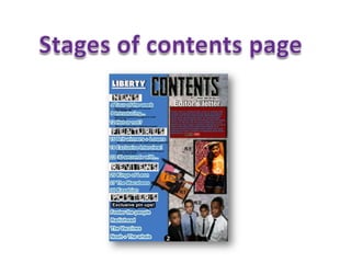
3. I first started by adding the logo of my
Then I added the features
magazine then added the contents
along the left hand side
title. I chose a font and colour that is
conforming to conventions of
different to the regular features
contents pages. I stuck to the
house style colours to provide
a monotonous look.
4. After that I added the editor’s
letter making sure I left enough
space for my images. I made
the editors letter in a
contrasting colour to make it
stand out on the copy.
5. After that I finally added my 3
images and positioned them in
different places until I found the
right place. It was difficult at
first as I did not want them to
look crowded on the page so
had to resize the images.
6. Finally I added some borders to
the images to make them look
more effective and I put the
page numbers next to them and
my contents page is finished.