1. Recipe Card 3– Analysis (Tangy Leek and Ginger Soup)
BACK
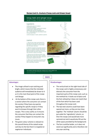
Disadvantages:
The vertical text on the right-hand side of
the recipe card is highly unnecessary and
distracts the consumer from the
important parts of the recipe card, such as
the method list. It looks out of place and
the font utilised by it does not match that
of the font which has been used
throughout the recipe card.
The two text columns could have been
spaced out more, as they are too close
together. The ‘method’ column should be
put aside the ‘ingredients’ column, as
then the recipe card would look more
symmetrical and it would also fill out the
white space provided by the background.
The font could be bolder, as it does not
stand out significantly and is therefore not
very eye-catching.
Advantages:
The image utilised is eye-catching and
bright, which means that the intended
audience will immediately be drawn to it
as it is the main focal point of the recipe
card design.
At the bottom of the recipe card, there is
a section where the consumer can contact
the society if they have any queries
regarding the specific recipe or if they
want to browse through their other
recipes. This is very useful; as it ensures
the consumer that they can contact the
society if they happen to encounter any
issues.
The green colour scheme is relevant to
the overall theme of the stated recipe
card due to the fact that it is targeted at
vegetarian individuals.