Download as PDF, PPTX


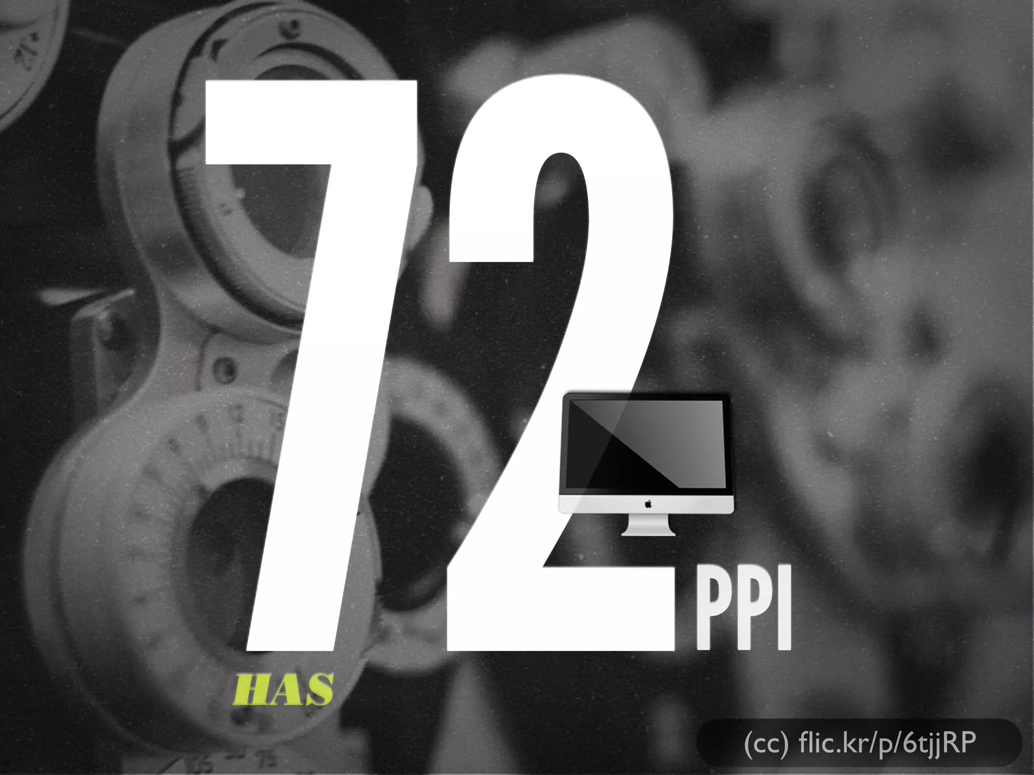
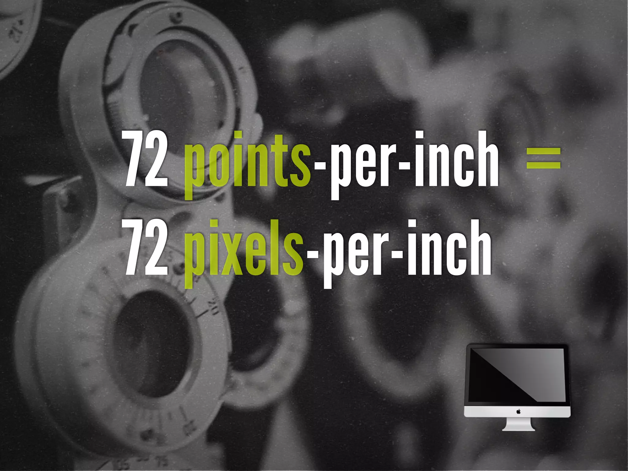
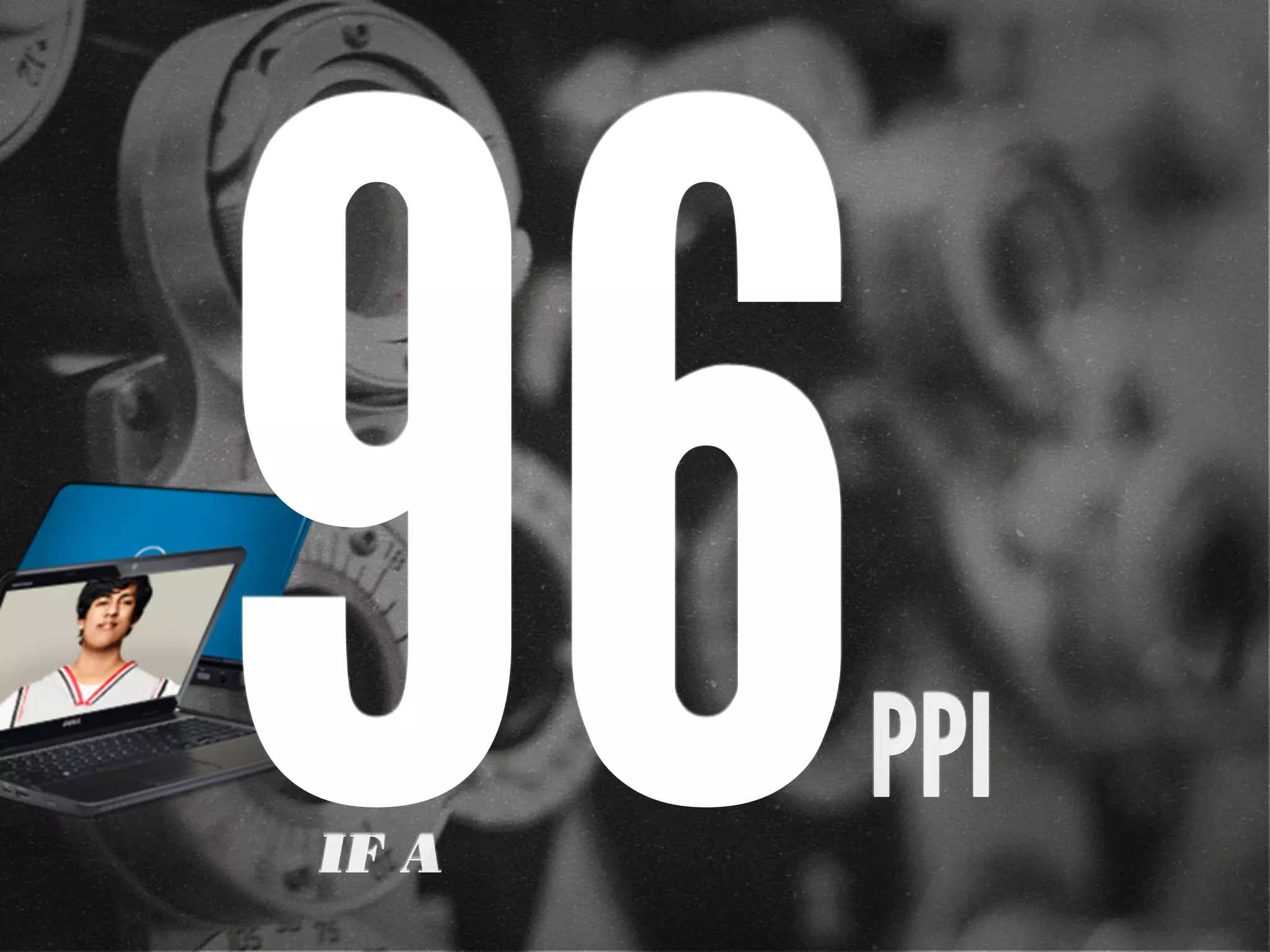
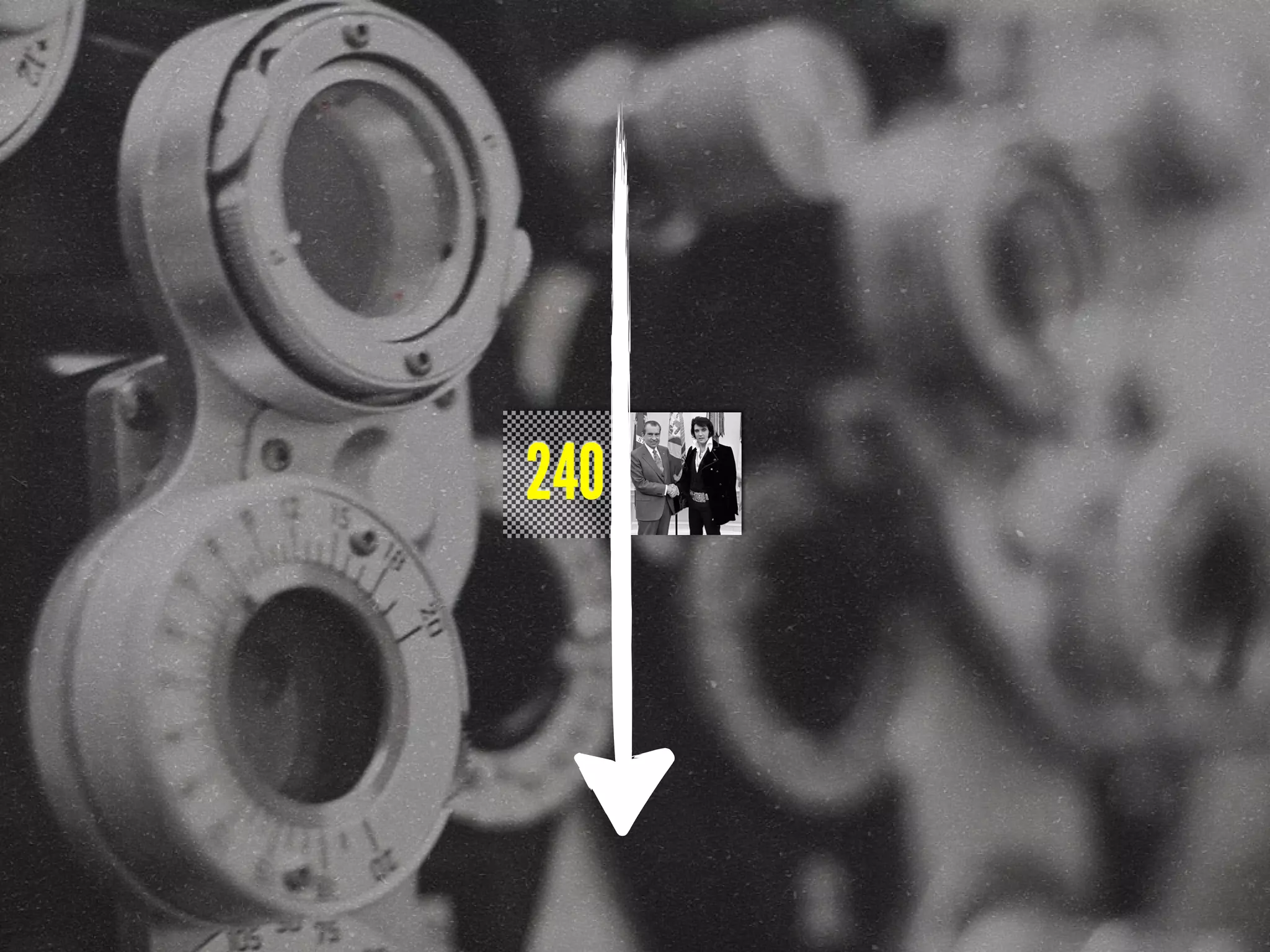
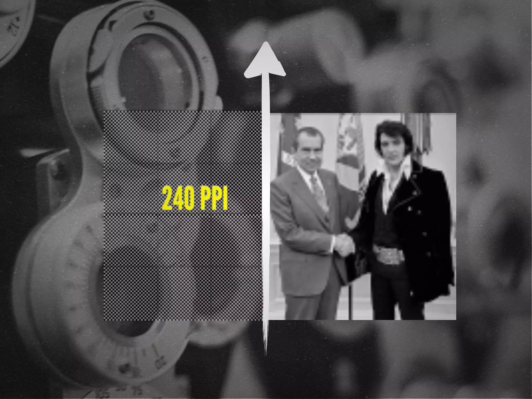
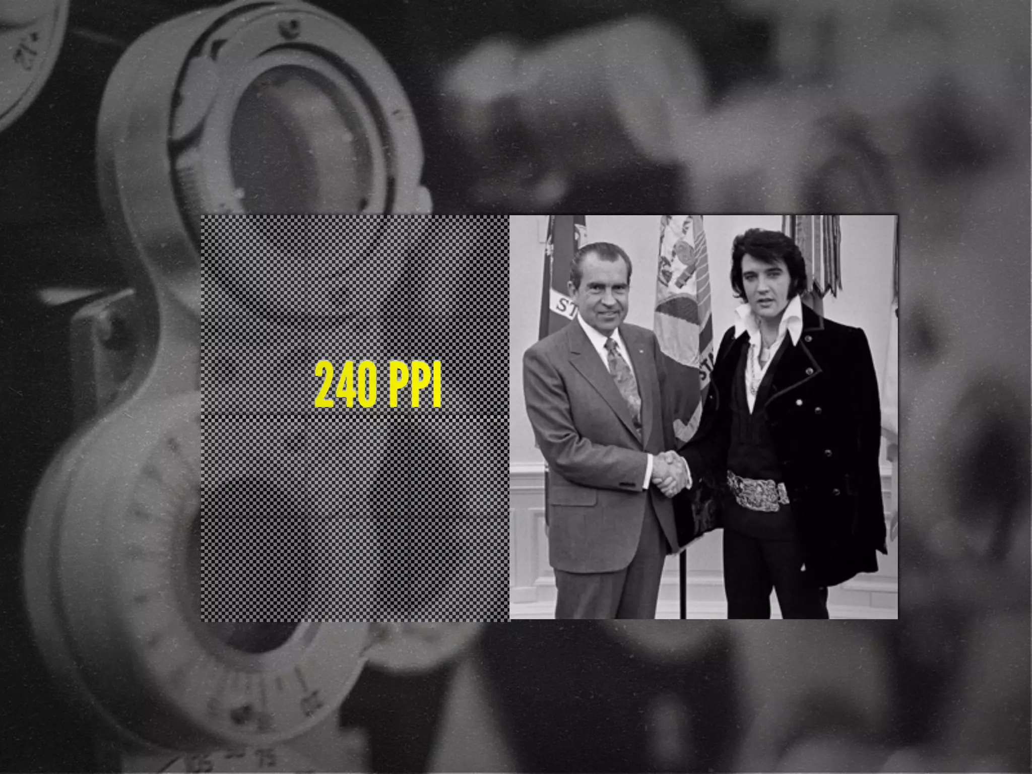
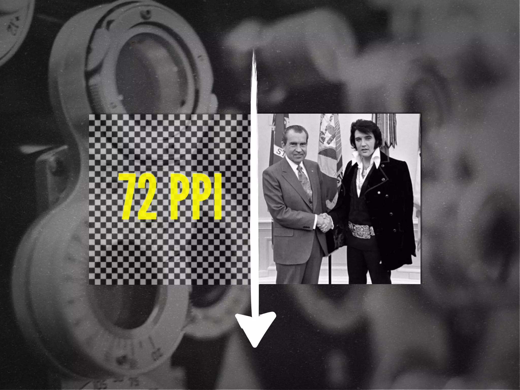
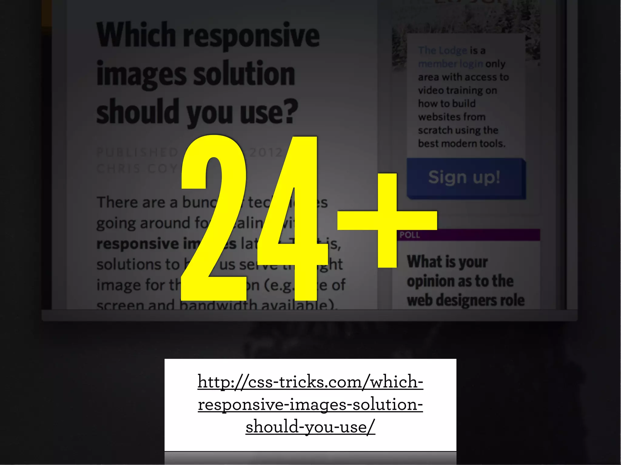
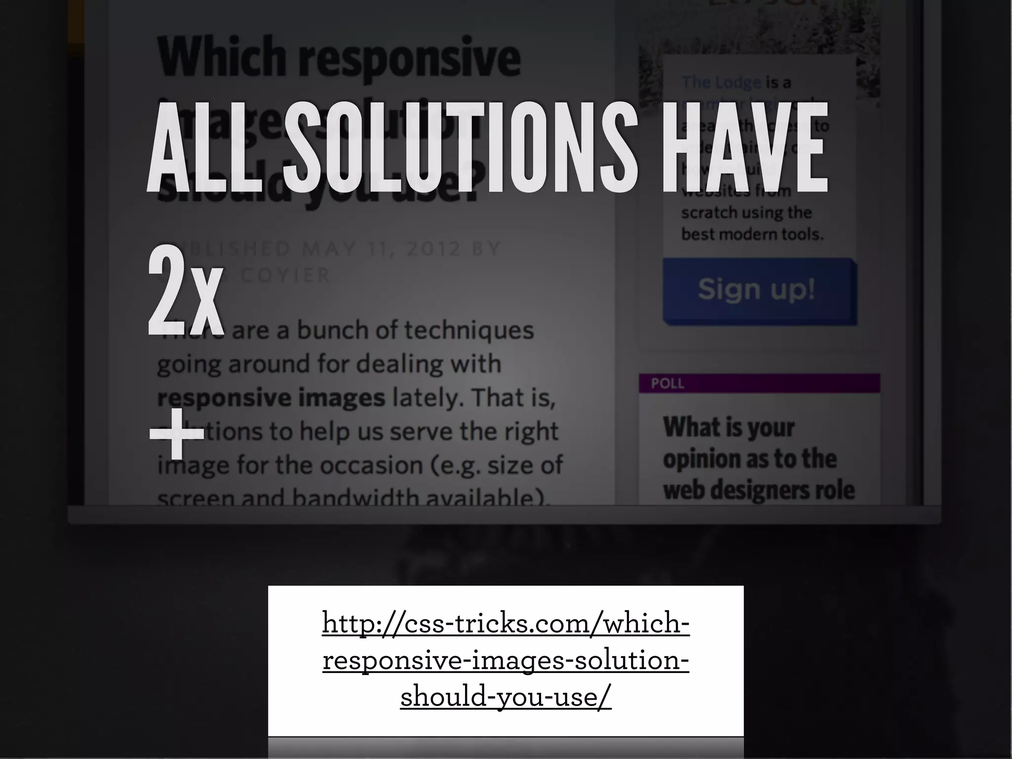
![72 points-per-inch
x [1+(1/3)]
= 96 PPI](https://image.slidesharecdn.com/adaptive-images-funkav5-150415072902-conversion-gate01/75/funka-Adaptive-Images-in-Responsive-Web-Design-36-2048.jpg)
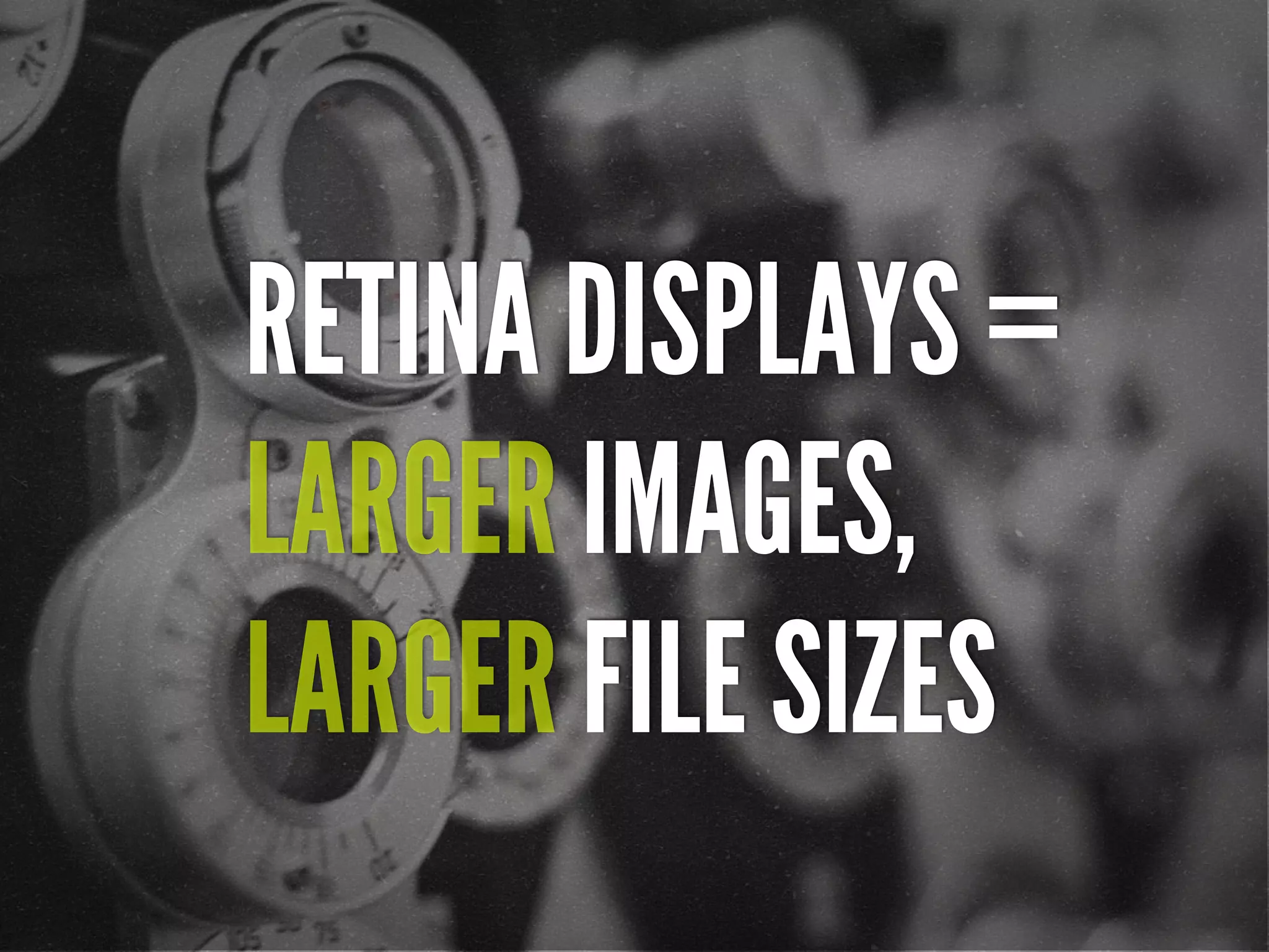
![[In 2013, Intel sees their
product line] offer a higher
resolution experience than a
top-of-the-line 1080p HDTV.”
“
http://liliputing.com/2012/04/intel-retina-laptop-
desktop-displays-coming-in-2013.html](https://image.slidesharecdn.com/adaptive-images-funkav5-150415072902-conversion-gate01/75/funka-Adaptive-Images-in-Responsive-Web-Design-39-2048.jpg)
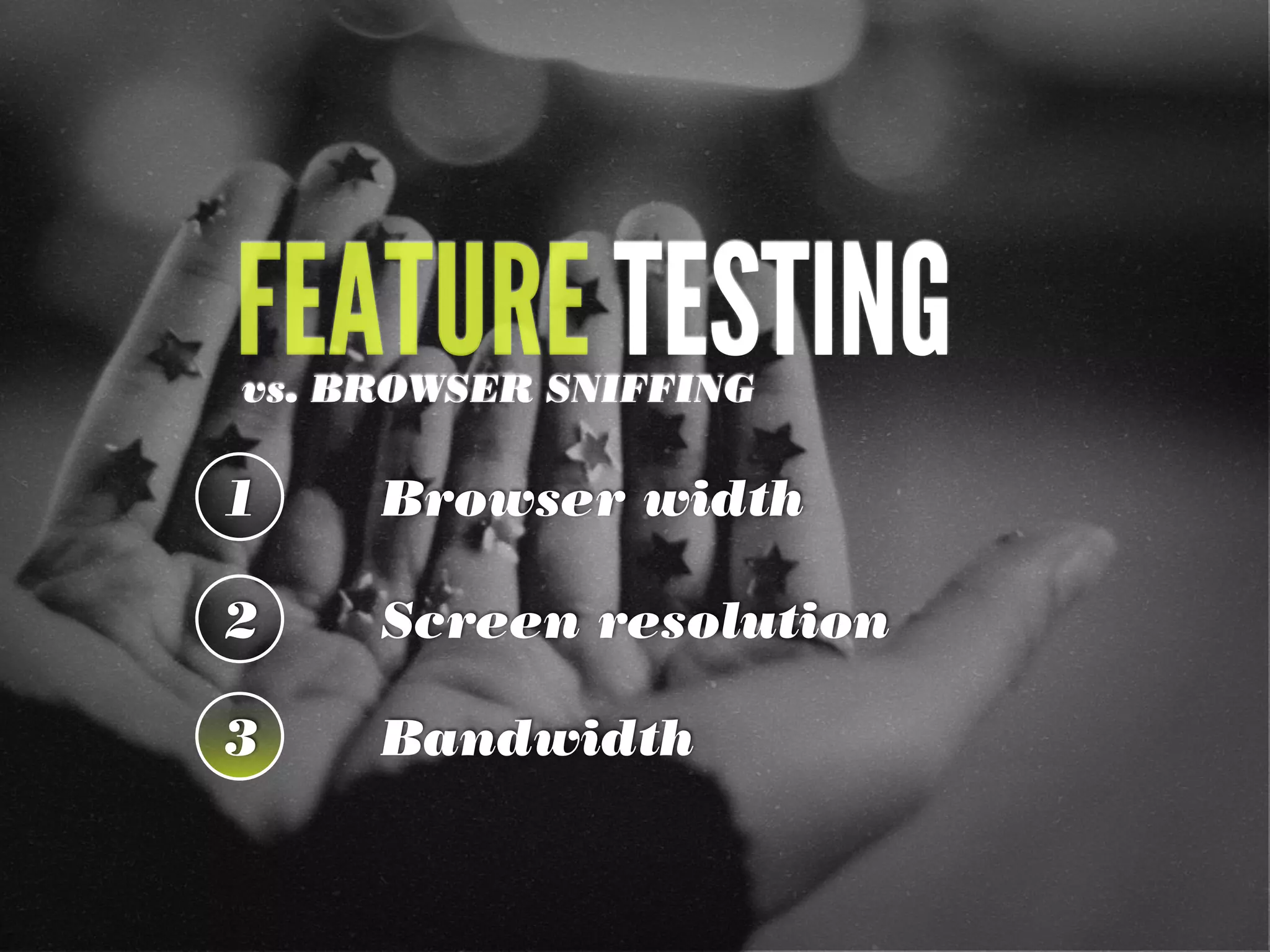
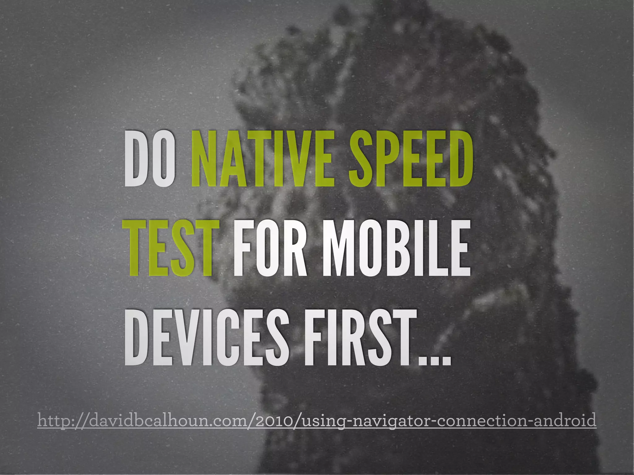
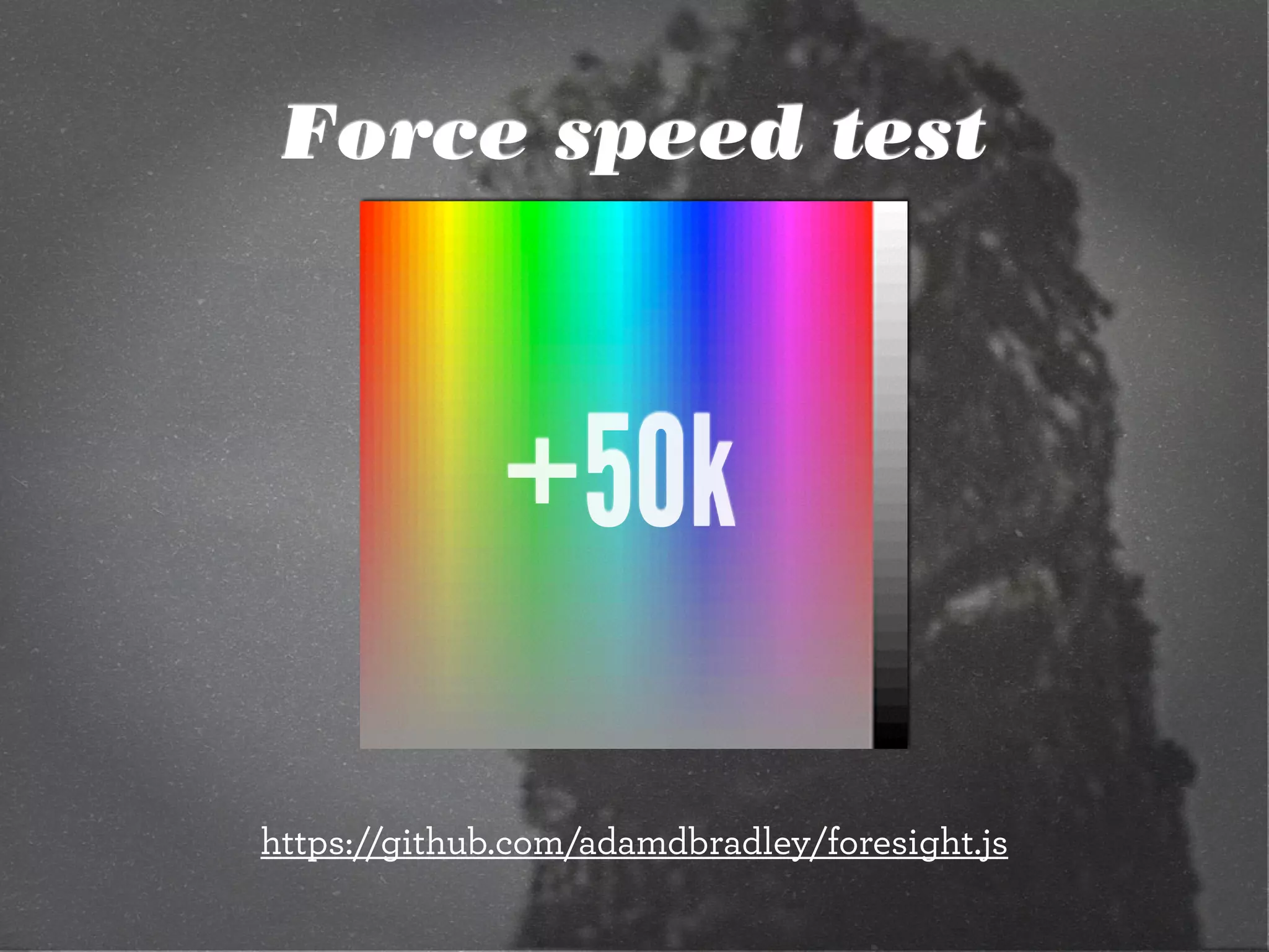
![Native speed test
// @Modernizr's network-connection.js
connection = navigator.connection || {
type: 0 }, // polyfill
isSlowConnection = connection.type == 3
|| connection.type == 4
| /^[23]g$/.test(connection.type);
http://davidbcalhoun.com/2010/using-navigator-connection-android](https://image.slidesharecdn.com/adaptive-images-funkav5-150415072902-conversion-gate01/75/funka-Adaptive-Images-in-Responsive-Web-Design-54-2048.jpg)


![HTML5 Boilerplate
<!doctype html>
<!--[if lt IE 7]> <html class="no-js lt-ie9 lt-ie8 lt-ie7"
lang="en">
<![endif]-->
<!--[if IE 7]> <html class="no-js lt-ie9 lt-ie8" lang="en">
<![endif]-->
<!--[if IE 8]> <html class="no-js lt-ie9" lang="en"> <!
[endif]-->
<!--[if gt IE 8]><!--> <html class="no-js" lang="en"> <!--<!
[endif]-->
<head>](https://image.slidesharecdn.com/adaptive-images-funkav5-150415072902-conversion-gate01/75/funka-Adaptive-Images-in-Responsive-Web-Design-133-2048.jpg)
![Modernizr check
if(!Modernizr.svg){
var images =
document.getElementsByTagName("img");
for(var i = 0; i < images.length; i++){
var src = images[i].src.split(".");
images[i].src = src[0] + ".png";
}
}
http://stackoverflow.com/questions/12846852/
svg-png-extension-switch](https://image.slidesharecdn.com/adaptive-images-funkav5-150415072902-conversion-gate01/75/funka-Adaptive-Images-in-Responsive-Web-Design-134-2048.jpg)
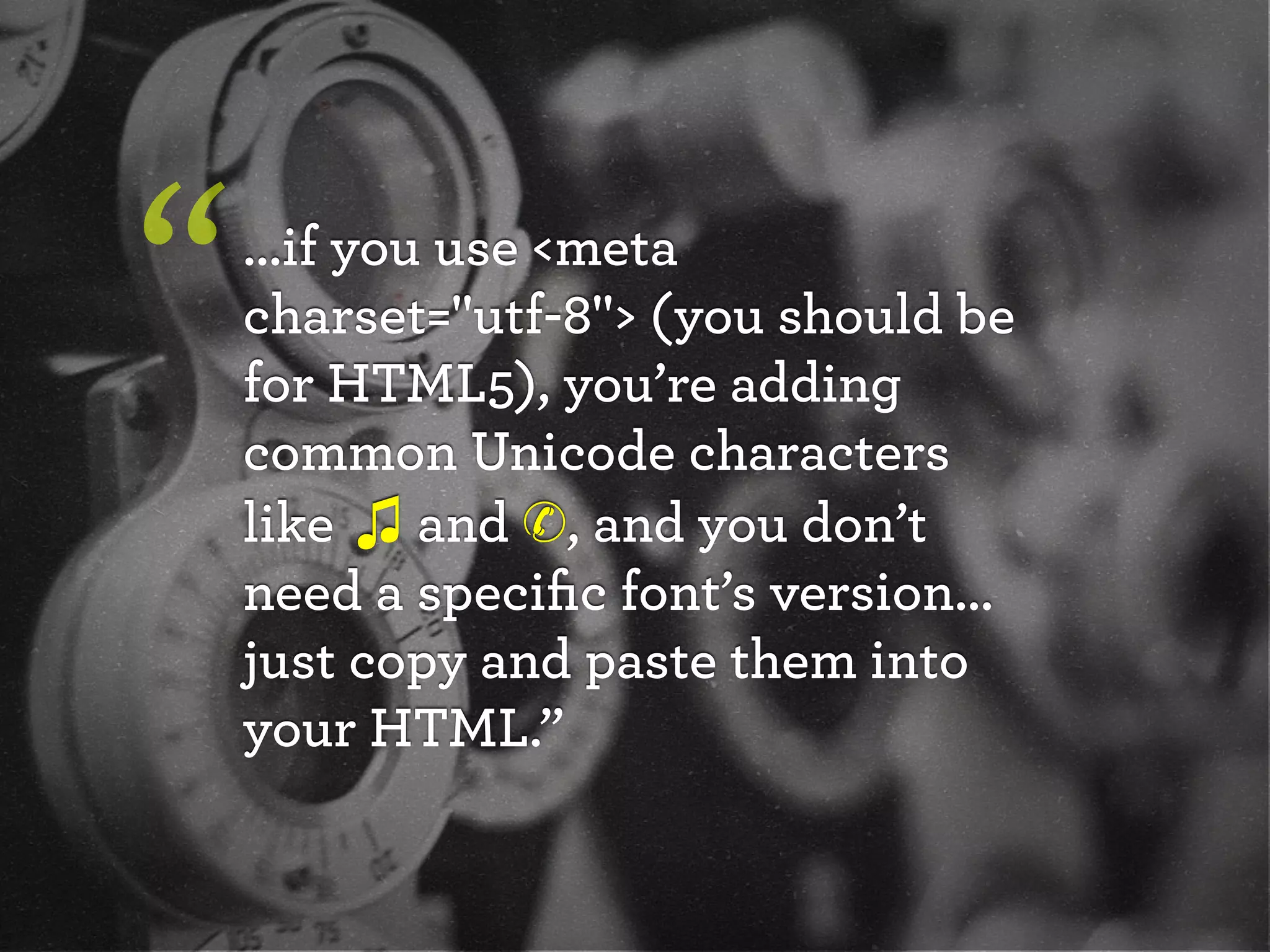

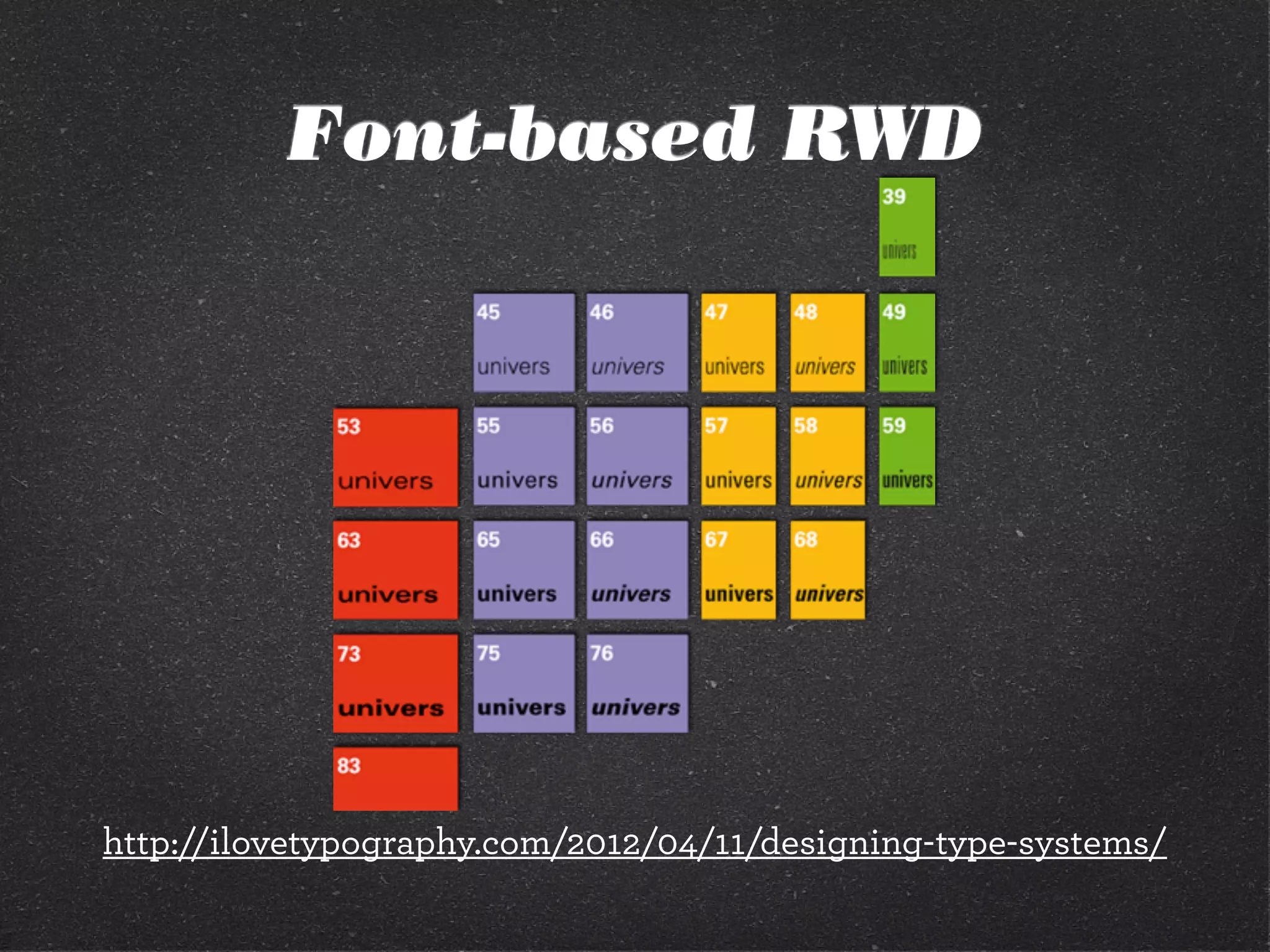
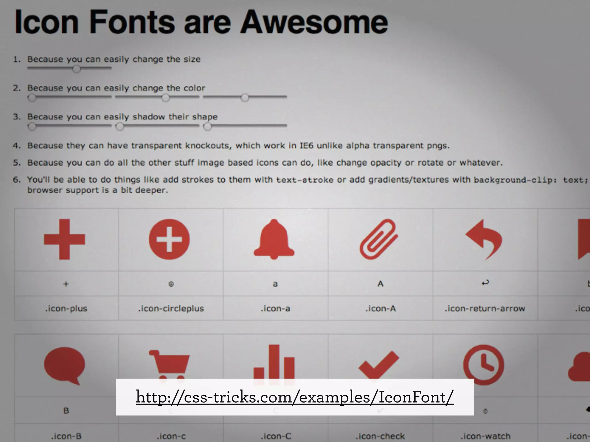
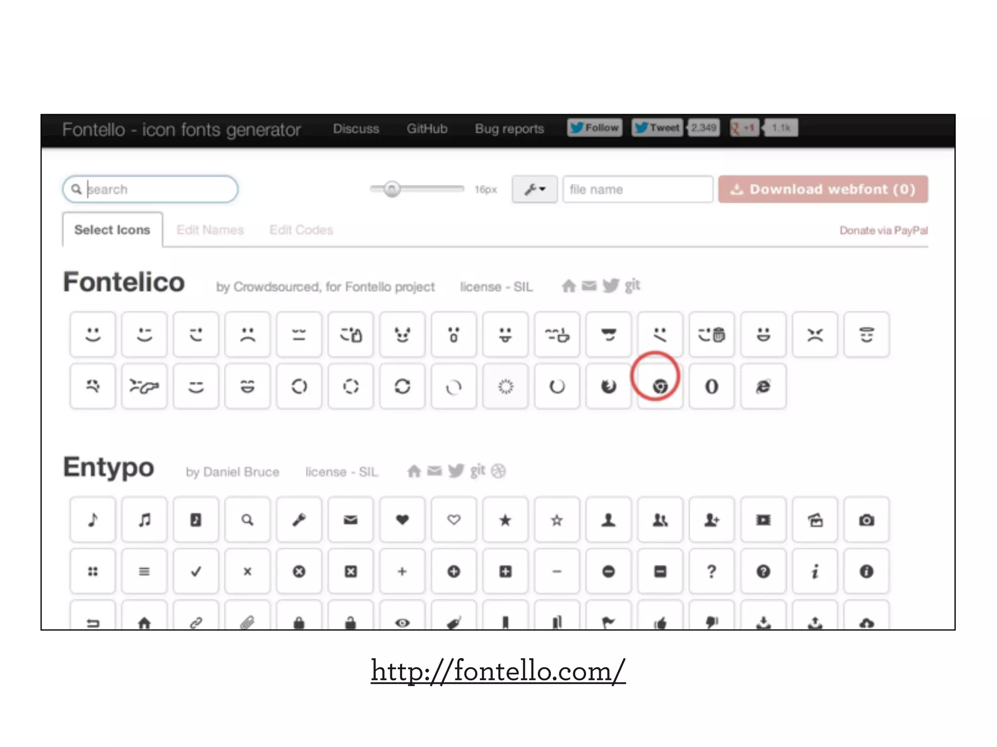
![Font-based icons
<style>
[data-icon]:before {
font-family: 'icon-font';
content: attr(data-icon);
}
</style>
<a href="http://example.com/cloud/save/">
<span data-icon="C" aria-hidden="true"></span>
Save to Cloud
</a>](https://image.slidesharecdn.com/adaptive-images-funkav5-150415072902-conversion-gate01/75/funka-Adaptive-Images-in-Responsive-Web-Design-145-2048.jpg)


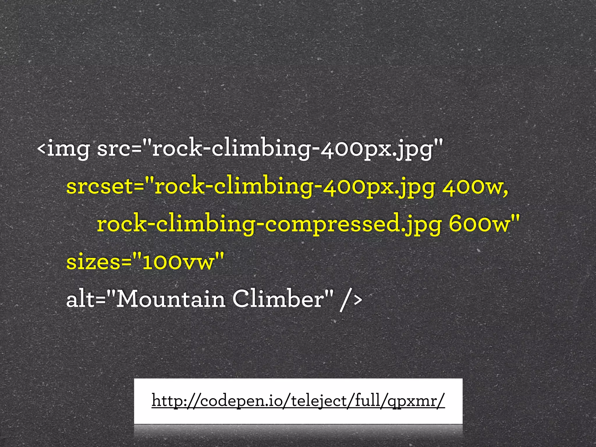
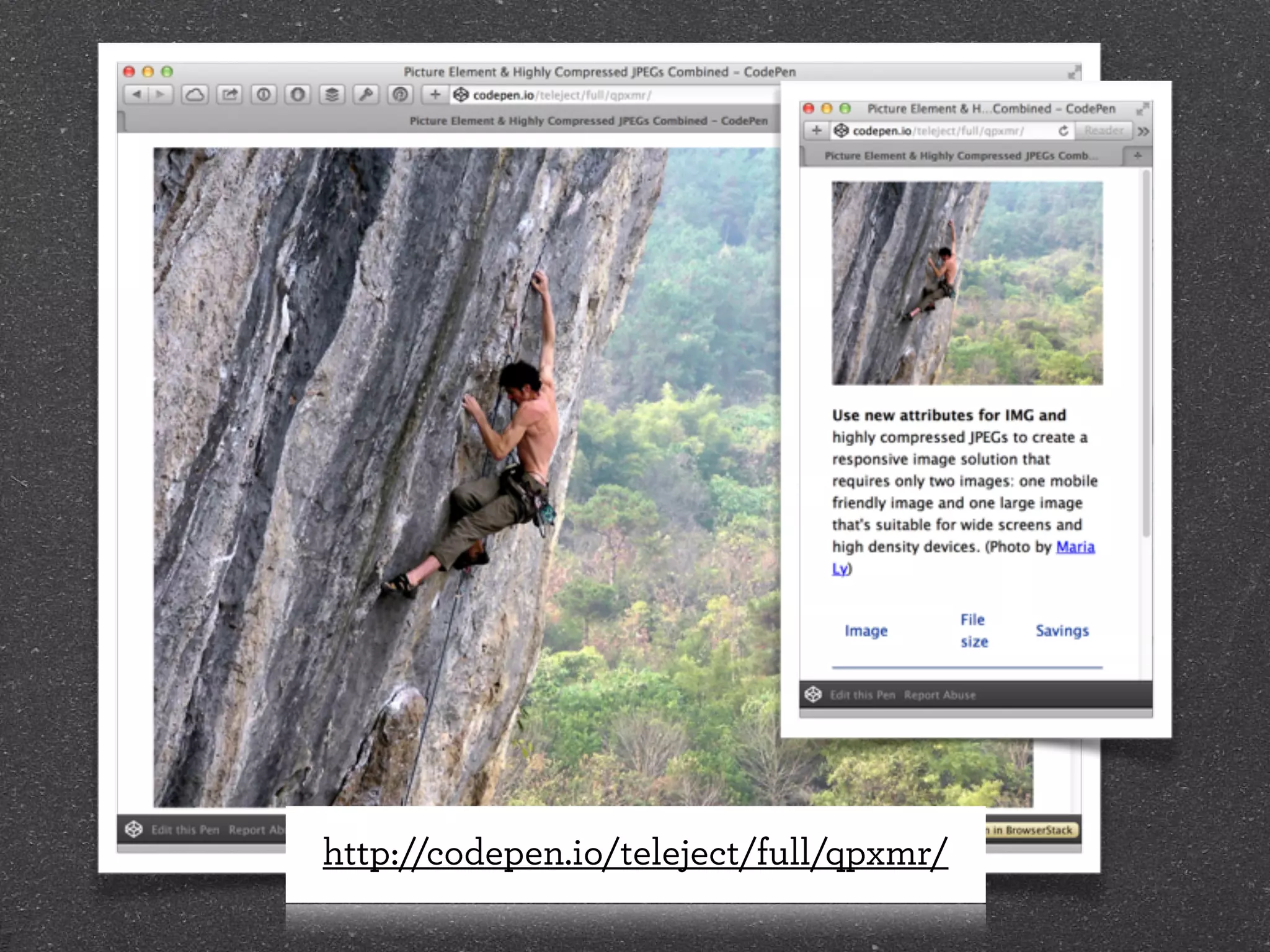

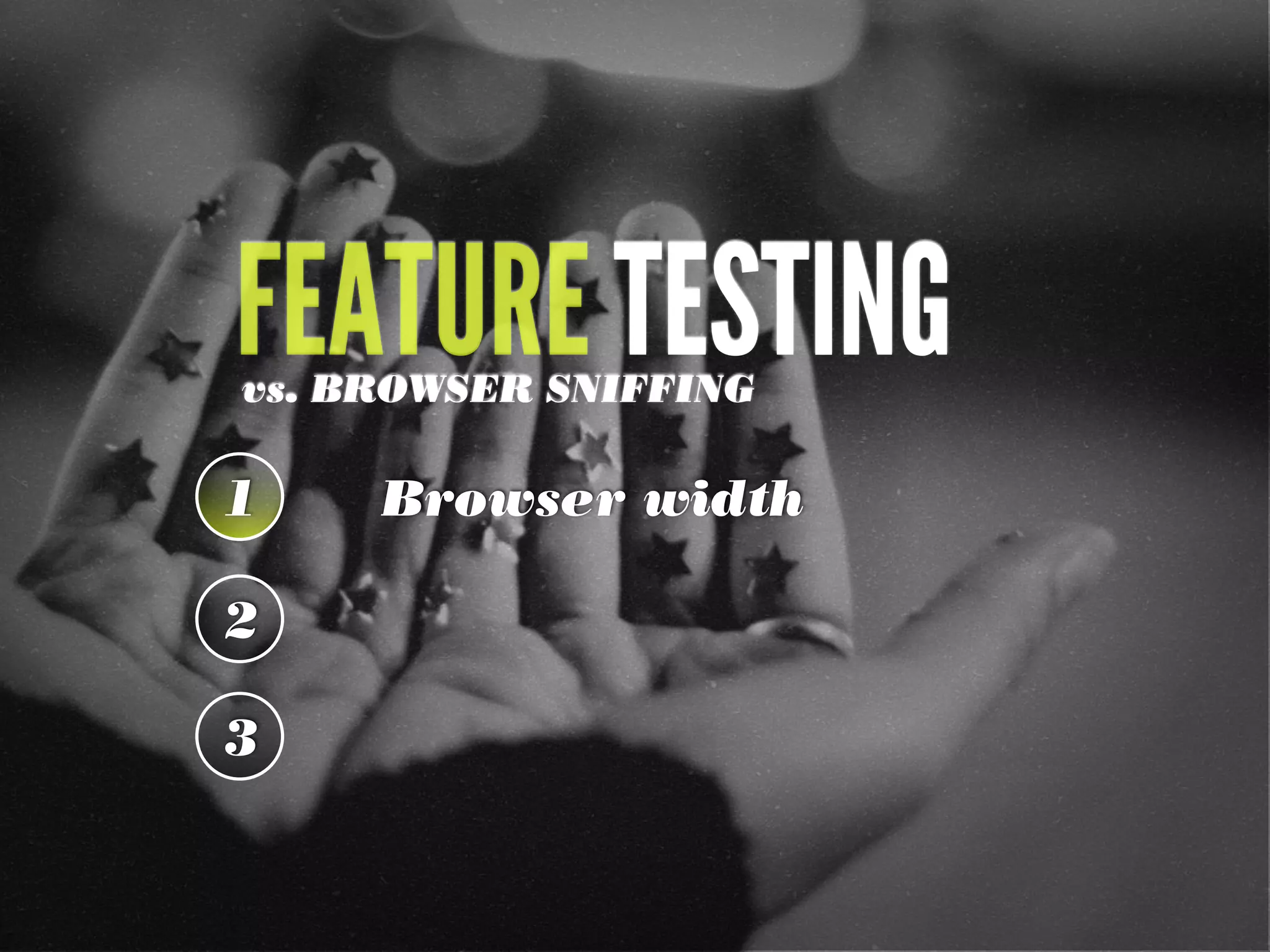
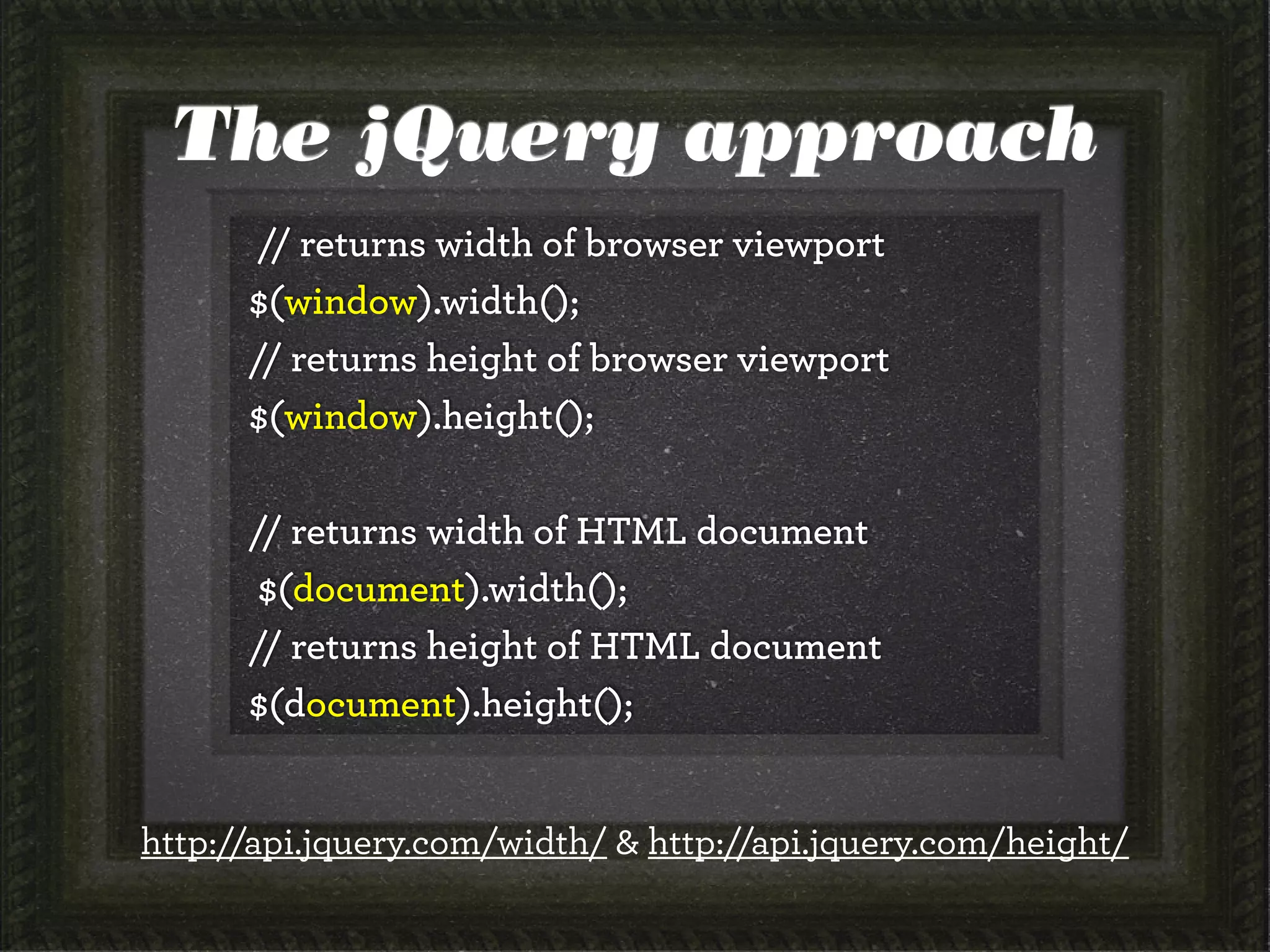
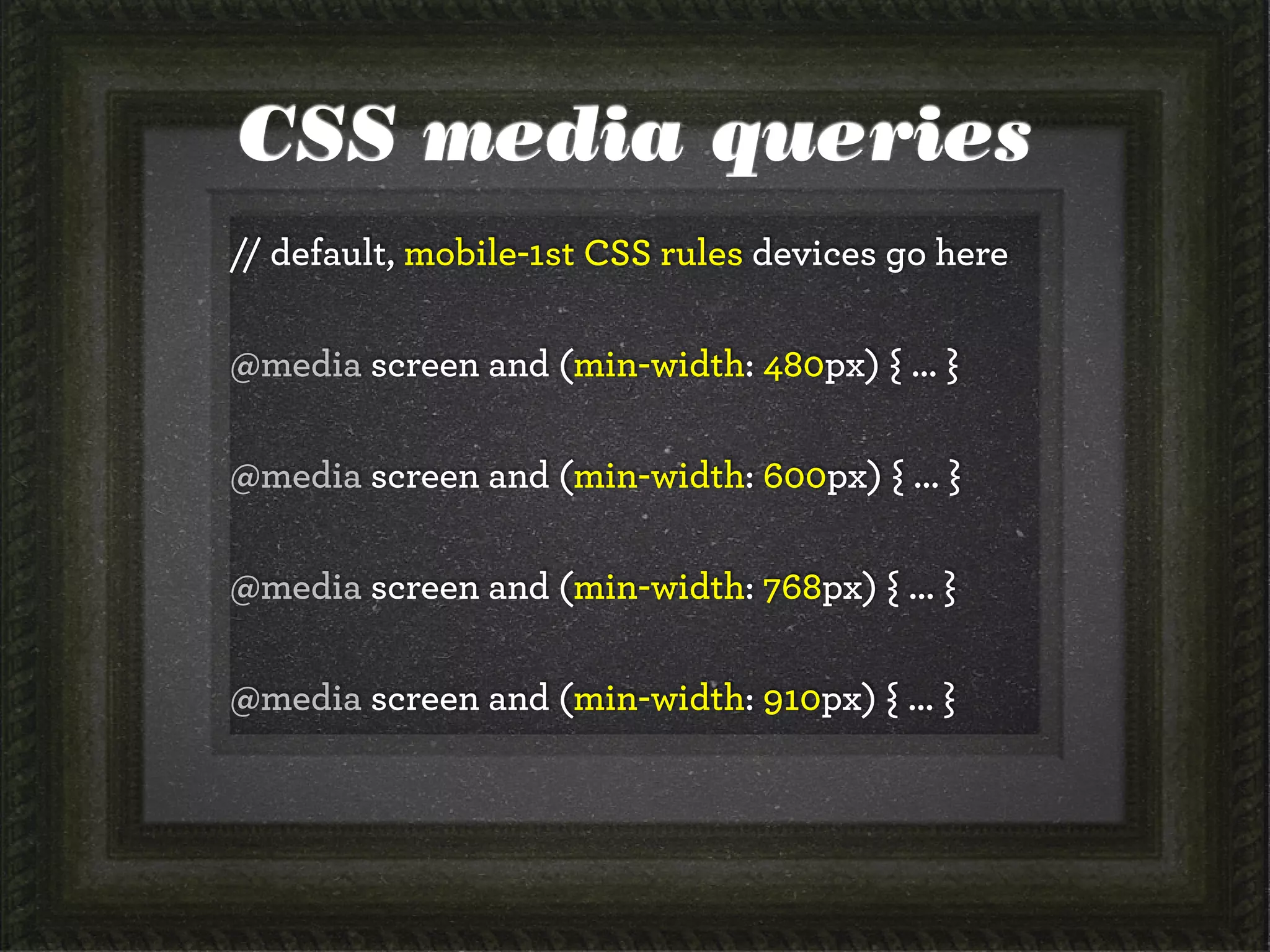
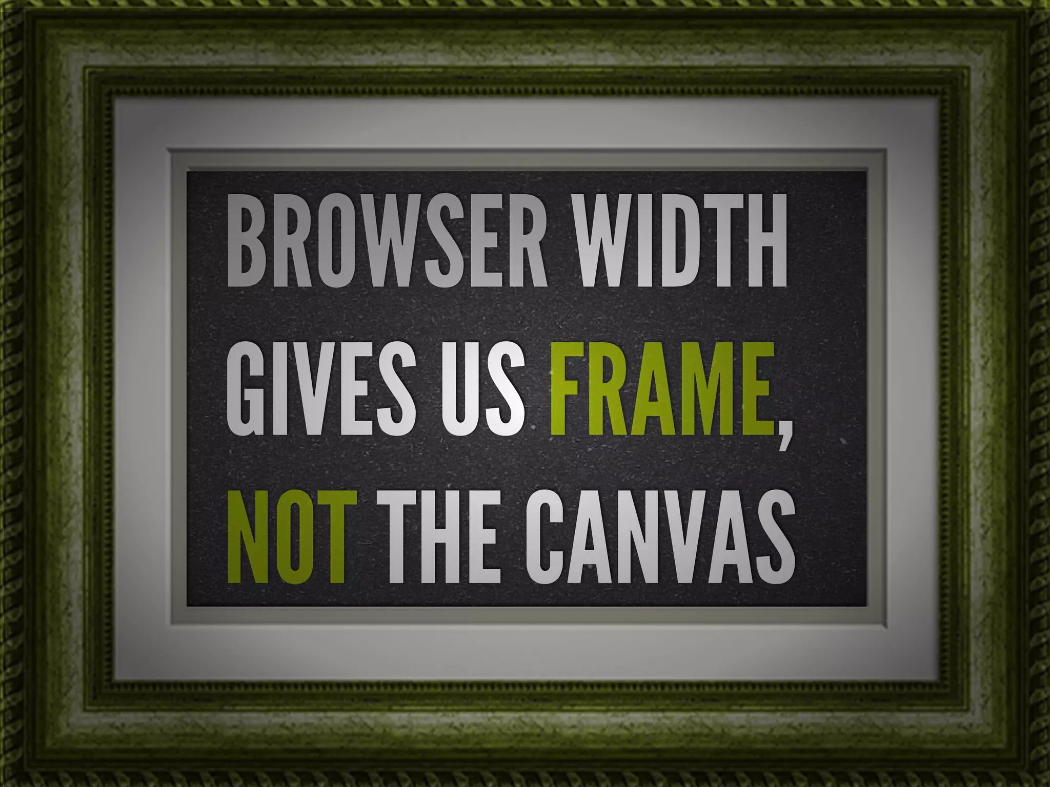
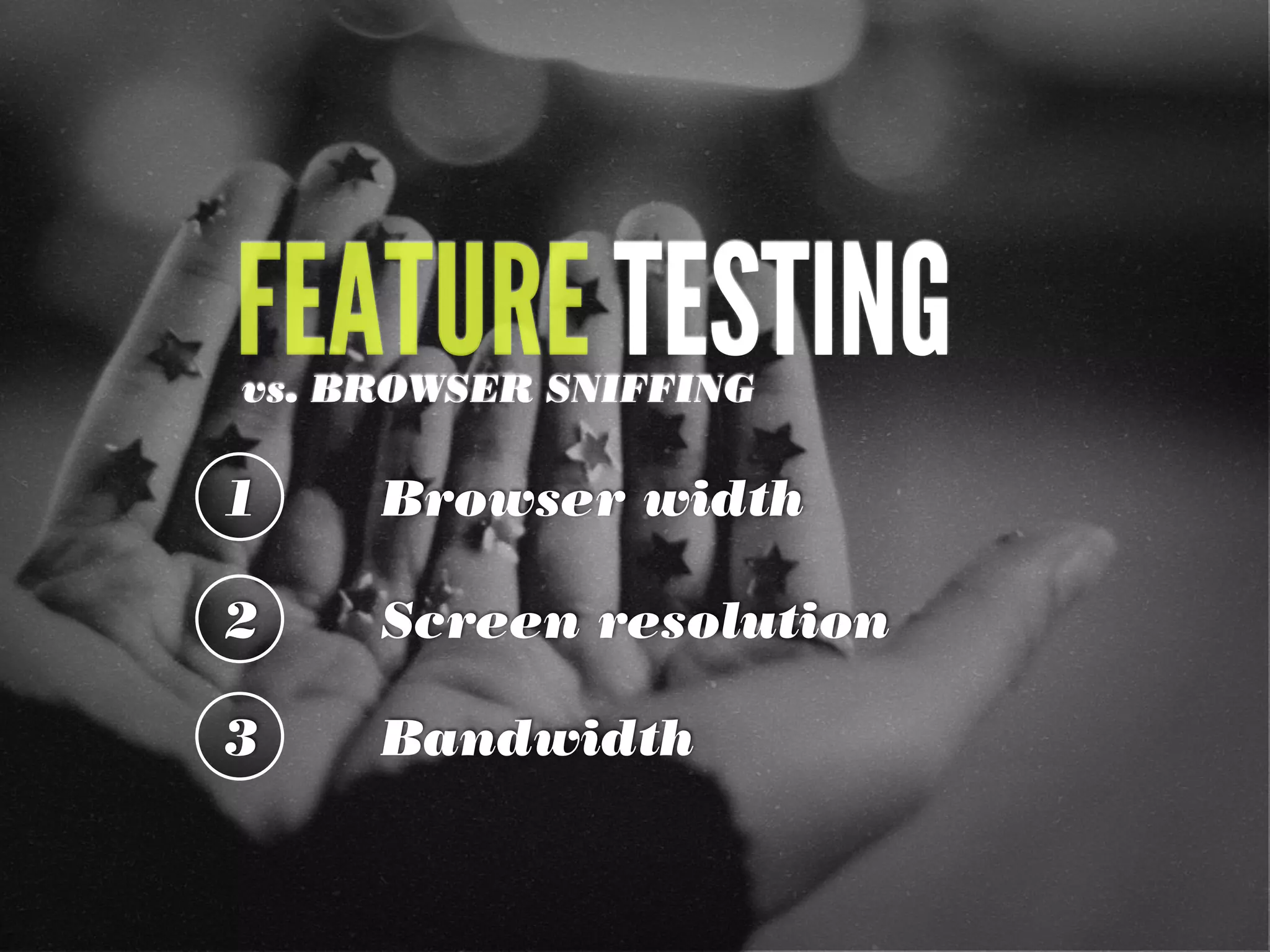
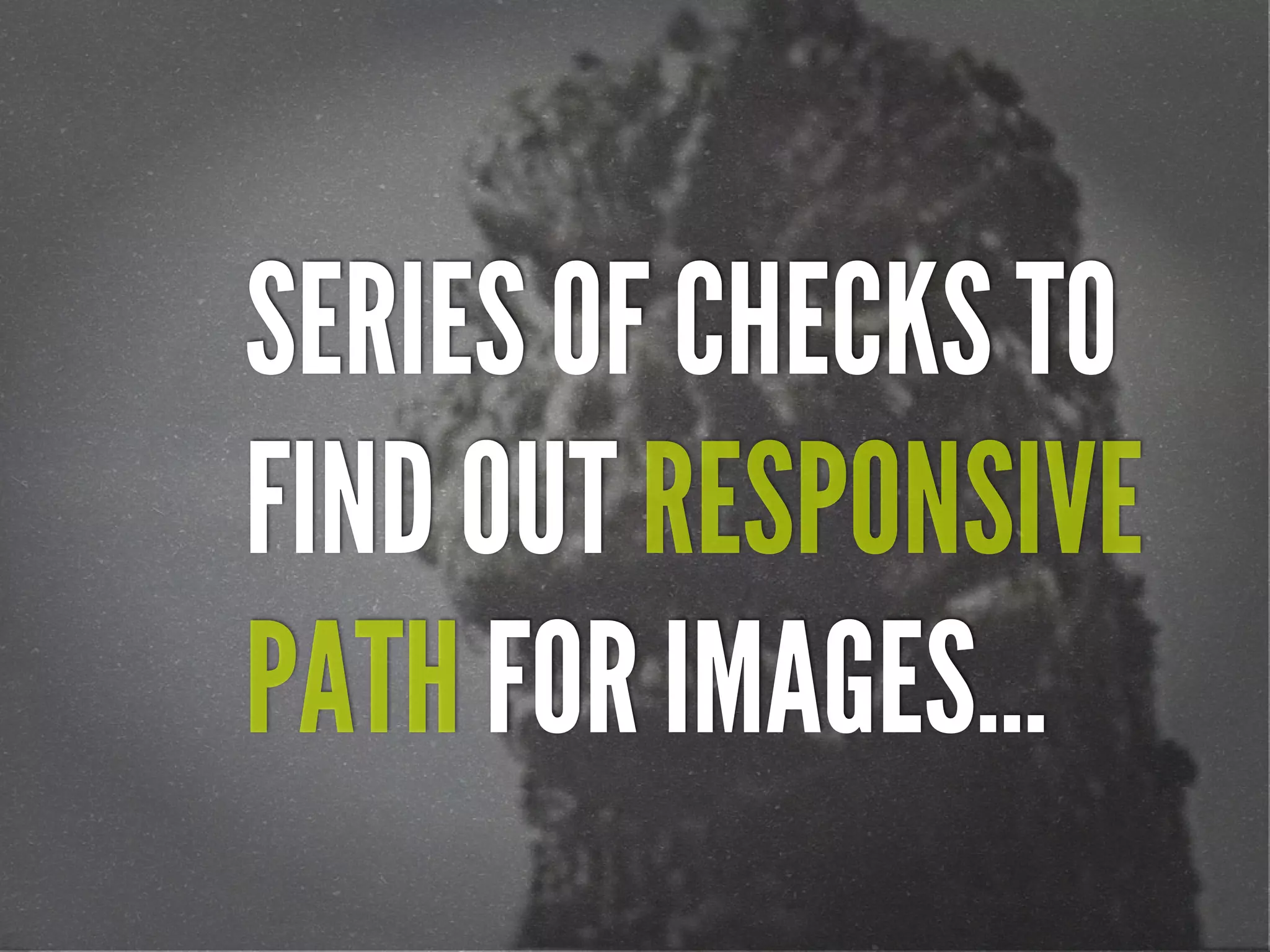
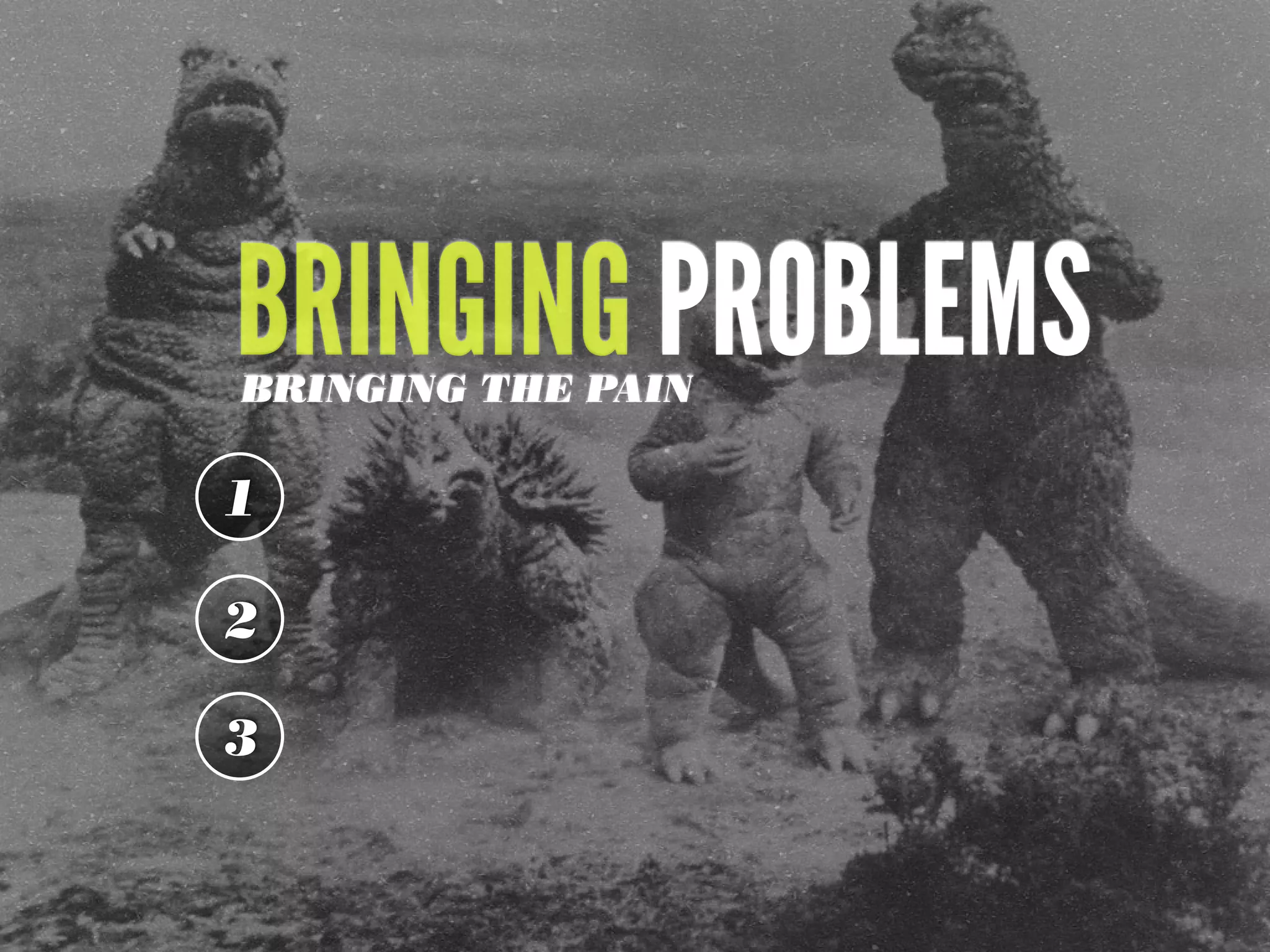
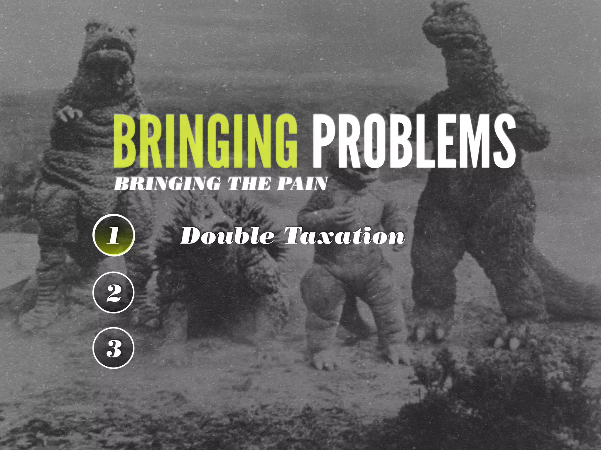
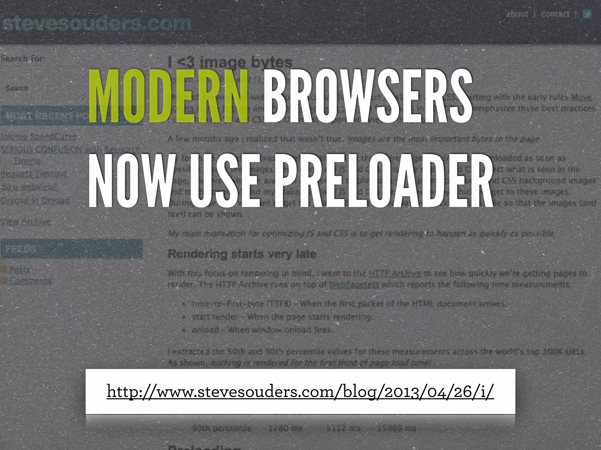
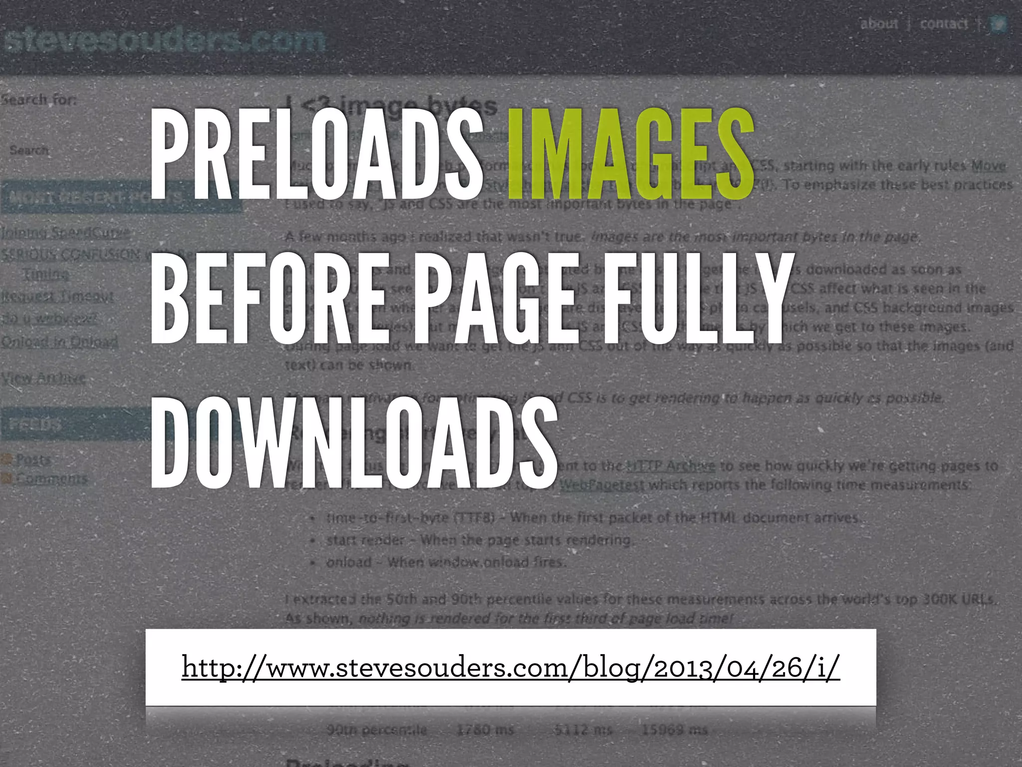
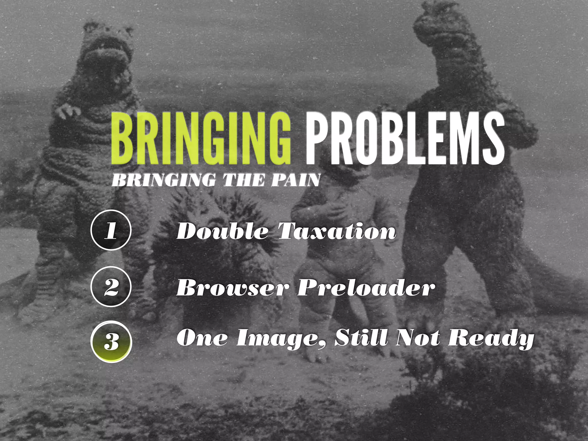
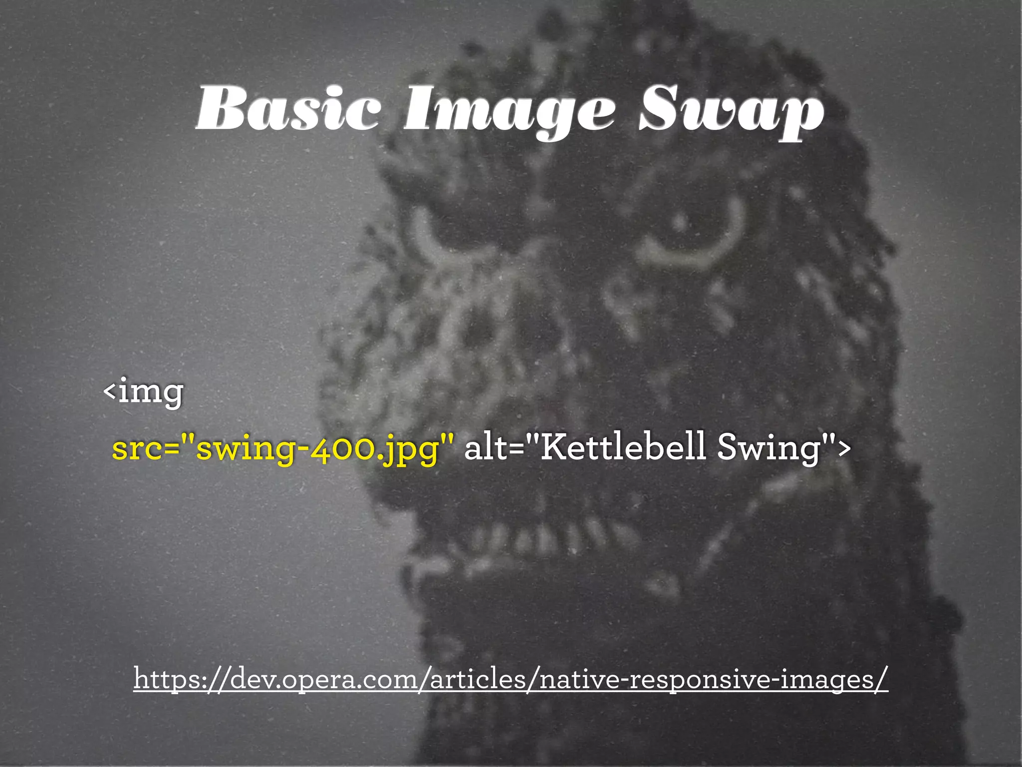
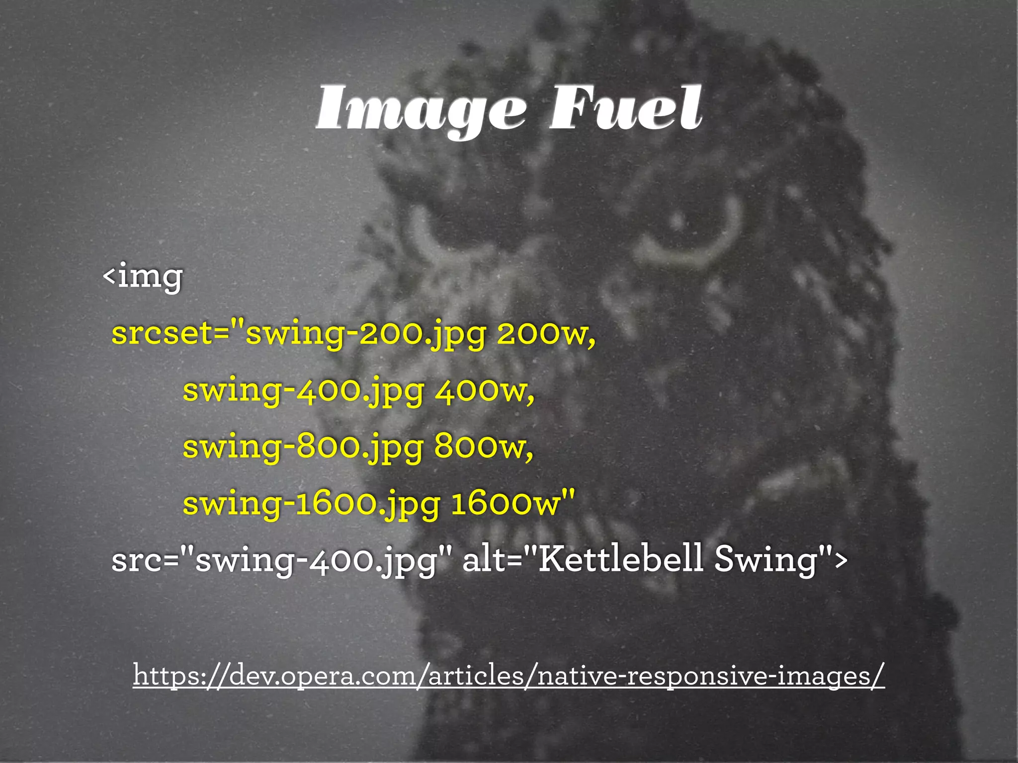
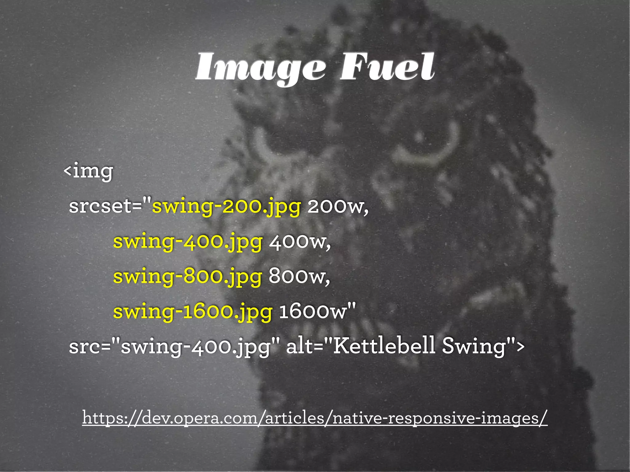
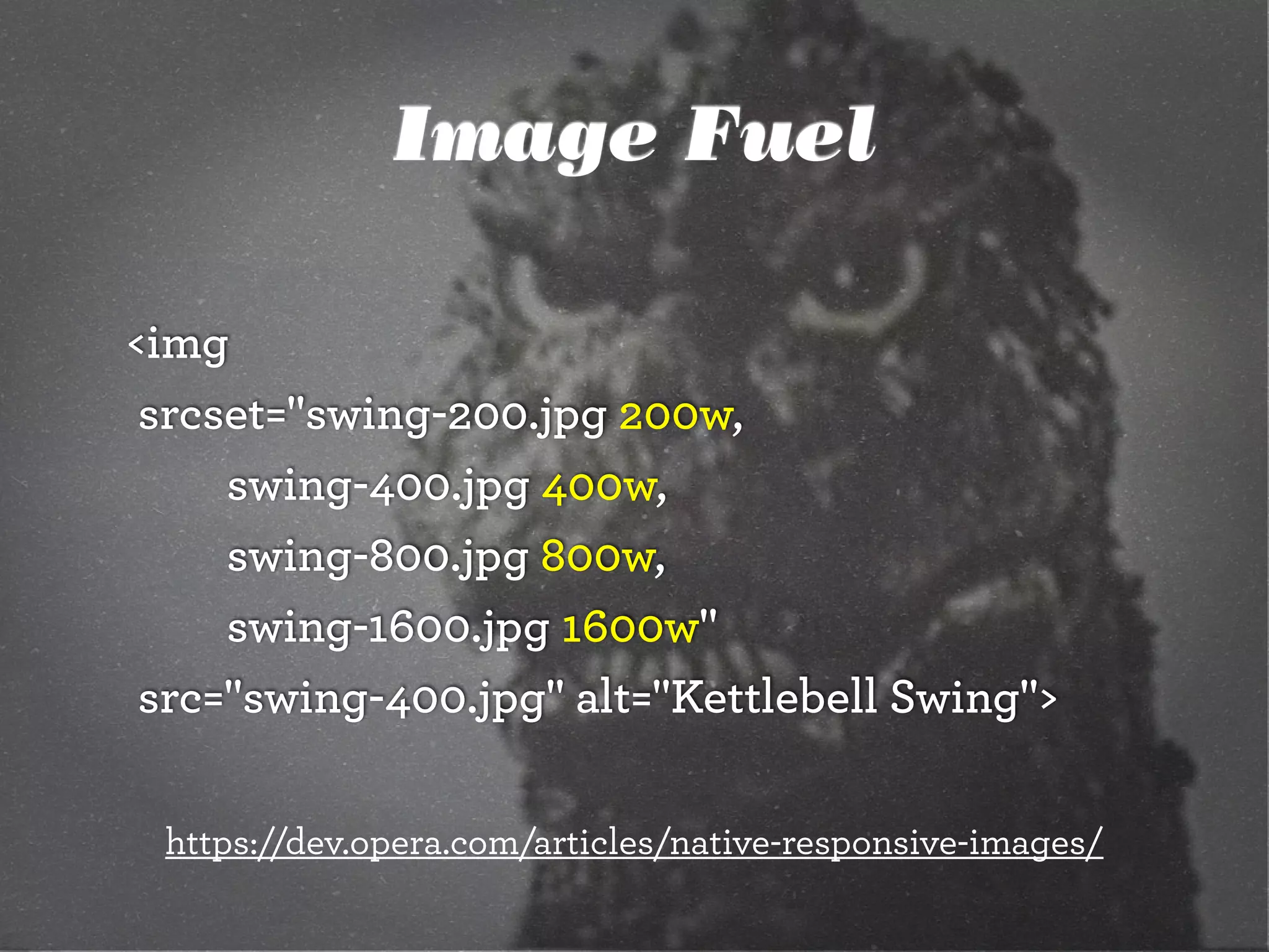
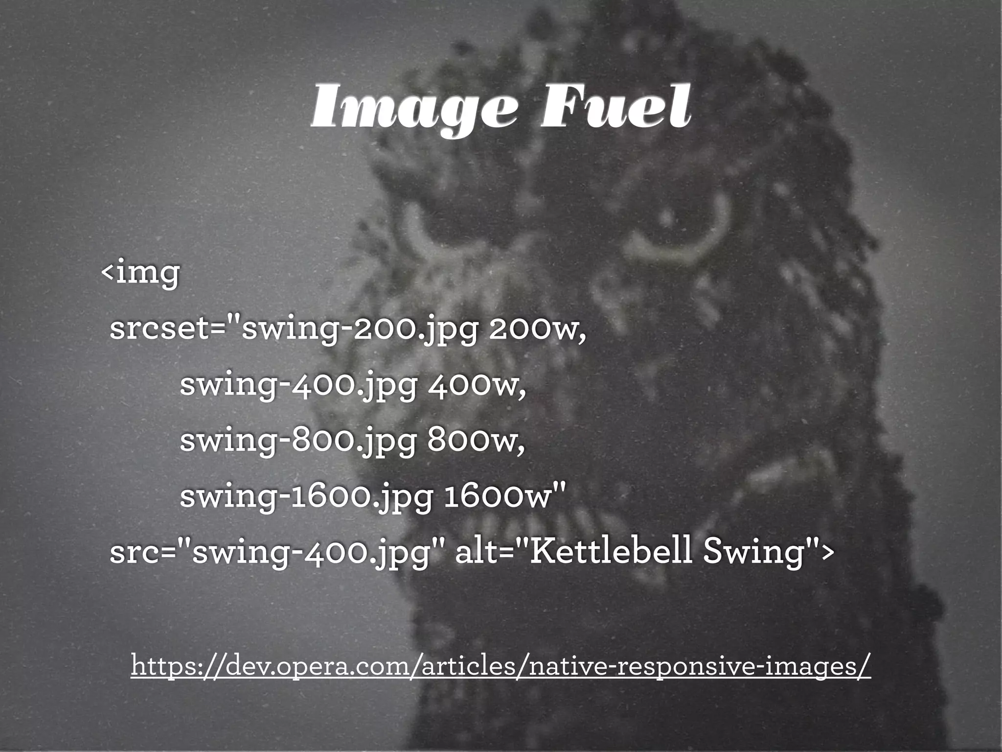
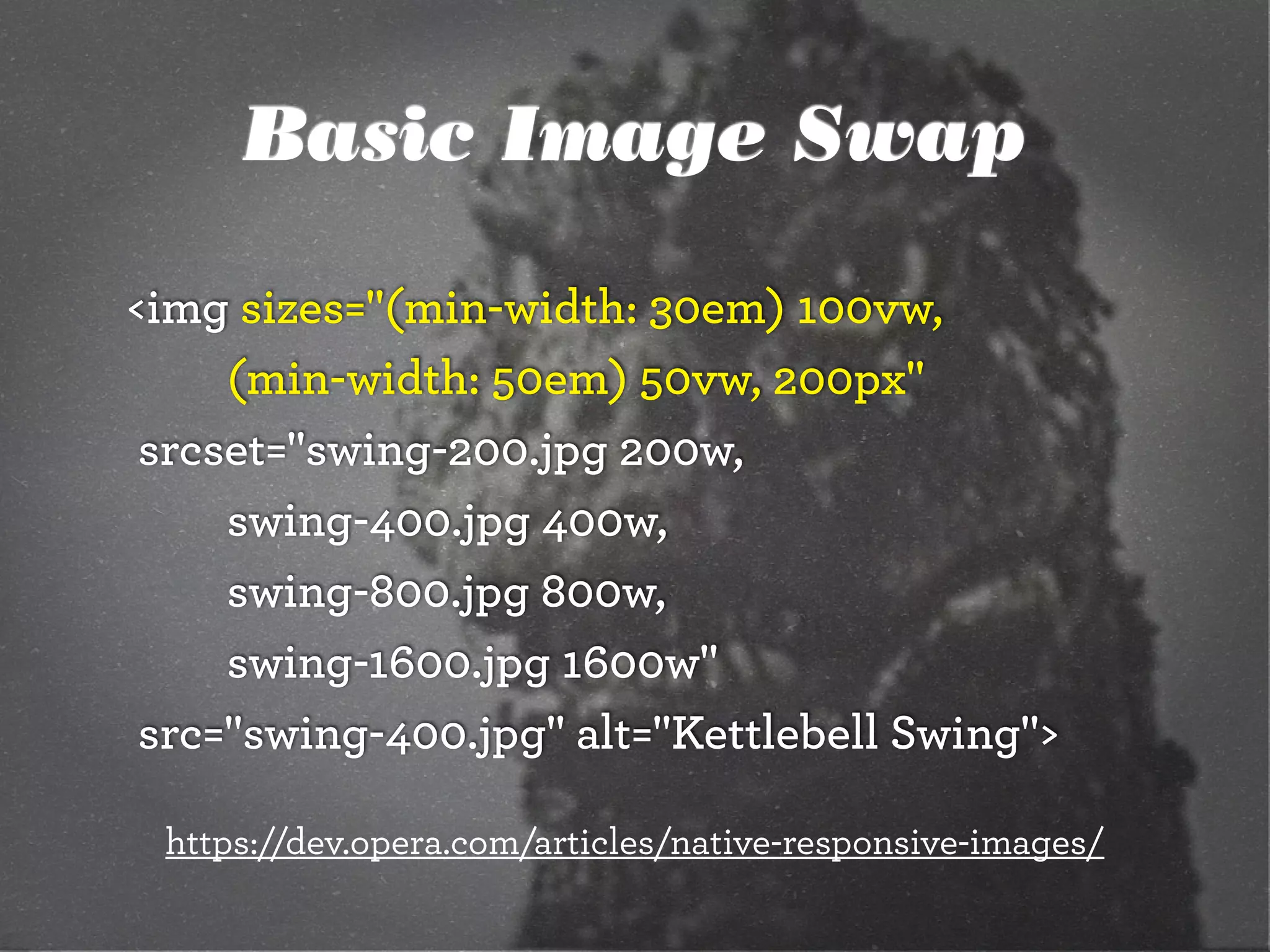
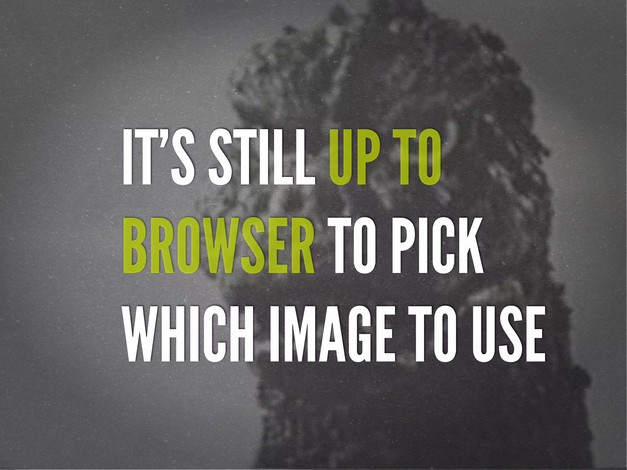
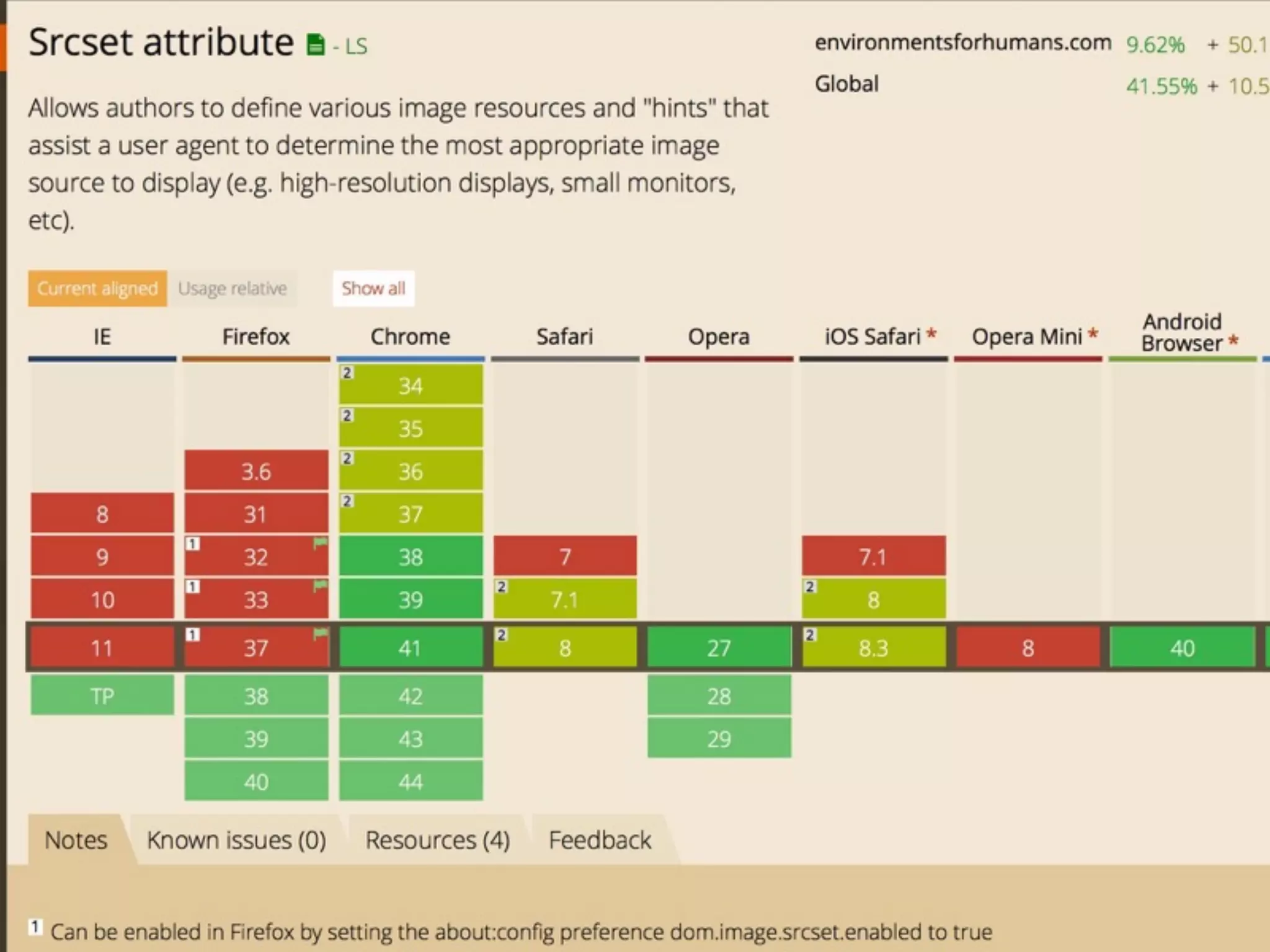
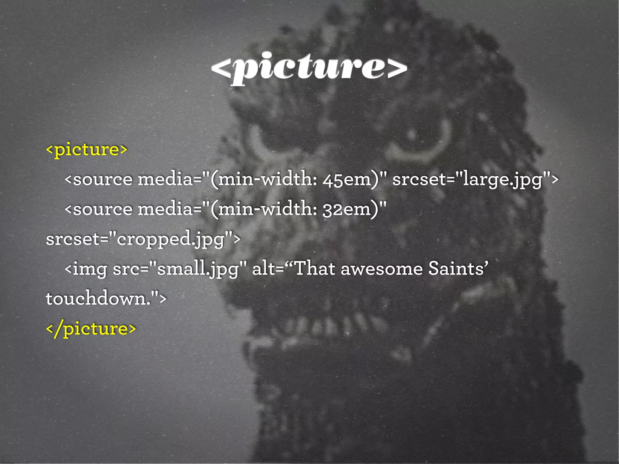
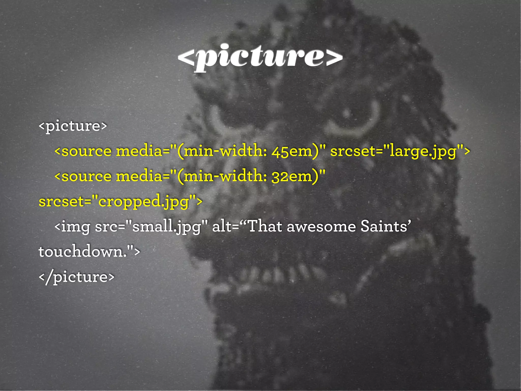
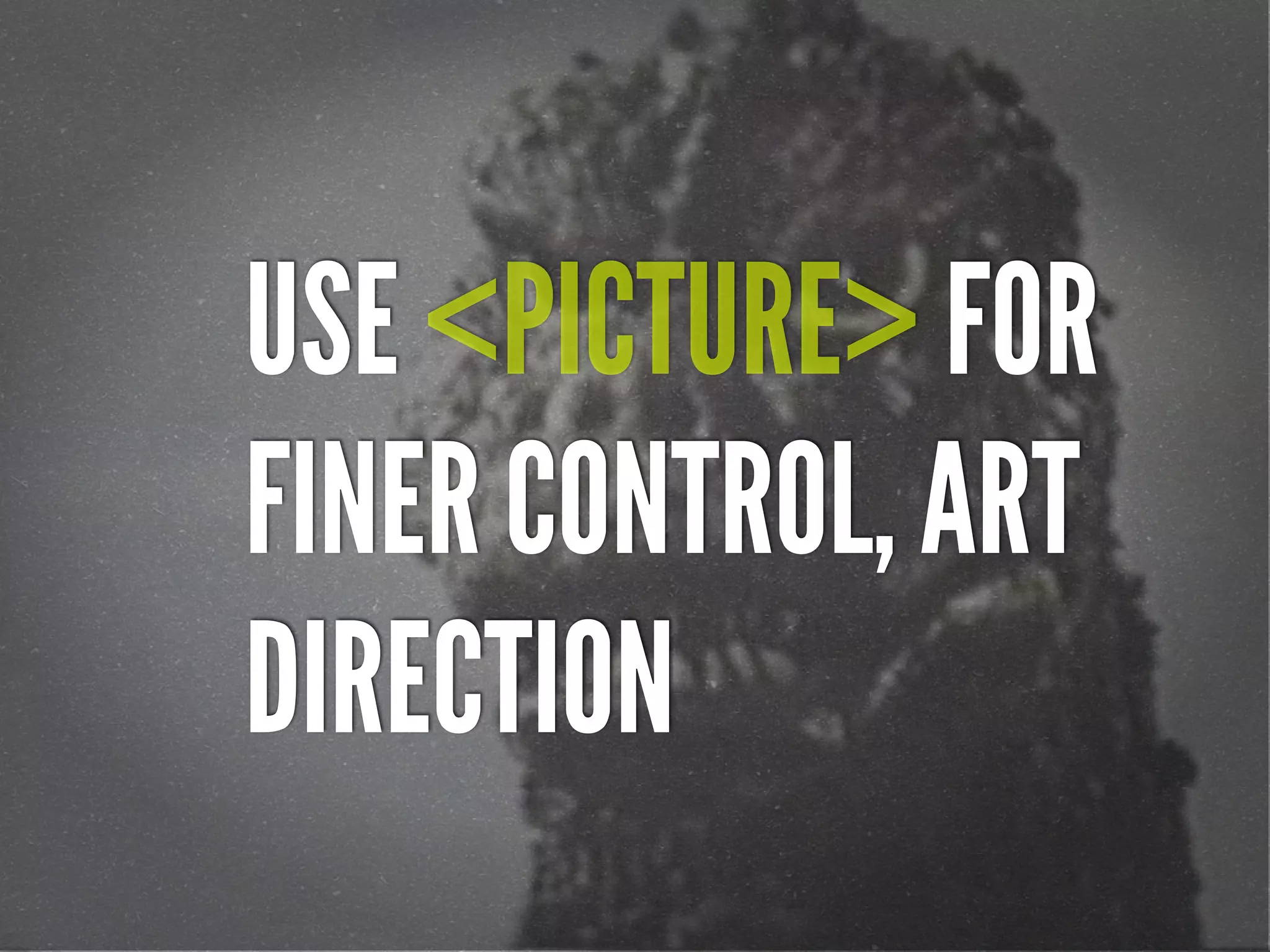
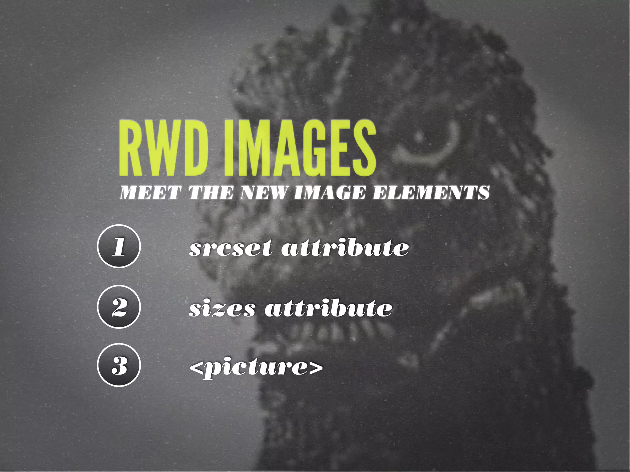
The document discusses the implementation of adaptive images in responsive web design, focusing on techniques such as feature testing versus browser sniffing, and the use of CSS media queries and new HTML elements like <picture> and <img srcset>. It highlights the importance of optimizing images based on browser width, screen resolution, and bandwidth. Additionally, it addresses potential challenges such as double taxation and the impact of modern practices on user experience.
![[cssdevconf] Adaptive Images in Responsive Web Design](https://cdn.slidesharecdn.com/ss_thumbnails/adaptive-imagesv16-131021133151-phpapp01-thumbnail.jpg?width=640&height=640&fit=bounds)
![[rwdsummit] Adaptive Images in Responsive Web Design](https://cdn.slidesharecdn.com/ss_thumbnails/adaptive-imagesv18-1-140325201134-phpapp02-thumbnail.jpg?width=640&height=640&fit=bounds)
![[peachpit] Adaptive Images in Responsive Web Design](https://cdn.slidesharecdn.com/ss_thumbnails/peachpit-schmitt-adaptive-images-v2-130925150604-phpapp01-thumbnail.jpg?width=640&height=640&fit=bounds)
![[refreshpitt] Adaptive Images in Responsive Web Design](https://cdn.slidesharecdn.com/ss_thumbnails/adaptive-imagesv10-130609110047-phpapp01-thumbnail.jpg?width=640&height=640&fit=bounds)
![[wcatx] Adaptive Images in Responsive Web Design](https://cdn.slidesharecdn.com/ss_thumbnails/wcatx-adaptive-images-130518143751-phpapp01-thumbnail.jpg?width=640&height=640&fit=bounds)
![[parisweb] Adaptive Images in Responsive Web Design](https://cdn.slidesharecdn.com/ss_thumbnails/adaptive-imagesv15v2-131014003217-phpapp01-thumbnail.jpg?width=640&height=640&fit=bounds)
![[Austin WordPress Meetup] Adaptive Images in Responsive Web Design](https://cdn.slidesharecdn.com/ss_thumbnails/adaptiveimages-wpaustinmeetup-150204100924-conversion-gate01-thumbnail.jpg?width=640&height=640&fit=bounds)
![[CSSDevConf] Adaptive Images in Responsive Web Design 2014](https://cdn.slidesharecdn.com/ss_thumbnails/adaptive-images-cssdevconf-141013185313-conversion-gate02-thumbnail.jpg?width=640&height=640&fit=bounds)
![[HEWEBAR 2012] Adaptive Images in Responsive Web Design](https://cdn.slidesharecdn.com/ss_thumbnails/hewebar-2012-adaptive-images-in-rwd-120729151800-phpapp02-thumbnail.jpg?width=640&height=640&fit=bounds)


![[convergese] Adaptive Images in Responsive Web Design](https://cdn.slidesharecdn.com/ss_thumbnails/2012-adaptive-images-convergese-120509135732-phpapp01-thumbnail.jpg?width=640&height=640&fit=bounds)
![[wvbcn] Adaptive Images in Responsive Web Design](https://cdn.slidesharecdn.com/ss_thumbnails/adaptive-imagesv13v2-130629093334-phpapp01-thumbnail.jpg?width=640&height=640&fit=bounds)
![[refreshaustin] Adaptive Images in Responsive Web Design](https://cdn.slidesharecdn.com/ss_thumbnails/adaptive-imagesv7-130410122323-phpapp02-thumbnail.jpg?width=640&height=640&fit=bounds)
![[HEWEBFL] Adaptive Images in Responsive Web Design](https://cdn.slidesharecdn.com/ss_thumbnails/hewebfl-adaptive-images2-130423085801-phpapp02-thumbnail.jpg?width=640&height=640&fit=bounds)
![[cssdevconf] Adaptive Images in RWD](https://cdn.slidesharecdn.com/ss_thumbnails/adaptive-imagesv6-121210084537-phpapp02-thumbnail.jpg?width=640&height=640&fit=bounds)
![[rwdsummit2012] Adaptive Images in Responsive Web Design](https://cdn.slidesharecdn.com/ss_thumbnails/schmitt-adaptive-imagesv2-120829225201-phpapp02-thumbnail.jpg?width=640&height=640&fit=bounds)


![[psuweb] Adaptive Images in Responsive Web Design](https://cdn.slidesharecdn.com/ss_thumbnails/adaptive-images-psuwebv2-130606095220-phpapp01-thumbnail.jpg?width=640&height=640&fit=bounds)
![[drupalcampatx] Adaptive Images in Responsive Web Design](https://cdn.slidesharecdn.com/ss_thumbnails/adaptive-imagesv12v2-130623122711-phpapp01-thumbnail.jpg?width=640&height=640&fit=bounds)
![[html5tx] Adaptive Images in Responsive Web Design](https://cdn.slidesharecdn.com/ss_thumbnails/adaptive-images-html5tx-130202100125-phpapp01-thumbnail.jpg?width=640&height=640&fit=bounds)
![[jqconatx] Adaptive Images for Responsive Web Design](https://cdn.slidesharecdn.com/ss_thumbnails/adaptive-imagesv14-130911193737-phpapp01-thumbnail.jpg?width=640&height=640&fit=bounds)


![[O'Reilly] HTML5 Design](https://cdn.slidesharecdn.com/ss_thumbnails/html5-workshop-111215160913-phpapp01-thumbnail.jpg?width=640&height=640&fit=bounds)
![[edUi] HTML5 Workshop](https://cdn.slidesharecdn.com/ss_thumbnails/html5-workshop-2-111014103112-phpapp02-thumbnail.jpg?width=640&height=640&fit=bounds)
![[heweb11] HTML5 Makeover](https://cdn.slidesharecdn.com/ss_thumbnails/html5-makeover-111027112644-phpapp01-thumbnail.jpg?width=640&height=640&fit=bounds)
![[HEWEBAR 2012] Beyond Desktop Browsing (HTML5)](https://cdn.slidesharecdn.com/ss_thumbnails/hewebar-2012-beyond-desktop-browsing-120729151254-phpapp01-thumbnail.jpg?width=640&height=640&fit=bounds)
![[amigos] HTML5 and CSS3](https://cdn.slidesharecdn.com/ss_thumbnails/html5-and-css3v6-130208132048-phpapp01-thumbnail.jpg?width=640&height=640&fit=bounds)
![[heweb11] CSS3 Makeover](https://cdn.slidesharecdn.com/ss_thumbnails/css3-makeover-111027113114-phpapp01-thumbnail.jpg?width=640&height=640&fit=bounds)
![[sxsw2013] Extremely Compressed JPEGs](https://cdn.slidesharecdn.com/ss_thumbnails/adaptive-imagesfordwmgv7-130312172016-phpapp01-thumbnail.jpg?width=640&height=640&fit=bounds)
![[convergefl] Adaptive Images in Responsive Web Design](https://cdn.slidesharecdn.com/ss_thumbnails/christopher-schmitt-adaptive-images-121014200507-phpapp02-thumbnail.jpg?width=640&height=640&fit=bounds)

![[artifactconf] Github for People Who Don't Code](https://cdn.slidesharecdn.com/ss_thumbnails/github-for-people-that-dont-code-131115221827-phpapp02-thumbnail.jpg?width=640&height=640&fit=bounds)


![[BROCHURE] Italy Tour Project | @SlideON](https://cdn.slidesharecdn.com/ss_thumbnails/brochure8-251215152319-2805af68-thumbnail.jpg?width=640&height=640&fit=bounds)


