Download as PDF, PPTX


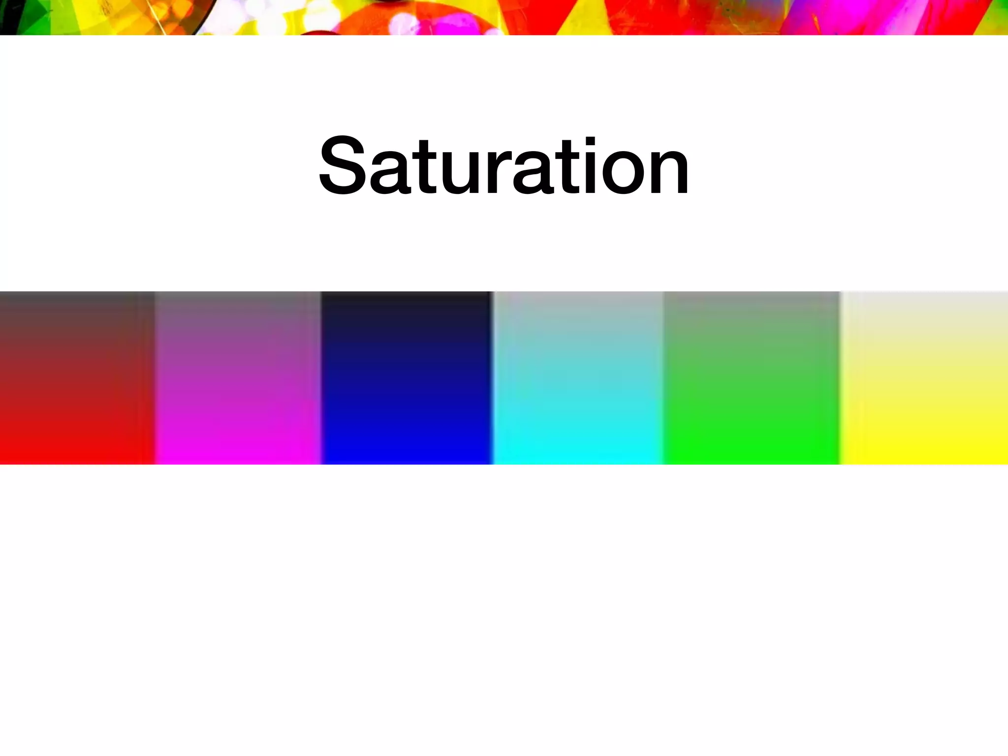

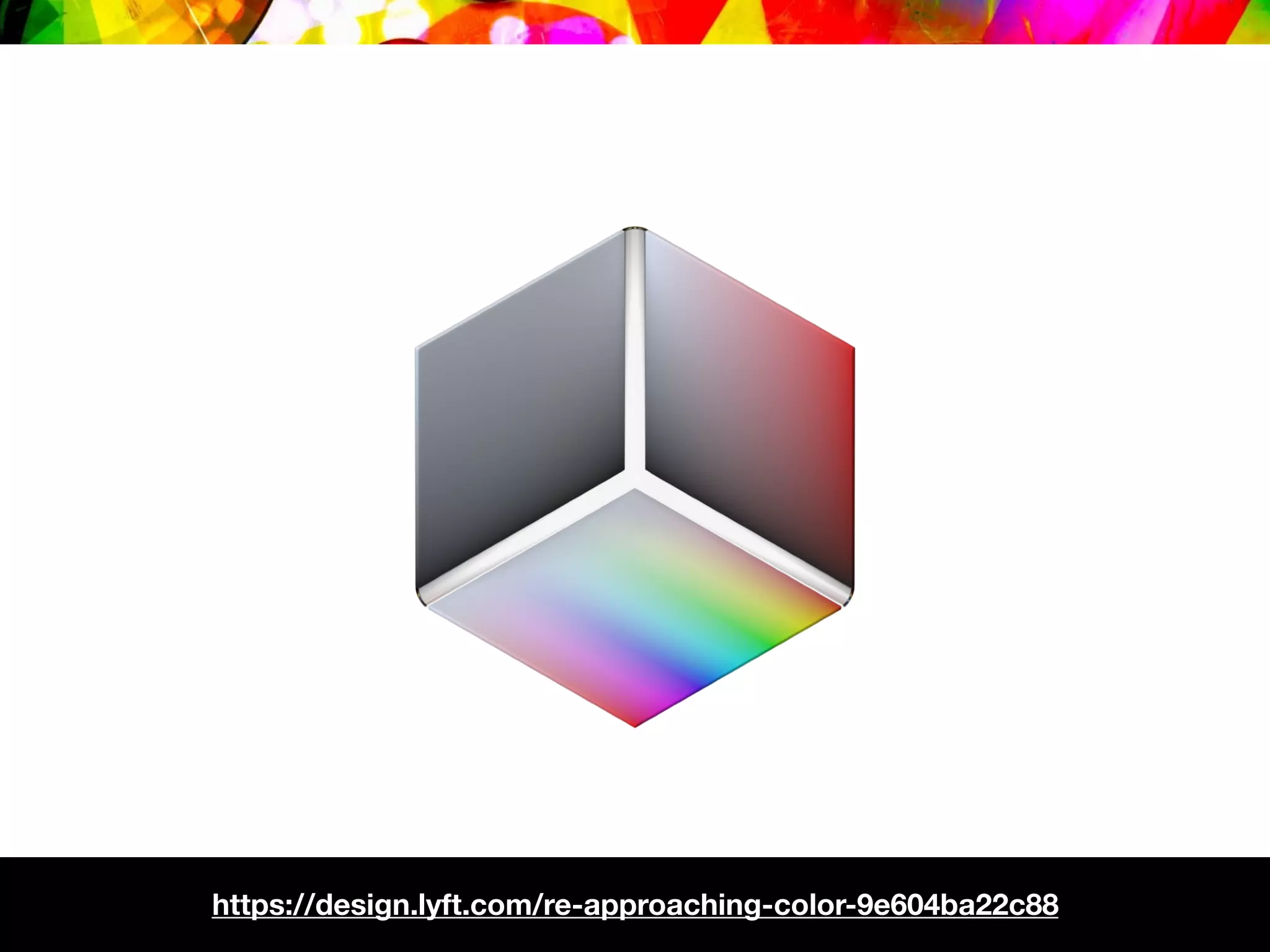

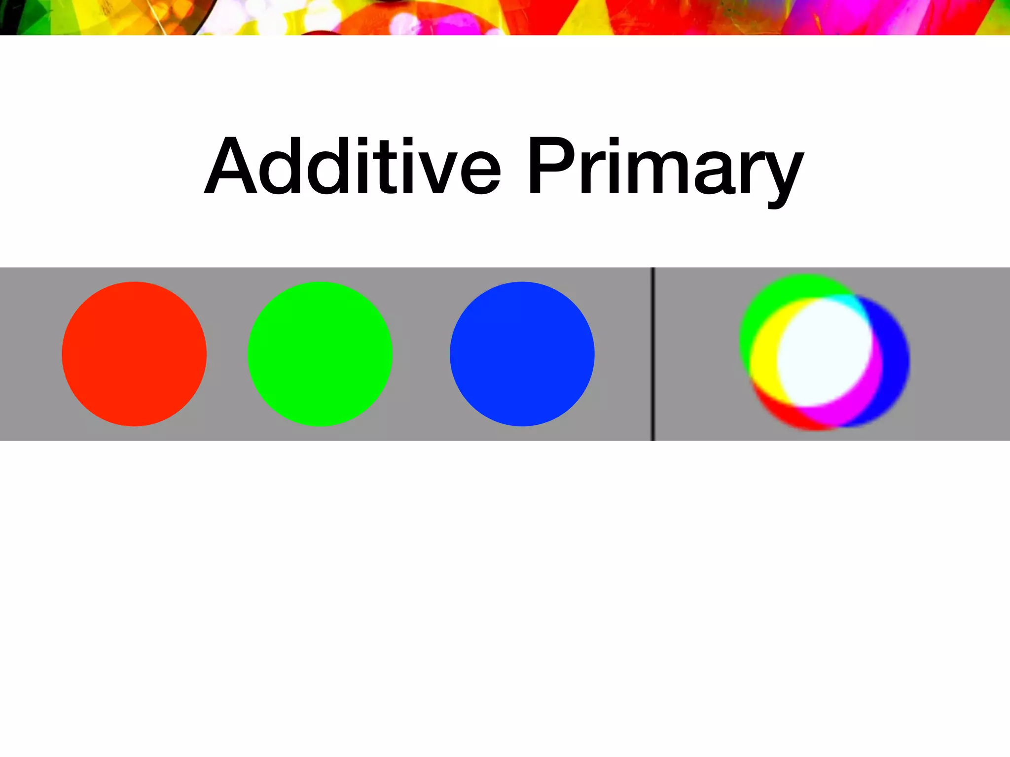


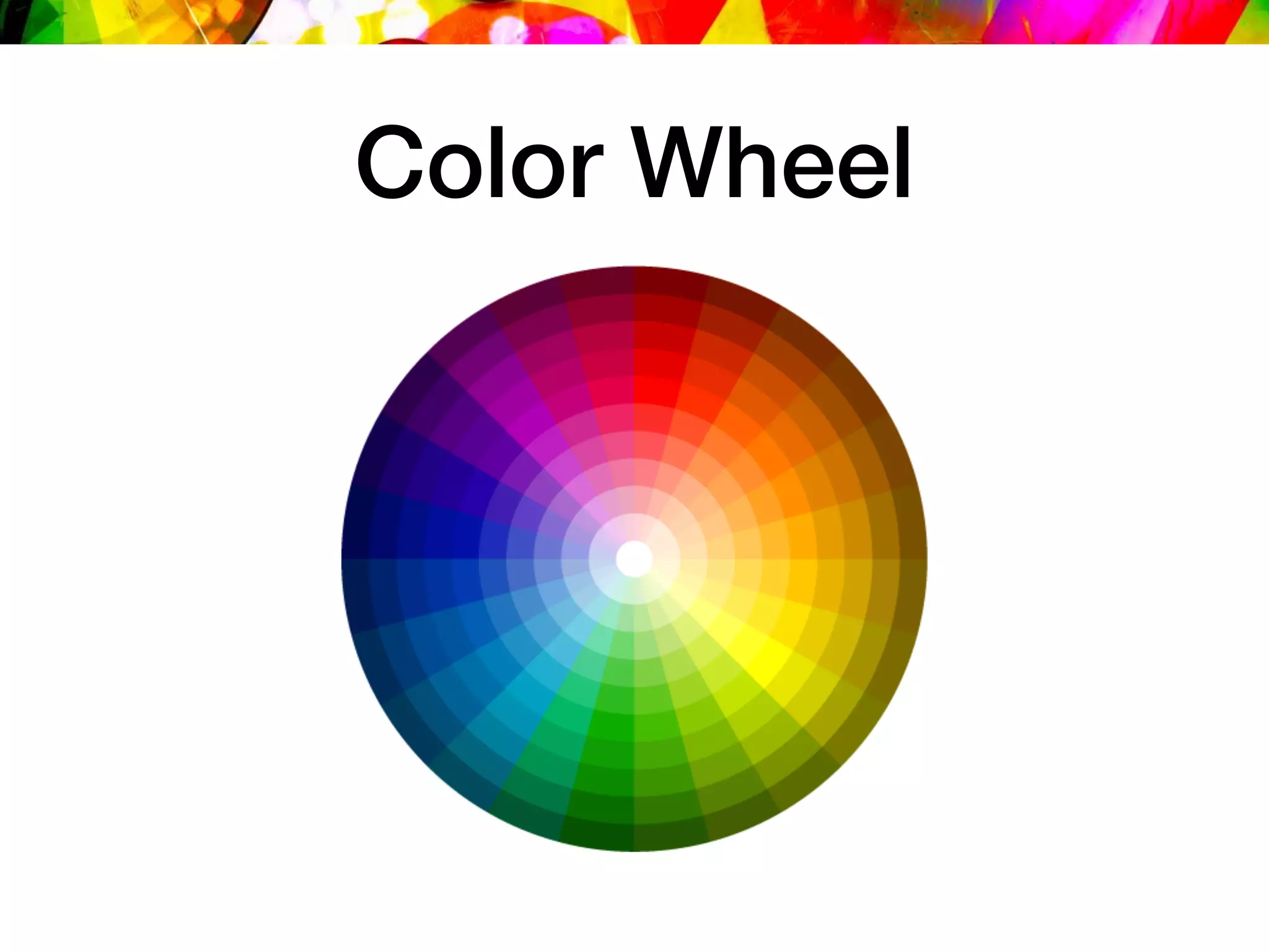

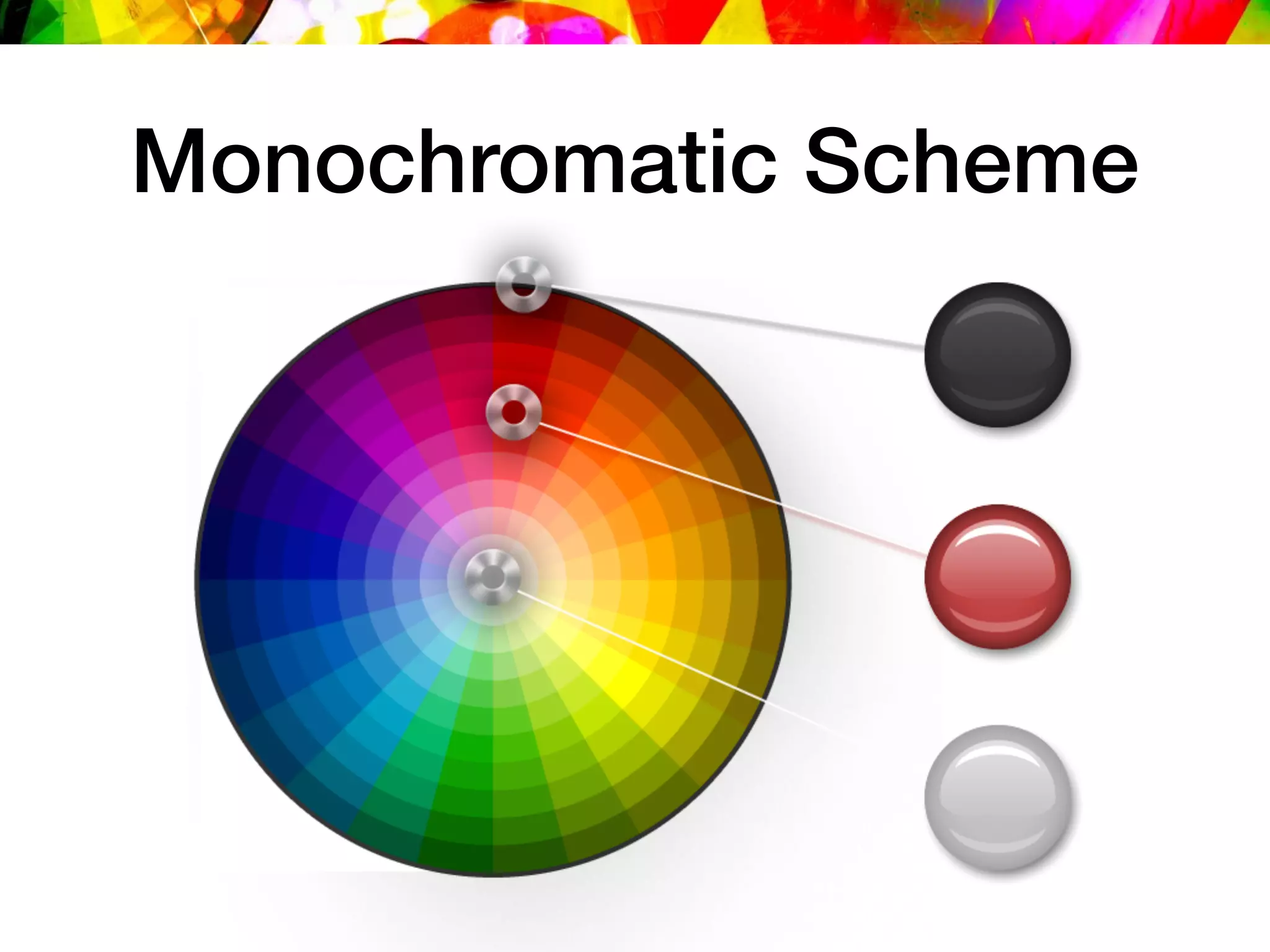


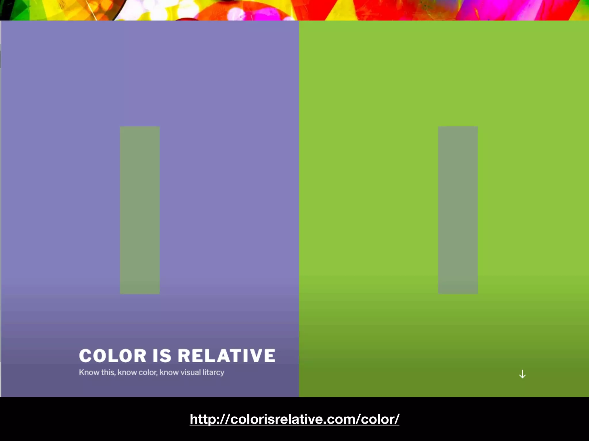


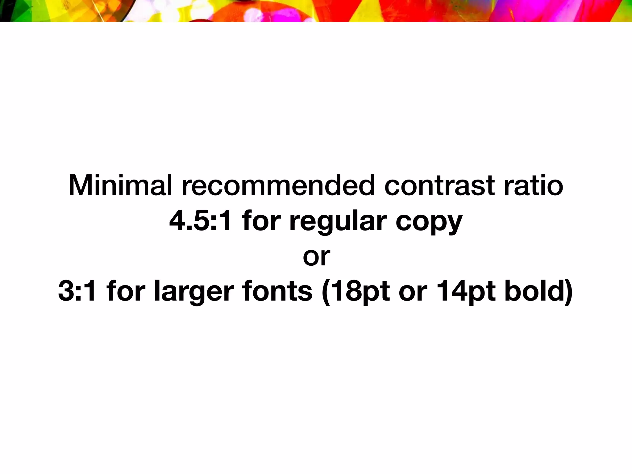


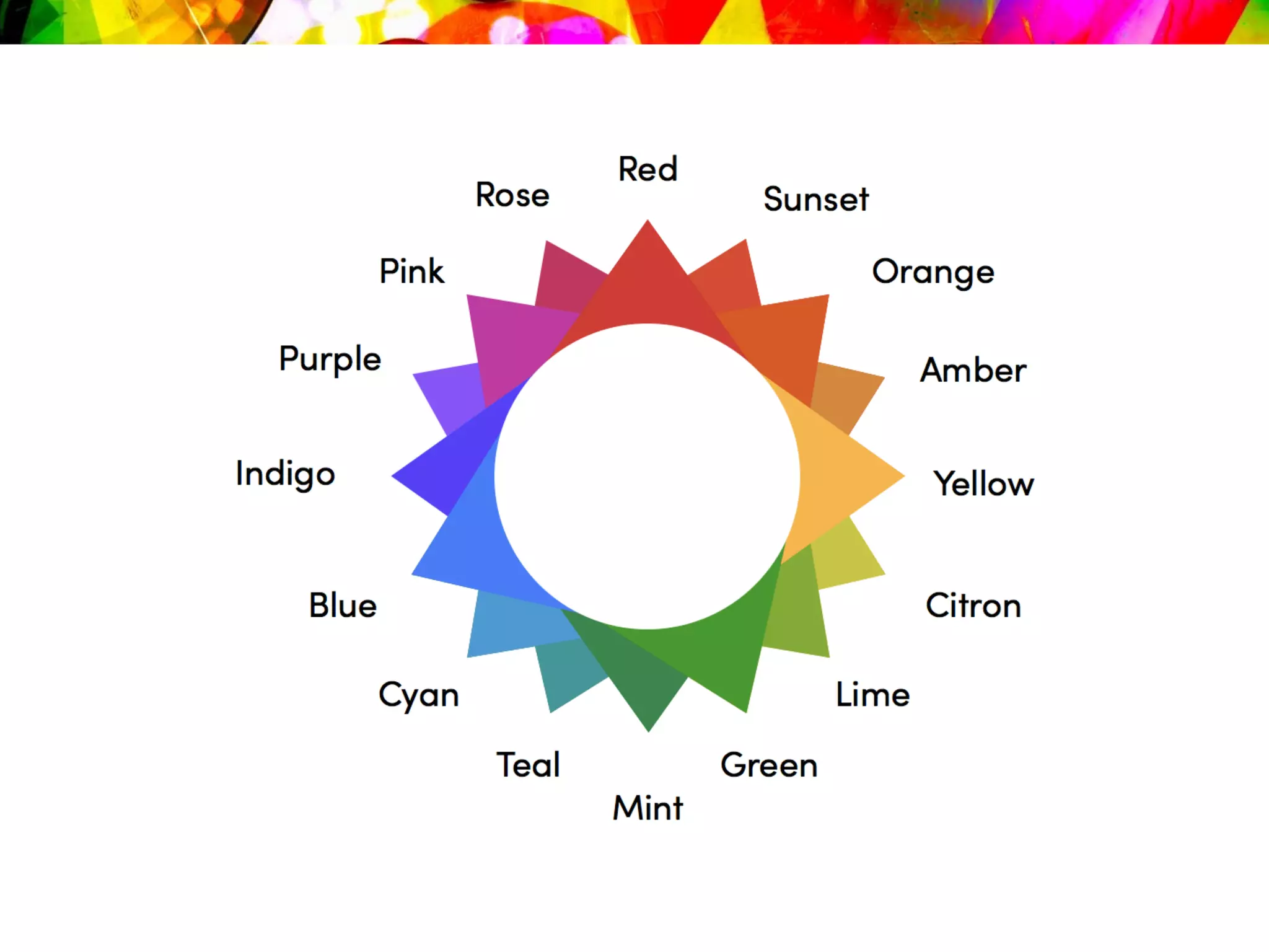


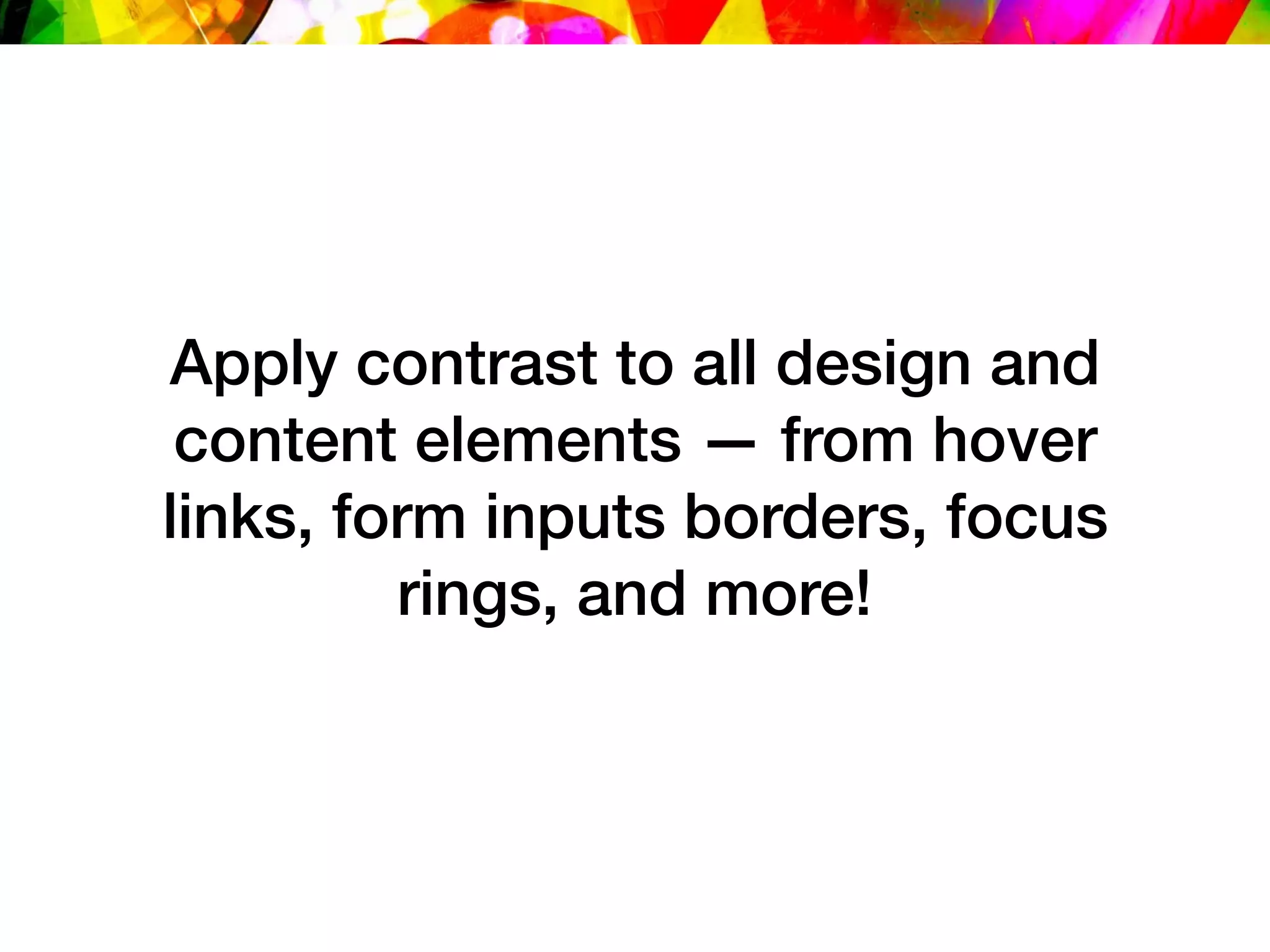
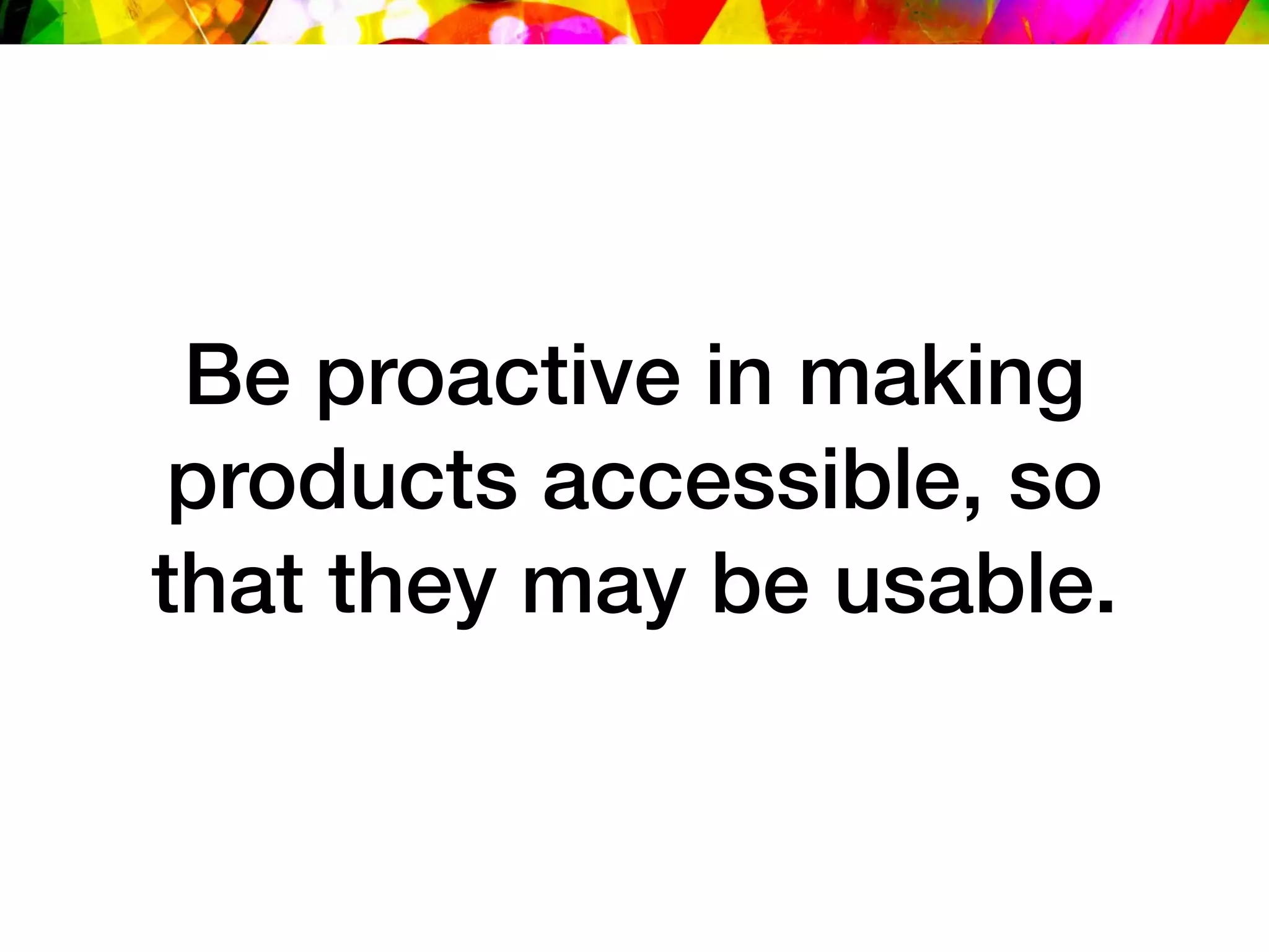


This document discusses best practices for using color in web design to ensure accessibility and avoid accessibility issues related to color contrast. It provides an overview of color theory terms, different color schemes, and examples of how top companies use color on their websites. It also reviews guidelines for sufficient color contrast from the WCAG and tools for checking color contrast. The key recommendations are to use color thoughtfully following principles of contrast and accessibility, apply sufficient contrast ratios to all elements, and proactively test color accessibility.


![[artifactconf] Github for People Who Don't Code](https://cdn.slidesharecdn.com/ss_thumbnails/github-for-people-that-dont-code-131115221827-phpapp02-thumbnail.jpg?width=640&height=640&fit=bounds)
![[Austin WordPress Meetup] Adaptive Images in Responsive Web Design](https://cdn.slidesharecdn.com/ss_thumbnails/adaptiveimages-wpaustinmeetup-150204100924-conversion-gate01-thumbnail.jpg?width=640&height=640&fit=bounds)
![[CSSDevConf] Adaptive Images in Responsive Web Design 2014](https://cdn.slidesharecdn.com/ss_thumbnails/adaptive-images-cssdevconf-141013185313-conversion-gate02-thumbnail.jpg?width=640&height=640&fit=bounds)

![[parisweb] Adaptive Images in Responsive Web Design](https://cdn.slidesharecdn.com/ss_thumbnails/adaptive-imagesv15v2-131014003217-phpapp01-thumbnail.jpg?width=640&height=640&fit=bounds)
![[peachpit] Adaptive Images in Responsive Web Design](https://cdn.slidesharecdn.com/ss_thumbnails/peachpit-schmitt-adaptive-images-v2-130925150604-phpapp01-thumbnail.jpg?width=640&height=640&fit=bounds)
![[refreshaustin] Adaptive Images in Responsive Web Design](https://cdn.slidesharecdn.com/ss_thumbnails/adaptive-imagesv7-130410122323-phpapp02-thumbnail.jpg?width=640&height=640&fit=bounds)
![[cssdevconf] Adaptive Images in Responsive Web Design](https://cdn.slidesharecdn.com/ss_thumbnails/adaptive-imagesv16-131021133151-phpapp01-thumbnail.jpg?width=640&height=640&fit=bounds)
![[amigos] HTML5 and CSS3](https://cdn.slidesharecdn.com/ss_thumbnails/html5-and-css3v6-130208132048-phpapp01-thumbnail.jpg?width=640&height=640&fit=bounds)
![[refreshpitt] Adaptive Images in Responsive Web Design](https://cdn.slidesharecdn.com/ss_thumbnails/adaptive-imagesv10-130609110047-phpapp01-thumbnail.jpg?width=640&height=640&fit=bounds)
![[rwdsummit] Adaptive Images in Responsive Web Design](https://cdn.slidesharecdn.com/ss_thumbnails/adaptive-imagesv18-1-140325201134-phpapp02-thumbnail.jpg?width=640&height=640&fit=bounds)
![[html5tx] Adaptive Images in Responsive Web Design](https://cdn.slidesharecdn.com/ss_thumbnails/adaptive-images-html5tx-130202100125-phpapp01-thumbnail.jpg?width=640&height=640&fit=bounds)
![[wcatx] Adaptive Images in Responsive Web Design](https://cdn.slidesharecdn.com/ss_thumbnails/wcatx-adaptive-images-130518143751-phpapp01-thumbnail.jpg?width=640&height=640&fit=bounds)
![[drupalcampatx] Adaptive Images in Responsive Web Design](https://cdn.slidesharecdn.com/ss_thumbnails/adaptive-imagesv12v2-130623122711-phpapp01-thumbnail.jpg?width=640&height=640&fit=bounds)
![[psuweb] Adaptive Images in Responsive Web Design](https://cdn.slidesharecdn.com/ss_thumbnails/adaptive-images-psuwebv2-130606095220-phpapp01-thumbnail.jpg?width=640&height=640&fit=bounds)
![[wvbcn] Adaptive Images in Responsive Web Design](https://cdn.slidesharecdn.com/ss_thumbnails/adaptive-imagesv13v2-130629093334-phpapp01-thumbnail.jpg?width=640&height=640&fit=bounds)
![[HEWEBFL] Adaptive Images in Responsive Web Design](https://cdn.slidesharecdn.com/ss_thumbnails/hewebfl-adaptive-images2-130423085801-phpapp02-thumbnail.jpg?width=640&height=640&fit=bounds)
![[funka] Adaptive Images in Responsive Web Design](https://cdn.slidesharecdn.com/ss_thumbnails/adaptive-images-funkav5-150415072902-conversion-gate01-thumbnail.jpg?width=640&height=640&fit=bounds)
![[sxsw2013] Extremely Compressed JPEGs](https://cdn.slidesharecdn.com/ss_thumbnails/adaptive-imagesfordwmgv7-130312172016-phpapp01-thumbnail.jpg?width=640&height=640&fit=bounds)
![[jqconatx] Adaptive Images for Responsive Web Design](https://cdn.slidesharecdn.com/ss_thumbnails/adaptive-imagesv14-130911193737-phpapp01-thumbnail.jpg?width=640&height=640&fit=bounds)


![Wondershare Filmora 15.0.11 Crack for Mac Key Full Download [Latest] pptx](https://cdn.slidesharecdn.com/ss_thumbnails/software-251207184836-1d16ba16-thumbnail.jpg?width=640&height=640&fit=bounds)


![iStat Menus 7.20 Crack for MacOS 2026 Full Version [Latest] pptx](https://cdn.slidesharecdn.com/ss_thumbnails/softwareoverview-251207191544-22b737dc-thumbnail.jpg?width=640&height=640&fit=bounds)


![Chapter4_Initiation_of_Sediment_Motion_v2[1].pptx](https://cdn.slidesharecdn.com/ss_thumbnails/chapter4initiationofsedimentmotionv21-251208223747-f94ef163-thumbnail.jpg?width=640&height=640&fit=bounds)


