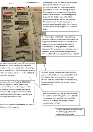
1. The heading‘INSIDE’anchorsthe contentspages
howeverthisisnotthe classical wayof
portrayingthe page,itis more modernwhich
couldshow how rock is developing.The black
fontdraws attentiontowardsthe title andthis
showsthat the audience shouldbe engagedby
thisas it isdirectaddressto lookinside the
magazine thatiswhy itmay not use contents.
Thisallowedme todevelopmymagazine
contentspage of usingideasbytryingto make it
more modernbutanchoringthat it isa ‘contents
page’.
The main image iscentral onthe page,allowing
everythingtofall intoplace aroundbutthisgive the
image more attentionasitcouldbe important,the
image usesbrightcoloursallowingittobe the
dominantimage onthe page and the readeris
attractedto. The image leavesamysteriousmindof
the reader,leadingthe readerwantingtofindout
more about the article,e.g.questioning‘whoisthis?’
ogo isalwaysonthe righthandside on mostmusic
azinesasthisallowsthe magazine tobe more
gnisable tothe reader,lettingthemacknowledge
music magazine itisif the contentspage was left
e therefore mylogowillalsobe onthe righthand
nexttomy‘content’.
The colour scheme isverysimple byonlyusingred,
blackand white andthisisverysimple andcontrast
fromthe fonttherefore thisattractsthe reader.
DifferentfontsizestoothereforeIwill alsobe using
three simple colours,whichalsoconnotesrockas
these coloursdo.
gazine usesthree sub-headings‘REGUALRS’,
RES’and ‘BANDLIST’ whichare verybold
edto everythingelse onthe magazine asthis
he magazine more intriguingandallowsthe
o knowwhatthe magazine will holdinside it
capital lettersfollowsthe genre rockallowing
rikingfromthe restof the page.
Each headline usesblackandwhite asthisallows
the readerto lookfor thingsa loteasier,ittellsthe
readerexactlywhere tolookandwhatwill be
revealedonthatpage.Usinglarge,boldtext
indicateswhere tolook.
ndex isusedtoshowdifferentbandsandartistto
hofeaturesinthe magazine.
Columnsare usedinmostmagazines
for contentpages,helpsthe
magazine tobe sectioned.