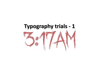
2. Pro’s
• We liked this font because it looks as though the
letters have been scratched in, which is typical of
the supernatural genre when looking at
typography, it also connotes danger as a claw
isn’t typically seen on a human being, which
suggests something which is supernatural or
unknown.
• We also decided to make the font red, as this is a
colour commonly associated with danger, which
is a basic convention of a supernatural horror
film.
3. Con’s
• However, we feel that this type of writing
looks like a child’s drawing, where crayon has
been used to create the letters, therefore the
supernatural horror theme may not come
across to the audience as strong as we would
like.