
Recommended
More Related Content
What's hot
What's hot (20)
Viewers also liked
Viewers also liked (15)
Recently uploaded
Recently uploaded (20)
1
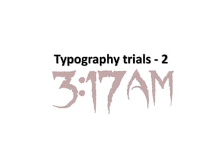
- 1. Typography trials - 2
- 2. Pros • I liked this typography because the letters looked slightly like weapons – i.e daggers. This isn’t a typical weapon used in supernatural horrors, however they still connote danger which is something we wanted to come across in our opening.
- 3. Cons • However, I didn’t like this font for numerous reasons. Firstly, I didn’t like the thickness of the lettering, as it was very large and didn’t look visually attractive to the audience. • Secondly, when we put the typography on the film the lettering came out a paler red than we wanted, which means we couldn’t connote danger as strongly, therefore the typography wouldn’t fit in with the genre. • Finally, the typography got the least votes on our survey which we created, with only one out of 14. With this little amount of votes it is clear that the style of lettering isn’t very popular.