HMCS Max Bernays Pre-Deployment Brief (May 2024).pptx
19) typography
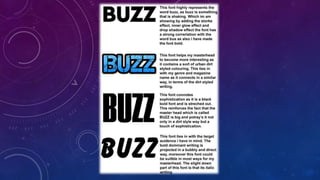
1.
2. After weeks of searching for a sophisticated and dominant font that would meet my criteria. I finally
managed to find an excellent font which looks amazing from every single corner. Firstly it has a huge
correlation with the actual music magazines name ‘’BUZZ’’ which consists of a varnished chrome
coloured design along with a shiver and glow if blue around each font. This represents a BUZZ being in
action. Furthermore the font style consists of bold dominant font which increases the masculinity of
the music magazines name and font, additionally the bulkiness and chunk of the font represents a
strong strength and power which correlates to my target audience which consists of young target
audience.