Download as PDF, PPTX


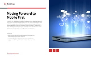

The document outlines the importance of a modern mobile-first strategy, highlighting how mobile applications have become crucial for customer engagement and services. It emphasizes the benefits of designing websites with mobile users in mind first, including improved user experience, effective customer segmentation, and increased revenue through mobile payments. Companies not adapting to this shift may risk losing their competitive edge as consumer behavior continues to prioritize mobile interactions.


