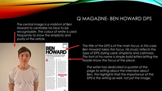
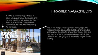
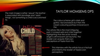
YEAR 12 MEDIA- DPS 
ANALYSIS 
Felan Quirke
Q MAGAZINE- BEN HOWARD DPS 
The title of the DPS is of the main focus, in this case 
Ben Howard takes the focus. His music reflects the 
type of DPS styling used; simplicity and calmness. 
The font of his name is simple bold letters letting the 
reader know the focus of the piece. 
The writer has dedicated a quarter of the 
page to writing about the interview about 
Ben, this highlights that the importance of the 
DPS is the writing as well, not just the image. 
The central image is a midshot of Ben 
Howard to centralise his face to be 
recognisable. The colour of white is used 
frequently to show the simplicity and 
purity of the article.
Q MAGAZINE- LADY GAGA DPS 
This tiny title is the name of the article focus ‘ 
lady gaga’ is written in small italic font. This 
shows off the focuses personality of not wanting 
much recognition, just an article about her in 
writing. 
However this massive ‘L’ is the tribute to her 
absurdness and melodramatic approach, this 
gives the audience a chance to see her nature. 
Half a page of writing is dedicated to Lady 
Gaga here, this intrigues the reader into 
finding out about their idol in depth and 
personal. 
This half of the page is a midshot 
of Gaga in her wackiness. A 
photo of her half naked shows 
her personality as a confident 
and charismatic focus.
Q MAGAZINE- FOO FIGHTERS DPS 
This huge, half page font dominates the page. It 
stands out and captivates the readers interest. 
Asking the rhetorical question in the title 
encourages the reader to read further. 
This small text is miniscule to the page but vital 
information. It describes the band by an 
oxymoron ‘crooked vultures’, vultures are 
known as agile creatures but the band reflects 
their rocky charisma. 
Foo Fighters are known as dramatic 
characters and this image supports that, the 
parody image is dramatic and humorous. 
The photo is close up and allows the reader 
to see the band like never before.
Q MAGAZINE- JAY Z DPS 
The main image is a head shot of Jay z, you see his 
‘slickness’ emanating from the page, he shows no 
expression, the image takes up half the page so jay 
z’s dramatic nature is shown in this focused image. 
A quote from jay z himself intrigues the 
reader to find out what the rapper 
himself thinks. It adds a sense of 
personality to the article. 
This half of the page is dedicated to 
an interview with the focus, the only 
name (letter) given of the focus point 
is a huge ‘J’ letting the reader know of 
his reluctance to be publicised as a 
‘softie’.
THRASHER MAGAZINE DPS 
The main image takes up the whole page, this 
magazine is dedicated to skateboarding and no 
shortage of the sport is given. The reader can see 
the image in full quality and in huge detail. The 
photo is encouraging and influential to get others 
skating. 
The title is another huge focus, it 
takes up a quarter of the page and 
the text itself is a spin off of the film 
‘Back to the Future’, this humour 
captivates the reader into reading 
the full issue.
THRASHER MAGAZINE- SUBHUMANS DPS 
Another full page image here shows a group 
of friends who are a skate group known as 
‘subhumans’, the entire page is dedicated 
to them, there are people skating, playing 
guitar and filming. This mixture shows off the 
groups exotic nature to go with their name. 
The title is the groups name, and the 
various colours highlight ‘fun’. 
The whole piece is very enthusiastic and 
over the top, it encourages the reader to 
want to join in.
PETE DOHERTY DPS 
This long awaited profile article is interesting in 
itself as Pete Doherty has been MIA in the 
media for years. This half page of writing is 
nectar to fans and the mass of writing looks 
hopeful. 
This image shows Pete in his golden 
days in the music world, this gives the 
reader a glimpse of the past star and 
highlight a sense of nostalgia. 
The main image is a mid shot of Pete 
and as he is holding two beverages it 
shows his struggle with his impulses and 
the reader can relate and sympathise 
with the article. Also the title ‘in good 
health’ mocks this concept by almost 
goading Pete into quitting the 
binging,.
TAYLOR MOMSEMS DPS 
The colour scheme girl is dark and 
gothic; red and black but then the 
cream colouring portrays innocence in 
the. 
The article title is the most intriguing 
part, it crossed wild and child together 
highlighting that the actor turned 
singer is still innocent yet raunchy. The 
reader can acquire their own 
perceptions of Taylor from this. 
This interview with the article focus is factual 
and informs the reader of Taylors own 
perceptions. 
The main image is rather ‘sexual’ the leather 
is associated with bondage and ‘adult 
things’, not something a child is accustomed 
to.

Year 12 Media DPS Analysis

  • 1.
    YEAR 12 MEDIA-DPS ANALYSIS Felan Quirke
  • 2.
    Q MAGAZINE- BENHOWARD DPS The title of the DPS is of the main focus, in this case Ben Howard takes the focus. His music reflects the type of DPS styling used; simplicity and calmness. The font of his name is simple bold letters letting the reader know the focus of the piece. The writer has dedicated a quarter of the page to writing about the interview about Ben, this highlights that the importance of the DPS is the writing as well, not just the image. The central image is a midshot of Ben Howard to centralise his face to be recognisable. The colour of white is used frequently to show the simplicity and purity of the article.
  • 3.
    Q MAGAZINE- LADYGAGA DPS This tiny title is the name of the article focus ‘ lady gaga’ is written in small italic font. This shows off the focuses personality of not wanting much recognition, just an article about her in writing. However this massive ‘L’ is the tribute to her absurdness and melodramatic approach, this gives the audience a chance to see her nature. Half a page of writing is dedicated to Lady Gaga here, this intrigues the reader into finding out about their idol in depth and personal. This half of the page is a midshot of Gaga in her wackiness. A photo of her half naked shows her personality as a confident and charismatic focus.
  • 4.
    Q MAGAZINE- FOOFIGHTERS DPS This huge, half page font dominates the page. It stands out and captivates the readers interest. Asking the rhetorical question in the title encourages the reader to read further. This small text is miniscule to the page but vital information. It describes the band by an oxymoron ‘crooked vultures’, vultures are known as agile creatures but the band reflects their rocky charisma. Foo Fighters are known as dramatic characters and this image supports that, the parody image is dramatic and humorous. The photo is close up and allows the reader to see the band like never before.
  • 5.
    Q MAGAZINE- JAYZ DPS The main image is a head shot of Jay z, you see his ‘slickness’ emanating from the page, he shows no expression, the image takes up half the page so jay z’s dramatic nature is shown in this focused image. A quote from jay z himself intrigues the reader to find out what the rapper himself thinks. It adds a sense of personality to the article. This half of the page is dedicated to an interview with the focus, the only name (letter) given of the focus point is a huge ‘J’ letting the reader know of his reluctance to be publicised as a ‘softie’.
  • 6.
    THRASHER MAGAZINE DPS The main image takes up the whole page, this magazine is dedicated to skateboarding and no shortage of the sport is given. The reader can see the image in full quality and in huge detail. The photo is encouraging and influential to get others skating. The title is another huge focus, it takes up a quarter of the page and the text itself is a spin off of the film ‘Back to the Future’, this humour captivates the reader into reading the full issue.
  • 7.
    THRASHER MAGAZINE- SUBHUMANSDPS Another full page image here shows a group of friends who are a skate group known as ‘subhumans’, the entire page is dedicated to them, there are people skating, playing guitar and filming. This mixture shows off the groups exotic nature to go with their name. The title is the groups name, and the various colours highlight ‘fun’. The whole piece is very enthusiastic and over the top, it encourages the reader to want to join in.
  • 8.
    PETE DOHERTY DPS This long awaited profile article is interesting in itself as Pete Doherty has been MIA in the media for years. This half page of writing is nectar to fans and the mass of writing looks hopeful. This image shows Pete in his golden days in the music world, this gives the reader a glimpse of the past star and highlight a sense of nostalgia. The main image is a mid shot of Pete and as he is holding two beverages it shows his struggle with his impulses and the reader can relate and sympathise with the article. Also the title ‘in good health’ mocks this concept by almost goading Pete into quitting the binging,.
  • 9.
    TAYLOR MOMSEMS DPS The colour scheme girl is dark and gothic; red and black but then the cream colouring portrays innocence in the. The article title is the most intriguing part, it crossed wild and child together highlighting that the actor turned singer is still innocent yet raunchy. The reader can acquire their own perceptions of Taylor from this. This interview with the article focus is factual and informs the reader of Taylors own perceptions. The main image is rather ‘sexual’ the leather is associated with bondage and ‘adult things’, not something a child is accustomed to.