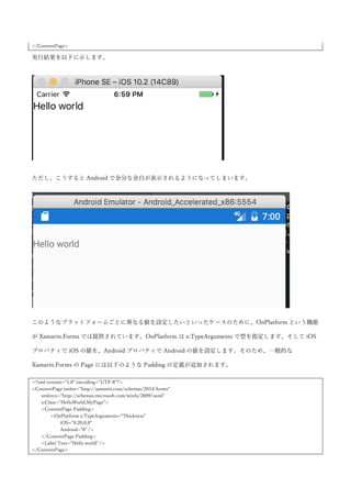
LineBreakMode プロパティで折り返し方法などが指定できます。設定できる値は、CharacterWrap,
HeadTruncation, MiddleTruncation,NoWrap, TailTruncation, WordWrap になります。Wrap とつくものが
横幅に収まりきらないときに折り返しを行う設定で、Truncation とつくものが…でトランケートする設定に
なります。XAML を以下に示します。
<?xml version="1.0" encoding="UTF-8"?>
<ContentPage xmlns="http://xamarin.com/schemas/2014/forms"
xmlns:x="http://schemas.microsoft.com/winfx/2009/xaml"
xmlns:local="clr-namespace:HelloWorld"
x:Class="HelloWorld.MyPage">
<ContentPage.Padding>
<OnPlatform x:TypeArguments="Thickness">
<On Platform="iOS">0,20,0,0</On>
</OnPlatform>
</ContentPage.Padding>
<StackLayout HorizontalOptions="Center"
VerticalOptions="Center">
<Frame WidthRequest="75">
<Label Text="This is a long long long long long long long long long text!!!!!!"
LineBreakMode="CharacterWrap" />
</Frame>
<Frame WidthRequest="75">
<Label Text="This is a long long long long long long long long long text!!!!!!"
LineBreakMode="TailTruncation" />
</Frame>
</StackLayout>
</ContentPage>
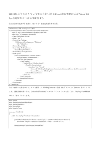
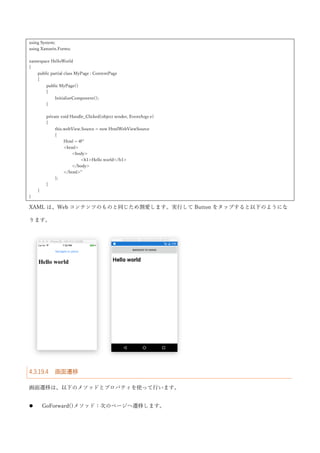
最初の Label は、文字単位での折り返しを指定しています。2 つ目の Label は、末尾でトランケートを指定し
ています。実行結果を以下に示します。
<DataTemplate>
<TextCell Text="{Binding Name}"/>
</DataTemplate>
</ListView.ItemTemplate>
</ListView>
</StackLayout>
</ContentPage>
コードビハインドで、List の List を組み立てて ItemsSource プロパティに設定しています。コードを以下に
示します。
using System;
using System.Collections.ObjectModel;
using Xamarin.Forms;
namespace HelloWorld
{
public partial class MyPage : ContentPage
{
private ObservableCollection<Family> People { get; }
public MyPage()
{
InitializeComponent();
this.People = new ObservableCollection<Family>
{
new Family("okazuki family", "o")
{
new Person { Name = "okazuki1" },
new Person { Name = "okazuki2" },
new Person { Name = "okazuki3" },
new Person { Name = "okazuki4" },
},
new Family("tanaka family", "t")
{
new Person { Name = "tanaka1" },
new Person { Name = "tanaka2" },
new Person { Name = "tanaka3" },
new Person { Name = "tanaka4" },
},
new Family("kimura family", "k")
{
new Person { Name = "kimura1" },
new Person { Name = "kimura2" },
new Person { Name = "kimura3" },
new Person { Name = "kimura4" },
},
};
this.listView.ItemsSource = this.People;
91.
}
}
public class Family: ObservableCollection<Person>
{
public string Name { get; set; }
public string ShortName { get; set; }
public Family(string name, string shortName)
{
this.Name = name;
this.ShortName = shortName;
}
}
public class Person
{
public string Name { get; set; }
}
}
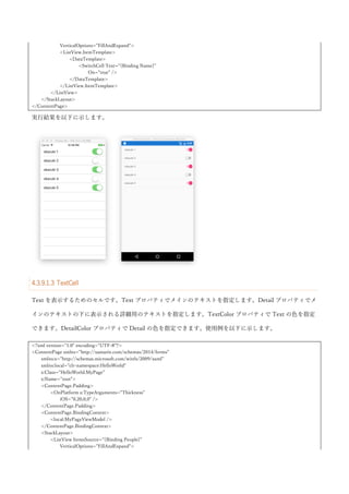
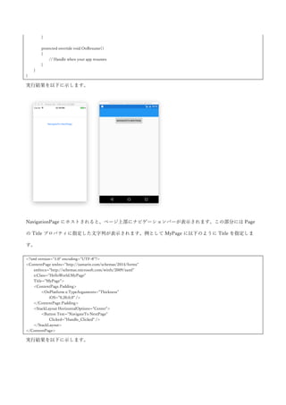
実行結果を以下に示します。
ListView には引っ張って更新(Pull To Refresh)の機能が付いています。IsPullToRefreshEnabled プロパテ
ィを true にすることで有効になります。Refreshing イベントで処理を行うか、RefreshCommand プロパティ
にバインドされた Command の Execute で更新処理を行います。更新処理の完了時には、IsRefreshing プロ
パティを false に設定するか、EndRefresh メソッドを呼び出して ListView に更新処理が終わったことを通知
します。コード例を以下に示します。
92.
<?xml version="1.0" encoding="UTF-8"?>
<ContentPagexmlns="http://xamarin.com/schemas/2014/forms"
xmlns:x="http://schemas.microsoft.com/winfx/2009/xaml"
x:Class="HelloWorld.MyPage">
<ContentPage.Padding>
<OnPlatform x:TypeArguments="Thickness">
<On Platform="iOS">0,20,0,0</On>
</OnPlatform>
</ContentPage.Padding>
<StackLayout>
<ListView x:Name="listView"
VerticalOptions="FillAndExpand"
IsPullToRefreshEnabled="true"
Refreshing="Handle_Refreshing">
<ListView.ItemTemplate>
<DataTemplate>
<TextCell Text="{Binding Name}" />
</DataTemplate>
</ListView.ItemTemplate>
</ListView>
</StackLayout>
</ContentPage>
引っ張って更新を有効にした ListView を画面においています。コードビハインドを以下に示します。
using System;
using System.Collections.ObjectModel;
using System.Linq;
using System.Threading.Tasks;
using Xamarin.Forms;
namespace HelloWorld
{
public partial class MyPage : ContentPage
{
private ObservableCollection<Person> People { get; } = new ObservableCollection<Person>(
Enumerable.Range(1, 5).Select(x => new Person { Name = $"okazuki {x}" }));
public MyPage()
{
InitializeComponent();
this.listView.ItemsSource = this.People;
}
private async void Handle_Refreshing(object sender, EventArgs e)
{
await Task.Delay(3000);
for (int i = 0; i < 5; i++)
{
this.People.Add(new Person { Name = $"okazuki {this.People.Count + 1}" });
}
93.
this.listView.IsRefreshing = false;
}
}
publicclass Person
{
public string Name { get; set; }
}
}
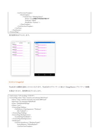
リフレッシュ処理では、3 秒待って要素を追加した後に、IsRefreshing プロパティに false を設定してリフレ
ッシュが終了したことを ListView に通知しています。実行結果を以下に示します。
更新中は、以下のようなアニメーションが表示されます。
リフレッシュが終わると要素が追加されていることが確認できます。
また、ListView のように ItemsSourceにコレクションを設定して ItemTemplate で見た目を定義する方法も
あります。コード例を以下に示します。
using Xamarin.Forms;
namespace HelloWorld
{
public partial class MyPage : TabbedPage
{
public MyPage()
{
InitializeComponent();
this.ItemsSource = new[]
{
new Item { Title = "Tab1", Color = "Red" },
new Item { Title = "Tab2", Color = "Blue" },
new Item { Title = "Tab3", Color = "Olive" },
};
}
}
public class Item
{
public string Title { get; set; }
public string Color { get; set; }
}
}
このデータを表示するための DataTemplate を XAML で指定します。
<?xml version="1.0" encoding="UTF-8"?>
<TabbedPage xmlns="http://xamarin.com/schemas/2014/forms"
ViewModel のインスタンスが DIコンテナによって作られるということは、ViewModel に対して様々なイン
スタンスをインジェクション可能だということになります。App.xaml.cs の RegisterTypes メソッドで自前で
追加したインスタンスはもちろんのこと、Prism が提供する様々な機能も DI でインジェクションして使用し
ます。このように Prism にとって DI は切っても切れない関係にあります。
Prism の DI 関連の機能として、IPlatformInitializer インターフェースがあります。これは App クラスのコン
ストラクタに実装クラスを渡すことで DI コンテナへのインスタンスの登録が行うタイミングを、
RegisterTypes 以外にも提供してくれます。使用方法としては、IPlatformInitializer インターフェースの実装
クラスを iOS, Android プロジェクトで実装して、App クラスのコンストラクタに渡すことでプラットフォー
ム固有のインスタンスを DI コンテナに登録するのに使用します。使用例を以下に示します。
まず、DependencyService と同じように PCL プロジェクトにプラットフォーム固有の処理を抽象化するイン
ターフェースを作成します。
namespace PrismEdu
{
public interface IPlatformNameProvider
{
string GetName();
}
}
そして、iOS と Android に実装クラスを作成します。
// iOS
namespace PrismEdu.iOS
{
public class PlatformNameProvider : IPlatformNameProvider
{
public string GetName() => "iOS";
}
}
// Android
namespace PrismEdu.Droid
{
public class PlatformNameProvider : IPlatformNameProvider
{
public string GetName() => "Android";
}
}
216.
DI するクラスが出来たので、IPlatformInitializer の実装クラスを作成します。iOSは、AppDelegate.cs に作
成します。
using System;
using System.Collections.Generic;
using System.Linq;
using Autofac;
using Foundation;
using Prism.Autofac.Forms;
using UIKit;
namespace PrismEdu.iOS
{
[Register("AppDelegate")]
public partial class AppDelegate : global::Xamarin.Forms.Platform.iOS.FormsApplicationDelegate
{
public override bool FinishedLaunching(UIApplication app, NSDictionary options)
{
global::Xamarin.Forms.Forms.Init();
LoadApplication(new App(new iOSPlatformInitializer()));
return base.FinishedLaunching(app, options);
}
}
public class iOSPlatformInitializer : IPlatformInitializer
{
public void RegisterTypes(IContainer container)
{
var builder = new ContainerBuilder();
builder.RegisterType<PlatformNameProvider>().As<IPlatformNameProvider>().SingleInstance();
builder.Update(container);
}
}
}
Android は、MainActivity.cs に作成します。
using System;
using Android.App;
using Android.Content;
using Android.Content.PM;
using Android.Runtime;
using Android.Views;
using Android.Widget;
using Android.OS;
using Prism.Autofac.Forms;
using Autofac;
217.
namespace PrismEdu.Droid
{
[Activity(Label ="PrismEdu.Droid", Icon = "@drawable/icon", Theme = "@style/MyTheme", MainLauncher = true,
ConfigurationChanges = ConfigChanges.ScreenSize | ConfigChanges.Orientation)]
public class MainActivity : global::Xamarin.Forms.Platform.Android.FormsAppCompatActivity
{
protected override void OnCreate(Bundle bundle)
{
TabLayoutResource = Resource.Layout.Tabbar;
ToolbarResource = Resource.Layout.Toolbar;
base.OnCreate(bundle);
global::Xamarin.Forms.Forms.Init(this, bundle);
LoadApplication(new App(new AndroidPlatformInitializer()));
}
}
public class AndroidPlatformInitializer : IPlatformInitializer
{
public void RegisterTypes(IContainer container)
{
var builder = new ContainerBuilder();
builder.RegisterType<PlatformNameProvider>().As<IPlatformNameProvider>().SingleInstance();
builder.Update(container);
}
}
}
App クラスに IPlatformInitializer を受け取るコンストラクタを追加します。
using Prism.Autofac;
using Prism.Autofac.Forms;
using PrismEdu.Views;
namespace PrismEdu
{
public partial class App : PrismApplication
{
public App(IPlatformInitializer initializer = null) : base(initializer)
{
}
protected override async void OnInitialized()
{
this.InitializeComponent();
await this.NavigationService.NavigateAsync("MainPage");
}
protected override void RegisterTypes()

![2017
かずきの
Xamarin.Forms 入門
[文書のサブタイトル]
大田一希](https://image.slidesharecdn.com/xamarin-161230152456/85/Xamarin-forms-1-320.jpg)


![HelloWorld プロジェクトが PCL のプロジェクトになります。基本的には、ここにロジックや画面などを記
載していきます。HelloWorld.Droid プロジェクトが Android のプロジェクトになります。ここの、
MainActivity.cs が Android 上の実質的なエントリポイントになります。Xamarin.Forms の初期化処理が書か
れています。
using System;
using Android.App;
using Android.Content;
using Android.Content.PM;
using Android.Runtime;
using Android.Views;
using Android.Widget;
using Android.OS;
namespace HelloWorld.Droid
{
[Activity(Label = "HelloWorld.Droid", Icon = "@drawable/icon", Theme = "@style/MyTheme", MainLauncher = true,
ConfigurationChanges = ConfigChanges.ScreenSize | ConfigChanges.Orientation)]
public class MainActivity : global::Xamarin.Forms.Platform.Android.FormsAppCompatActivity
{
protected override void OnCreate(Bundle bundle)
{
TabLayoutResource = Resource.Layout.Tabbar;
ToolbarResource = Resource.Layout.Toolbar;
base.OnCreate(bundle);
global::Xamarin.Forms.Forms.Init(this, bundle);
LoadApplication(new App());
}
}
}
長いですが、基本的には global::Xamarin.Forms.Forms.Init(this, bundle)という行と LoadApplication(new
App())という行が初期化処理になります。次に HelloWorld.iOS プロジェクトを見ていきます。
HelloWorld.iOS プロジェクトは、AppDelegate.cs クラスがエントリポイントとなります。コードを以下に示
します。
using System;
using System.Collections.Generic;
using System.Linq;
using Foundation;
using UIKit;](https://image.slidesharecdn.com/xamarin-161230152456/85/Xamarin-forms-10-320.jpg)
![namespace HelloWorld.iOS
{
[Register("AppDelegate")]
public partial class AppDelegate : global::Xamarin.Forms.Platform.iOS.FormsApplicationDelegate
{
public override bool FinishedLaunching(UIApplication app, NSDictionary options)
{
global::Xamarin.Forms.Forms.Init();
LoadApplication(new App());
return base.FinishedLaunching(app, options);
}
}
}
iOS も、global::Xamarin.Forms.Forms.Init()の行と LoadApplication(new App())が Xamarin.Forms の初期化
処理を行なっている部分になります。
次に、LoadApplication メソッドに渡されている App クラスについて見てみます。App クラスは、
HelloWorld プロジェクトに App.xaml と App.xaml.cs の 2 つのファイルで構成されています。後述します
が、XAML と呼ばれるマークアップ言語と、それに紐づいたコードビハインドクラスからできています。
App.xaml.cs を開くと以下のようなコードになっています。
using Xamarin.Forms;
namespace HelloWorld
{
public partial class App : Application
{
public App()
{
InitializeComponent();
MainPage = new HelloWorldPage();
}
protected override void OnStart()
{
// Handle when your app starts
}
protected override void OnSleep()
{
// Handle when your app sleeps
}](https://image.slidesharecdn.com/xamarin-161230152456/85/Xamarin-forms-11-320.jpg)


![ここでは、データバインディングの BindingContext について説明します。BindingContext は、コントロー
ルの親クラスをたどって行くとたどり着く BindableObject クラスに定義されているプロパティになります。
このプロパティは、データバインディングの Source プロパティが指定されていないときに暗黙的に Source
として使われるというプロパティになります。さらに、BindingContext は、コントロールの階層の親から子
へと伝播して行くので Page の BindingContext に設定することで自動的に Page 内の全コントロールの
Binding の Source が設定可能です。この特徴を利用して、Page の BindingContext にオブジェクトを設定し
て、それとデータバインディングを行うことで C#のオブジェクトの世界と XAML の世界を接続するプログ
ラミングモデルがよく採用されます。BindingContext に設定するオブジェクトは、INotifyPropertyChanged
インターフェースを実装していることが多くのケースにおいて望ましいです。データバインディングは、
INotifyPropertyChanged インターフェースの PropertyChanged イベントを監視して、データの変更を検知し
てターゲットの値の更新を行います。逆にいうと、INotifyPropertyChanged インターフェースを実装してい
ないクラスを BindingContext に設定しても、ソースのプロパティが変わってもターゲットに伝搬されないた
め実質使い物になりません。
そのため、以下のような INotifyPropertyChanged の実装クラスを定義しておいて、そのクラスを継承する形
で BindingContext に設定するクラスを定義するという方法がよく取られています。
using System.ComponentModel;
using System.Runtime.CompilerServices;
namespace HelloWorld
{
public class BindableBase : INotifyPropertyChanged
{
protected BindableBase()
{
}
public event PropertyChangedEventHandler PropertyChanged;
protected virtual void OnPropertyChanged([CallerMemberName] string propertyName = null)
{
this.PropertyChanged?.Invoke(this, new PropertyChangedEventArgs(propertyName));
}
protected virtual bool SetProperty<T>(ref T field, T value, [CallerMemberName] string propertyName = null)
{
if (object.Equals(field, value)) { return false; }
field = value;](https://image.slidesharecdn.com/xamarin-161230152456/85/Xamarin-forms-32-320.jpg)


![<RowDefinition Height="Auto" />
<RowDefinition />
</Grid.RowDefinitions>
<Button Text="Pin"
Clicked="Handle_Clicked" />
<maps:Map x:Name="map"
IsShowingUser="true"
MapType="Street"
Grid.Row="1" />
</Grid>
</ContentPage>
コードビハインドを以下に示します。
using System;
using System.Linq;
using Xamarin.Forms;
using Xamarin.Forms.Maps;
namespace HelloWorld
{
public partial class MyPage : ContentPage
{
public MyPage()
{
InitializeComponent();
}
private void Handle_Clicked(object sender, EventArgs e)
{
var pinTypes = new[]
{
PinType.Generic,
PinType.Place,
PinType.SavedPin,
PinType.SearchResult,
};
var pins = pinTypes.Select((x, i) => new Pin
{
Type = x,
Position = new Position(this.map.VisibleRegion.Center.Latitude, this.map.VisibleRegion.Center.Longitude + i * 0.01),
Label = $"Label {i}",
Address = $"Address {i}",
});
this.map.Pins.Clear();
foreach (var pin in pins)
{
this.map.Pins.Add(pin);
}
}](https://image.slidesharecdn.com/xamarin-161230152456/85/Xamarin-forms-124-320.jpg)
![</ContentPage.Padding>
<Grid>
<cv:CarouselView x:Name="carouselView">
<cv:CarouselView.ItemTemplate>
<DataTemplate>
<Grid>
<Grid.RowDefinitions>
<RowDefinition Height="3*" />
<RowDefinition Height="7*" />
</Grid.RowDefinitions>
<Label Text="{Binding Label}"
FontSize="Large" />
<Image Source="{Binding Image}"
Grid.Row="1" />
</Grid>
</DataTemplate>
</cv:CarouselView.ItemTemplate>
</cv:CarouselView>
</Grid>
</ContentPage>
コードビハインドで CarouselView にデータを設定しています。
using Xamarin.Forms;
namespace HelloWorld
{
public partial class MyPage : ContentPage
{
public MyPage()
{
InitializeComponent();
this.carouselView.ItemsSource = new[]
{
new Item { Label = "Label1", Image = "profile.jpg" },
new Item { Label = "Label2", Image = "profile.jpg" },
new Item { Label = "Label3", Image = "profile.jpg" },
};
}
}
public class Item
{
public string Image { get; set; }
public string Label { get; set; }
}
}
実行結果を以下に示します。スワイプでコンテンツを切り替えることができます。](https://image.slidesharecdn.com/xamarin-161230152456/85/Xamarin-forms-126-320.jpg)


![また、ListView のように ItemsSource にコレクションを設定して ItemTemplate で見た目を定義する方法も
あります。コード例を以下に示します。
using Xamarin.Forms;
namespace HelloWorld
{
public partial class MyPage : TabbedPage
{
public MyPage()
{
InitializeComponent();
this.ItemsSource = new[]
{
new Item { Title = "Tab1", Color = "Red" },
new Item { Title = "Tab2", Color = "Blue" },
new Item { Title = "Tab3", Color = "Olive" },
};
}
}
public class Item
{
public string Title { get; set; }
public string Color { get; set; }
}
}
このデータを表示するための DataTemplate を XAML で指定します。
<?xml version="1.0" encoding="UTF-8"?>
<TabbedPage xmlns="http://xamarin.com/schemas/2014/forms"](https://image.slidesharecdn.com/xamarin-161230152456/85/Xamarin-forms-143-320.jpg)


![<ContentPage.Padding>
<OnPlatform x:TypeArguments="Thickness">
<On Platform="iOS">0,20,0,0</On>
</OnPlatform>
</ContentPage.Padding>
<ContentPage.Resources>
<ResourceDictionary>
<Style x:Key="labelStyle"
TargetType="Label">
<Setter Property="HorizontalOptions"
Value="Center" />
<Setter Property="FontSize"
Value="Large" />
<Setter Property="FontAttributes"
Value="Bold,Italic" />
</Style>
<Style x:Key="redLabelStyle"
TargetType="Label"
BasedOn="{StaticResource labelStyle}">
<Setter Property="TextColor"
Value="Red" />
</Style>
<Style x:Key="blueLabelStyle"
TargetType="Label"
BasedOn="{StaticResource labelStyle}">
<Setter Property="TextColor"
Value="Blue" />
</Style>
</ResourceDictionary>
</ContentPage.Resources>
<StackLayout>
<Label Text="ここのスタイルを実行時に切り替えます"
Style="{DynamicResource dynamicLabelStyle}" />
<Button Text="スタイルの切替"
Clicked="Handle_Clicked" />
</StackLayout>
</ContentPage>
コードビハインドで dynamicLabelStyle を動的に切り替えています。コードを以下に示します。
using System;
using Xamarin.Forms;
namespace HelloWorld
{
public partial class MyPage : ContentPage
{
public MyPage()
{
InitializeComponent();
this.Resources["dynamicLabelStyle"] = this.Resources["redLabelStyle"];
}](https://image.slidesharecdn.com/xamarin-161230152456/85/Xamarin-forms-150-320.jpg)
![private void Handle_Clicked(object sender, EventArgs e)
{
this.Resources["dynamicLabelStyle"] = this.Resources["blueLabelStyle"];
}
}
}
実行結果を以下に示します。実行直後は赤色のテキストが表示されています。
Button をタップすると Styleg が入れ替わり青色の Label になります。](https://image.slidesharecdn.com/xamarin-161230152456/85/Xamarin-forms-151-320.jpg)


![DependencyService を使用しなくても使用できる後述する Plugin という仕組みがあるので、そちらを探して
みたなかった場合に、DependencyService を検討するという順番がいいです。
DependencyService の作り方について説明します。DependencyService を作成するには、まず PCL プロジェ
クトにインターフェースを作成します。ここでは、プラットフォーム名を返すだけの機能を持ったインター
フェースを作ります。
namespace HelloWorld
{
public interface IPlatformNameProvider
{
string GetName();
}
}
Droid プロジェクトに IPlatformNameProvider の実装クラスを作成します。この時、Dependency 属性をア
センブリにつけることで DependencyService として使えるようにします。
[assembly: Xamarin.Forms.Dependency(typeof(HelloWorld.Droid.PlatformNameProvider))]
namespace HelloWorld.Droid
{
public class PlatformNameProvider : IPlatformNameProvider
{
public string GetName()
{
return "Android";
}
}
}
同じように iOS プロジェクトにも IPlatformNameProvider の実装クラスを作り Dependency 属性を指定しま
す。
[assembly: Xamarin.Forms.Dependency(typeof(HelloWorld.iOS.PlatformNameProvider))]
namespace HelloWorld.iOS
{
public class PlatformNameProvider : IPlatformNameProvider
{
public string GetName()
{
return "iOS";
}
}
}
そして、PCL で DependencyService を使います。まず、文字列を表示するための Label を置いた XAML を
示します。](https://image.slidesharecdn.com/xamarin-161230152456/85/Xamarin-forms-185-320.jpg)


![[assembly: ResolutionGroupName("HelloWorld")]
[assembly: ExportEffect(typeof(HelloWorld.Droid.UnderlineEffect), "UnderlineEffect")]
namespace HelloWorld.Droid
{
public class UnderlineEffect : PlatformEffect
{
protected override void OnAttached()
{
var label = this.Control as TextView;
if (label == null) { return; }
label.PaintFlags = label.PaintFlags | Android.Graphics.PaintFlags.UnderlineText;
}
protected override void OnDetached()
{
}
}
}
iOS プロジェクトにも下線を引くための Effect を作成します。こちらは、Text プロパティが変更するたびに
書式付きのテキストを設定するようにしています。
using System;
using System.ComponentModel;
using UIKit;
using Xamarin.Forms;
using Xamarin.Forms.Platform.iOS;
[assembly: ResolutionGroupName("HelloWorld")]
[assembly: ExportEffect(typeof(HelloWorld.iOS.UnderlineEffect), "UnderlineEffect")]
namespace HelloWorld.iOS
{
public class UnderlineEffect : PlatformEffect
{
protected override void OnAttached()
{
var label = this.Control as UILabel;
if (label == null) { return; }
label.AttributedText = new Foundation.NSAttributedString(
label.Text ?? "",
underlineStyle: Foundation.NSUnderlineStyle.Single);
}
protected override void OnDetached()
{
}
protected override void OnElementPropertyChanged(PropertyChangedEventArgs args)](https://image.slidesharecdn.com/xamarin-161230152456/85/Xamarin-forms-188-320.jpg)


![まず、Android です。
using System;
using System.Linq;
using Android.Widget;
using Xamarin.Forms;
using Xamarin.Forms.Platform.Android;
[assembly: ResolutionGroupName("HelloWorld")]
[assembly: ExportEffect(typeof(HelloWorld.Droid.UnderlineEffect), "UnderlineEffect")]
namespace HelloWorld.Droid
{
public class UnderlineEffect : PlatformEffect
{
protected override void OnAttached()
{
var label = this.Control as TextView;
if (label == null) { return; }
var effect = this.Element.Effects.First(x => x is HelloWorld.UnderlineEffect) as HelloWorld.UnderlineEffect;
if (effect.IsEnabled)
{
label.PaintFlags = label.PaintFlags | Android.Graphics.PaintFlags.UnderlineText;
}
}
protected override void OnDetached()
{
}
}
}
iOS のコードを以下に示します。
using System;
using System.Linq;
using System.ComponentModel;
using UIKit;
using Xamarin.Forms;
using Xamarin.Forms.Platform.iOS;
[assembly: ResolutionGroupName("HelloWorld")]
[assembly: ExportEffect(typeof(HelloWorld.iOS.UnderlineEffect), "UnderlineEffect")]
namespace HelloWorld.iOS
{
public class UnderlineEffect : PlatformEffect
{
private bool IsEnabled { get; set; }
protected override void OnAttached()
{](https://image.slidesharecdn.com/xamarin-161230152456/85/Xamarin-forms-191-320.jpg)

![まず、CustomRenderer を作る前に PCL プロジェクトに Xamarin.Forms のコントロールを作成します。名前
は CustomButton として View クラスから継承します。ラベルを指定するための Text プロパティとタップさ
れた時のイベントの Clicked イベントを定義しています。
using System;
using Xamarin.Forms;
namespace HelloWorld
{
public class CustomButton : View
{
public static readonly BindableProperty TextProperty = BindableProperty.Create(
"Text",
typeof(string),
typeof(CustomButton));
public string Text
{
get { return (string)this.GetValue(TextProperty); }
set { this.SetValue(TextProperty, value); }
}
public event EventHandler Clicked;
internal void OnClicked()
{
this.Clicked?.Invoke(this, EventArgs.Empty);
}
}
}
CustomRenderer から Clicked イベントを発行するために internal なメソッドを作っています。これをネイテ
ィブのプロジェクトから呼べるように AssemblyInfo.cs に以下の 2 行を追加します。
[assembly: InternalsVisibleTo("HelloWorld.Droid")]
[assembly: InternalsVisibleTo("HelloWorld.iOS")]
まず、Android 側のプロジェクトに CustomRenderer を作成します。CustomRenderer は、
ViewCustomRendere<TView, TNativeView>を継承して作成します。TView が先ほど PCL に定義したクラ
スで TNativeView がマッピングするためのネイティブコントロールになります。今回は Android の Button
コントロールにマッピングさせます。CustomRenderer は、OnElementChanged メソッドで this.Control を
チェックしてコントロールが生成されていなかったらネイティブのコントロールを生成して
SetNativeControl メソッドで設定します。そして、イベント引数の NewElement に値が入っていた場合は、
ネイティブコントロールのプロパティ値などを設定します。一般的に、コントロールのプロパティの初期化](https://image.slidesharecdn.com/xamarin-161230152456/85/Xamarin-forms-194-320.jpg)
![はプロパティ単位にメソッドを作って行います。これは後述する OnElementPropertyChanged メソッドでプ
ロパティ単位の更新で再利用するためです。OnElementProeprtyChanged メソッドでは、変更のあったプロ
パティをネイティブコントロールに伝搬します。最後に Dispose メソッドで後始末を行います。作成した
CustomRenderer クラスは、ExportRenderer 属性でエクスポートします。Android の CustomRenderer のコ
ードを以下に示します。
using System;
using System.ComponentModel;
using Android.Widget;
using Xamarin.Forms.Platform.Android;
[assembly: Xamarin.Forms.ExportRenderer(typeof(HelloWorld.CustomButton), typeof(HelloWorld.Droid.CustomButtonRenderer))]
namespace HelloWorld.Droid
{
public class CustomButtonRenderer : ViewRenderer<CustomButton, Button>
{
protected override void OnElementChanged(ElementChangedEventArgs<CustomButton> e)
{
base.OnElementChanged(e);
if (this.Control == null)
{
var button = new Button(this.Context);
button.Click += this.OnClick;
this.SetNativeControl(button);
}
if (e.NewElement != null)
{
this.UpdateText();
}
}
protected override void OnElementPropertyChanged(object sender, PropertyChangedEventArgs e)
{
base.OnElementPropertyChanged(sender, e);
if (e.PropertyName == CustomButton.TextProperty.PropertyName)
{
this.UpdateText();
}
}
private void UpdateText()
{
this.Control.Text = this.Element.Text;
}](https://image.slidesharecdn.com/xamarin-161230152456/85/Xamarin-forms-195-320.jpg)
![private void OnClick(object sender, EventArgs e)
{
this.Element.OnClicked();
}
protected override void Dispose(bool disposing)
{
if (disposing)
{
this.Control.Click -= this.OnClick;
}
base.Dispose(disposing);
}
}
}
iOS 側も同様に作成します。iOS では UIButton にマッピングを行います。コードを以下に示します。
using System;
using System.ComponentModel;
using UIKit;
using Xamarin.Forms.Platform.iOS;
[assembly: Xamarin.Forms.ExportRenderer(typeof(HelloWorld.CustomButton), typeof(HelloWorld.iOS.CustomButtonRenderer))]
namespace HelloWorld.iOS
{
public class CustomButtonRenderer : ViewRenderer<CustomButton, UIButton>
{
protected override void OnElementChanged(ElementChangedEventArgs<CustomButton> e)
{
base.OnElementChanged(e);
if (this.Control == null)
{
var button = new UIButton(UIButtonType.RoundedRect);
button.TouchDown += this.OnTouchDown;
this.SetNativeControl(button);
}
if (e.NewElement != null)
{
this.UpdateText();
}
}
protected override void OnElementPropertyChanged(object sender, PropertyChangedEventArgs e)
{
base.OnElementPropertyChanged(sender, e);
if (e.PropertyName == CustomButton.TextProperty.PropertyName)
{
this.UpdateText();](https://image.slidesharecdn.com/xamarin-161230152456/85/Xamarin-forms-196-320.jpg)


![ここでは、画像をライブラリやカメラから取得する Media plugin を使用して Plugin の使用方法について説
明したいと思います。
Media plugin は、以下の GitHub で開発されています。
https://github.com/jamesmontemagno/MediaPlugin
導入は簡単で、以下の NuGet から入手します。
https://www.nuget.org/packages/Xam.Plugin.Media/
PCL, Android, iOS のプロジェクトに Xam.Plugin.Media パッケージを追加します。Android のプロジェクト
の設定を行います。MainActivity.cs に以下のメソッドを追加します。ランタイムパーミッションへの対応に
なります。
public override void OnRequestPermissionsResult(int requestCode, string[] permissions, Permission[] grantResults)
{
PermissionsImplementation.Current.OnRequestPermissionsResult(requestCode, permissions, grantResults);
}
以下のパーミッションを許可します。
WRITE_EXTERNAL_STORAGE
READ_EXTERNAL_STORAGE
以下のコードを追加します。
[assembly: UsesFeature("android.hardware.camera", Required = false)]
[assembly: UsesFeature("android.hardware.camera.autofocus", Required = false)]
Android N の場合は、追加の手順が必要ですが今回は Android 6.0 をターゲットとしてるのでここまでで終わ
りです。iOS の設定は以下の記述を info.plist に追加します。
<key>NSCameraUsageDescription</key>
<string>This app needs access to the camera to take photos.</string>
<key>NSPhotoLibraryUsageDescription</key>
<string>This app needs access to photos.</string>
<key>NSMicrophoneUsageDescription</key>
<string>This app needs access to microphone.</string>
下準備ができたので Media plugin を使用します。まず、画面に Button と Image を置きます。
<?xml version="1.0" encoding="UTF-8"?>
<ContentPage xmlns="http://xamarin.com/schemas/2014/forms"](https://image.slidesharecdn.com/xamarin-161230152456/85/Xamarin-forms-199-320.jpg)


![なデータを書き込んだ直後などに明示的に保存するためのメソッドとして SavePropertiesAsync メソッドも
提供されています。Properties プロパティの使用例を以下に示します。
<?xml version="1.0" encoding="UTF-8"?>
<ContentPage xmlns="http://xamarin.com/schemas/2014/forms"
xmlns:x="http://schemas.microsoft.com/winfx/2009/xaml"
x:Class="HelloWorld.MyPage">
<ContentPage.Padding>
<OnPlatform x:TypeArguments="Thickness">
<On Platform="iOS">0,20,0,0</On>
</OnPlatform>
</ContentPage.Padding>
<StackLayout VerticalOptions="Center">
<Entry x:Name="entry" />
<Button Text="Store"
Clicked="ButtonStore_Clicked" />
<Button Text="Restore"
Clicked="ButtonRestore_Clicked" />
</StackLayout>
</ContentPage>
コードビハインドを以下に示します。
using System;
using Xamarin.Forms;
namespace HelloWorld
{
public partial class MyPage : ContentPage
{
public MyPage()
{
InitializeComponent();
}
private async void ButtonStore_Clicked(object sender, EventArgs e)
{
Application.Current.Properties["input"] = this.entry.Text;
await Application.Current.SavePropertiesAsync();
}
private void ButtonRestore_Clicked(object sender, EventArgs e)
{
if (Application.Current.Properties.ContainsKey("input"))
{
this.entry.Text = (string)Application.Current.Properties["input"];
}
}
}
}](https://image.slidesharecdn.com/xamarin-161230152456/85/Xamarin-forms-204-320.jpg)
![実行して Store ボタンをタップするとデータを保存して、Restore ボタンをタップするとデータを復元しま
す。アプリケーションが終了されてもデータは永続化されます。
12.2 ローカルファイル
ローカルファイルの扱い方は Android と iOS で共通のコードでできますが、PCL で対応していないため
DepdnencyService で実装する必要があります。コード自体は一般的な C#のコードで、Personal フォルダ以
下に読み書きを行うものになります。
まず、以下のようなインターフェースを PCL に作成します。
namespace HelloWorld
{
public interface IFileIO
{
void Save(string fileName, string text);
string Read(string fileName);
}
}
そして、Android と iOS プロジェクトに以下のコードを追加します。リンクとして追加するのをお勧めしま
す。
using System;
using System.IO;
[assembly: Xamarin.Forms.Dependency(typeof(HelloWorld.FileIO))]
namespace HelloWorld
{
public class FileIO : IFileIO
{
public string Read(string fileName)
{
var path = Path.Combine(
Environment.GetFolderPath(Environment.SpecialFolder.Personal),
fileName);
if (!File.Exists(path))
{
return "";
}
return File.ReadAllText(path);
}
public void Save(string fileName, string text)
{
var path = Path.Combine(](https://image.slidesharecdn.com/xamarin-161230152456/85/Xamarin-forms-205-320.jpg)

![ CreateTableAsync<T>メソッド:クラスの定義に基づいてテーブルを作成する。
Table<T>メソッド:このメソッドの戻り値に LINQ を書いて ToListAsync メソッドを呼ぶことでデー
タを取得できる。
QueryAsync<T>:SQL を指定してデータを取得できる。
UpdateAsync メソッド:引数に渡されたクラスをもとに更新する。
InsertAsync メソッド:引数に渡されたクラスをもとに更新する。
DeleteAsync メソッド:引数に渡されたクラスをもとに削除する。
SQLiteConnection クラスのインスタンスの生成時の DB のファイルパスの指定方法がプラットフォーム固有
になります。そのため、SQLite の DB のパスを返す部分を DependencyServicev で作成する必要がありま
す。コード例を以下に示します。
PCL プロジェクトに以下のようなインターフェースを定義します。
namespace HelloWorld
{
public interface IDbPathProvider
{
string GetPath();
}
}
Android 側は以下のように実装します。
using System;
using System.IO;
[assembly: Xamarin.Forms.Dependency(typeof(HelloWorld.Droid.DbPathProvider))]
namespace HelloWorld.Droid
{
public class DbPathProvider : IDbPathProvider
{
public string GetPath()
{
return Path.Combine(
Environment.GetFolderPath(Environment.SpecialFolder.Personal),
"database.db3");
}
}
}
iOS 側は以下のように実装します。
using System;](https://image.slidesharecdn.com/xamarin-161230152456/85/Xamarin-forms-207-320.jpg)
![using System.IO;
[assembly: Xamarin.Forms.Dependency(typeof(HelloWorld.iOS.DbPathProvider))]
namespace HelloWorld.iOS
{
public class DbPathProvider : IDbPathProvider
{
public string GetPath()
{
var path = Path.Combine(
Environment.GetFolderPath(Environment.SpecialFolder.Personal),
"..",
"Library",
"Databases");
if (!Directory.Exists(path))
{
Directory.CreateDirectory(path);
}
return Path.Combine(path, "database.db3");
}
}
}
このクラスを使って Xamarin.Forms の画面を作ります。XAML を以下に示します。
<?xml version="1.0" encoding="UTF-8"?>
<ContentPage xmlns="http://xamarin.com/schemas/2014/forms"
xmlns:x="http://schemas.microsoft.com/winfx/2009/xaml"
x:Class="HelloWorld.MyPage">
<ContentPage.Padding>
<OnPlatform x:TypeArguments="Thickness">
<On Platform="iOS">0,20,0,0</On>
</OnPlatform>
</ContentPage.Padding>
<StackLayout>
<StackLayout Orientation="Horizontal"
VerticalOptions="Start">
<Entry x:Name="entryName"
HorizontalOptions="FillAndExpand" />
<Button Text="Add"
Clicked="Handle_Clicked" />
</StackLayout>
<ListView x:Name="listView"
VerticalOptions="FillAndExpand">
<ListView.ItemTemplate>
<DataTemplate>
<TextCell Text="{Binding Name}" />
</DataTemplate>
</ListView.ItemTemplate>
</ListView>
</StackLayout>](https://image.slidesharecdn.com/xamarin-161230152456/85/Xamarin-forms-208-320.jpg)
![</ContentPage>
コードビハインドを以下に示します。
using System;
using System.Threading.Tasks;
using SQLite;
using Xamarin.Forms;
namespace HelloWorld
{
public partial class MyPage : ContentPage
{
private SQLiteAsyncConnection Connection { get; }
public MyPage()
{
InitializeComponent();
this.Connection = new SQLiteAsyncConnection(
DependencyService.Get<IDbPathProvider>().GetPath());
this.Connection.CreateTableAsync<Person>().Wait();
this.LoadAsync();
}
private async void Handle_Clicked(object sender, System.EventArgs e)
{
if (string.IsNullOrWhiteSpace(this.entryName.Text)) { return; }
await this.Connection.InsertAsync(new Person { Name = this.entryName.Text });
this.entryName.Text = "";
await this.LoadAsync();
}
private async Task LoadAsync()
{
this.listView.ItemsSource = await this.Connection
.Table<Person>()
.OrderBy(x => x.Id)
.ToListAsync();
}
}
public class Person
{
[PrimaryKey]
[AutoIncrement]
public int Id { get; set; }
public string Name { get; set; }
}
}](https://image.slidesharecdn.com/xamarin-161230152456/85/Xamarin-forms-209-320.jpg)


![DI するクラスが出来たので、IPlatformInitializer の実装クラスを作成します。iOS は、AppDelegate.cs に作
成します。
using System;
using System.Collections.Generic;
using System.Linq;
using Autofac;
using Foundation;
using Prism.Autofac.Forms;
using UIKit;
namespace PrismEdu.iOS
{
[Register("AppDelegate")]
public partial class AppDelegate : global::Xamarin.Forms.Platform.iOS.FormsApplicationDelegate
{
public override bool FinishedLaunching(UIApplication app, NSDictionary options)
{
global::Xamarin.Forms.Forms.Init();
LoadApplication(new App(new iOSPlatformInitializer()));
return base.FinishedLaunching(app, options);
}
}
public class iOSPlatformInitializer : IPlatformInitializer
{
public void RegisterTypes(IContainer container)
{
var builder = new ContainerBuilder();
builder.RegisterType<PlatformNameProvider>().As<IPlatformNameProvider>().SingleInstance();
builder.Update(container);
}
}
}
Android は、MainActivity.cs に作成します。
using System;
using Android.App;
using Android.Content;
using Android.Content.PM;
using Android.Runtime;
using Android.Views;
using Android.Widget;
using Android.OS;
using Prism.Autofac.Forms;
using Autofac;](https://image.slidesharecdn.com/xamarin-161230152456/85/Xamarin-forms-216-320.jpg)
![namespace PrismEdu.Droid
{
[Activity(Label = "PrismEdu.Droid", Icon = "@drawable/icon", Theme = "@style/MyTheme", MainLauncher = true,
ConfigurationChanges = ConfigChanges.ScreenSize | ConfigChanges.Orientation)]
public class MainActivity : global::Xamarin.Forms.Platform.Android.FormsAppCompatActivity
{
protected override void OnCreate(Bundle bundle)
{
TabLayoutResource = Resource.Layout.Tabbar;
ToolbarResource = Resource.Layout.Toolbar;
base.OnCreate(bundle);
global::Xamarin.Forms.Forms.Init(this, bundle);
LoadApplication(new App(new AndroidPlatformInitializer()));
}
}
public class AndroidPlatformInitializer : IPlatformInitializer
{
public void RegisterTypes(IContainer container)
{
var builder = new ContainerBuilder();
builder.RegisterType<PlatformNameProvider>().As<IPlatformNameProvider>().SingleInstance();
builder.Update(container);
}
}
}
App クラスに IPlatformInitializer を受け取るコンストラクタを追加します。
using Prism.Autofac;
using Prism.Autofac.Forms;
using PrismEdu.Views;
namespace PrismEdu
{
public partial class App : PrismApplication
{
public App(IPlatformInitializer initializer = null) : base(initializer)
{
}
protected override async void OnInitialized()
{
this.InitializeComponent();
await this.NavigationService.NavigateAsync("MainPage");
}
protected override void RegisterTypes()](https://image.slidesharecdn.com/xamarin-161230152456/85/Xamarin-forms-217-320.jpg)


![{
get { return this.message; }
set { this.SetProperty(ref this.message, value); }
}
public NextPageViewModel()
{
}
public void OnNavigatedFrom(NavigationParameters parameters)
{
}
public void OnNavigatedTo(NavigationParameters parameters)
{
}
public void OnNavigatingTo(NavigationParameters parameters)
{
if (parameters != null)
{
if (parameters.ContainsKey("id"))
{
this.Message = $"Id: {parameters["id"]}";
}
}
}
}
}
NextPage は Message プロパティを表示するだけのシンプルなものです。
<?xml version="1.0" encoding="UTF-8"?>
<ContentPage xmlns="http://xamarin.com/schemas/2014/forms"
xmlns:x="http://schemas.microsoft.com/winfx/2009/xaml"
x:Class="PrismEdu.Views.NextPage">
<StackLayout HorizontalOptions="Center"
VerticalOptions="Center">
<Label Text="{Binding Message}"
FontSize="Large" />
</StackLayout>
</ContentPage>
実行結果を以下に示します。](https://image.slidesharecdn.com/xamarin-161230152456/85/Xamarin-forms-233-320.jpg)