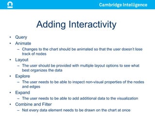
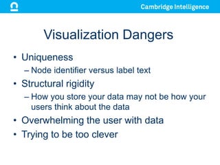
Creating Interactive Graph
Visualizations
Corey Lanum
Cambridge Intelligence

Founded May 2011
We build tools to visualize networks
We run on almost any browser and any device
KeyLines vs. Neo4j Browser
• The Neo4j browser is a great tool for
developers and data architects to
understand their data model
• KeyLines is a customizable tool to allow
an application’s end users to understand
the relationships in the data itself
Purpose of Visualization
• To better understand the structure of the
data that you are collecting
• To better understand the relationships
contained in the data that you are
collecting
KeyLines and Neo4j
Who uses graph visualization?
• Finance and Insurance
– Fraud discovery and investigation
– Regulatory compliance

• Information Technology
– Network Topology
– Risk Assessment

• Government
– Defense and Intelligence
– Law Enforcement

• Oil and Gas
– Physical Infrastructure
Creating Visualizations
• Convey Information
Through Visual Properties
– Nodes
•
•
•
•

Images or Icons
Colors
Sizes
Glyphs

– Edges
• Colors
• Width
Adding Interactivity
• Query
• Animate
– Changes to the chart should be animated so that the user doesn’t lose
track of nodes

• Layout
– The user should be provided with multiple layout options to see what
best organizes the data

• Explore
– The user needs to be able to inspect non-visual properties of the nodes
and edges

• Expand
– The user needs to be able to add additional data to the visualization

• Combine and Filter
– Not every data element needs to be drawn on the chart at once
Visualization Dangers
• Uniqueness
– Node identifier versus label text

• Structural rigidity
– How you store your data may not be how your
users think about the data

• Overwhelming the user with data
• Trying to be too clever
Thanks!

corey@cambridge-intelligence.com

All logos, trademarks, service marks and copyrights used in this
presentation belong to their respective owners

Visualizing the neo4j graph database with key lines

  • 1.
  • 2.
    Cambridge Intelligence Founded May2011 We build tools to visualize networks We run on almost any browser and any device
  • 3.
    KeyLines vs. Neo4jBrowser • The Neo4j browser is a great tool for developers and data architects to understand their data model • KeyLines is a customizable tool to allow an application’s end users to understand the relationships in the data itself
  • 4.
    Purpose of Visualization •To better understand the structure of the data that you are collecting • To better understand the relationships contained in the data that you are collecting
  • 5.
  • 6.
    Who uses graphvisualization? • Finance and Insurance – Fraud discovery and investigation – Regulatory compliance • Information Technology – Network Topology – Risk Assessment • Government – Defense and Intelligence – Law Enforcement • Oil and Gas – Physical Infrastructure
  • 7.
    Creating Visualizations • ConveyInformation Through Visual Properties – Nodes • • • • Images or Icons Colors Sizes Glyphs – Edges • Colors • Width
  • 8.
    Adding Interactivity • Query •Animate – Changes to the chart should be animated so that the user doesn’t lose track of nodes • Layout – The user should be provided with multiple layout options to see what best organizes the data • Explore – The user needs to be able to inspect non-visual properties of the nodes and edges • Expand – The user needs to be able to add additional data to the visualization • Combine and Filter – Not every data element needs to be drawn on the chart at once
  • 9.
    Visualization Dangers • Uniqueness –Node identifier versus label text • Structural rigidity – How you store your data may not be how your users think about the data • Overwhelming the user with data • Trying to be too clever
  • 10.
    Thanks! corey@cambridge-intelligence.com All logos, trademarks,service marks and copyrights used in this presentation belong to their respective owners