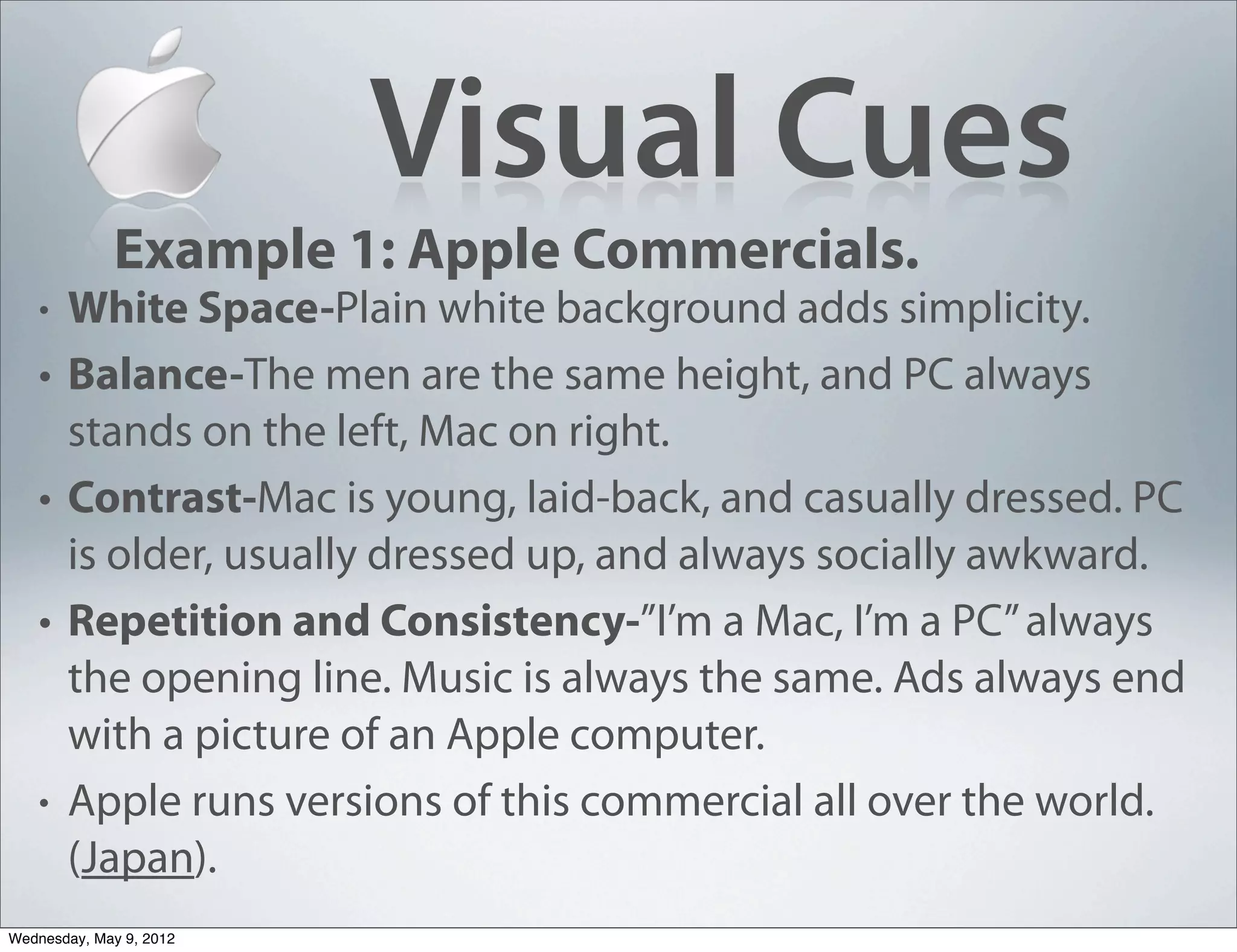
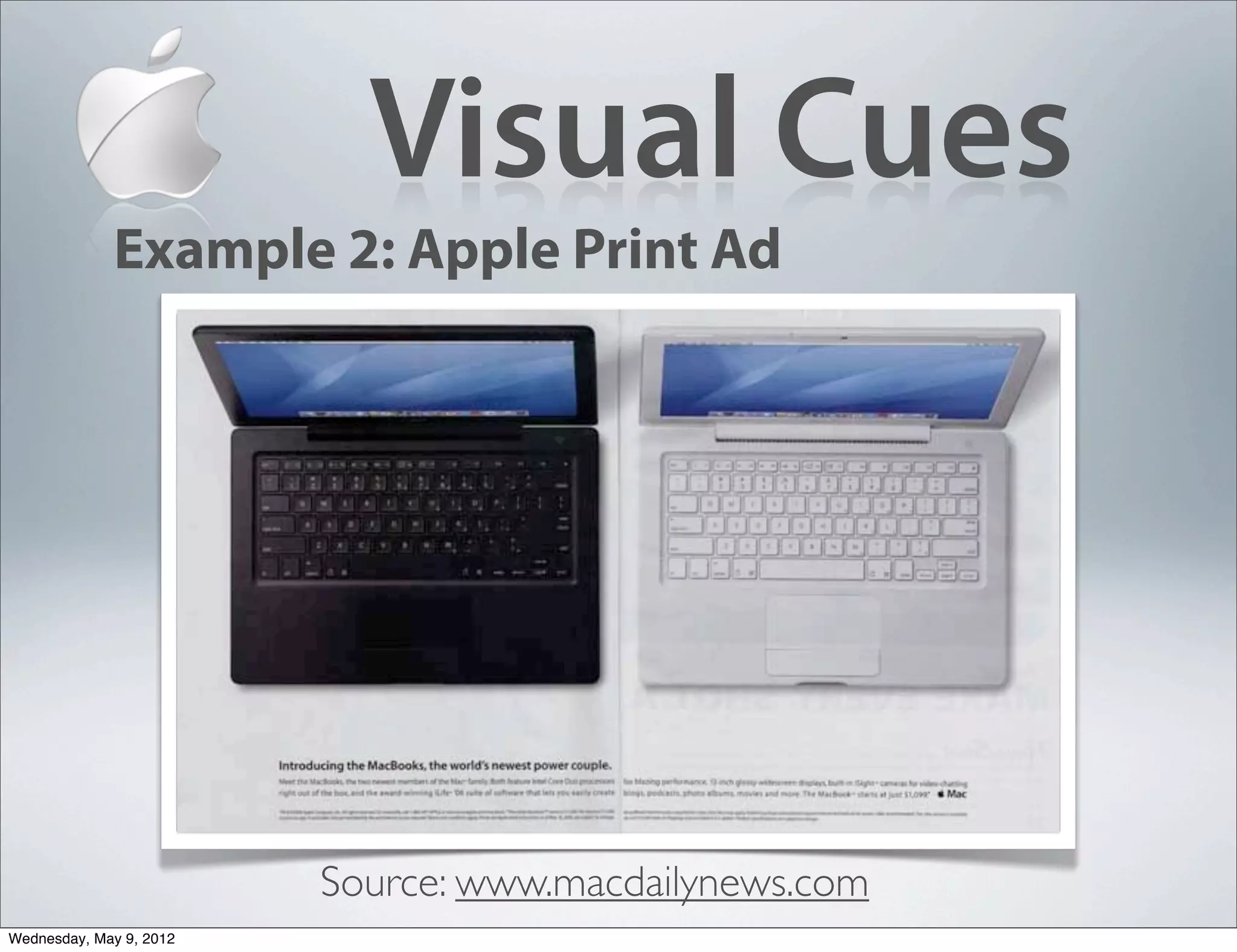
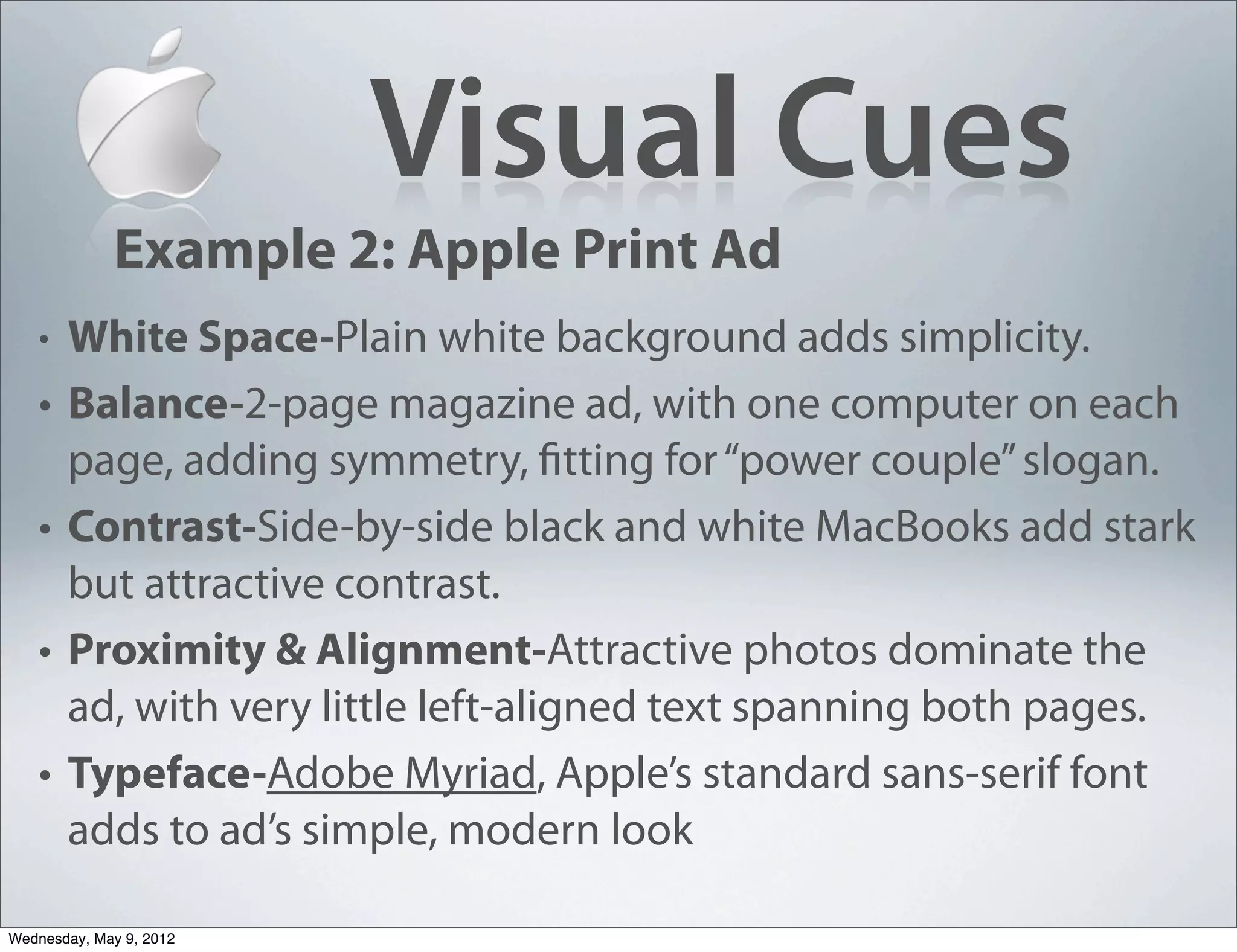
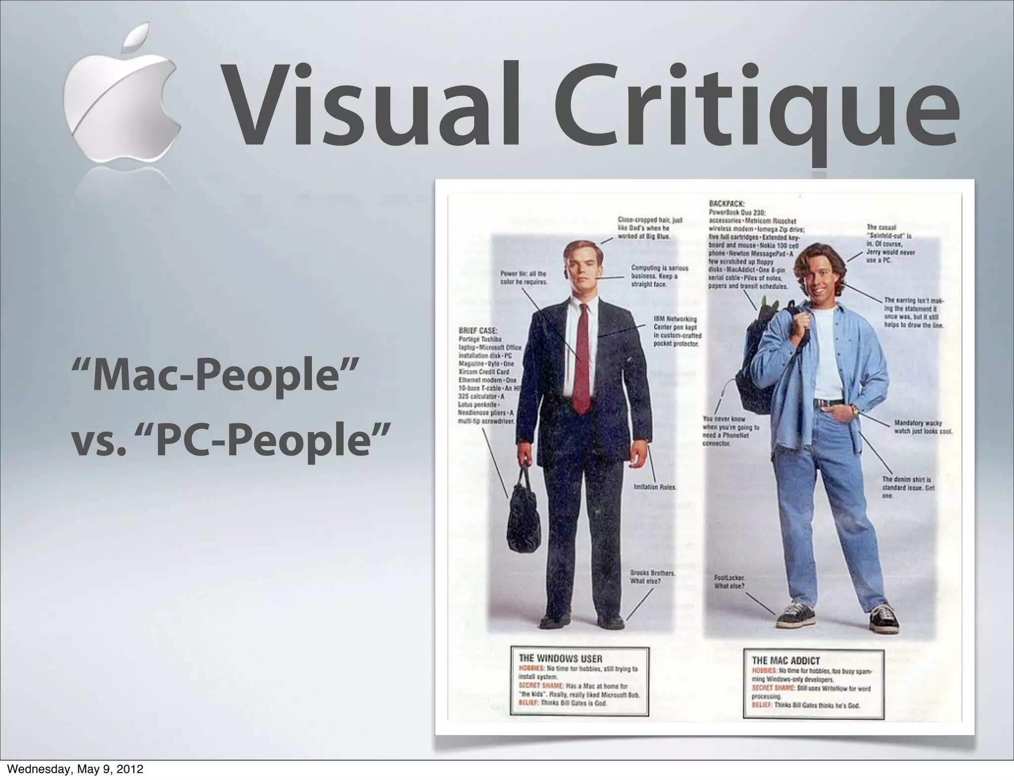
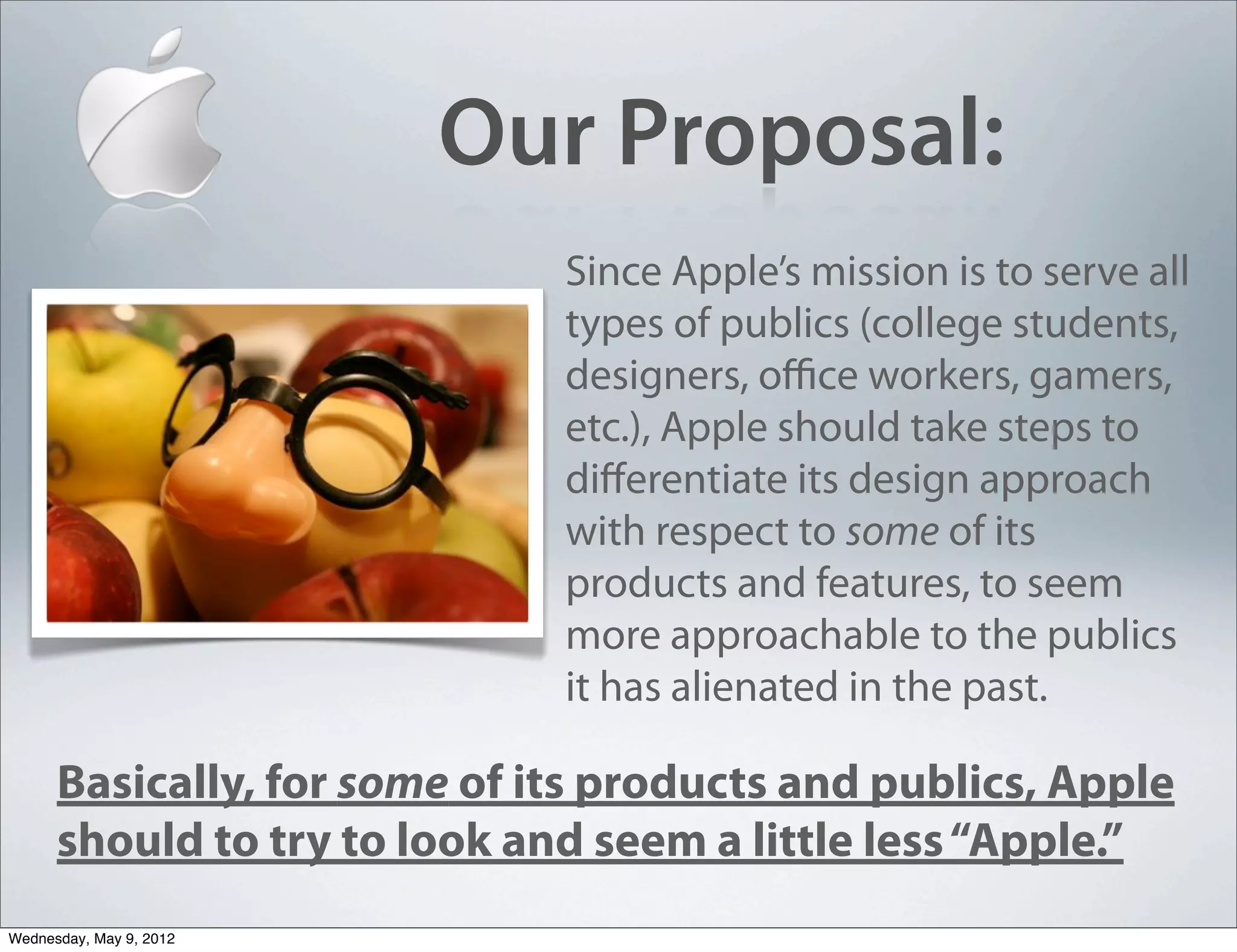
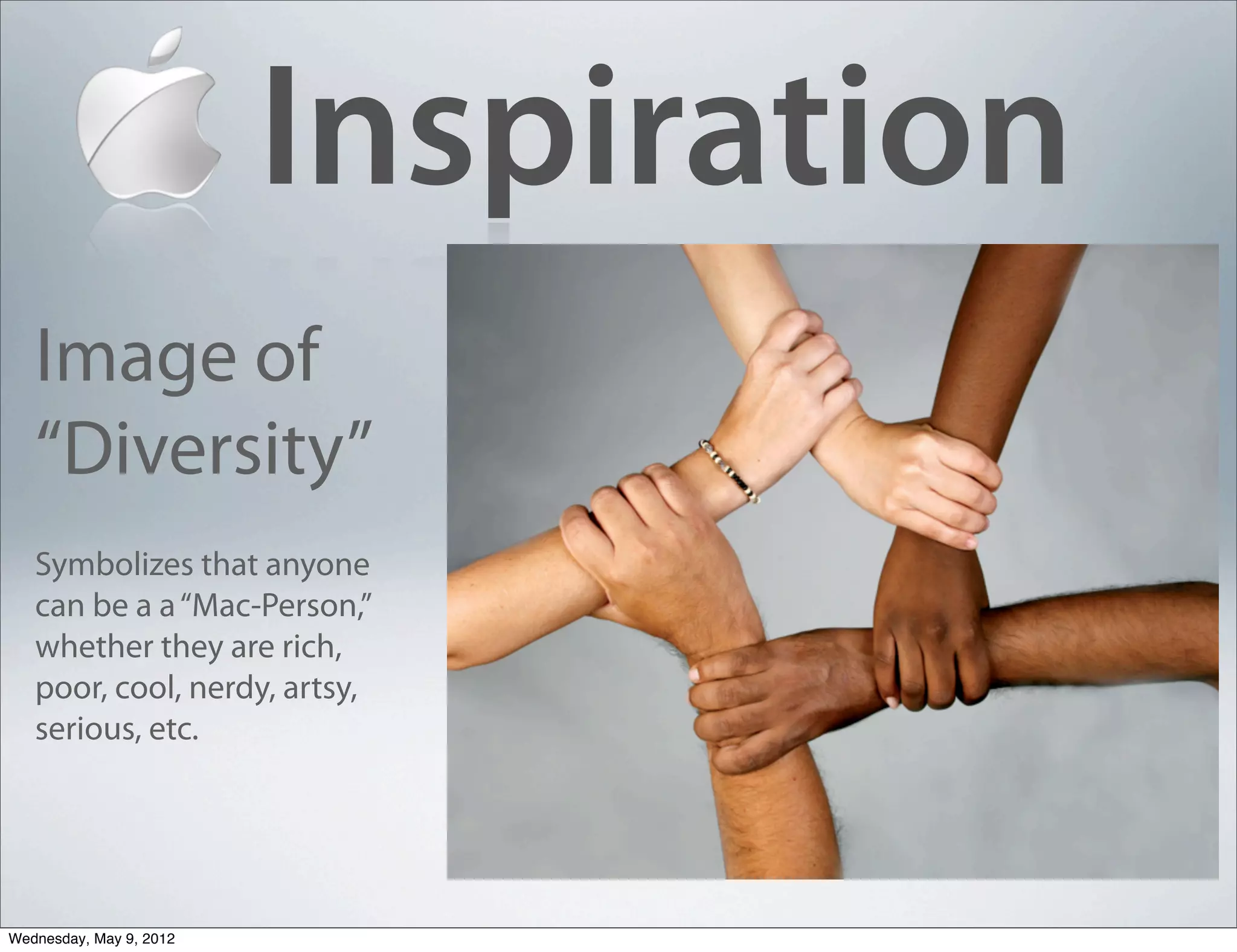
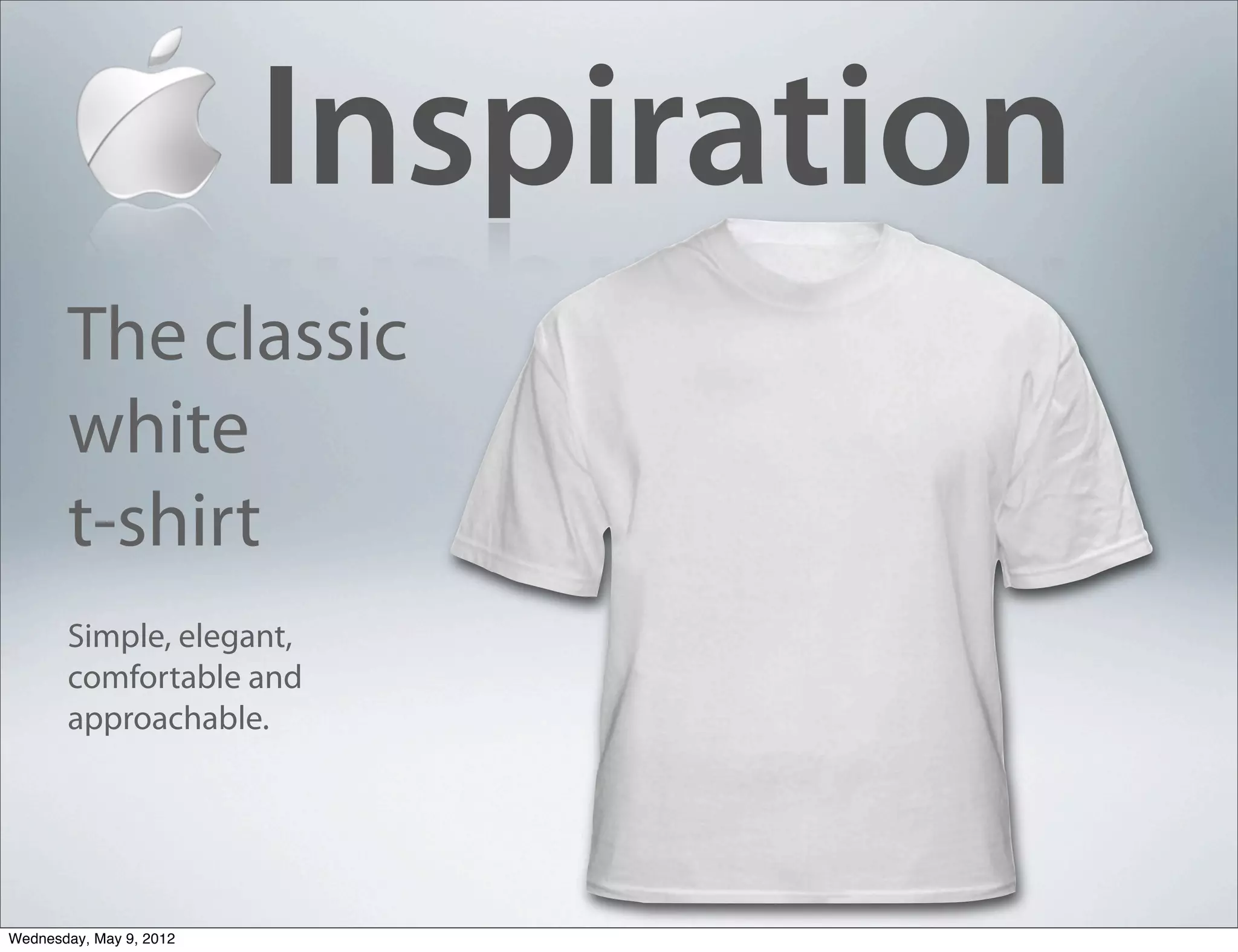
A Visual Analysis of Apple®
                  Presented by Adrian Erlenbach, Kaylee Hyman, Jami Baker and Erin Hughes


Wednesday, May 9, 2012
About Apple®
   •   Established in 1976 by Steve Jobs at the beginning of the
       “personal computer revolution.”

   •   Goal was to create an “inexpensive and simple to use
       computer.”

   •   The company’s iconic logo, an apple with a bite taken out
       of it, is now one of the world’s most recognizable corporate
       symbols.
       (Source: www.apple-history.com)


Wednesday, May 9, 2012
Apple’s Mission
       “Apple is committed to bringing the best
       personal computing experience to
       students, educators, creative professionals
       and consumers around the world through its
       innovative hardware, software and Internet
       offerings.”
       (Source: Apple.com)


Wednesday, May 9, 2012
Why an Apple?
    •   While Apple has never officially commented on the
        inspiration for its logo, the public has many theories:
        •   Steve Job used to work on an Apple Farm.
        •   Apples are Steve Jobs’ favorite fruit.
        •   Named after Beatles Album titled Apple.
        •   Biblical symbolism: Adam and Eve, creationism,etc.
        •   They just couldn’t think of anything better.

    •   According to the original designer, the “bite” in Apple’s logo
        simply was added to make it look more an Apple. Also a play
        on words (bite/byte... get it?).
        (Source: www.apple-history.com)

Wednesday, May 9, 2012
30 years of Apples
                                1976
                                “The Newton Crest”:
                                Apple’s original logo,
                                Designed by graphic
                                designer Ronald
                                Wayne.


Wednesday, May 9, 2012
30 years of Apples

                                 1976-1998
                                 “The Rainbow”: The
                                 first actual ‘apple’.
                                 Created by designer
                                 Rob Janoff.


Wednesday, May 9, 2012
30 years of Apples

                                 1998-present
                                 “The Monochrome
                                 Logo”: Symbolized a
                                 corporate identity
                                 overhaul for Apple.
                                 Has been modified
                                 slightly over the years.


Wednesday, May 9, 2012
Brand Recognition


     The Apple logo is now one of the most
     recognizable corporate brands on the planet.
Wednesday, May 9, 2012
Brand Recognition


     The Apple logo is now one of the most
     recognizable corporate brands on the planet.
Wednesday, May 9, 2012
Brand Recognition


     The Apple logo is now one of the most
     recognizable corporate brands on the planet.
Wednesday, May 9, 2012
Brand Recognition


     The Apple logo is now one of the most
     recognizable corporate brands on the planet.
Wednesday, May 9, 2012
Visual Cues
                             Example 1:
                             Apple Commercials.


Wednesday, May 9, 2012
Visual Cues
             Example 1: Apple Commercials.
   •   White Space-Plain white background adds simplicity.
   •   Balance-The men are the same height, and PC always
       stands on the left, Mac on right.
   •   Contrast-Mac is young, laid-back, and casually dressed. PC
       is older, usually dressed up, and always socially awkward.
   •   Repetition and Consistency-”I’m a Mac, I’m a PC” always
       the opening line. Music is always the same. Ads always end
       with a picture of an Apple computer.
   •   Apple runs versions of this commercial all over the world.
       (Japan).
Wednesday, May 9, 2012
Visual Cues
             Example 2: Apple Print Ad


                         Source: www.macdailynews.com
Wednesday, May 9, 2012
Visual Cues
             Example 2: Apple Print Ad
   •   White Space-Plain white background adds simplicity.
   •   Balance-2-page magazine ad, with one computer on each
       page, adding symmetry, fitting for “power couple” slogan.
   •   Contrast-Side-by-side black and white MacBooks add stark
       but attractive contrast.
   •   Proximity & Alignment-Attractive photos dominate the
       ad, with very little left-aligned text spanning both pages.
   •   Typeface-Adobe Myriad, Apple’s standard sans-serif font
       adds to ad’s simple, modern look

Wednesday, May 9, 2012
Visual Cues
             Example 2: Apple Product Packaging


Wednesday, May 9, 2012
Visual Cues
             Example 2: Apple Product Packaging
   •   “A packaging experience.”
   • White (and Black) Space-Nothing on outside of box other
     than product name and photo. Very limited text in
     instruction materials.
   • Organization and proximity-Three-step “quick-start”
     instructions are easy to follow and add to the user-friendly
     appeal
   • Harmony-Sleek, minimalist packaging adds to the
     user“experience”

Wednesday, May 9, 2012
Visual Critique
                           • Modern, simplistic visual identity
   Positive                    reflects organization’s mission to create
                               well-designed products that are easy to
   Impressions                 use.
                           •   Powerful, consistent design strategy
                               creates a clear brand personality.
                           •   Memorable messages and repetition
                               creates brand recognition and
                               resonance.
                           •   One of the most successful, innovative
                               corporate identities in the world.


Wednesday, May 9, 2012
Visual Critique
       Extreme level repetition & consistency
       makes it hard for Apple to tailor message
                                                             Negative
       to diverse publics. For example:                    Impressions
        • Young and trendy feeling of the brand makes
              it less appealing to more-serious business
              users.
          •   Sleek, modern ads make Apple products seem
              expensive, alienating lower-income publics
          •   Microsoft Ad: “I’m not cool enough to be a
              Mac person”
          •   As a result of Apple’s “high and mighty”
              approach to communication, Mac users can
              be perceived as stuck-up, cultish, etc.
Wednesday, May 9, 2012
Visual Critique

          “Mac-People”
          vs. “PC-People”


Wednesday, May 9, 2012
Our Proposal:
                              Since Apple’s mission is to serve all
                              types of publics (college students,
                              designers, office workers, gamers,
                              etc.), Apple should take steps to
                              differentiate its design approach
                              with respect to some of its
                              products and features, to seem
                              more approachable to the publics
                              it has alienated in the past.

      Basically, for some of its products and publics, Apple
      should to try to look and seem a little less “Apple.”
Wednesday, May 9, 2012
Idea #1
        Apple could:
        Design more down-to-earth ads to promote its most
        affordable products (iPod Shuffle, refurbished products,
        etc.) to lower-income publics like college students, or
        other individuals from less-privileged backgrounds.
            • Target these groups through less-expensive seeming ads (College
                newspapers vs. GQ Magazine; Spanish-language radio stations vs. the
                Superbowl)
            •   Ads can still maintain many the minimalist design approach, just without
                seeming so “stuck-up.”


Wednesday, May 9, 2012
Idea #2
       Apple could also:
       Design more informational, in-depth ads to address the
       concerns of “gamer” types.

       • Apple’s compatibility problems have been fixed for years, but some high-
           tech publics still consider Apple products to be less powerful than PC and
           overrated.
       •   Apple could address such concerns with more print-heavy, technically
           oriented ads that tackle specific misconceptions in “nerdier” language
       •   Make visual elements less “artsy” in appearance
       •   Run ads in specialized high-tech channels like gaming magazines, or adapt
           message to an exhibit at a gaming convention.


Wednesday, May 9, 2012
Inspiration
   Image of
   “Diversity”
   Symbolizes that anyone
   can be a a “Mac-Person,”
   whether they are rich,
   poor, cool, nerdy, artsy,
   serious, etc.


Wednesday, May 9, 2012
Inspiration
       The classic
       white
       t-shirt
       Simple, elegant,
       comfortable and
       approachable.


Wednesday, May 9, 2012
Inspiration
   Key Public
   Relevant:
   Ramen Noodles
   The symbol of low-
   income survival


Wednesday, May 9, 2012
Inspiration
     Technical
     Manual
     No-frills, information-
     based design.


Wednesday, May 9, 2012
Any Questions?


Wednesday, May 9, 2012

Visual Analysis of Apple

  • 1.
    A Visual Analysisof Apple® Presented by Adrian Erlenbach, Kaylee Hyman, Jami Baker and Erin Hughes Wednesday, May 9, 2012
  • 2.
    About Apple® • Established in 1976 by Steve Jobs at the beginning of the “personal computer revolution.” • Goal was to create an “inexpensive and simple to use computer.” • The company’s iconic logo, an apple with a bite taken out of it, is now one of the world’s most recognizable corporate symbols. (Source: www.apple-history.com) Wednesday, May 9, 2012
  • 3.
    Apple’s Mission “Apple is committed to bringing the best personal computing experience to students, educators, creative professionals and consumers around the world through its innovative hardware, software and Internet offerings.” (Source: Apple.com) Wednesday, May 9, 2012
  • 4.
    Why an Apple? • While Apple has never officially commented on the inspiration for its logo, the public has many theories: • Steve Job used to work on an Apple Farm. • Apples are Steve Jobs’ favorite fruit. • Named after Beatles Album titled Apple. • Biblical symbolism: Adam and Eve, creationism,etc. • They just couldn’t think of anything better. • According to the original designer, the “bite” in Apple’s logo simply was added to make it look more an Apple. Also a play on words (bite/byte... get it?). (Source: www.apple-history.com) Wednesday, May 9, 2012
  • 5.
    30 years ofApples 1976 “The Newton Crest”: Apple’s original logo, Designed by graphic designer Ronald Wayne. Wednesday, May 9, 2012
  • 6.
    30 years ofApples 1976-1998 “The Rainbow”: The first actual ‘apple’. Created by designer Rob Janoff. Wednesday, May 9, 2012
  • 7.
    30 years ofApples 1998-present “The Monochrome Logo”: Symbolized a corporate identity overhaul for Apple. Has been modified slightly over the years. Wednesday, May 9, 2012
  • 8.
    Brand Recognition The Apple logo is now one of the most recognizable corporate brands on the planet. Wednesday, May 9, 2012
  • 9.
    Brand Recognition The Apple logo is now one of the most recognizable corporate brands on the planet. Wednesday, May 9, 2012
  • 10.
    Brand Recognition The Apple logo is now one of the most recognizable corporate brands on the planet. Wednesday, May 9, 2012
  • 11.
    Brand Recognition The Apple logo is now one of the most recognizable corporate brands on the planet. Wednesday, May 9, 2012
  • 12.
    Visual Cues Example 1: Apple Commercials. Wednesday, May 9, 2012
  • 13.
    Visual Cues Example 1: Apple Commercials. • White Space-Plain white background adds simplicity. • Balance-The men are the same height, and PC always stands on the left, Mac on right. • Contrast-Mac is young, laid-back, and casually dressed. PC is older, usually dressed up, and always socially awkward. • Repetition and Consistency-”I’m a Mac, I’m a PC” always the opening line. Music is always the same. Ads always end with a picture of an Apple computer. • Apple runs versions of this commercial all over the world. (Japan). Wednesday, May 9, 2012
  • 14.
    Visual Cues Example 2: Apple Print Ad Source: www.macdailynews.com Wednesday, May 9, 2012
  • 15.
    Visual Cues Example 2: Apple Print Ad • White Space-Plain white background adds simplicity. • Balance-2-page magazine ad, with one computer on each page, adding symmetry, fitting for “power couple” slogan. • Contrast-Side-by-side black and white MacBooks add stark but attractive contrast. • Proximity & Alignment-Attractive photos dominate the ad, with very little left-aligned text spanning both pages. • Typeface-Adobe Myriad, Apple’s standard sans-serif font adds to ad’s simple, modern look Wednesday, May 9, 2012
  • 16.
    Visual Cues Example 2: Apple Product Packaging Wednesday, May 9, 2012
  • 17.
    Visual Cues Example 2: Apple Product Packaging • “A packaging experience.” • White (and Black) Space-Nothing on outside of box other than product name and photo. Very limited text in instruction materials. • Organization and proximity-Three-step “quick-start” instructions are easy to follow and add to the user-friendly appeal • Harmony-Sleek, minimalist packaging adds to the user“experience” Wednesday, May 9, 2012
  • 18.
    Visual Critique • Modern, simplistic visual identity Positive reflects organization’s mission to create well-designed products that are easy to Impressions use. • Powerful, consistent design strategy creates a clear brand personality. • Memorable messages and repetition creates brand recognition and resonance. • One of the most successful, innovative corporate identities in the world. Wednesday, May 9, 2012
  • 19.
    Visual Critique Extreme level repetition & consistency makes it hard for Apple to tailor message Negative to diverse publics. For example: Impressions • Young and trendy feeling of the brand makes it less appealing to more-serious business users. • Sleek, modern ads make Apple products seem expensive, alienating lower-income publics • Microsoft Ad: “I’m not cool enough to be a Mac person” • As a result of Apple’s “high and mighty” approach to communication, Mac users can be perceived as stuck-up, cultish, etc. Wednesday, May 9, 2012
  • 20.
    Visual Critique “Mac-People” vs. “PC-People” Wednesday, May 9, 2012
  • 21.
    Our Proposal: Since Apple’s mission is to serve all types of publics (college students, designers, office workers, gamers, etc.), Apple should take steps to differentiate its design approach with respect to some of its products and features, to seem more approachable to the publics it has alienated in the past. Basically, for some of its products and publics, Apple should to try to look and seem a little less “Apple.” Wednesday, May 9, 2012
  • 22.
    Idea #1 Apple could: Design more down-to-earth ads to promote its most affordable products (iPod Shuffle, refurbished products, etc.) to lower-income publics like college students, or other individuals from less-privileged backgrounds. • Target these groups through less-expensive seeming ads (College newspapers vs. GQ Magazine; Spanish-language radio stations vs. the Superbowl) • Ads can still maintain many the minimalist design approach, just without seeming so “stuck-up.” Wednesday, May 9, 2012
  • 23.
    Idea #2 Apple could also: Design more informational, in-depth ads to address the concerns of “gamer” types. • Apple’s compatibility problems have been fixed for years, but some high- tech publics still consider Apple products to be less powerful than PC and overrated. • Apple could address such concerns with more print-heavy, technically oriented ads that tackle specific misconceptions in “nerdier” language • Make visual elements less “artsy” in appearance • Run ads in specialized high-tech channels like gaming magazines, or adapt message to an exhibit at a gaming convention. Wednesday, May 9, 2012
  • 24.
    Inspiration Image of “Diversity” Symbolizes that anyone can be a a “Mac-Person,” whether they are rich, poor, cool, nerdy, artsy, serious, etc. Wednesday, May 9, 2012
  • 25.
    Inspiration The classic white t-shirt Simple, elegant, comfortable and approachable. Wednesday, May 9, 2012
  • 26.
    Inspiration Key Public Relevant: Ramen Noodles The symbol of low- income survival Wednesday, May 9, 2012
  • 27.
    Inspiration Technical Manual No-frills, information- based design. Wednesday, May 9, 2012
  • 28.