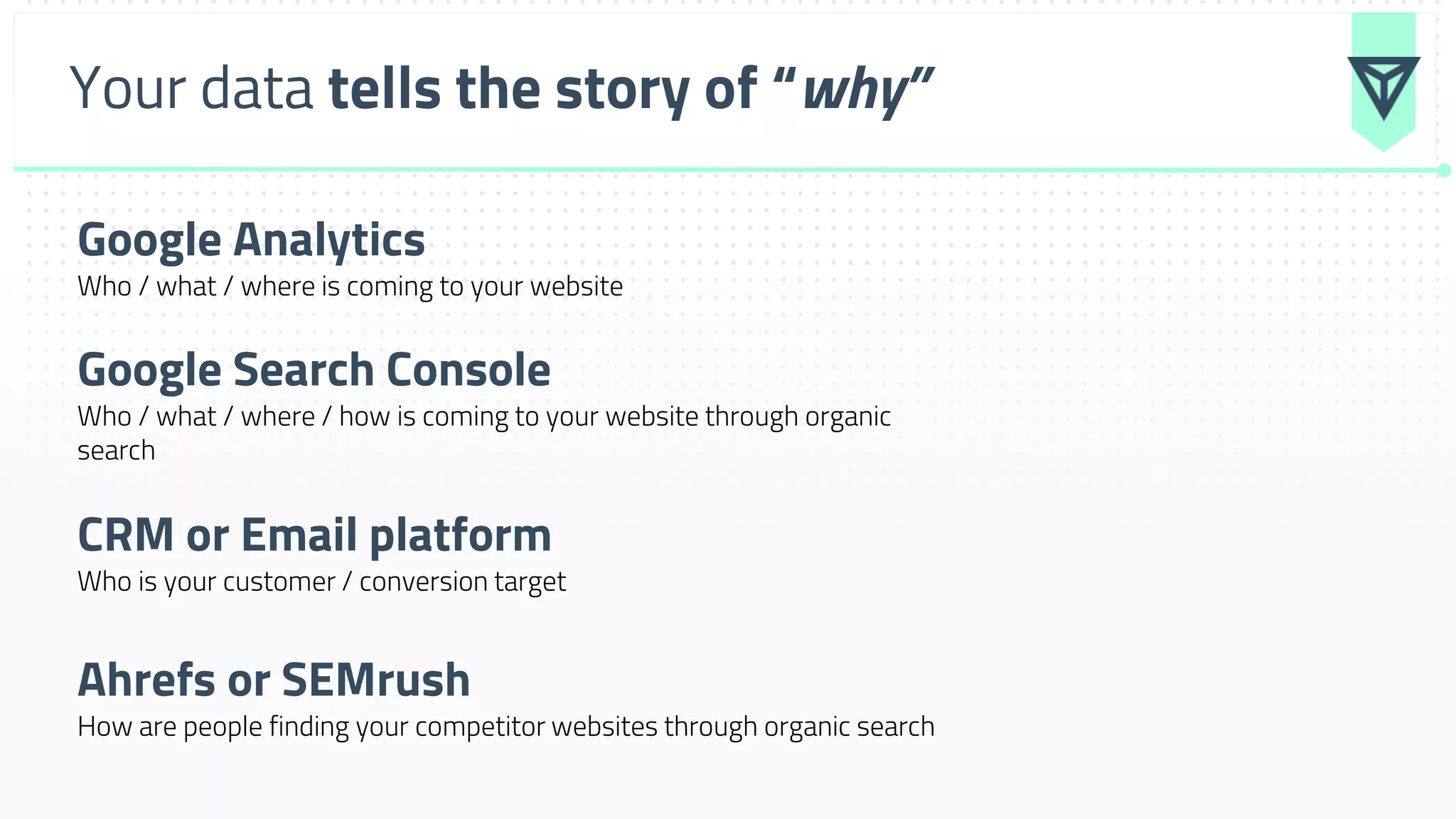
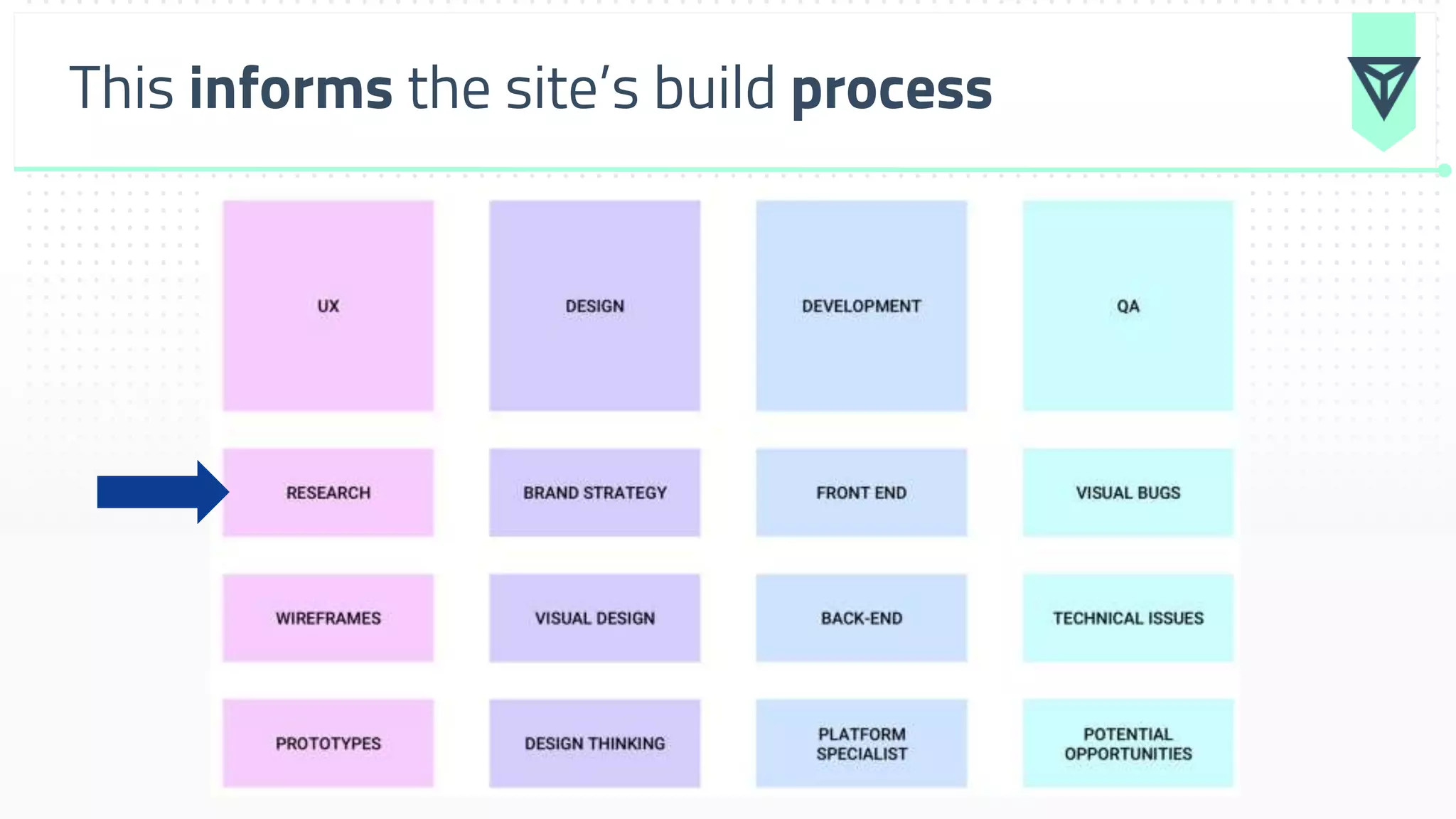
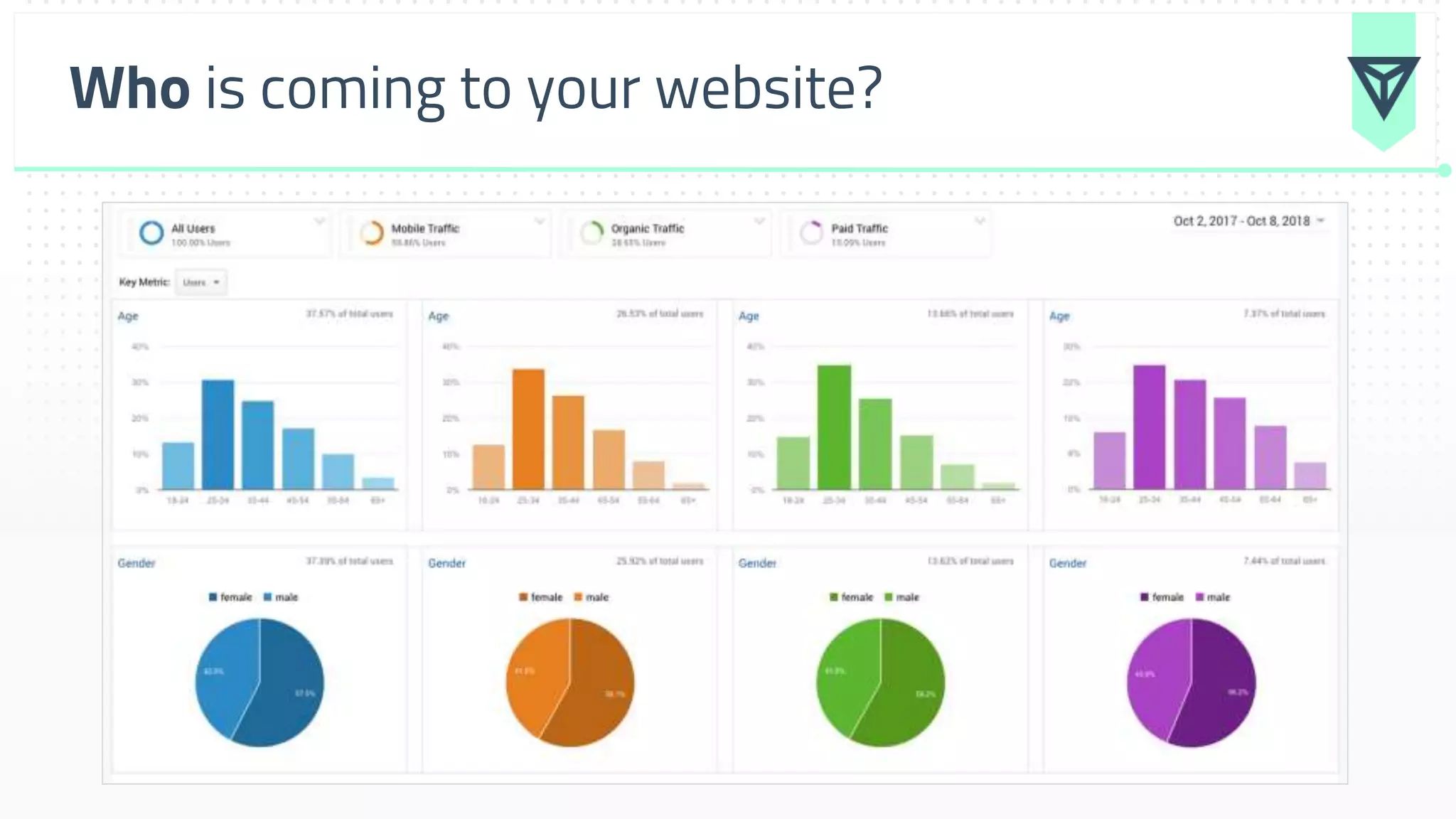
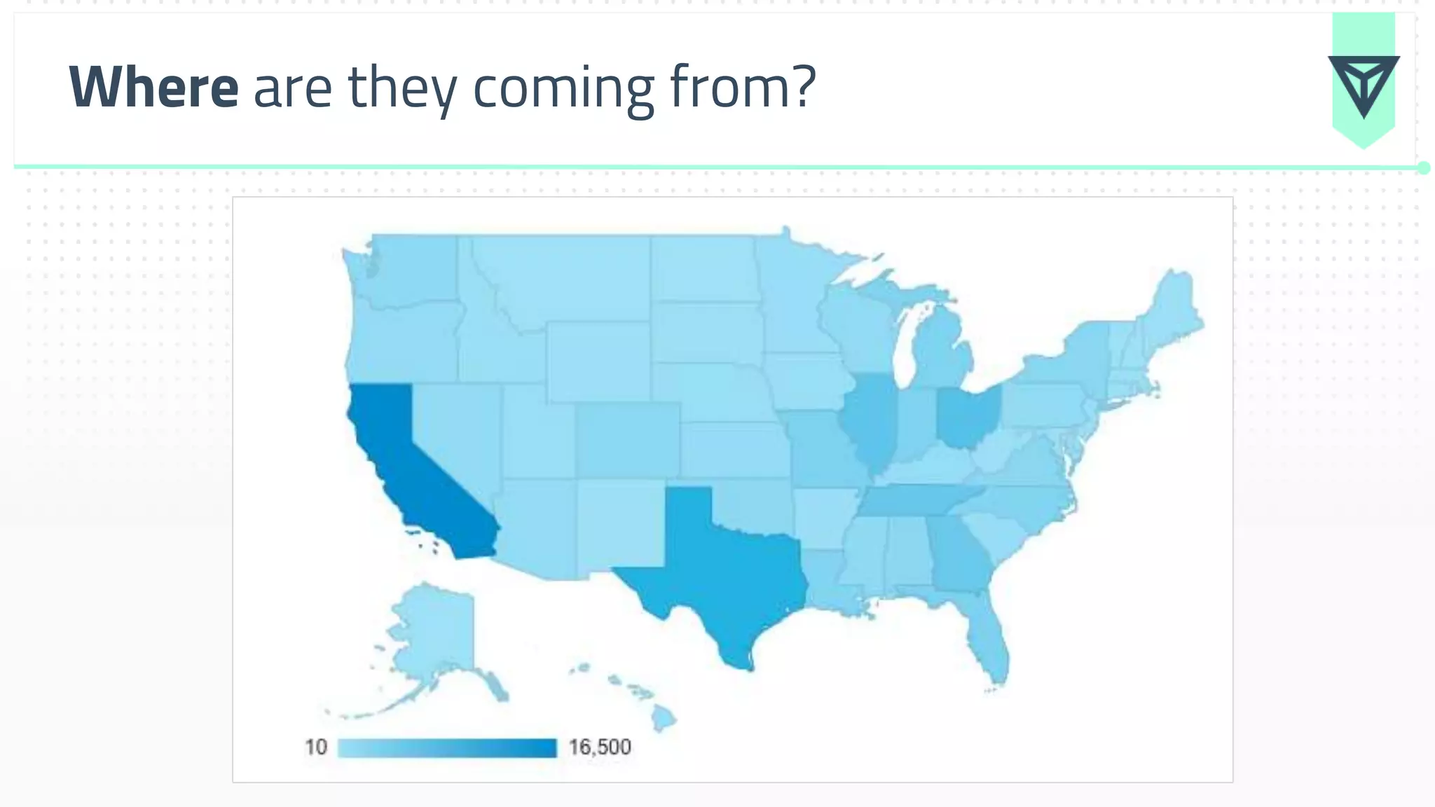
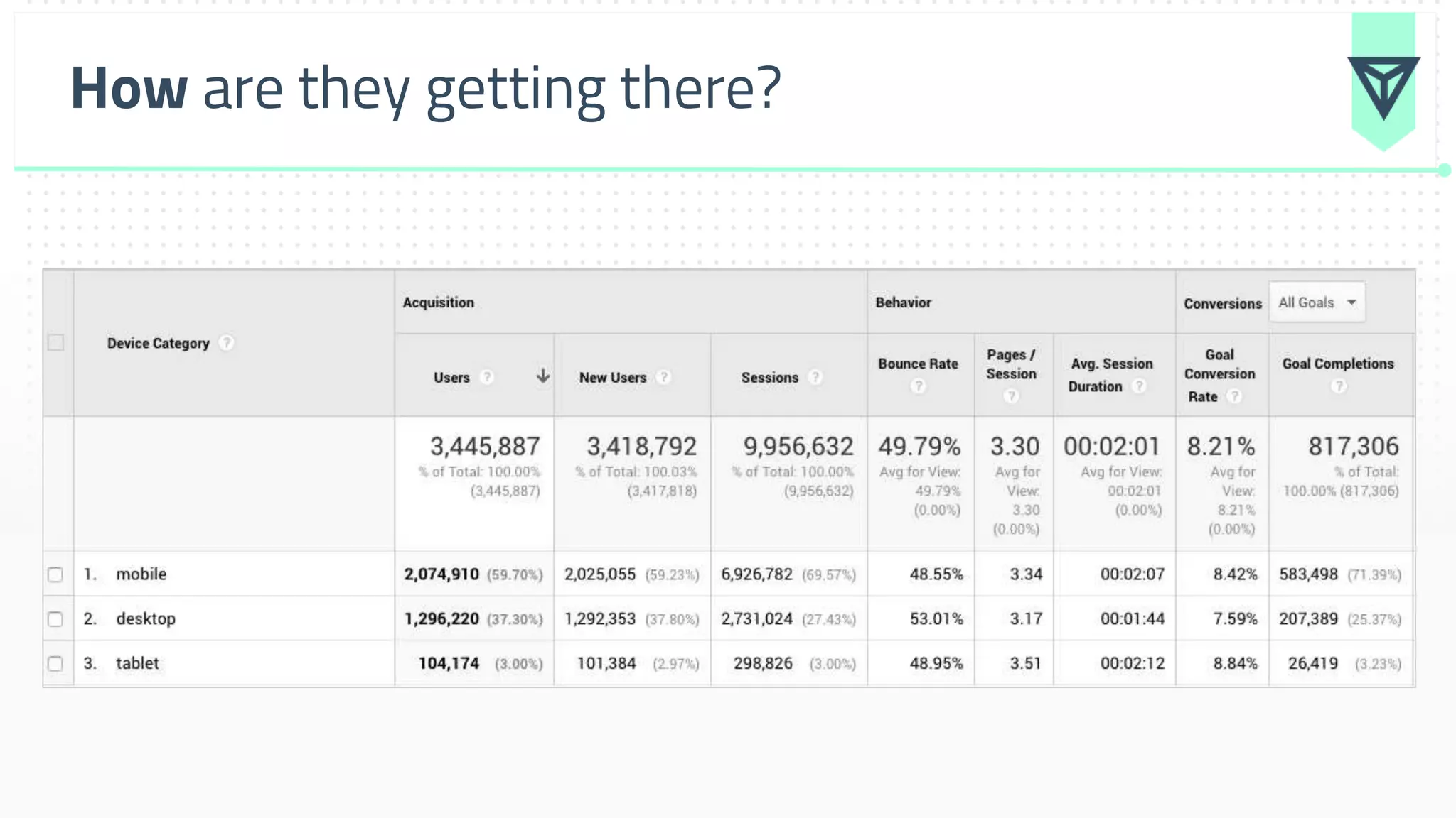
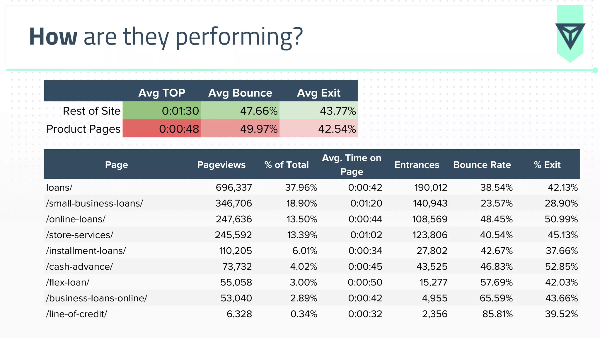
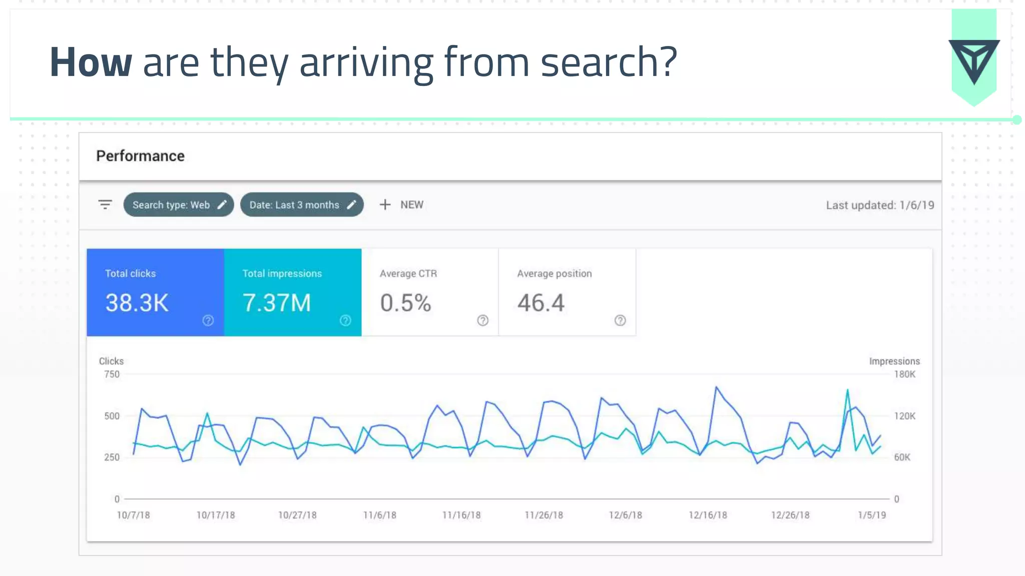
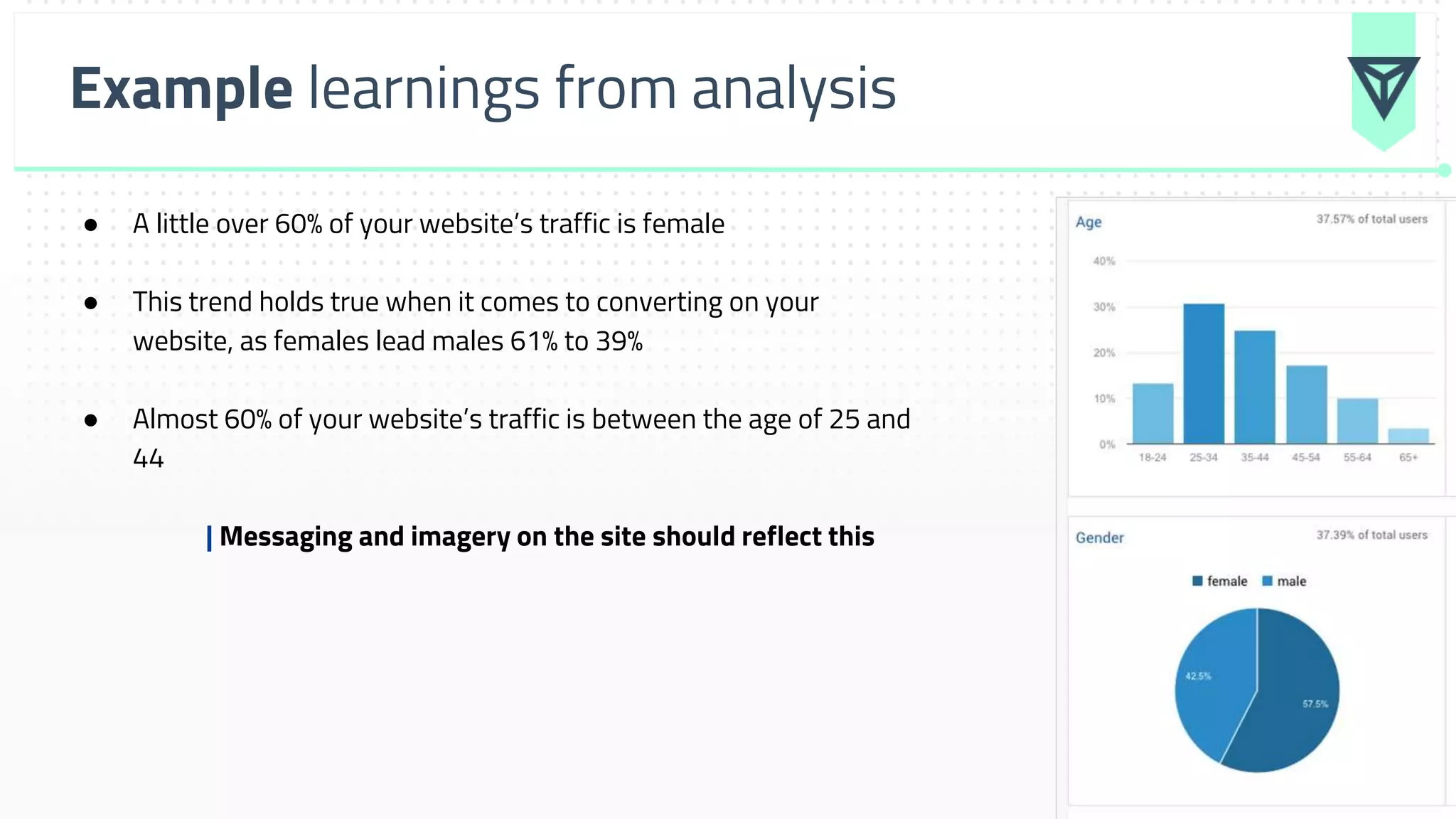
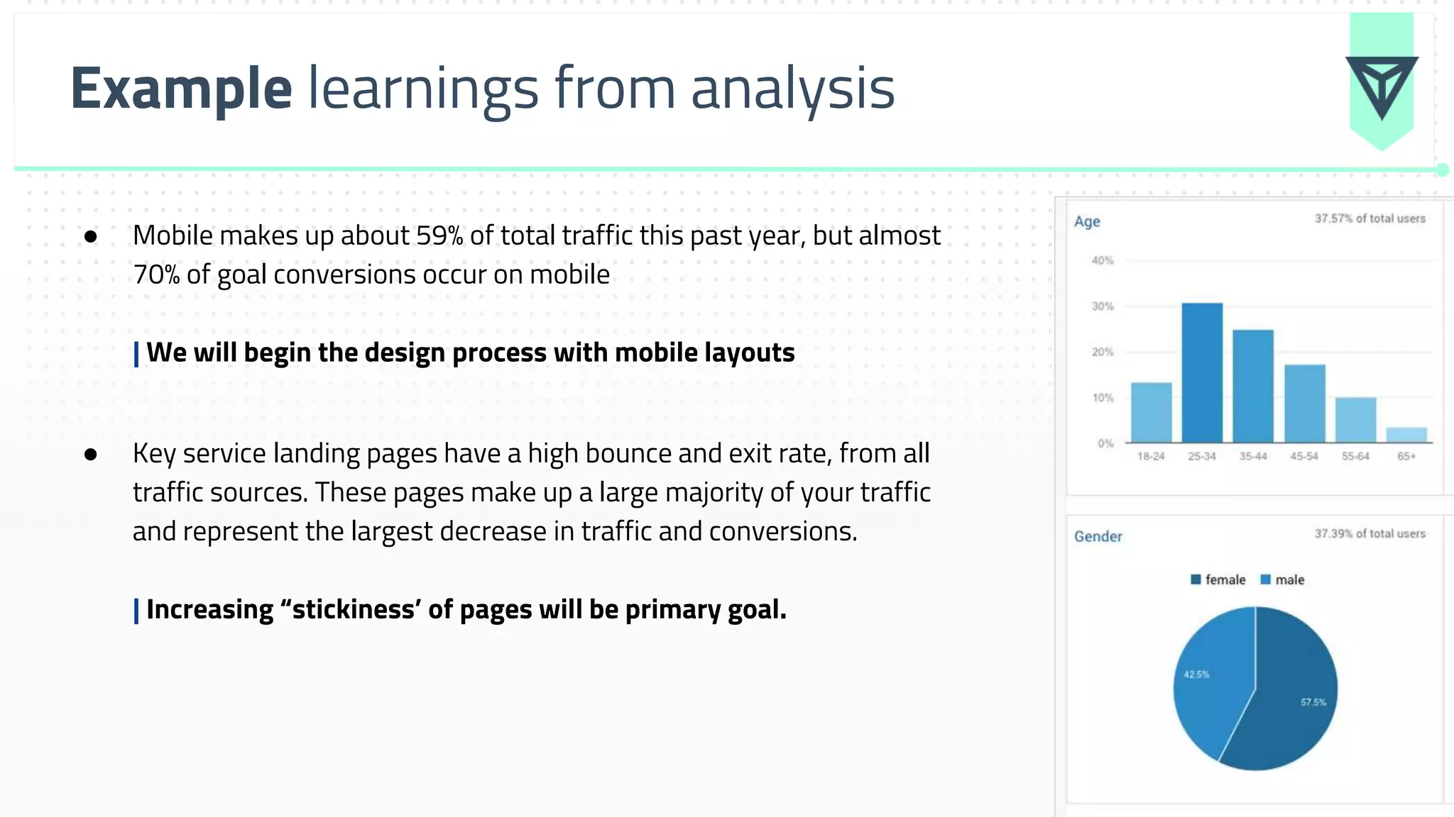
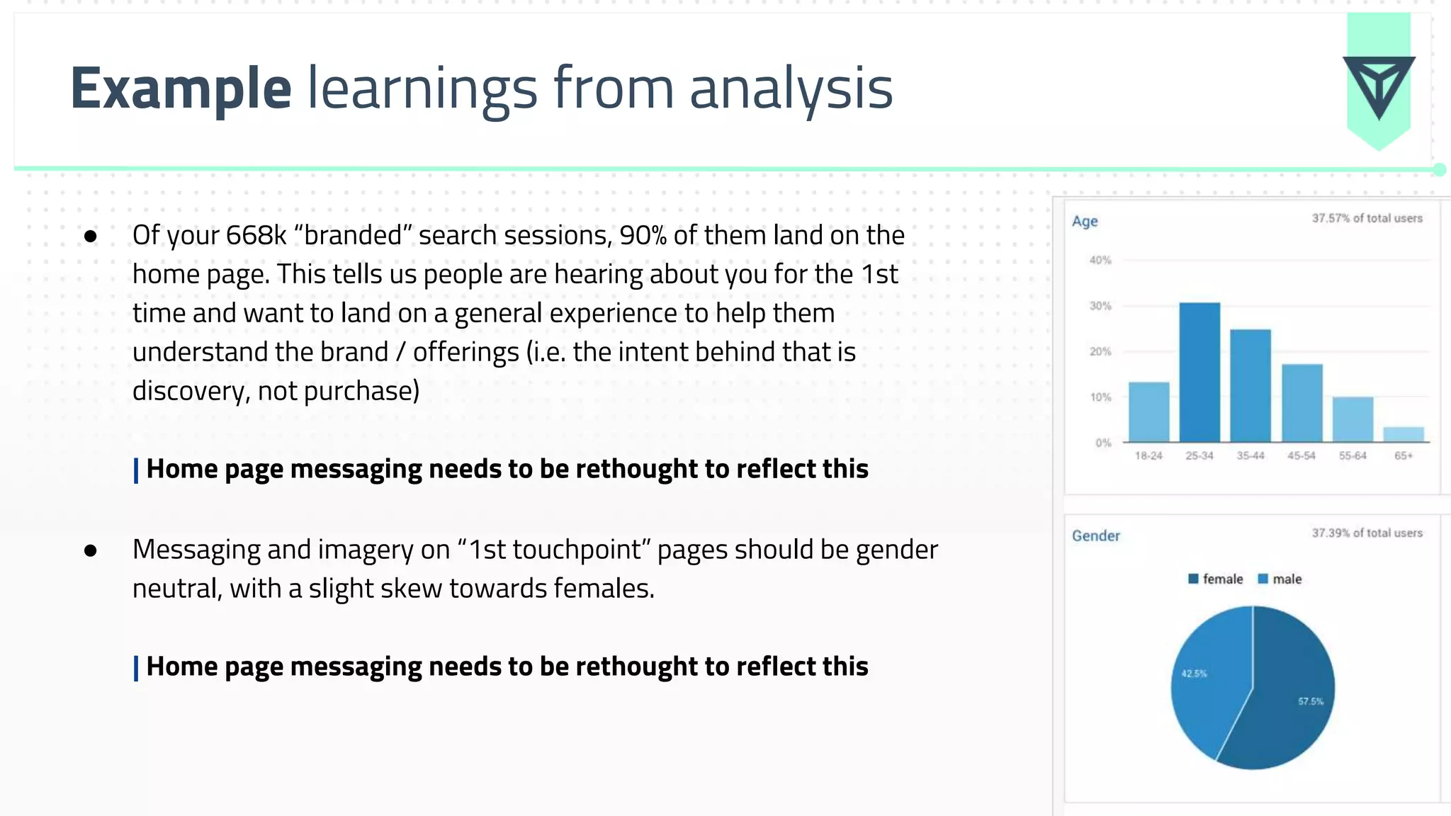
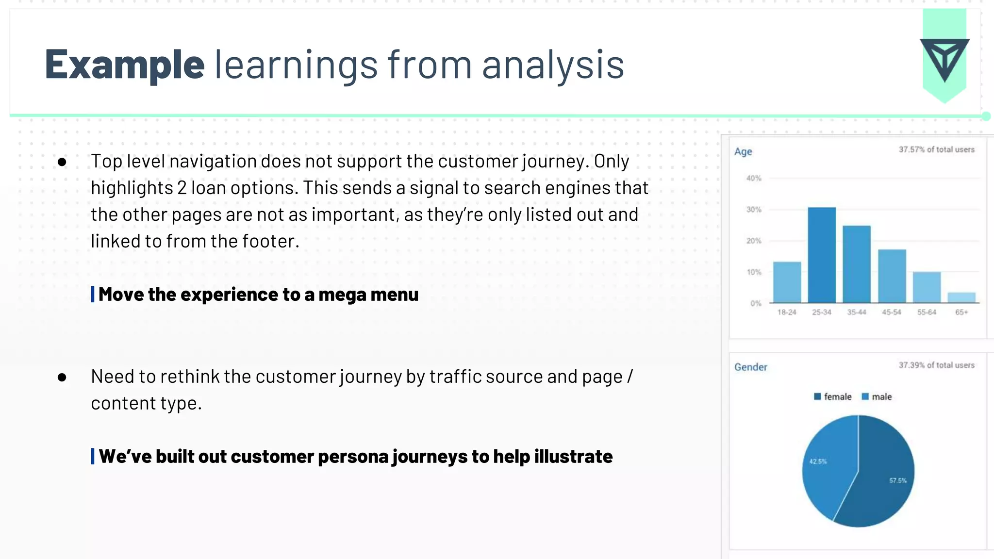
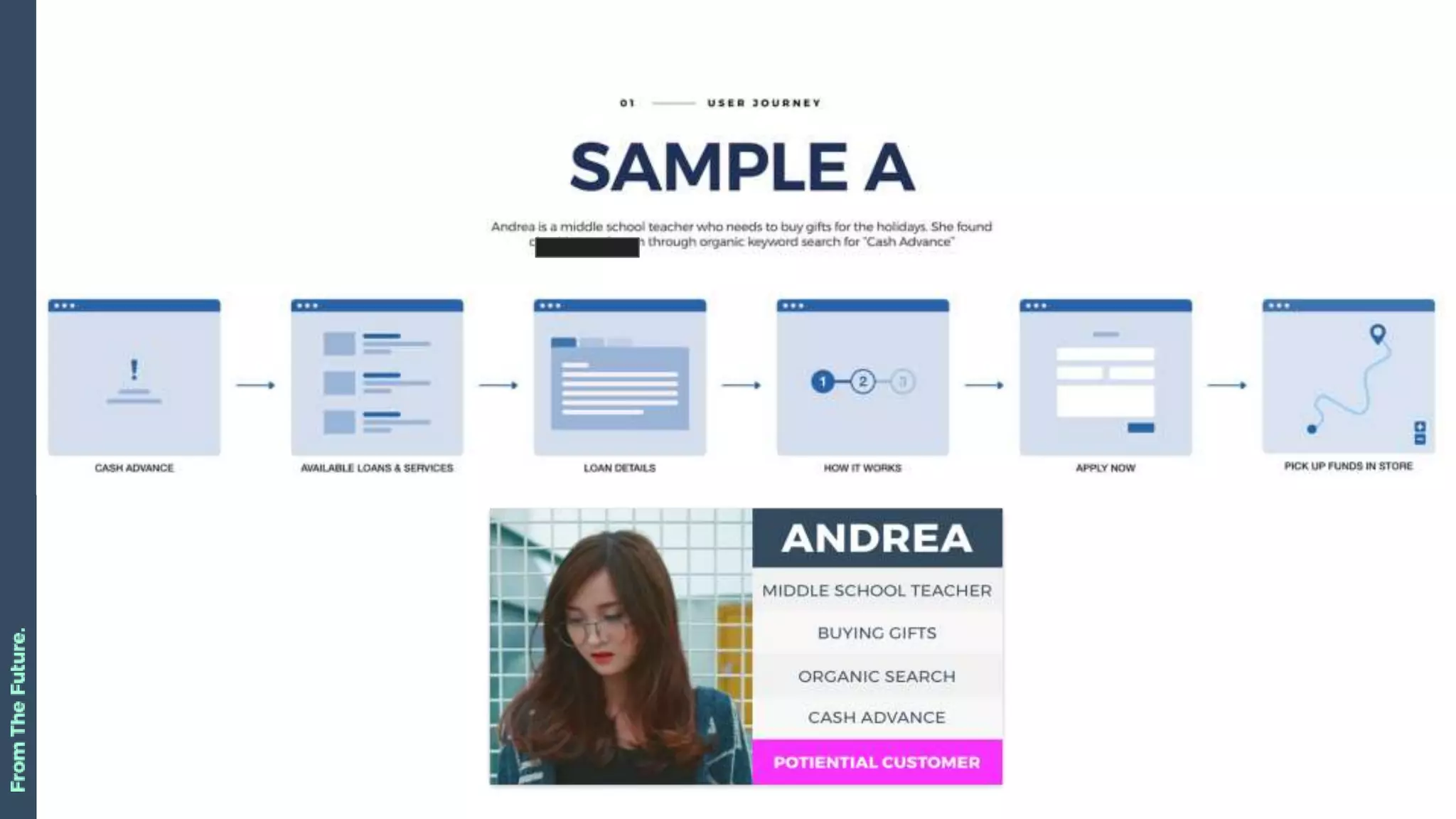
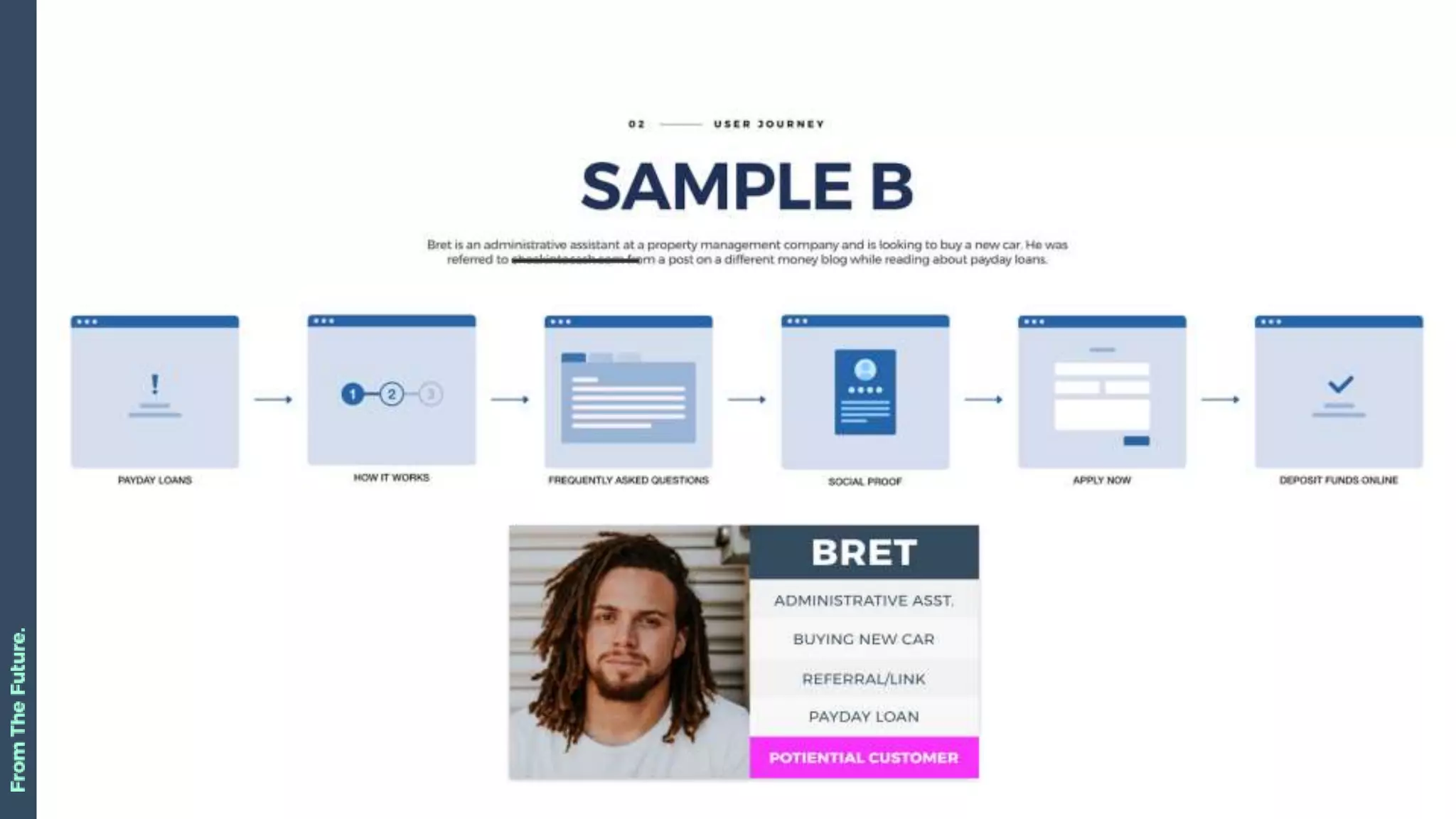
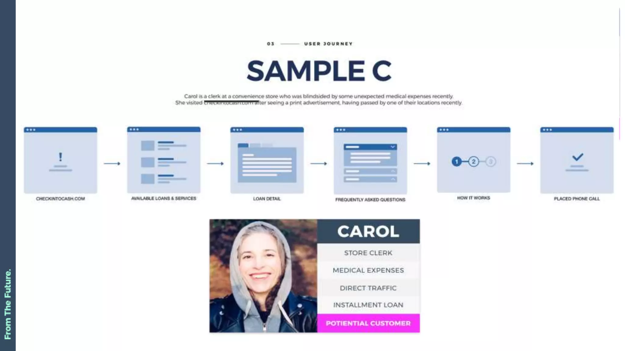
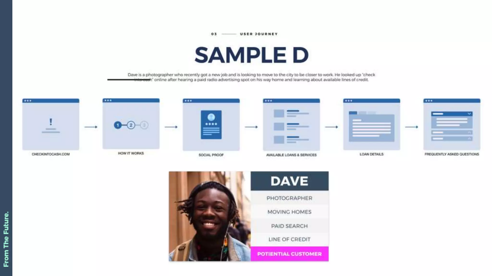
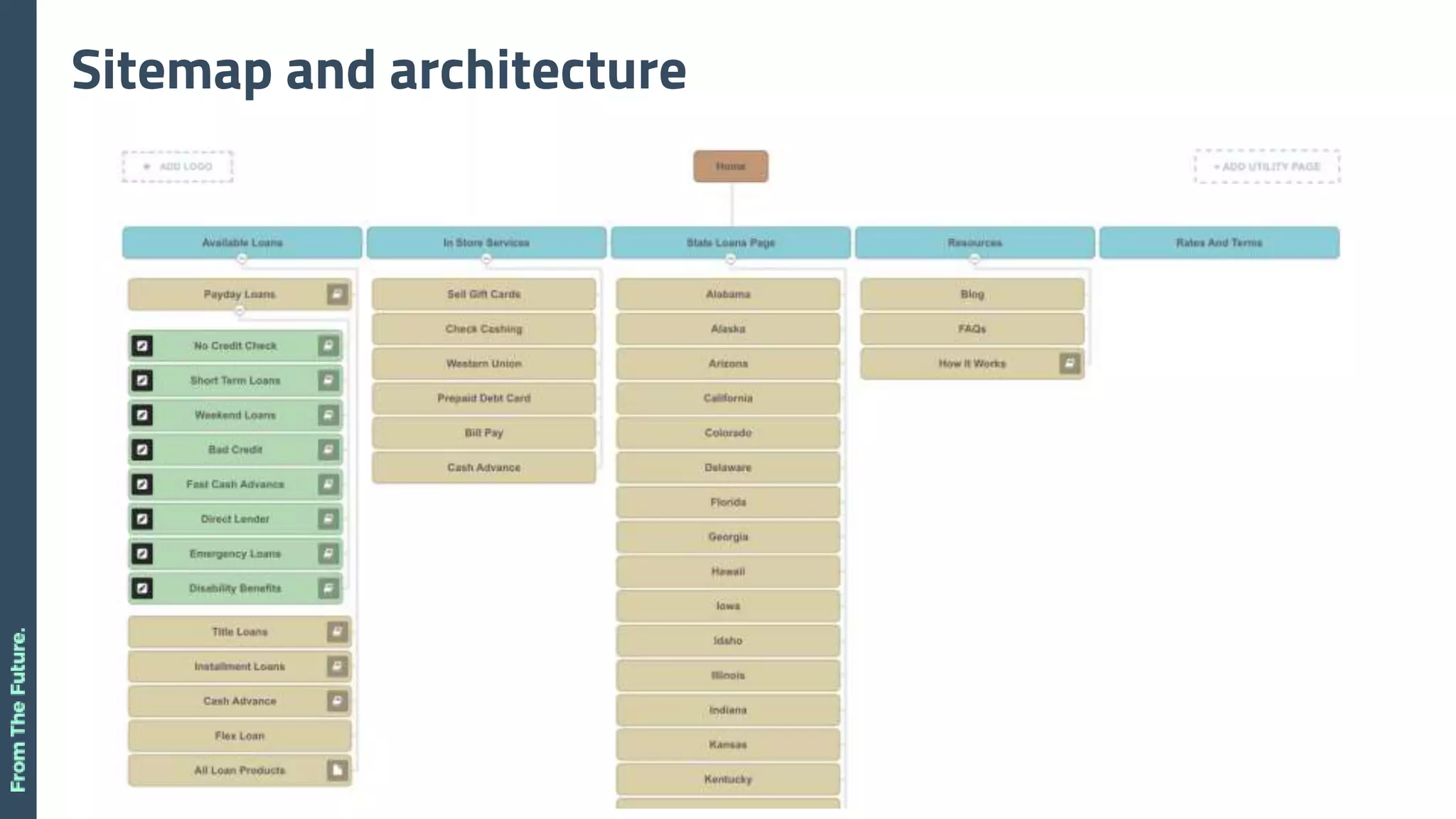
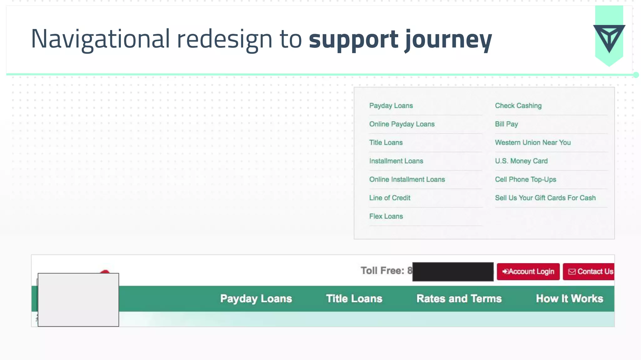
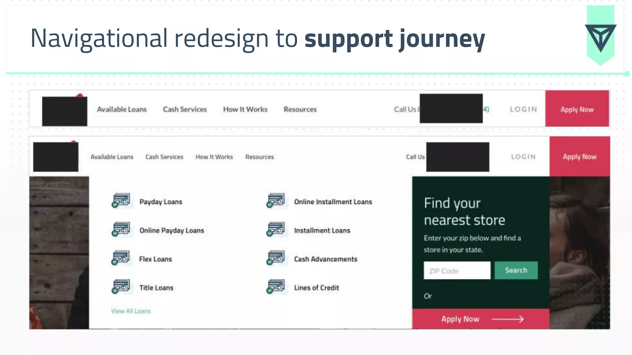
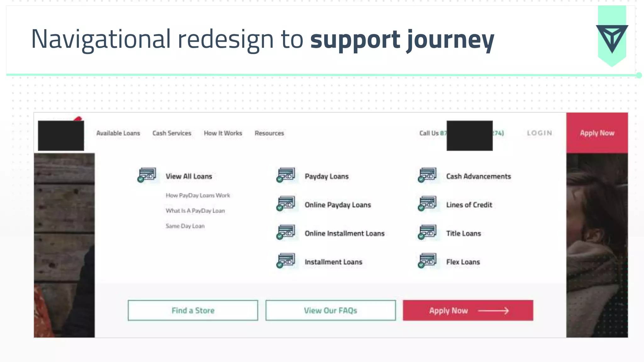
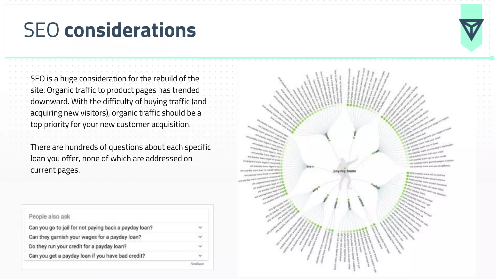
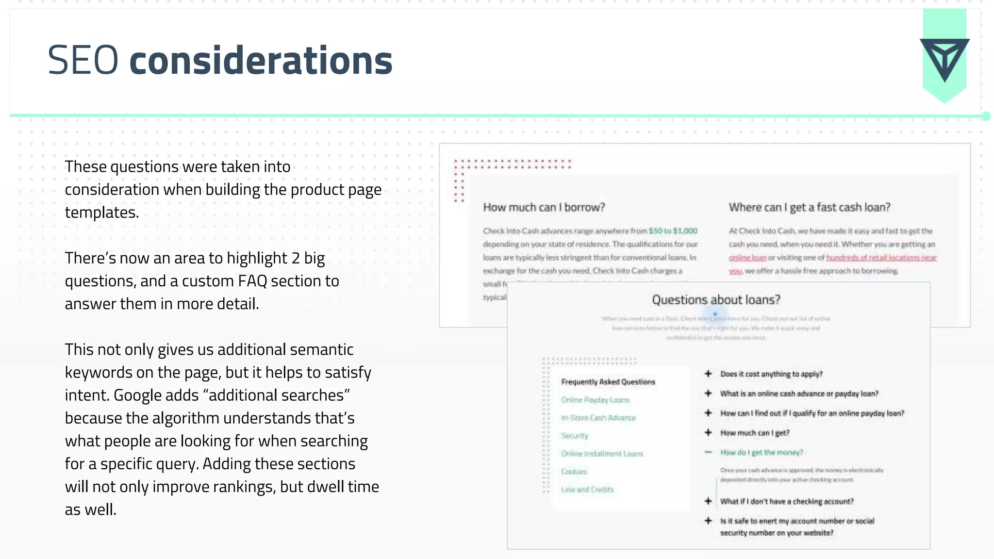
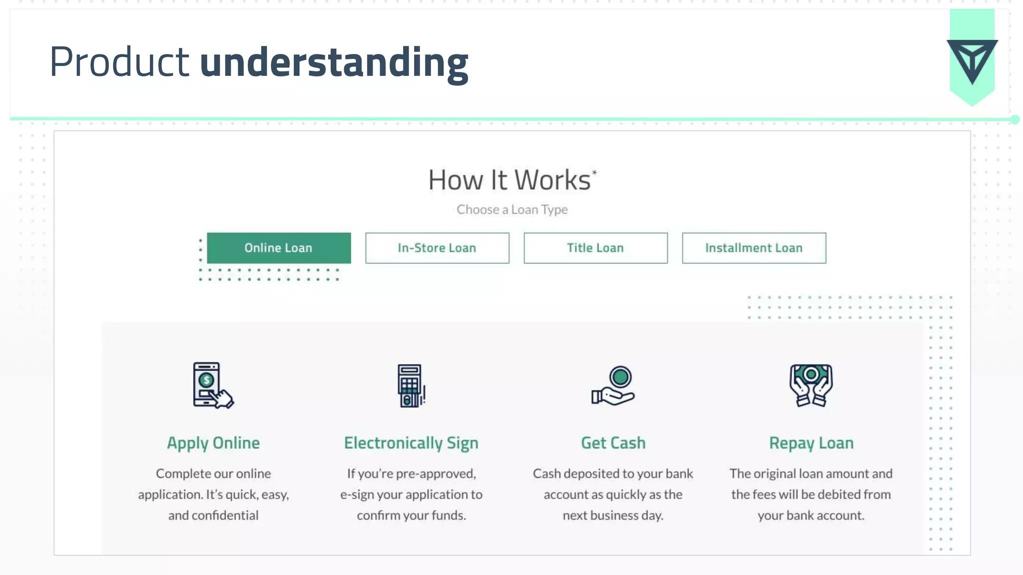
Websites aren't all about fonts and colors, they're also about form and function. We use an in depth data analysis process to build the RIGHT marketing websites for our clients. This presentation breaks down the exact reports you need to look at to do so.
3. The problem...
A poor performing website with
decreasing engagement, stickiness,
conversions and organic search
performance (mainly due to their poor UX
and messaging).
6. Your data tells the story of “why”
Google Analytics
Who / what / where is coming to your website
Google Search Console
Who / what / where / how is coming to your website through organic
search
CRM or Email platform
Who is your customer / conversion target
Ahrefs or SEMrush
How are people finding your competitor websites through organic search
20. Example learnings from analysis
● A little over 60% of your website’s traffic is female
● This trend holds true when it comes to converting on your
website, as females lead males 61% to 39%
● Almost 60% of your website’s traffic is between the age of 25 and
44
| Messaging and imagery on the site should reflect this
21. Example learnings from analysis
● Mobile makes up about 59% of total traffic this past year, but almost
70% of goal conversions occur on mobile
| We will begin the design process with mobile layouts
● Key service landing pages have a high bounce and exit rate, from all
traffic sources. These pages make up a large majority of your traffic
and represent the largest decrease in traffic and conversions.
| Increasing “stickiness’ of pages will be primary goal.
22. Example learnings from analysis
● Of your 668k “branded” search sessions, 90% of them land on the
home page. This tells us people are hearing about you for the 1st
time and want to land on a general experience to help them
understand the brand / offerings (i.e. the intent behind that is
discovery, not purchase)
| Home page messaging needs to be rethought to reflect this
● Messaging and imagery on “1st touchpoint” pages should be gender
neutral, with a slight skew towards females.
| Home page messaging needs to be rethought to reflect this
23. Example learnings from analysis
● Top level navigation does not support the customer journey. Only
highlights 2 loan options. This sends a signal to search engines that
the other pages are not as important, as they’re only listed out and
linked to from the footer.
| Move the experience to a mega menu
● Need to rethink the customer journey by traffic source and page /
content type.
| We’ve built out customer persona journeys to help illustrate
33. SEO considerations
SEO is a huge consideration for the rebuild of the
site. Organic traffic to product pages has trended
downward. With the difficulty of buying traffic (and
acquiring new visitors), organic traffic should be a
top priority for your new customer acquisition.
There are hundreds of questions about each specific
loan you offer, none of which are addressed on
current pages.
34. SEO considerations
These questions were taken into
consideration when building the product page
templates.
There’s now an area to highlight 2 big
questions, and a custom FAQ section to
answer them in more detail.
This not only gives us additional semantic
keywords on the page, but it helps to satisfy
intent. Google adds “additional searches”
because the algorithm understands that’s
what people are looking for when searching
for a specific query. Adding these sections
will not only improve rankings, but dwell time
as well.