Histograms
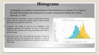
A histogram isa graphical representation of the distribution of a dataset. It is a type of
bar chart that displays the frequencies or counts of data points falling into various
intervals, or "bins."
Bins or Intervals: The range of values is divided into intervals,
or bins. Each bin represents a specific range of values, and the
data points are grouped into these bins.
Frequency: The height of each bar (or rectangle) in the
histogram represents the frequency or count of data points
within that bin. It shows how many data points fall within a
particular range.
X-axis and Y-axis: The x-axis represents the range of values (or
intervals), and the y-axis represents the frequency or count of
data points. The bars are typically drawn adjacent to each other
with no gap.
5.
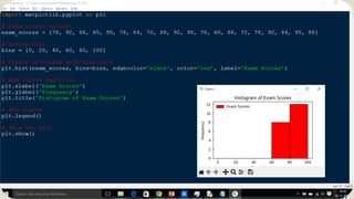
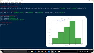
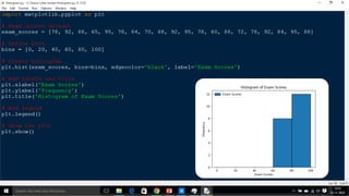
HISTOGRAMS EXAMPLE :
let'sconsider an example of exam scores for a class of students. The scores
range from 0 to 100, and we want to create a histogram to visualize the
distribution of scores.
import matplotlib.pyplot as plt
# Exam scores dataset
exam_scores = [78, 92, 88, 65, 95, 78, 84, 70, 88, 92, 95, 78, 60, 88, 72, 78, 92, 84, 95, 88]
# Define bins
bins = [0, 20, 40, 60, 80, 100]
# Create histogram
plt.hist(exam_scores, bins=bins, edgecolor='black')
# Add labels and title
plt.xlabel('Exam Scores')
plt.ylabel('Frequency')
plt.title('Histogram of Exam Scores')
# Show the plot
plt.show()
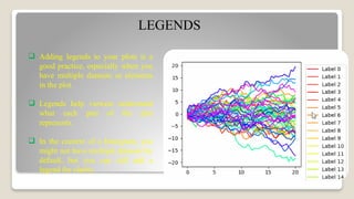
LEGENDS
Adding legendsto your plots is a
good practice, especially when you
have multiple datasets or elements
in the plot.
Legends help viewers understand
what each part of the plot
represents.
In the context of a histogram, you
might not have multiple datasets by
default, but you can still add a
legend for clarity.
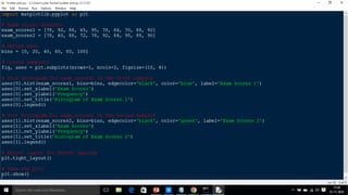
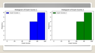
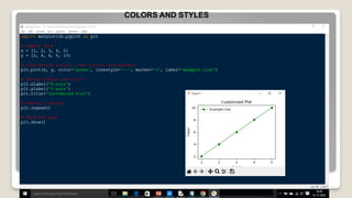
COLOURS
You canspecify colors for the bars in your
histogram by using the color parameter in the
plt.hist function.
If you want different colors for different bars or
bins, you can provide a list of colors to the color
parameter.
colors = ['red', 'green', 'blue', 'orange', 'purple']
plt.hist(exam_scores, bins=bins,
edgecolor='black', color=colors, label='Exam
Scores')
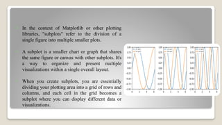
In thecontext of Matplotlib or other plotting
libraries, "subplots" refer to the division of a
single figure into multiple smaller plots.
A subplot is a smaller chart or graph that shares
the same figure or canvas with other subplots. It's
a way to organize and present multiple
visualizations within a single overall layout.
When you create subplots, you are essentially
dividing your plotting area into a grid of rows and
columns, and each cell in the grid becomes a
subplot where you can display different data or
visualizations.
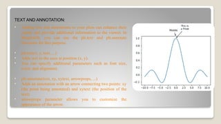
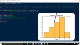
TEXT AND ANNOTATION:
•Adding text and annotations to your plots can enhance their
clarity and provide additional information to the viewer. In
Matplotlib, you can use the plt.text and plt.annotate
functions for this purpose.
• plt.text(x, y, text, ...)
• Adds text to the axes at position (x, y).
• You can specify additional parameters such as font size,
color, and alignment.
• plt.annotate(text, xy, xytext, arrowprops, ...)
• Adds an annotation with an arrow connecting two points: xy
(the point being annotated) and xytext (the position of the
text).
• arrowprops parameter allows you to customize the
appearance of the arrow.
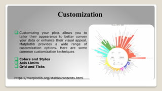
Customization
Customizing yourplots allows you to
tailor their appearance to better convey
your data or enhance their visual appeal.
Matplotlib provides a wide range of
customization options. Here are some
common customization techniques
Colors and Styles
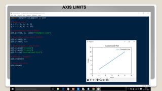
Axis Limits
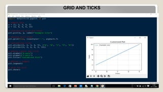
Grid and Ticks
https://matplotlib.org/stable/contents.html
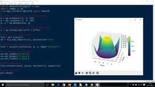
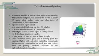
Three dimensional plotting
Matplotlib provides a toolkit called mplot3d for creating
three-dimensional plots. You can use this toolkit to create
3D scatter plots, surface plots, and other types of
visualizations in three dimensions.
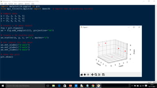
fig is the overall figure object.
ax is a subplot of the figure, but it's a 3D subplot.
ax.scatter is used to create a 3D scatter plot.
np.meshgrid is used to create a grid of x and y values.
z is defined as a function of x and y.
ax.plot_surface is used to create a 3D surface plot
These examples should give you a starting point for
creating 3D plots with Matplotlib. Depending on your data
and the type of visualization you need, you may explore
other 3D plotting functions available in the
mpl_toolkits.mplot3d module..
![HISTOGRAMS EXAMPLE :
let's consider an example of exam scores for a class of students. The scores
range from 0 to 100, and we want to create a histogram to visualize the
distribution of scores.
import matplotlib.pyplot as plt
# Exam scores dataset
exam_scores = [78, 92, 88, 65, 95, 78, 84, 70, 88, 92, 95, 78, 60, 88, 72, 78, 92, 84, 95, 88]
# Define bins
bins = [0, 20, 40, 60, 80, 100]
# Create histogram
plt.hist(exam_scores, bins=bins, edgecolor='black')
# Add labels and title
plt.xlabel('Exam Scores')
plt.ylabel('Frequency')
plt.title('Histogram of Exam Scores')
# Show the plot
plt.show()](https://image.slidesharecdn.com/ppt-251208094938-e7e608c4/85/DATA-EXPLORATION-AND-VISUALIZATION-INIT-II-5-320.jpg)

![COLOURS
You can specify colors for the bars in your
histogram by using the color parameter in the
plt.hist function.
If you want different colors for different bars or
bins, you can provide a list of colors to the color
parameter.
colors = ['red', 'green', 'blue', 'orange', 'purple']
plt.hist(exam_scores, bins=bins,
edgecolor='black', color=colors, label='Exam
Scores')](https://image.slidesharecdn.com/ppt-251208094938-e7e608c4/85/DATA-EXPLORATION-AND-VISUALIZATION-INIT-II-10-320.jpg)