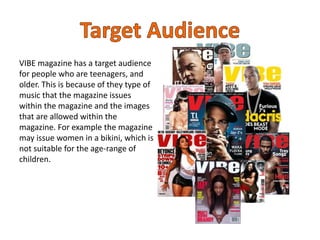
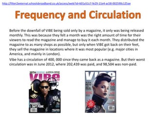
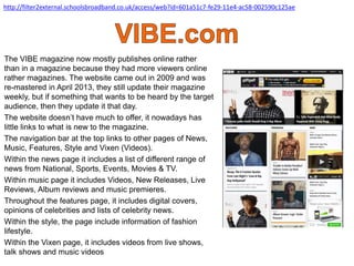
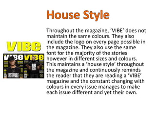
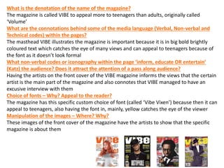
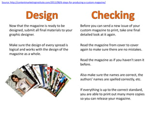
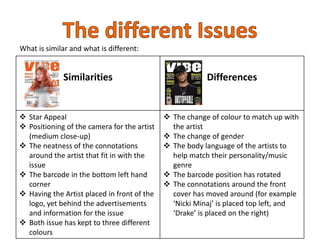
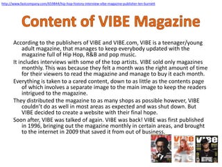
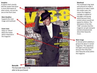
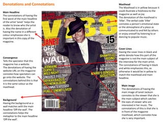
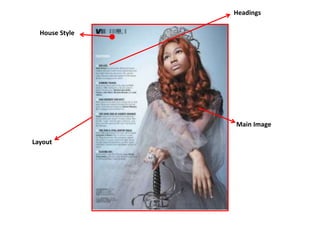
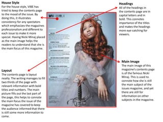
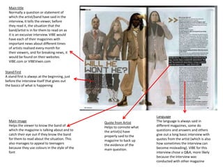
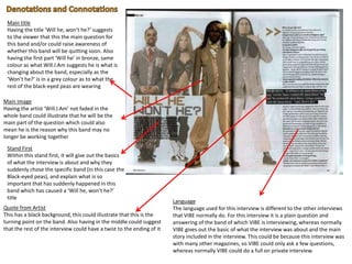
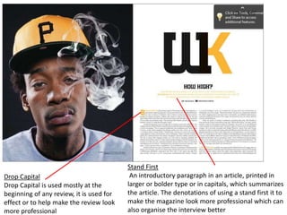
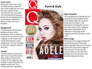
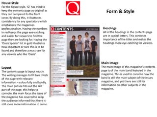
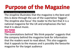
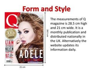
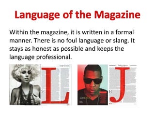
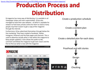
This document provides details about planning and pitching a print-based media product. It includes slides describing VIBE magazine, its target audience, genres covered, publisher SpinMedia, frequency and circulation. It discusses the magazine's brand ideology, website, house style, production process, and content planning. Examples of covers, contents pages, and spreads from VIBE and Q magazines are analyzed. The production process for the magazine is summarized in 6 steps: creating a production schedule, content plan, detailed plans for stories, proofreading, design, and final checking.
WHO ARE THE MAIN BLOGGERS AND CONTENT PRODUCERS ON PLUS SIZE FASHION AND BEAUTY ON FACEBOOK?
The study applies a methodology developed by IBPAD about the references universe for a specific segment, with the aim of understanding multi-dimensionally who leads content production on the platform.
WHO ARE THE MAIN BLOGGERS AND CONTENT PRODUCERS ON PLUS SIZE FASHION AND BEAUTY ON FACEBOOK?
The study applies a methodology developed by IBPAD about the references universe for a specific segment, with the aim of understanding multi-dimensionally who leads content production on the platform.
A Strategic Approach: GenAI in EducationPeter Windle
Artificial Intelligence (AI) technologies such as Generative AI, Image Generators and Large Language Models have had a dramatic impact on teaching, learning and assessment over the past 18 months. The most immediate threat AI posed was to Academic Integrity with Higher Education Institutes (HEIs) focusing their efforts on combating the use of GenAI in assessment. Guidelines were developed for staff and students, policies put in place too. Innovative educators have forged paths in the use of Generative AI for teaching, learning and assessments leading to pockets of transformation springing up across HEIs, often with little or no top-down guidance, support or direction.
This Gasta posits a strategic approach to integrating AI into HEIs to prepare staff, students and the curriculum for an evolving world and workplace. We will highlight the advantages of working with these technologies beyond the realm of teaching, learning and assessment by considering prompt engineering skills, industry impact, curriculum changes, and the need for staff upskilling. In contrast, not engaging strategically with Generative AI poses risks, including falling behind peers, missed opportunities and failing to ensure our graduates remain employable. The rapid evolution of AI technologies necessitates a proactive and strategic approach if we are to remain relevant.
The Roman Empire A Historical Colossus.pdfkaushalkr1407
The Roman Empire, a vast and enduring power, stands as one of history's most remarkable civilizations, leaving an indelible imprint on the world. It emerged from the Roman Republic, transitioning into an imperial powerhouse under the leadership of Augustus Caesar in 27 BCE. This transformation marked the beginning of an era defined by unprecedented territorial expansion, architectural marvels, and profound cultural influence.
The empire's roots lie in the city of Rome, founded, according to legend, by Romulus in 753 BCE. Over centuries, Rome evolved from a small settlement to a formidable republic, characterized by a complex political system with elected officials and checks on power. However, internal strife, class conflicts, and military ambitions paved the way for the end of the Republic. Julius Caesar’s dictatorship and subsequent assassination in 44 BCE created a power vacuum, leading to a civil war. Octavian, later Augustus, emerged victorious, heralding the Roman Empire’s birth.
Under Augustus, the empire experienced the Pax Romana, a 200-year period of relative peace and stability. Augustus reformed the military, established efficient administrative systems, and initiated grand construction projects. The empire's borders expanded, encompassing territories from Britain to Egypt and from Spain to the Euphrates. Roman legions, renowned for their discipline and engineering prowess, secured and maintained these vast territories, building roads, fortifications, and cities that facilitated control and integration.
The Roman Empire’s society was hierarchical, with a rigid class system. At the top were the patricians, wealthy elites who held significant political power. Below them were the plebeians, free citizens with limited political influence, and the vast numbers of slaves who formed the backbone of the economy. The family unit was central, governed by the paterfamilias, the male head who held absolute authority.
Culturally, the Romans were eclectic, absorbing and adapting elements from the civilizations they encountered, particularly the Greeks. Roman art, literature, and philosophy reflected this synthesis, creating a rich cultural tapestry. Latin, the Roman language, became the lingua franca of the Western world, influencing numerous modern languages.
Roman architecture and engineering achievements were monumental. They perfected the arch, vault, and dome, constructing enduring structures like the Colosseum, Pantheon, and aqueducts. These engineering marvels not only showcased Roman ingenuity but also served practical purposes, from public entertainment to water supply.
Read| The latest issue of The Challenger is here! We are thrilled to announce that our school paper has qualified for the NATIONAL SCHOOLS PRESS CONFERENCE (NSPC) 2024. Thank you for your unwavering support and trust. Dive into the stories that made us stand out!
2024.06.01 Introducing a competency framework for languag learning materials ...Sandy Millin
http://sandymillin.wordpress.com/iateflwebinar2024
Published classroom materials form the basis of syllabuses, drive teacher professional development, and have a potentially huge influence on learners, teachers and education systems. All teachers also create their own materials, whether a few sentences on a blackboard, a highly-structured fully-realised online course, or anything in between. Despite this, the knowledge and skills needed to create effective language learning materials are rarely part of teacher training, and are mostly learnt by trial and error.
Knowledge and skills frameworks, generally called competency frameworks, for ELT teachers, trainers and managers have existed for a few years now. However, until I created one for my MA dissertation, there wasn’t one drawing together what we need to know and do to be able to effectively produce language learning materials.
This webinar will introduce you to my framework, highlighting the key competencies I identified from my research. It will also show how anybody involved in language teaching (any language, not just English!), teacher training, managing schools or developing language learning materials can benefit from using the framework.
Francesca Gottschalk - How can education support child empowerment.pptxEduSkills OECD
Francesca Gottschalk from the OECD’s Centre for Educational Research and Innovation presents at the Ask an Expert Webinar: How can education support child empowerment?
Introduction to AI for Nonprofits with Tapp NetworkTechSoup
Dive into the world of AI! Experts Jon Hill and Tareq Monaur will guide you through AI's role in enhancing nonprofit websites and basic marketing strategies, making it easy to understand and apply.
How to Make a Field invisible in Odoo 17Celine George
It is possible to hide or invisible some fields in odoo. Commonly using “invisible” attribute in the field definition to invisible the fields. This slide will show how to make a field invisible in odoo 17.
Welcome to TechSoup New Member Orientation and Q&A (May 2024).pdfTechSoup
In this webinar you will learn how your organization can access TechSoup's wide variety of product discount and donation programs. From hardware to software, we'll give you a tour of the tools available to help your nonprofit with productivity, collaboration, financial management, donor tracking, security, and more.
1. OCR –
Level 3 Cambridge Introductory Diploma in
Media
Unit 13:
Planning and Pitching a Print based Media
Product
P1 Evidence
Name: Tom Evenden
Candidate Number: 2048
Center Name: St. Andrew’s Catholic School
Center Number: 64135
Set Brief - Print
Project/Brief –
Music Magazine & Promotion
2. Slide 3 … LO1
Slide 4 … VIBE Magazine
Slide 5 …Target Audience
Slide 6 …Genre
Slide 7 …SpinMedia
Slide 8 …Frequency and Circulation
Slide 9 … Brand Ideology/Ethos
Slide 10 …VIBE.com
Slide 11 …House Style
Slide 12 …VIBE
Slide 13 …Production Process
Slide 14 …Create a Production Schedule
Slide 15 …Create a content plan
Slide 16 …Create a detailed plan for each story
Slide 17 …Proofread and Edit Stories
Slide 18 …Design & Checking
Slide 19 …The different Issues
Slide 20 … Content of VIBE Magazine
Slide 21 …VIBE Front Cover Analysis
Slide 22 …VIBE Front Cover Analysis - Continued
Slide 23 …VIBE Contents Page
Slide 24 …VIBE Contents Page - Continued
Slide 25 …VIBE DPS Analysis
Slide 26 …VIBE DPS Analysis – Continued Part 1
Slide 27 …VIBE DPS Analysis – Continued Part 2
Slide 28 … Q Magazine
Slide 29 …Q Magazine Front Cover
Slide 30 …Q Magazine Contents Page
Slide 31 …Q Magazine DPS Analysis
Slide 32 …Purpose of Q Magazine
Slide 33 … House Style
Slide 34 …Form and Style
Slide 35 …Language of the Magazine
Slide 36 …Content of the Magazine
Slide 37 … Genre
Slide 38 … Production Process and Distribution
Slide 39 … Frequency
Slide 40 … Katz’ Uses & Gratifications
Slide 41 … Maslow’s Hierarchy of Needs
Slide 42 … Demographics
3.
4.
5. VIBE magazine has a target audience
for people who are teenagers, and
older. This is because of they type of
music that the magazine issues
within the magazine and the images
that are allowed within the
magazine. For example the magazine
may issue women in a bikini, which is
not suitable for the age-range of
children.
6. VIBE has a range of different genres. These genres are
covered within each issue of the magazine, sometimes the
magazine also does an issue per genre. VIBE magazine has
decided it to cover the genres of Hip Hop, R&B and pop
music. This is because they feel that this can relate to their
target audience of teenagers who have mostly found theses
genres to be most popular. By choosing some of the most
popular genres, VIBE can sell more magazines to the public.
7. SpinMedia, founded by Anthony Batt, are
the new publishers of VIBE. They became
publishers of VIBE on 25th April 2013 – the
same date when VIBE came back to the
magazine.
SpinMedia is one of the most trustworthy
music publishers in the world. It looks after
another 8 music magazines where they
advertise their sites and what they are
about on their site. In 2009, SpinMedia
managed to raise 12.5 Million dollars
through the help and support it gives to
their customers – as well as their own
personal magazine (Spin Magazine).
SpinMedia has their own website as well.
On their site, the public are able to visit
VIBE’s website (circled).
SpinMedia is also different to many other
publishers because it doesn’t have a slogan.
http://www.spinmedia.com/#music
8. Before the downfall of VIBE being sold only by a magazine, it only was being released
monthly. This was because they felt a month was the right amount of time for their
viewers to read the magazine and manage to buy it each month. They distributed the
magazine to as many shops as possible, but only when VIBE got back on their feet,
they sell the magazine in locations where it was most popular (e.g. major cities in
America, and mainly in London).
Vibe has a circulation of 400, 000 since they came back as a magazine. But their worst
circulation was in June 2012, where 202,439 was paid, and 98,504 was non-paid.
http://filter2external.schoolsbroadband.co.uk/access/web?id=601a51c7-fe29-11e4-ac58-002590c125ae
9. VIBE was launched in 1993 in a co-
partnership with Time Inc. as a global,
monthly released, magazine with the
name VIBE was put to appeal more for
teenagers.
In 2003 VIBE was launched onto
television for more publicity and then in
2005 VIBE added in a gossip column at
the back of the magazine for it to appeal
to women, giving VIBE an audience of
50.5% male, and 49.5% female.
Soon after, in 2009, VIBE shut down
because manufacturing the magazine
cost too much, and the founder, Quincy
Jones, moved VIBE to the internet in
hope that the magazine may son return.
In 2012 an investment fund called
InterMedia Partners, saw VIBE as a
website and moved it back to a magazine
but chose to sell it in places where it was
mostly sold before shutting down in
2009. VIBE once again got more and
more popular, in 2013 SpinMedia
became the new publishers of VIBE,
adding Uptown, BlackBook Media to the
company which merged into VIBE Media.
On April 25th 2013, VIBE re-mastered the
website of VIBE.com and created
VIBEVixen.com.
http://www.fastcompany.com/659844/hip-hop-history-interview-vibe-magazine-publisher-len-burnett
10. The VIBE magazine now mostly publishes online rather
than in a magazine because they had more viewers online
rather magazines. The website came out in 2009 and was
re-mastered in April 2013, they still update their magazine
weekly, but if something that wants to be heard by the target
audience, then they update it that day.
The website doesn’t have much to offer, it nowadays has
little links to what is new to the magazine.
The navigation bar at the top links to other pages of News,
Music, Features, Style and Vixen (Videos).
Within the news page it includes a list of different range of
news from National, Sports, Events, Movies & TV.
Within music page it includes Videos, New Releases, Live
Reviews, Album reviews and music premieres.
Throughout the features page, it includes digital covers,
opinions of celebrities and lists of celebrity news.
Within the style, the page include information of fashion
lifestyle.
Within the Vixen page, it includes videos from live shows,
talk shows and music videos
http://filter2external.schoolsbroadband.co.uk/access/web?id=601a51c7-fe29-11e4-ac58-002590c125ae
11. Throughout the magazine, ‘VIBE’ does not
maintain the same colours. They also
include the logo on every page possible in
the magazine. They also use the same
font for the majority of the stories
however in different sizes and colours.
This maintains a ‘house style’ throughout
the magazine and continuously reminds
the reader that they are reading a ‘VIBE’
magazine and the constant changing with
colours in every issue manages to make
each issue different and yet their own.
12. What is the denotation of the name of the magazine?
The magazine is called VIBE to appeal more to teenagers than adults, originally called
‘Volume’
What are the connotations behind some of the media language (Verbal, Non-verbal and
Technical codes) within the pages?
The masthead VIBE illustrates the magazine is important because it is in big bold brightly
coloured text which catches the eye of many views and can appeal to teenagers because of
the font as it doesn’t look formal
What non-verbal codes or iconography within the page ‘inform, educate OR entertain’
(Katz) the audience? Does it attract the attention of a pass along audience?
Having the artists on the front cover of the VIBE magazine informs the views that the certain
artist is the main part of the magazine and also connotes that VIBE managed to have an
excusive interview with them
Choice of fonts – Why? Appeal to the reader?
The magazine has this specific custom choice of font (called ‘Vibe Vixen’) because then it can
appeal to teenagers, also having the font in, mainly, yellow catches the eye of the viewer
Manipulation of the images – Where? Why?
These images of the front cover of the magazine have the artists to show that the specific
magazine is about them
13. VIBE Production covers every
aspect of the production process
from early planning to execution of
an occasion, from character
creation to fully display design,
from nightlife concepts to event
marketing and product launches.
They also have a list filled with the
world’s most inspiring and
outstanding DJs, artists,
performers and stage-shows for all
types of events.
Create a production schedule
Create a content plan
Create a detailed plan for each story
Proofread and edit stories
Design
Checking
Source: http://contentmarketinginstitute.com/2011/08/6-steps-for-producing-a-custom-magazine/
14. This helps to manage the production well so you do not miss the agreed-upon
deadline for sending the magazine to the printers and your target distribution date.
The latter should be your starting point.
Create your plan going backward from that date, taking into consideration any
obstacles that may prolong the process.
You also need to leave time before the deadline so your team can proof-read
everything
Source: http://contentmarketinginstitute.com/2011/08/6-steps-for-producing-a-custom-magazine/
15. Next, you must create an editor’s table of content for all pages, including the front and
back covers. This helps to plan the content of a magazine issue and to monitor the
production process. You then need to make sure that the plan is confirmed by all the
team.
Normally, a number of pages need to be tracked and will be determined before the
content is planned in detail. Well-defined magazines already have determined the
length in the magazine well before the actual production process begins.
Furthermore, you should build your content for at least one issue ahead of your
schedule. This makes sure you are never left with an empty space if an article falls
behind and this also provides a safety net for articles that might need extra time to be
written, photographed, illustrated or designed.
Source: http://contentmarketinginstitute.com/2011/08/6-steps-for-producing-a-custom-magazine/
16. Once you’ve confirmed your overall content plan, you’ll need to make a detailed plan
for each story the magazine will cover. Your decisions must be:
The content of a story
Design mock-up
Writers of the story
Instructions for the team, so they know what they must do
Type of article/content for the story
Flat Plan
Source: http://contentmarketinginstitute.com/2011/08/6-steps-for-producing-a-custom-magazine/
17. You must proof-read your magazine before the deadline. Look out for things such as:
Headline is correct – make sure everything with the headline is 100% correct and
you are happy with all of it.
The pictures – make sure they are relevant and not misleading.
Body/content of the magazine – to make sure it is clear, readable and suitable for
your target audience.
The introduction – making sure it is short and interesting making the reader want
to read more.
Source: http://contentmarketinginstitute.com/2011/08/6-steps-for-producing-a-custom-magazine/
18. Now that the magazine is ready to be
designed, submit all final materials to your
graphic designer.
Make sure the design of every spread is
logical and works with the design of the
magazine as a whole.
Before you can send a new issue of your
custom magazine to print, take one final
detailed look at it again.
Read the magazine from cover to cover
again to make sure there are no mistakes.
Read the magazine as if you haven’t seen it
before.
Also make sure the names are correct, the
authors’ names are spelled correctly, etc.
If everything is up to the correct standard,
you are able to print out many more copies
so you can release your magazine.
Source: http://contentmarketinginstitute.com/2011/08/6-steps-for-producing-a-custom-magazine/
19. Similarities Differences
Star Appeal
Positioning of the camera for the artist
(medium close-up)
The neatness of the connotations
around the artist that fit in with the
issue
The barcode in the bottom left hand
corner
Having the Artist placed in front of the
logo, yet behind the advertisements
and information for the issue
Both issue has kept to three different
colours
The change of colour to match up with
the artist
The change of gender
The body language of the artists to
help match their personality/music
genre
The barcode position has rotated
The connotations around the front
cover has moved around (for example
‘Nicki Minaj’ is placed top left, and
‘Drake’ is placed on the right)
What is similar and what is different:
20. http://www.fastcompany.com/659844/hip-hop-history-interview-vibe-magazine-publisher-len-burnett
According to the publishers of VIBE and VIBE.com, VIBE is a teenager/young
adult magazine, that manages to keep everybody updated with the
magazine full of Hip Hop, R&B and pop music.
It includes interviews with some of the top artists. VIBE sold only magazines
monthly. This was because they felt a month was the right amount of time
for their viewers to read the magazine and manage to buy it each month.
Everything is taken to a cared content, down to as little as the contents page
of which involves a separate image to the main image to keep the readers
intrigued to the magazine.
They distributed the magazine to as many shops as possible however, VIBE
couldn’t do as well in most areas as expected and was shut down. But
VIBE decided to create a website with their final hope.
Soon after, VIBE was talked of again. VIBE was back! VIBE was first published
in 1996, bringing out the magazine monthly in certain areas, and brought
to the internet in 2009 that saved it from out of business.
21. Masthead
The masthead is big, bold
and colourful to make it
stand out to make it catch
the readers eyes, this
means the magazine
manages to appeal to
teenagers and young
adults because these
certain colours would not
appeal to children. The
denotation of the title
‘VIBE’ connotes that this
magazine can get everyone
excited and passionate
about their favourite
music.
Main Headline
Supports the main
image and masthead
Main image
To denote which celebrity is
going to be about in certain
magazines. This appeals to
teenagers and young adult
because then they have
their favourite artists within
the magazine
Barcode
The barcode helps to be
able to be purchased
Cover Lines
Helps to ‘inform’
(Katz) the reader
what is featured in
the magazine
Strapline
A caption that’s shortly
tells the viewer that there
is more information of
other artists, not just the
one on the front cover
22. Masthead
The Masthead is in yellow because it
could illustrate a freshness to the
magazine as well as joy
The denotation of the masthead is
'Vibe'. The verbal code 'Vibe'
connotes a person's emotional state
or the atmosphere of a place as
communicated to and felt by others
or enjoy oneself by listening to or
dancing to popular music.
Main Headline
The connotations of having the
first word of the main headline
of the artist ‘Janet’ helps the
reader to know who the artist
is. Also the denotation of
having the name in a different
colour emphasizes she is
important in this copy of the
magazine.
Main image
The denotations of having the
main image of Janet Jackson
connotes to the viewer that she is
the main subject which catches
the eyes of viewer who are
interested in her music. The
connotations of this is that she is
in front of the magazine
masthead, which connotes how
she is very important.
Background
Having the background as a
wall matches with the main
headline ‘Off the wall’. The
connotations helps the
metaphor to the main headline
‘Off the wall’.
Denotations and Connotations
Convergence
Tells the spectator that this
magazine has a website.
The denotations of having the
website URL on the magazine
connotes how spectators can
go onto the website. The
connotations behind this is that
it is the same colour as the
masthead.
Cover Lines
Having the cover lines in black and
white denote how this part of the
magazine is not the main subject of
the interview for the main artist.
The connotations of having in black
and white emphasizes this, as
otherwise it would be in yellow to
match the masthead and main
headline.
24. House Style
For the house style, VIBE has
tried to keep the contents page
to the mood of the issue. By
doing this, it illustrates
consistency for any spectators
which emphasizes the magazines
professionalism and different to
each issue to make it more
special. Having Nicki Minaj placed
as the main image helps the
readers to understand that she is
the main focus of this magazine.
Headings
All of the headings in
the contents page are in
capital letters and in
bold. This connotes
importance of the titles
and makes the headings
more eye-catching for
viewers.
Layout
The contents page is layout
neatly. The writing manages to fill
two thirds of the page with
relevant information with bold
titles and numbers. The main
picture fills out the last part of
the page, this helps to connote
the main focus the issue of the
magazine has covered to keep
the audience informed that there
is still some more information to
come.
Main Image
The main image of this
magazine’s contents page
is of the famous Nicki
Minaj. This is used to
connote how she is still
the main subject of the
issues magazine, and yet
there are still for
information on other
subjects in the magazine.
25. Main title
Normally a question or statement of
which the artist/band have said in the
interview, it tells the viewer, before
they read it, the situation that the
band/artist is in for them to read on as
it is an excusive interview. VIBE would
have each of their magazines with
important news about different times
of artists realised every month for
their viewers, and for breaking news, it
would be found on their websites
VIBE.com or VIBEVixen.com
Main image
Helps the viewer to know the band of
which the magazine is talking about and to
catch their eye out if they know the band
for them to read about the situation. This
also manages to appeal to teenagers
because they use colours in the style of the
font
Quote from Artist
Helps to connote what
the artist(s) have
properly said to the
magazine to back up
the evidence of the
main question.
Stand First
A stand first is always at the beginning, just
before the interview itself that gives out
the basics of what is happening
Language
The language is always said in
different magazines, some do
questions and answers and others
give out a long basic interview with
quotes from the artist (which is also
how sometimes the interview can
become misleading). VIBE for this
interview chose a Q&A, more likely
because the interview was
conducted with other magazine
26. Main title
Having the title ‘Will he, won’t he?’ suggests
to the viewer that this the main question for
this band and/or could raise awareness of
whether this band will be quitting soon. Also
having the first part ‘Will he’ in bronze, same
colour as what Will.I.Am suggests he is what is
changing about the band, especially as the
‘Won’t he?’ is in a grey colour as to what the
rest of the black-eyed peas are wearing
Main image
Having the artist ‘Will.I.Am’ not faded in the
whole band could illustrate that he will be the
main part of the question which could also
mean he is the reason why this band may no
longer be working together
Quote from Artist
This has a black background, this could illustrate that this is the
turning point on the band. Also having in the middle could suggest
that the rest of the interview could have a twist to the ending of it
Language
The language used for this interview is different to the other interviews
that VIBE normally do. For this interview it is a plain question and
answering of the band of which VIBE is interviewing, whereas normally
VIBE gives out the basic of what the interview was about and the main
story included in the interview. This could be because this interview was
with many other magazines, so VIBE could only ask a few questions,
whereas normally VIBE could do a full on private interview.
Stand First
Within this stand first, it will give out the basics
of what the interview is about and why they
suddenly chose the specific band (in this case the
Black-eyed peas), and explain what is so
important that has suddenly happened in this
band which has caused a ‘Will he, won’t he?’
title
27. Drop Capital
Drop Capital is used mostly at the
beginning of any review, it is used for
effect or to help make the review look
more professional
Stand First
An introductory paragraph in an article, printed in
larger or bolder type or in capitals, which summarizes
the article. The denotations of using a stand first it to
make the magazine look more professional which can
also organise the interview better
28.
29. Main Headline
The connotations of having the first
word of the main headline of the
artist ‘Adele’ helps the reader to
know who the artist is. The
denotation of having the name in
the same colour as the magazine
logo colour emphasizes she is
important in this copy of the
magazine and the main focus of the
issue
Main Image
Having the main image of Adele fill
up two thirds of the front cover
helps emphasize that she is the main
story of the issue of the magazine.
Also using her to look into the
camera makes it seem like she is
looking out to the spectator and
therefore directed to them.
Cover Lines
Having the cover lines in red
and black denotes how this
part of the magazine, but is not
the main subject of the
interview for the main artist.
The connotations of having in
black and red emphasizes this,
as otherwise it would be in
white to match the main
headline.
Background
The denotation of having the
background plain white
emphasizes more to Adele to
make her the main focus of the
magazine so the viewers will
not be distracted by a fancy
background. This also manages
to keep the magazine original
and neat.
Flasher
The denotation of using ‘The
300th Issue’ across the side of
page helps to illustrate the
success of the magazine, also
having it in gold illustrates the
golden moment for ‘Q’ an
emphasises their celebration.
Form & Style
30. House Style
For the house style, ‘Q’ has tried to
keep the contents page as original as
they can compared to the front
cover. By doing this, it illustrates
consistency for any spectators which
emphasizes the magazines
professionalism. Having the numbers
in red keeps the page eye-catching
and easier for viewers to find the
page they are looking for. Having the
‘Oasis Special’ list in gold illustrates
how important or rare this is to be
found and therefore a must-see for
any viewers who like ‘Oasis’.
Headings
All of the headings in the contents page
are in capital letters. This connotes
importance of the titles and makes the
headings more eye-catching for viewers.
Layout
The contents page is layout neatly.
The writing manages to fill two thirds
of the page with relevant
information – colourfully and boldly.
The main picture fills out the last
part of the page, this helps to
connote the main focus the issue of
the magazine has covered to keep
the audience informed that there is
still some more information to come.
Main Image
The main image of this magazine’s contents
page is of the main band featured in the
magazine. This is used to connote how the
band is still the main subject of the issues
magazine, and yet there are still for
information on other subjects in the
magazine.
Form & Style
31. Drop Capital
The drop capital takes over 5 lines which is used follow conventions and to make
the page look more interesting. The font of each drop capital letter is in the same
font as the Masthead, this makes the article more eye-catching.
Main Image
On the left, the
picture of Lady
Gaga fills out
the entire page.
This illustrates
how she is the
main attraction
of this issue of
the magazine.
The fact of
having her
picture in black
and white helps
reflects how
artistic and
different Lady
Gaga is
compared to
other music
artists
Masthead
This double page
spread does not
have an official
Masthead apart
from using Lady
Gaga’s name in
the top right hand
corner. Within
the masthead,
‘Gaga’ is all in
caps, this is
because the it
manages to stand
out the name of
‘Lady Gaga’
better. Also the
use of the ‘L’
across the right
hand side of the
page, this conveys
how this is the
main article
because it is in
the same colour
and style as Q’s
logo.
Layout
The layout is conveyed with having Lady Gaga on the left and the article on the right. Having
the picture of Gaga on the left, filling the entire page, illustrates how she is the main focus of
the magazine. Having the article on the right in three columns helps emphasize how into
detail Q magazine has gone for into this interview, and the ‘L’ as a background matches up
with the logo of Q which also emphasizes how this is the main article.
Form & Style
32. The strapline illustrates that the magazine is the best and
this is done through the use of the superlative ‘biggest’.
The strapline also focus’ the reader to the fact that it is a
national magazine for the UK and emphasises the fact
that it is about music.
The connotations behind ‘We think popular’ suggests that
the company behind the magazine look for information
that the readers want to read about. This also suggests
that it appeals to the masses and is possibly the favourite
magazine for the target audience
33. Throughout the magazine, Q
maintains the same colours of red,
and black. They also include
the logo on every page possible in the
magazine. They also use the same
font for the majority of the stories.
This maintains a ‘house style’
throughout the magazine and
continuously reminds the reader that
they are reading a ‘Q’ magazine
34. The measurements of Q
magazine is 28.5 cm high
and 21 cm wide. It is a
monthly publication and
distributed nationally in
the UK. Alternatively the
website updates its
information daily.
28.5cm
21 cm
35. Within the magazine, it is written in a formal
manner. There is no foul language or slang. It
stays as honest as possible and keeps the
language professional.
36. Q is the legendary monthly magazine which celebrates everything
that’s great in rock and pop.
It launched in 1986 building an international reputation for quality
amongst fans, stars and the music industry. With world-beating
exclusives, definitive album reviews, outstanding production values
and an inimitable sense of humour, top form photographers and
photos, Q shapes music in the UK and beyond. Every month the
magazine creates new stars and categorizes what’s coming next. The
interviews and pictures are taken to the highest quality specifically to
the readers, down to the quality of the contents – with clearly stated
information and images. With Q’s online establishment, a new
interactive iPad edition, social media, Q Radio, live events and of
course the world famous annual Q Awards – the most exclusive event
in the music calendar – the message is everywhere.
http://magazines.bauermediaadvertising.com/magazines/detail/Q
37. Q Magazine likes to keep their genre between the two most
popular music genre of todays society – Rock and Pop.
This is used to keep up with the trend of how the magazine sees
what type of music their target audience listen to.
This is because they feel that this can relate to their target
audience of teenagers who have mostly found theses genres to
be most popular. By choosing the most popular genres, Q is able
to sell more magazines to the public, and is one of the reasons
why Q Magazine has become one of the most popular magazines
of the UK.
38. Q magazine has many way of distributing. It is available in all
newspaper shops and main supermarkets. Q has also
managed to have their own website – of which is available for
viewers to find many articles online for them to read as many
people may find it easier to get a copy of the magazine
through the internet.
Furthermore, Q has advertised themselves through below the
line marketing. They have created a Facebook, Twitter,
Instagram, Pinterest and YouTube pages and channels. This is
used to advertise socially what is new within the magazine to
keep people updated, it also allows the public to like,
comment and follow the magazine to get even closer and the
first to find out what is new with the magazine
Create a production schedule
Create a content plan
Create a detailed plan for each story
Proofread and edit stories
Design
Checking
Source: http://contentmarketinginstitute.com/2011/08/6-steps-for-producing-a-custom-magazine/
39. HOW often is the magazine published?
Q magazine is published monthly in the UK to the public.
Circulation – 48, 353 (Jan – Jun’14)
Readership – 339, 000 (Jan – Dec’13)
http://magazines.bauermediaadvertising.com/magazines/detail/Q
40. Katz theory is about relevant events and conditions in immediate surroundings,
society and the world and/or seeking advice on practical matters or opinion and
decision choices.
This links to VIBE because it includes all types of information about music around the
world on what is new in the music industry. This will inform and educate the audience
to keep them updated about what is going on around the world within music.
However, VIBE diverts from any sort of information not relevant to music, this is
important because it manages to keep up the fact how this magazine is for music
purposes only.
On some levels this also related to Q because they include al relevant information on
music, but they sometimes take it to the next level with some information not relevant
to music but still provides the right information – this could be the reasons to why Q
magazine is the UK’s number 1 magazine.
http://www.slideshare.net/zlorhenley/uses-and-gratifications-theory-6933502
41. Successful marketing persuades a prospective client to purchase the product or
service you are selling.
This links to VIBE magazine because VIBE persuades the target audience that it is
better than the other magazines. For example VIBE has there own online page through
social media, for example they have a Facebook page. This is an example of below the
line marketing. They use this idea for marketing my magazine because it is not only
cheaper, but the newer and more efficient way for marketing as it keeps to what their
target audience will use.
This also links to Q magazine because it can allow the magazine to stand out more. For
example they also have their own Facebook page as Facebook is now starting to grab
the attention of older viewers than younger. This type of social media can also be the
start of many ways how they can market their magazine.
http://www.simplypsychology.org/maslow.html
42. Demographic segmentation consists of dividing the market into groups
based on variables such as age, gender family size, religion, race and
nationality.
This relates to VIBE magazine because their target audience has a age
(13+), gender (male and female) along with suitable religion, race and
nationality (any).
This also relates to Q because of the same reasons, they too have a
age range (18+), gender (Male and Female) with a suitable religion,
race and nationality (any). According to socio economic groups, VIBE is
aimed for people in the category ‘B’ and ‘C1’ because the class is more
around the age-range target.
http://www.abc1demographic.co.uk