OUTLINE
❖ Introduction ofVisual Perception
❖ Visual Representation of Data
❖ Data Abstraction
❖ Visual Encodings
❖ Use of Color
❖ Perceptual Issues
❖ Information Overloads
DIPESH KOIRALA 2
DATA VISUALIZATION
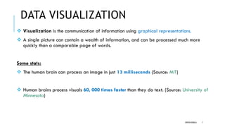
❖ Visualizationis the communication of information using graphical representations.
❖ A single picture can contain a wealth of information, and can be processed much more
quickly than a comparable page of words.
Some stats:
❖ The human brain can process an image in just 13 milliseconds (Source: MIT)
❖ Human brains process visuals 60, 000 times faster than they do text. (Source: University of
Minnesota)
DIPESH KOIRALA 7
8.
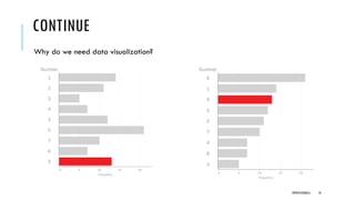
CONTINUE
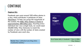
Capture this
Facebook userspost around 350 million photos in
a day, which contributes 4 petabytes of data.
(Raconteur). To help you grasp the magnitude of
this number, the Milky Way Galaxy is home to
approximately 200 billion stars. Assuming every
individual star was a single byte, we would need
20,000 Milky Way Galaxies to match the
number of stars with the number of data created
by Facebook users each day.
Source: https://piktochart.com/blog/data-
visualization-statistics/
No of bytes daily in facebook > Stars in Milky
Way Galaxy
DIPESH KOIRALA 8
CONTINUE
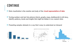
❖ Data visualizationis the creation and study of the visual representation of data
❖ Turning numbers and text into pictures (charts, graphs, maps, dashboards) to tell story,
identify patterns, trends and insights that might be hidden in raw numeric data
❖ Presenting complex datasets in a way that is easy to understand an interpret
DIPESH KOIRALA 11
12.
CONTINUE
What makes aneffective data visualization?
❖It has clear purpose and message
Complements and enhances the text
❖It is easy to interpret
Note: A good figure is like a joke, if you have to explain it, it’s not that good.
❖It accurately reflects the data.
DIPESH KOIRALA 12
13.
CONTINUE
Benefits:
❖ Simplify Complexity: Make large or intricate datasets digestible and less intimidating.
❖ Identify patterns and trends : Easily spot relationships, correlations, and shifts over time.
❖ Reveal Insights : Uncover hidden information that might not be obvious in tables.
❖ Communicate Effectively : Convey findings and conclusions to various audiences,
including non-technical stakeholders.
❖ Support Decision-Making: Provide a clear basis for informed actions and strategies.
DIPESH KOIRALA 13
14.
INTRODUCTION TO VISUALPERCEPTION
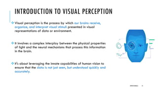
❖Visual perception is the process by which our brains receive,
organize, and interpret visual stimuli presented in visual
representations of data or environment.
❖It involves a complex interplay between the physical properties
of light and the neural mechanisms that process this information
in the brain.
❖It's about leveraging the innate capabilities of human vision to
ensure that the data is not just seen, but understood quickly and
accurately.
DIPESH KOIRALA 14
15.
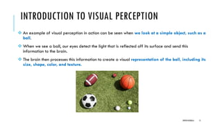
INTRODUCTION TO VISUALPERCEPTION
❖ An example of visual perception in action can be seen when we look at a simple object, such as a
ball.
❖ When we see a ball, our eyes detect the light that is reflected off its surface and send this
information to the brain.
❖ The brain then processes this information to create a visual representation of the ball, including its
size, shape, color, and texture.
DIPESH KOIRALA 15
16.
INTRODUCTION TO VISUALPERCEPTION
❖Perception is studied to better control the presentations of data and eventually to
utilize or exploit human perception.
❖Not paying attention to perception will lead to problems in visualization.
❖How do we know that our visual representations are not interpreted differently by
different viewers?
❖How can we be sure that the data we present is understood?
DIPESH KOIRALA 16
17.
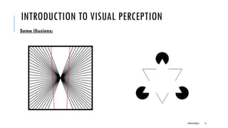
INTRODUCTION TO VISUALPERCEPTION
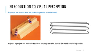
How can we be sure that the data we present is understood?
Figures highlight our inability to notice visual problems except on more detailed perusal.
DIPESH KOIRALA 17
18.
INTRODUCTION TO VISUALPERCEPTION
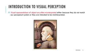
❖ Visual representations of object are often misinterpreted either because they do not match
our perceptual system or they are intended to be misinterpreted.
DIPESH KOIRALA 18
INTRODUCTION TO VISUALPERCEPTION
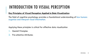
Key Principles of Visual Perception Applied to Data Visualization
The field of cognitive psychology provides a foundational understanding of how humans
organize and interpret visual information.
Applying these principles is critical for effective data visualization
1. Gestalt Principles
2. Pre-attentive Attributes
DIPESH KOIRALA 20
21.
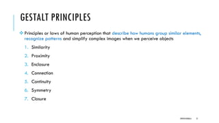
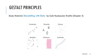
GESTALT PRINCIPLES
❖Principles orlaws of human perception that describe how humans group similar elements,
recognize patterns and simplify complex images when we perceive objects
1. Similarity
2. Proximity
3. Enclosure
4. Connection
5. Continuity
6. Symmetry
7. Closure
DIPESH KOIRALA 21
22.
GESTALT PRINCIPLES
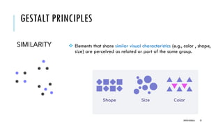
❖ Elementsthat share similar visual characteristics (e.g., color , shape,
size) are perceived as related or part of the same group.
DIPESH KOIRALA 22
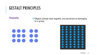
GESTALT PRINCIPLES
Enclosure
❖Objects thatare physically enclosed together are thought as belonging to part of a group.
❖It doesn’t take a very strong enclosure to do this: light background shading is often enough
DIPESH KOIRALA 24
25.
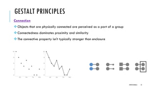
GESTALT PRINCIPLES
Connection
❖Objects thatare physically connected are perceived as a part of a group
❖Connectedness dominates proximity and similarity
❖The connective property isn’t typically stronger than enclosure
DIPESH KOIRALA 25
26.
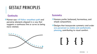
GESTALT PRINCIPLES
Continuity
❖Human eyewill follow smoothest path and
perceive elements aligned in a way that
suggests a continuous line or curve as being
more related.
Symmetry
❖Humans prefer balanced, harmonious, and
simple compositions.
❖Designs that incorporate symmetry and order
are perceived as stable and aesthetically
pleasing, contributing to visual comfort.
DIPESH KOIRALA 26
27.
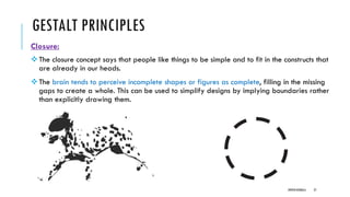
GESTALT PRINCIPLES
Closure:
❖The closureconcept says that people like things to be simple and to fit in the constructs that
are already in our heads.
❖The brain tends to perceive incomplete shapes or figures as complete, filling in the missing
gaps to create a whole. This can be used to simplify designs by implying boundaries rather
than explicitly drawing them.
DIPESH KOIRALA 27
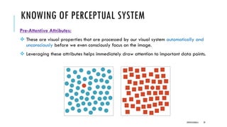
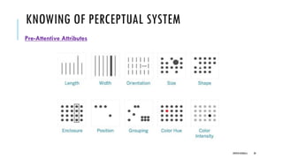
KNOWING OF PERCEPTUALSYSTEM
Pre-Attentive Attributes:
❖ These are visual properties that are processed by our visual system automatically and
unconsciously before we even consciously focus on the image.
❖ Leveraging these attributes helps immediately draw attention to important data points.
DIPESH KOIRALA 29
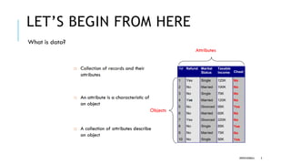
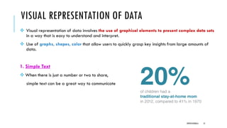
VISUAL REPRESENTATION OFDATA
❖ Visual representation of data involves the use of graphical elements to present complex data sets
in a way that is easy to understand and interpret.
❖ Use of graphs, shapes, color that allow users to quickly grasp key insights from large amounts of
data.
1. Simple Text
❖ When there is just a number or two to share,
simple text can be a great way to communicate
DIPESH KOIRALA 31
32.
VISUAL REPRESENTATION OFDATA
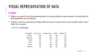
2. Tables
❖ Tables are great for just that-communicating to a mixed audience whose members will each look for
their particular row of interest.
❖ If there is need to communicate multiple different units of measure, this is also typically easier with a
table than a graph.
Variation: Heatmap
DIPESH KOIRALA 32
33.
VISUAL REPRESENTATION OFDATA
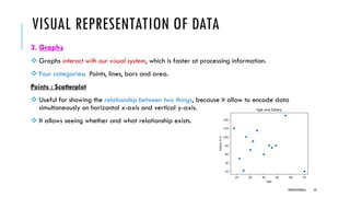
3. Graphs
❖ Graphs interact with our visual system, which is faster at processing information.
❖ Four categories: Points, lines, bars and area.
Points : Scatterplot
❖ Useful for showing the relationship between two things, because it allow to encode data
simultaneously on horizontal x-axis and vertical y-axis.
❖ It allows seeing whether and what relationship exists.
DIPESH KOIRALA 33
34.
VISUAL REPRESENTATION OFDATA
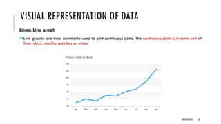
Lines: Line graph
❖Line graphs are most commonly used to plot continuous data. The continuous data is in some unit of
time: days, months, quarters or years.
DIPESH KOIRALA 34
35.
VISUAL REPRESENTATION OFDATA
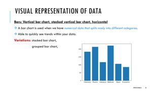
Bars: Vertical bar chart, stacked vertical bar chart, horizontal
❖ A bar chart is used when we have numerical data that splits nicely into different categories.
❖ Able to quickly see trends within your data.
Variations: stacked bar chart,
grouped bar chart,
DIPESH KOIRALA 35
36.
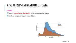
VISUAL REPRESENTATION OFDATA
4. Areas
❖ To show proportion or distribution of certain categorical group.
❖ Used less compared to point line and bars.
DIPESH KOIRALA 36
37.
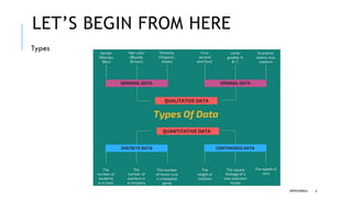
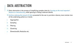
DATA ABSTRACTION
❖ Dataabstraction is the process of simplifying complex data by focusing on the most important
features or characteristics, while ignoring or hiding irrelevant details.
❖ Involves reducing the amount of data presented to the user to provide a clearer, more concise view
of the underlying patterns or trends.
i. Aggregation
ii. Sampling
iii. Filtering
iv. Clustering
v. Dimensionality Reduction etc.
DIPESH KOIRALA 37
38.
DATA ABSTRACTION
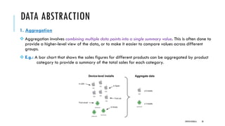
1. Aggregation
❖Aggregation involves combining multiple data points into a single summary value. This is often done to
provide a higher-level view of the data, or to make it easier to compare values across different
groups.
❖ E.g.: A bar chart that shows the sales figures for different products can be aggregated by product
category to provide a summary of the total sales for each category.
DIPESH KOIRALA 38
39.
CONTINUE
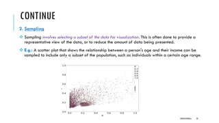
2. Sampling
❖ Samplinginvolves selecting a subset of the data for visualization. This is often done to provide a
representative view of the data, or to reduce the amount of data being presented.
❖ E.g.: A scatter plot that shows the relationship between a person's age and their income can be
sampled to include only a subset of the population, such as individuals within a certain age range.
DIPESH KOIRALA 39
40.
CONTINUE
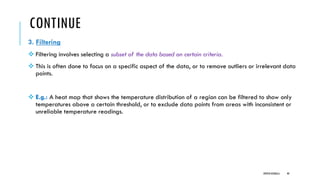
3. Filtering
❖ Filteringinvolves selecting a subset of the data based on certain criteria.
❖ This is often done to focus on a specific aspect of the data, or to remove outliers or irrelevant data
points.
❖ E.g.: A heat map that shows the temperature distribution of a region can be filtered to show only
temperatures above a certain threshold, or to exclude data points from areas with inconsistent or
unreliable temperature readings.
DIPESH KOIRALA 40
41.
CONTINUE
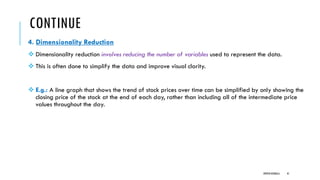
4. Dimensionality Reduction
❖Dimensionality reduction involves reducing the number of variables used to represent the data.
❖ This is often done to simplify the data and improve visual clarity.
❖ E.g.: A line graph that shows the trend of stock prices over time can be simplified by only showing the
closing price of the stock at the end of each day, rather than including all of the intermediate price
values throughout the day.
DIPESH KOIRALA 41
42.
VISUAL ENCODINGS
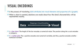
❖is theprocess of translating data attributes into visual elements and properties of a graphic.
❖When a chart is created, decisions are made about how the data's characteristics will be
represented visually.
❖ In a bar chart: The height of the bar encodes a numerical value. The position along the x-axis encodes
a category.
❖ In a scatter plot: The x-position encodes one numerical variable, and the y-position encodes another
numerical variable.
DIPESH KOIRALA 42
43.
VISUAL ENCODINGS
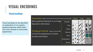
Visual encodings
Visualencodings can be described
as combination of two aspects:
graphical elements called marks
and visual channels to control their
appearance.
DIPESH KOIRALA 43
44.
VISUAL ENCODINGS
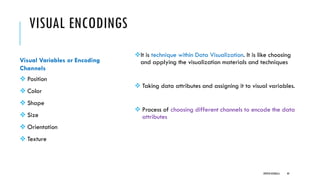
❖It istechnique within Data Visualization. It is like choosing
and applying the visualization materials and techniques
❖ Taking data attributes and assigning it to visual variables.
❖ Process of choosing different channels to encode the data
attributes
DIPESH KOIRALA 44
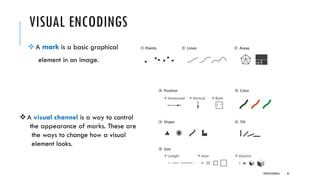
Visual Variables or Encoding
Channels
❖ Position
❖ Color
❖ Shape
❖ Size
❖ Orientation
❖ Texture
45.
VISUAL ENCODINGS
❖A markis a basic graphical
element in an image.
DIPESH KOIRALA 45
❖A visual channel is a way to control
the appearance of marks. These are
the ways to change how a visual
element looks.
46.
PRINCIPLES OF VISUALENCODINGS
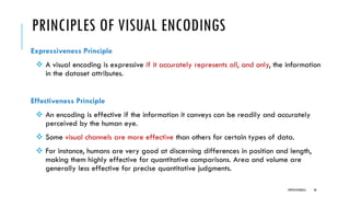
Expressiveness Principle
❖ A visual encoding is expressive if it accurately represents all, and only, the information
in the dataset attributes.
Effectiveness Principle
❖ An encoding is effective if the information it conveys can be readily and accurately
perceived by the human eye.
❖ Some visual channels are more effective than others for certain types of data.
❖ For instance, humans are very good at discerning differences in position and length,
making them highly effective for quantitative comparisons. Area and volume are
generally less effective for precise quantitative judgments.
DIPESH KOIRALA 46
47.
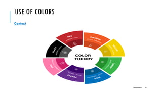
USE OF COLORS
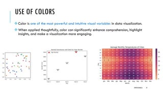
❖Color is one of the most powerful and intuitive visual variables in data visualization.
❖ When applied thoughtfully, color can significantly enhance comprehension, highlight
insights, and make a visualization more engaging.
DIPESH KOIRALA 47
48.
USE OF COLORS
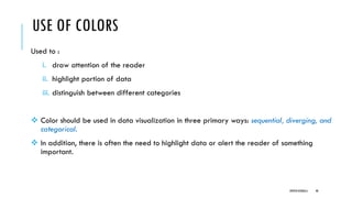
Usedto :
i. draw attention of the reader
ii. highlight portion of data
iii. distinguish between different categories
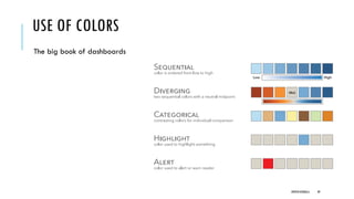
❖ Color should be used in data visualization in three primary ways: sequential, diverging, and
categorical.
❖ In addition, there is often the need to highlight data or alert the reader of something
important.
DIPESH KOIRALA 48
USE OF COLORS
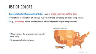
Sequentialcolor (Representing Order) : use of single color from light to dark
❖Variations in saturation of a single hue can indicate increasing or decreasing values.
❖E.g., A heatmap where darker shades of hue represent higher temperatures.
DIPESH KOIRALA 50
❖Figure shows the unemployment rate by
state using
❖A sequential color scheme.
51.
USE OF COLORS
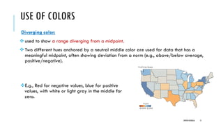
Divergingcolor:
❖used to show a range diverging from a midpoint.
❖Two different hues anchored by a neutral middle color are used for data that has a
meaningful midpoint, often showing deviation from a norm (e.g., above/below average,
positive/negative).
DIPESH KOIRALA 51
❖E.g., Red for negative values, blue for positive
values, with white or light gray in the middle for
zero.
52.
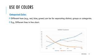
USE OF COLORS
CategoricalColor:
❖Different hues (e.g., red, blue, green) can be for separating distinct, groups or categories.
❖E.g., Different lines in line chart.
DIPESH KOIRALA 52
53.
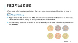
PERCEPTUAL ISSUES
When usingcolor in data visualization, there are some important considerations to keep in
mind:
Color Vision Deficiency
❖ Approximately 8% of men and 0.5% of women have some form of color vision deficiency,
which can affect their ability to distinguish between certain colors.
❖ This deficiency is caused by a lack of one of three types of cones within the eye needed to
see all color.
DIPESH KOIRALA 53
54.
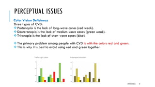
PERCEPTUAL ISSUES
Color VisionDeficiency
Three types of CVD:
❖Protanopia is the lack of long-wave cones (red weak).
❖Deuteranopia is the lack of medium-wave cones (green weak).
❖Tritanopia is the lack of short-wave cones (blue).
❖The primary problem among people with CVD is with the colors red and green.
❖This is why it is best to avoid using red and green together
DIPESH KOIRALA 54
55.
PERCEPTUAL ISSUES
Consistency
❖ Usingconsistent color schemes throughout a data visualization can make it easier for the
viewer to understand the data and identify patterns or relationships.
❖ Using too many colors or changing color schemes can create distraction.
Context
❖ The use of color should always be considered in the context of the data being presented
and the goals of the visualization.
DIPESH KOIRALA 55
PERCEPTUAL ISSUES
❖ Perceptualissues can arise in visual representation when the
visual cues used to represent data values are not aligned with the
way the human brain processes visual information.
❖ To address perceptual issues, designers can use techniques such
as:
i. Gestalt Principles
ii. Data scaling
iii. Labeling
DIPESH KOIRALA 57
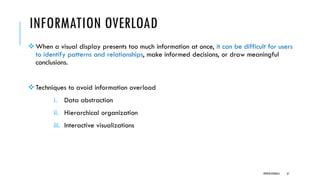
INFORMATION OVERLOAD
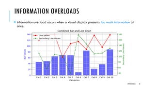
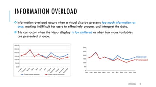
❖Information overloadoccurs when a visual display presents too much information at
once, making it difficult for users to effectively process and interpret the data.
❖This can occur when the visual display is too cluttered or when too many variables
are presented at once.
DIPESH KOIRALA 59
60.
INFORMATION OVERLOAD
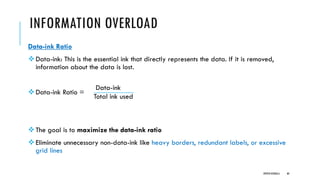
Data-ink Ratio
❖Data-ink:This is the essential ink that directly represents the data. If it is removed,
information about the data is lost.
❖Data-ink Ratio =
❖The goal is to maximize the data-ink ratio
❖Eliminate unnecessary non-data-ink like heavy borders, redundant labels, or excessive
grid lines
DIPESH KOIRALA 60
Data-ink
Total ink used
61.
INFORMATION OVERLOAD
❖When avisual display presents too much information at once, it can be difficult for users
to identify patterns and relationships, make informed decisions, or draw meaningful
conclusions.
❖Techniques to avoid information overload
i. Data abstraction
ii. Hierarchical organization
iii. Interactive visualizations
DIPESH KOIRALA 61