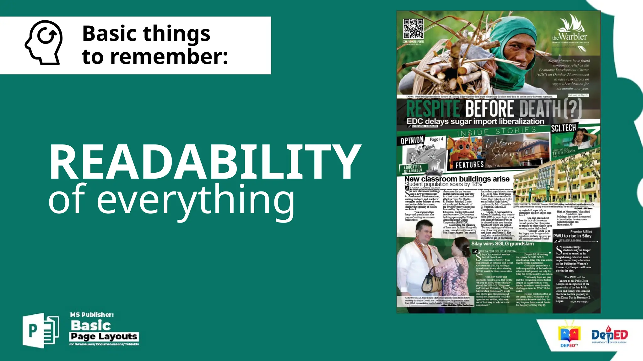
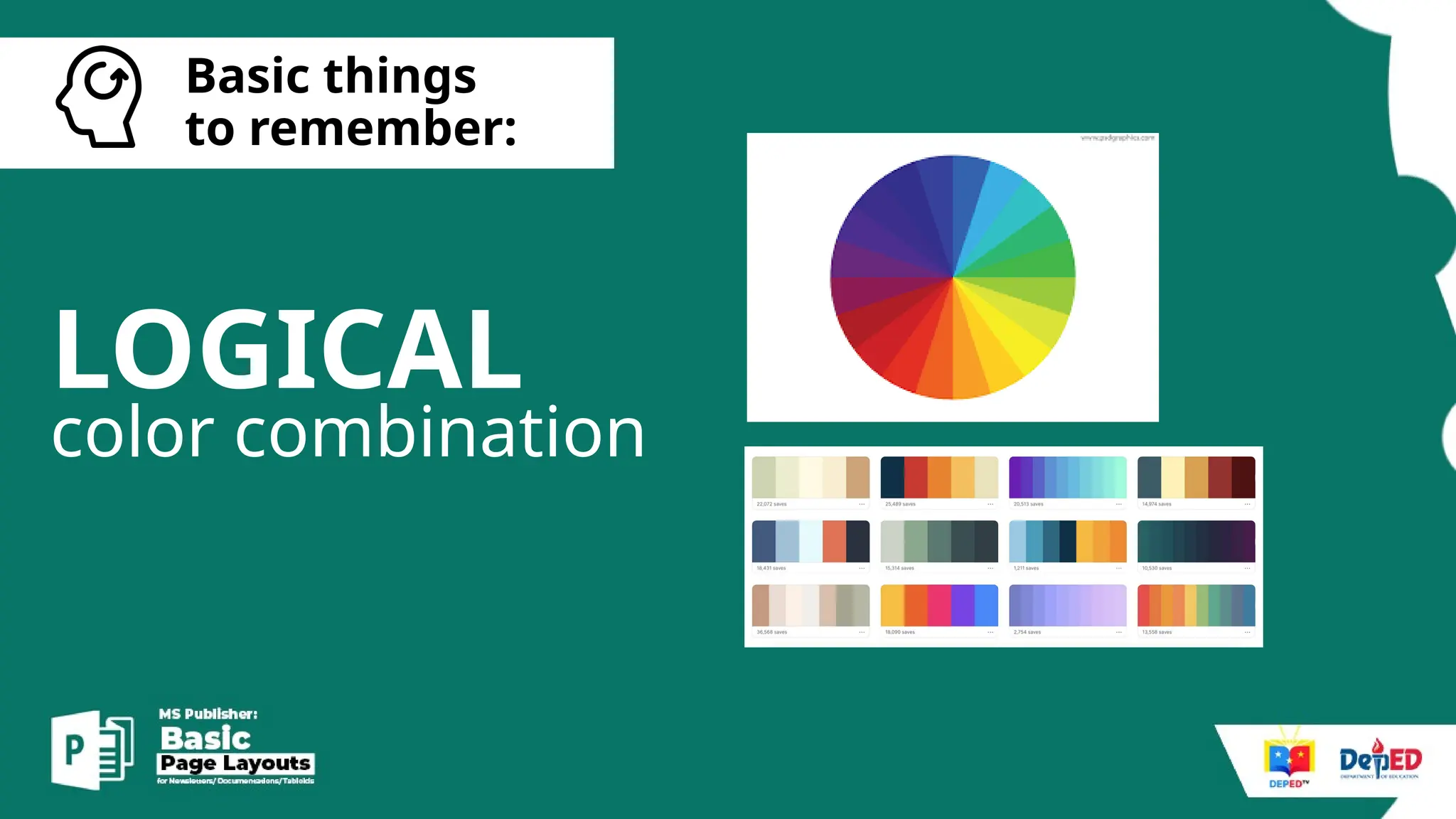
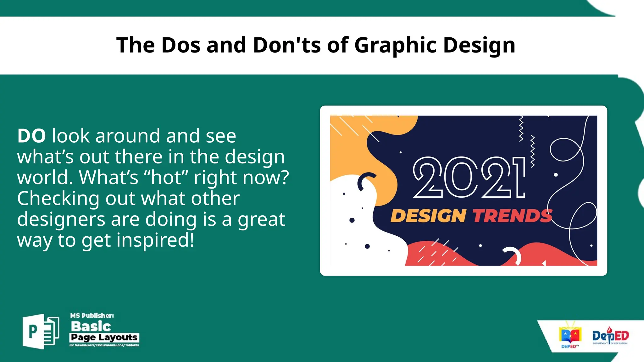
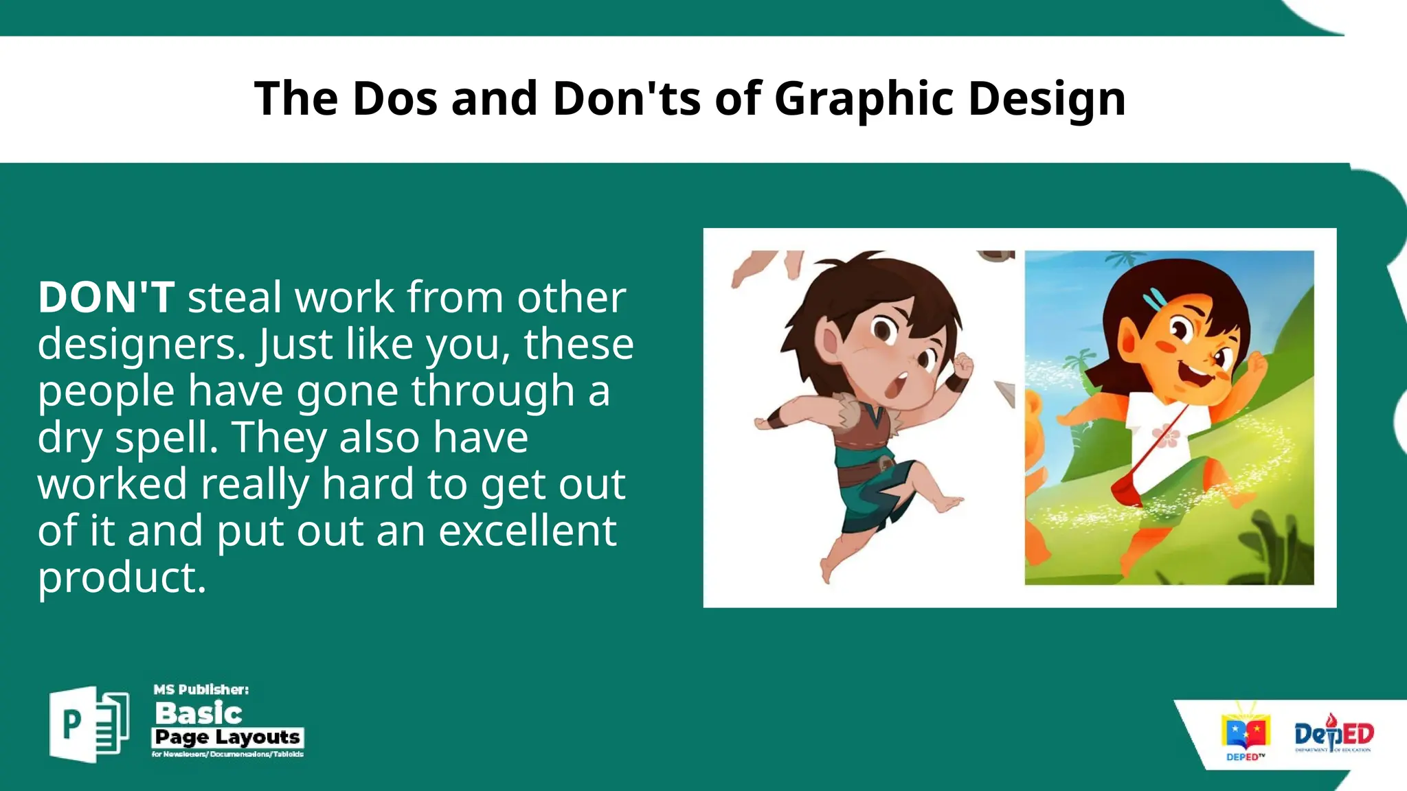
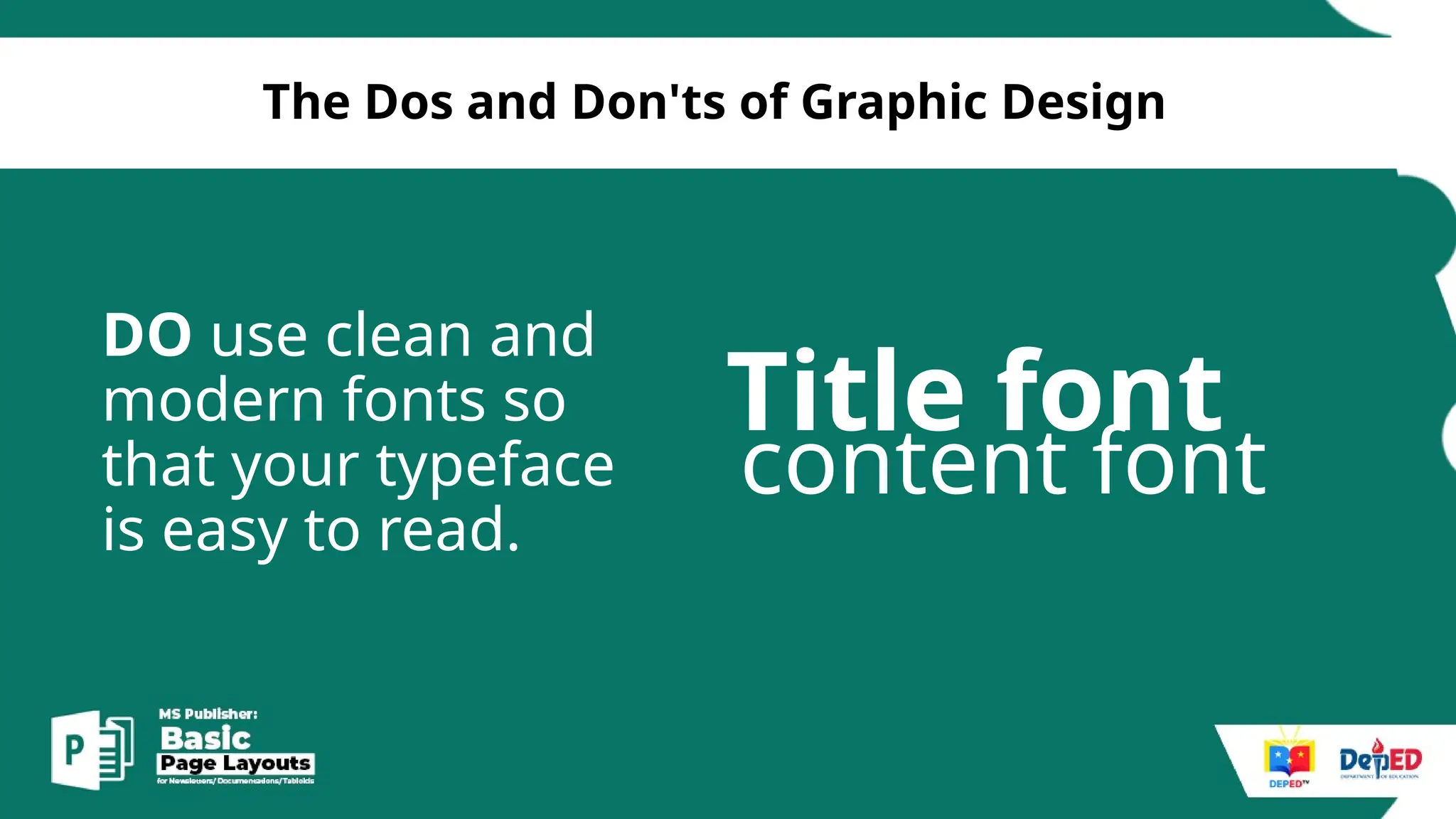
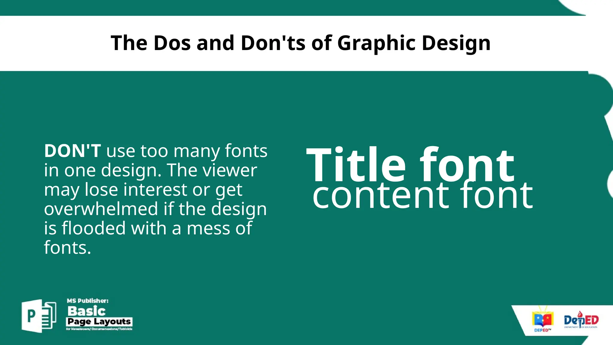
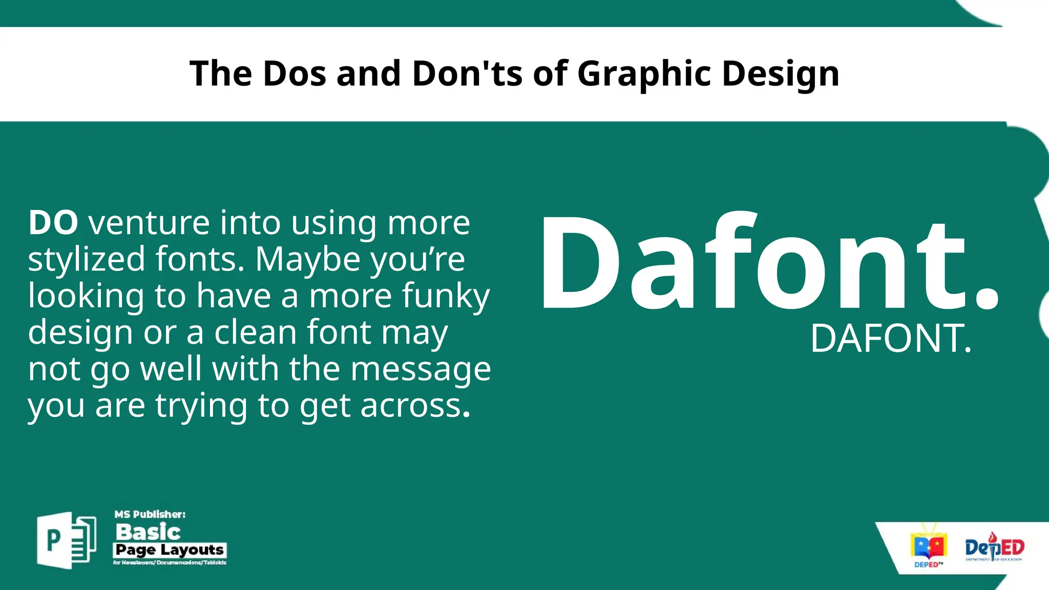
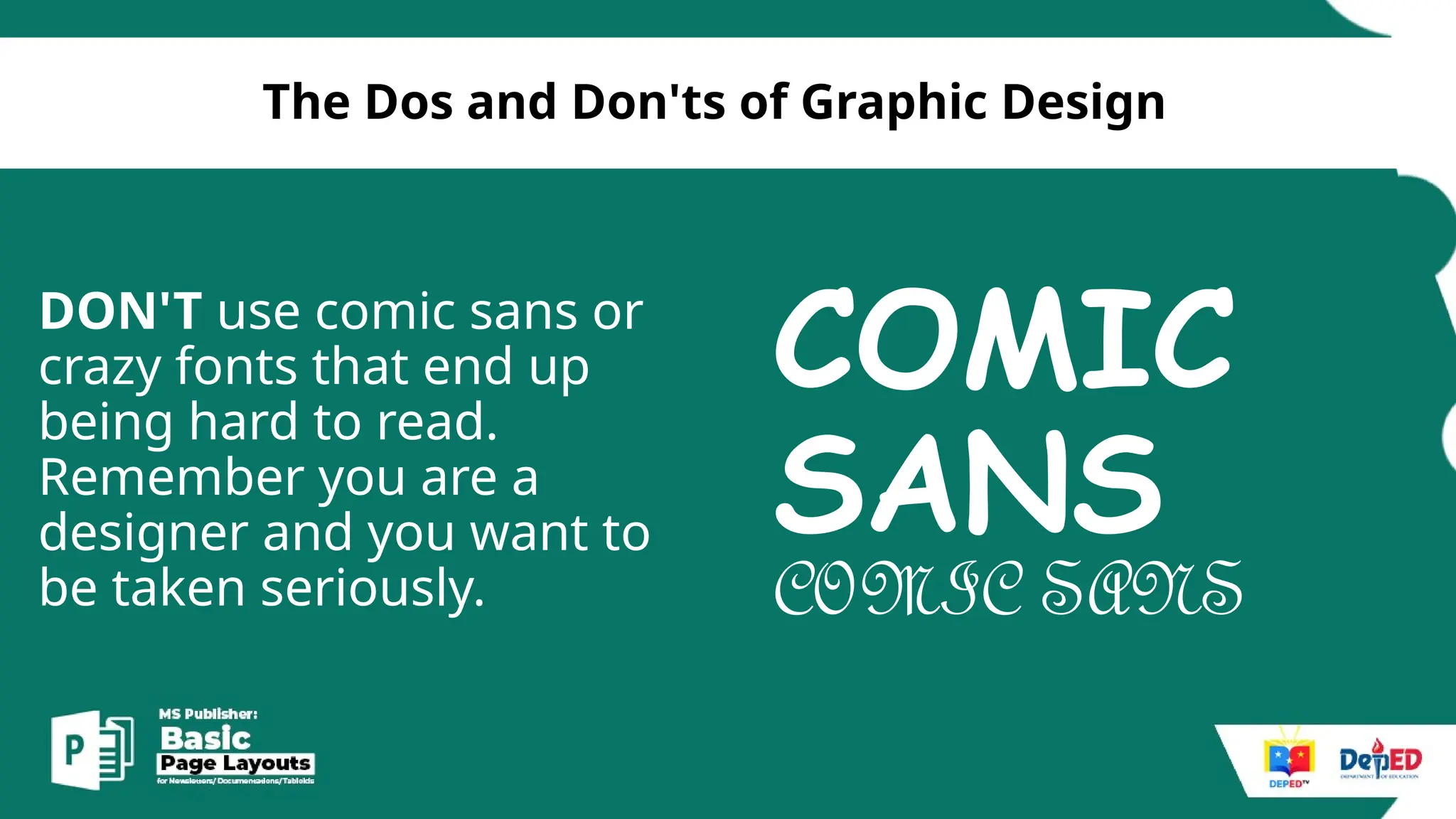
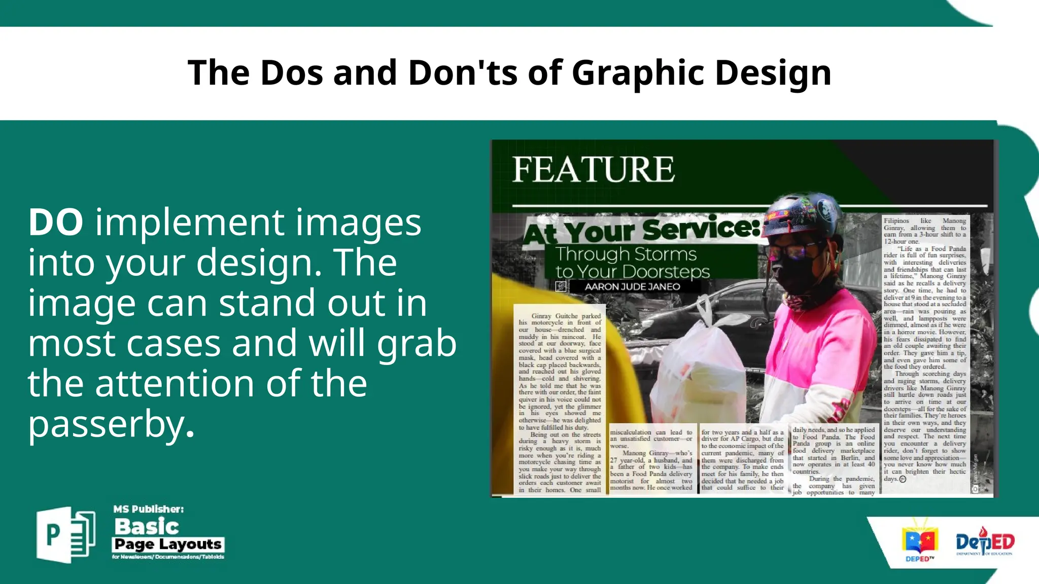
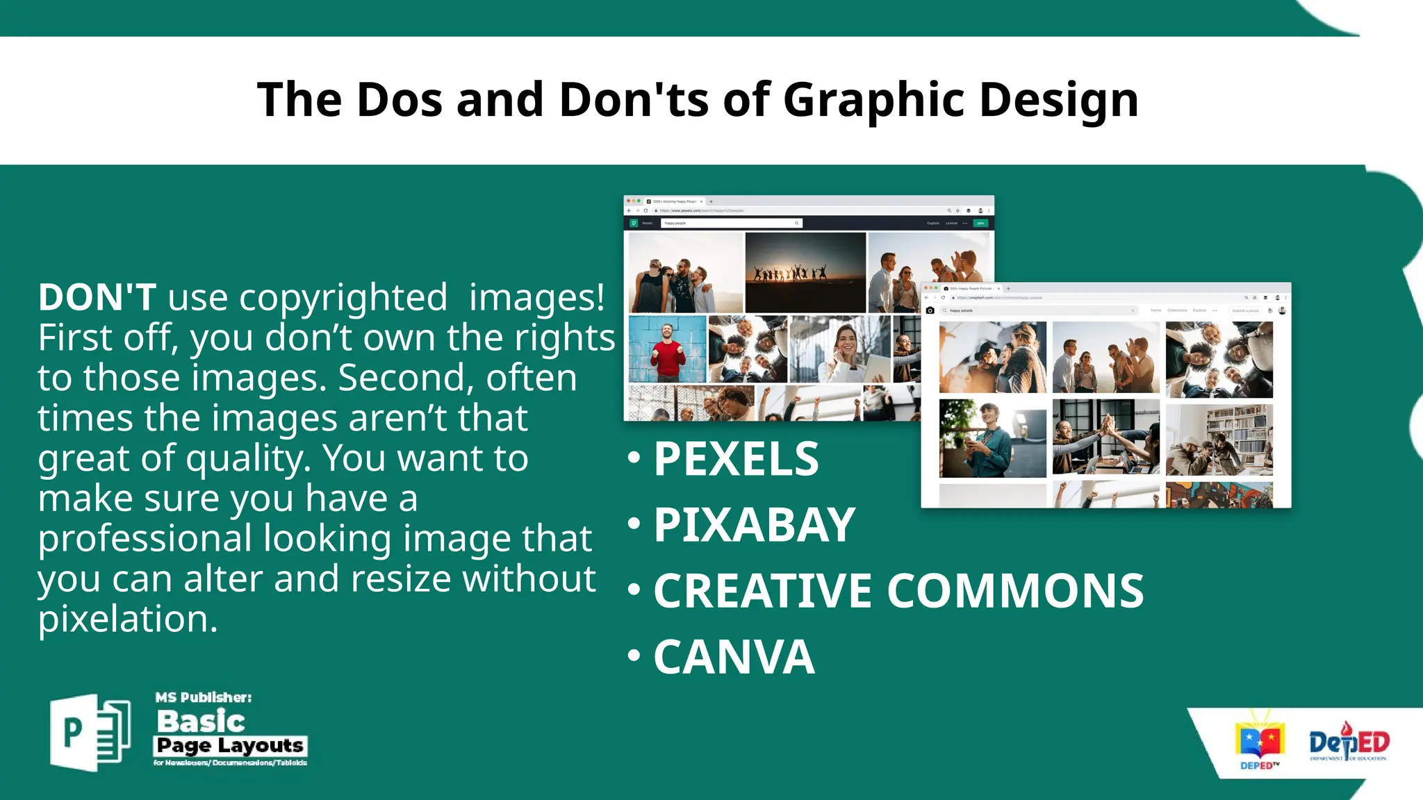
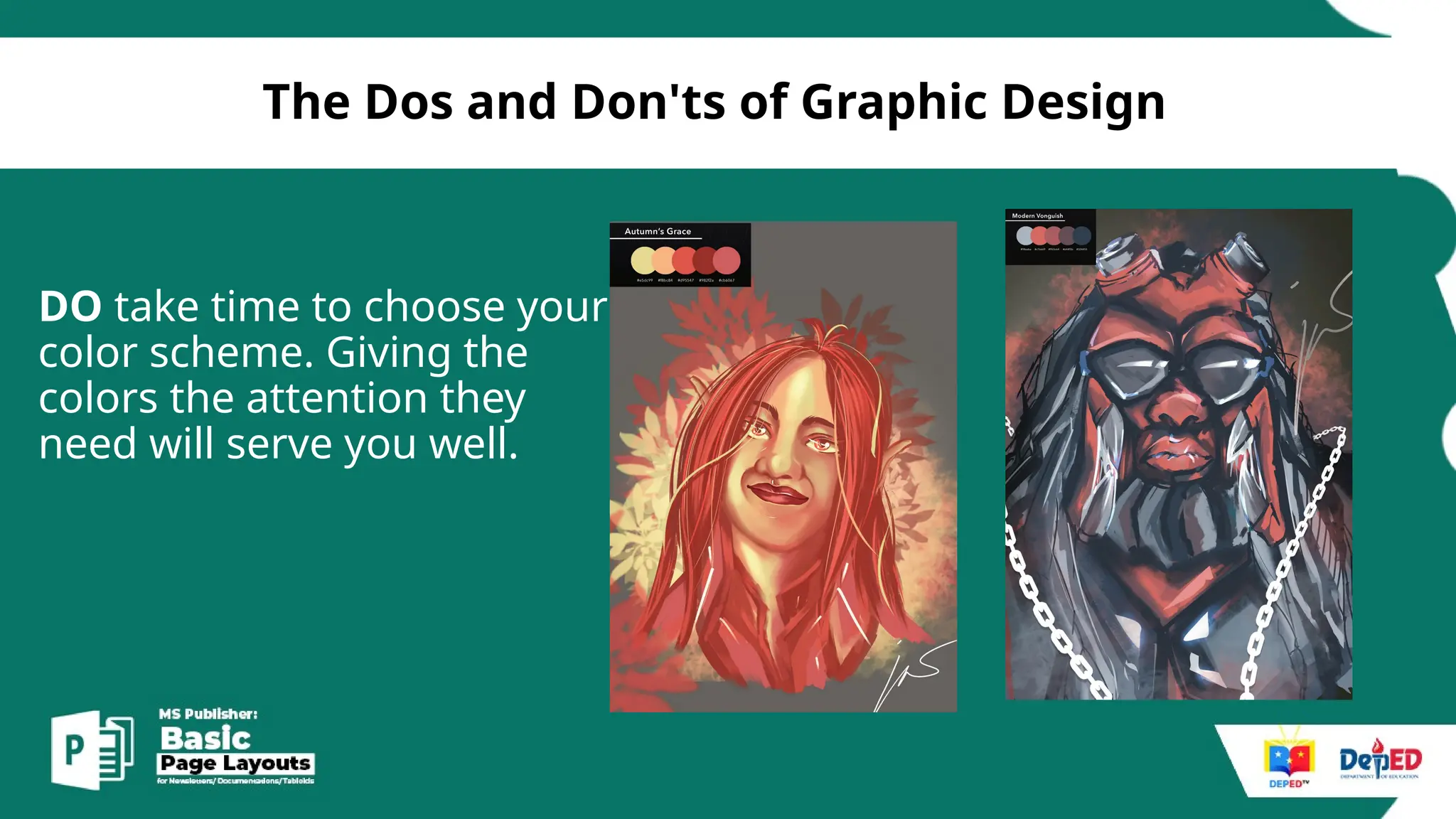
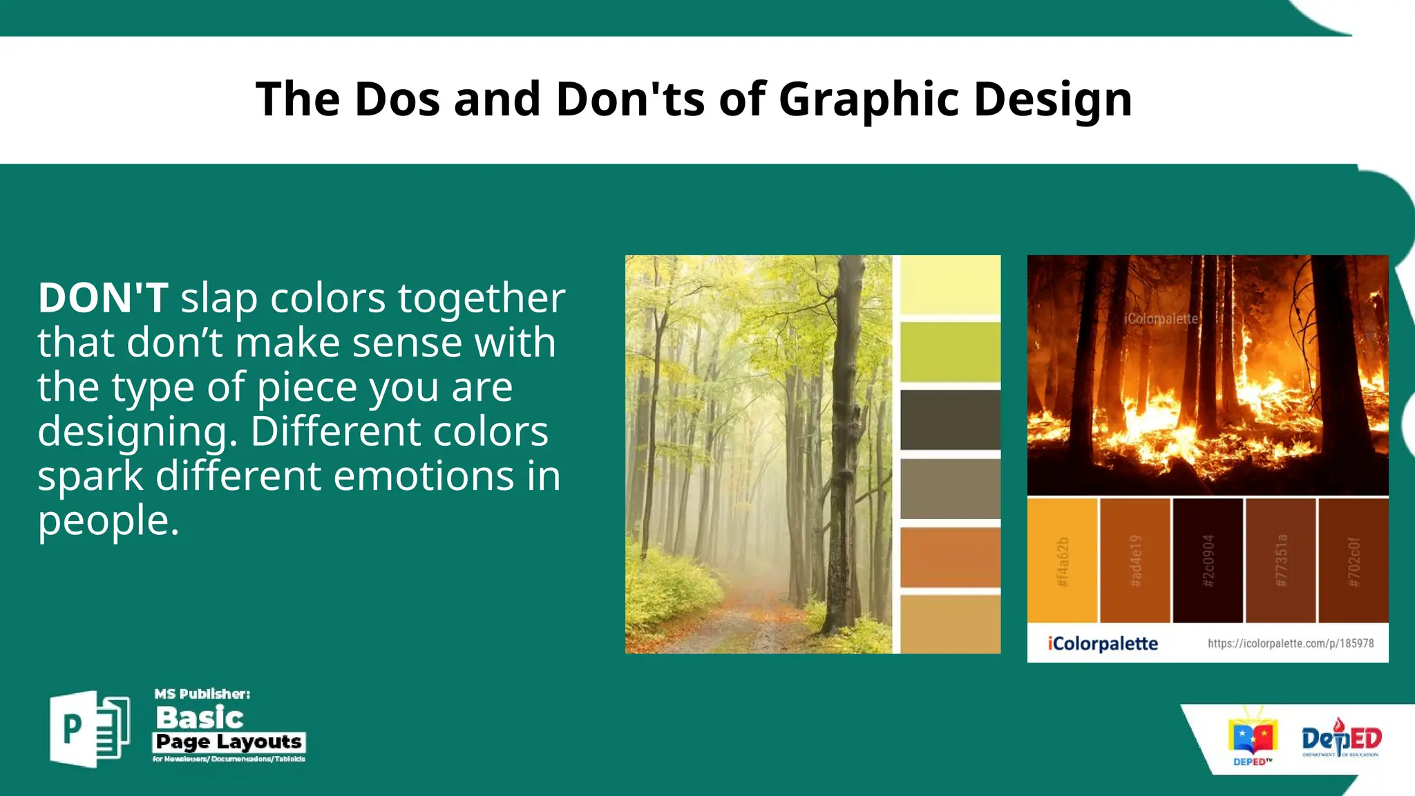
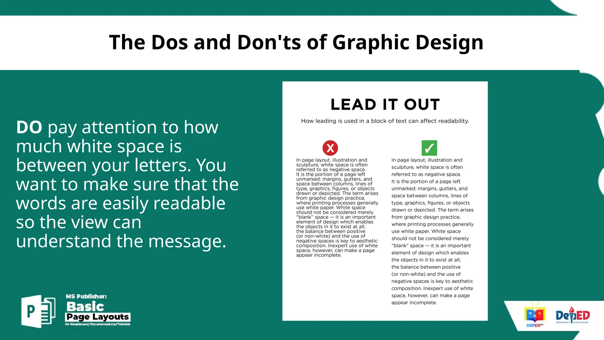
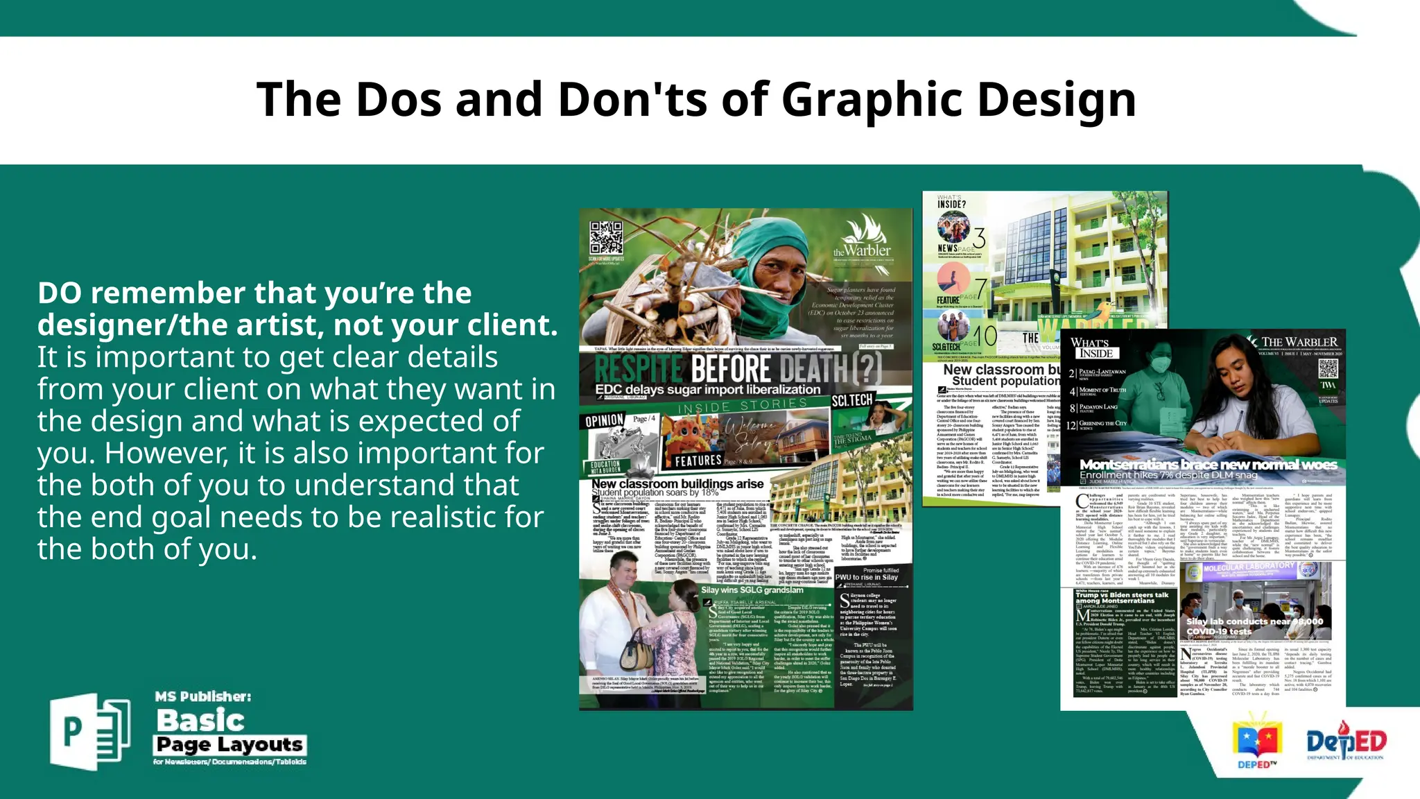
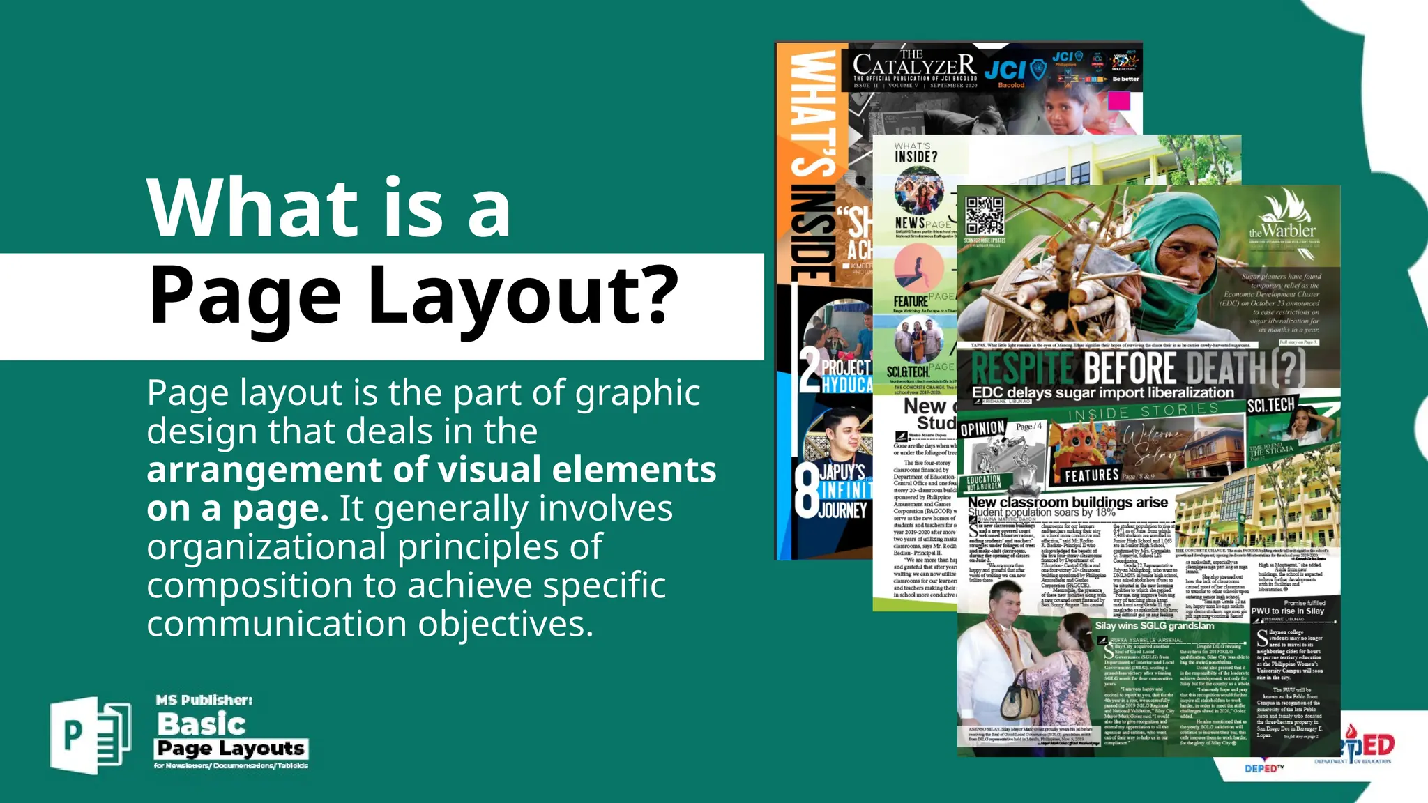
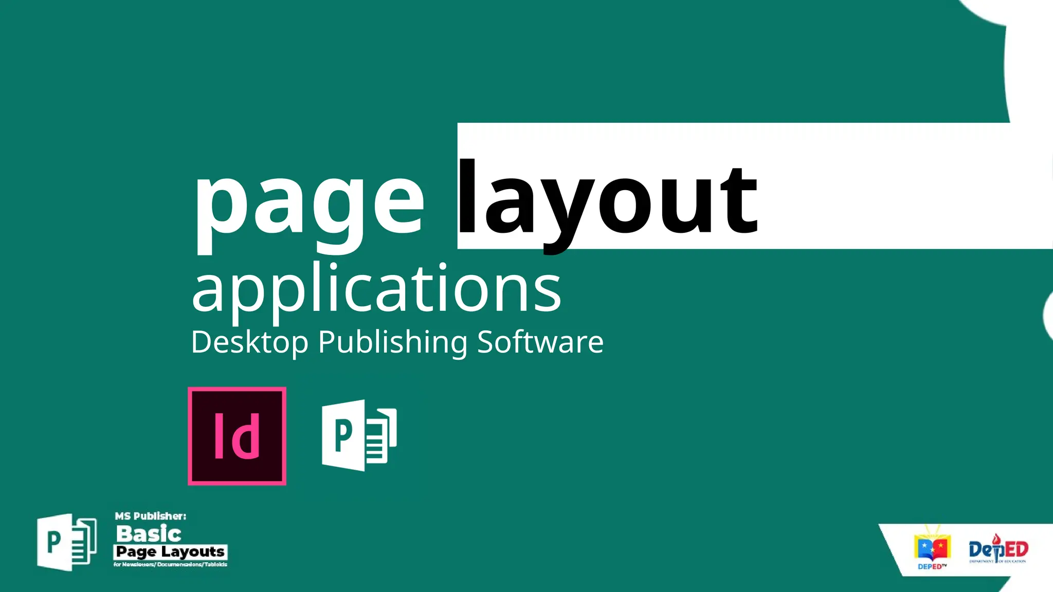
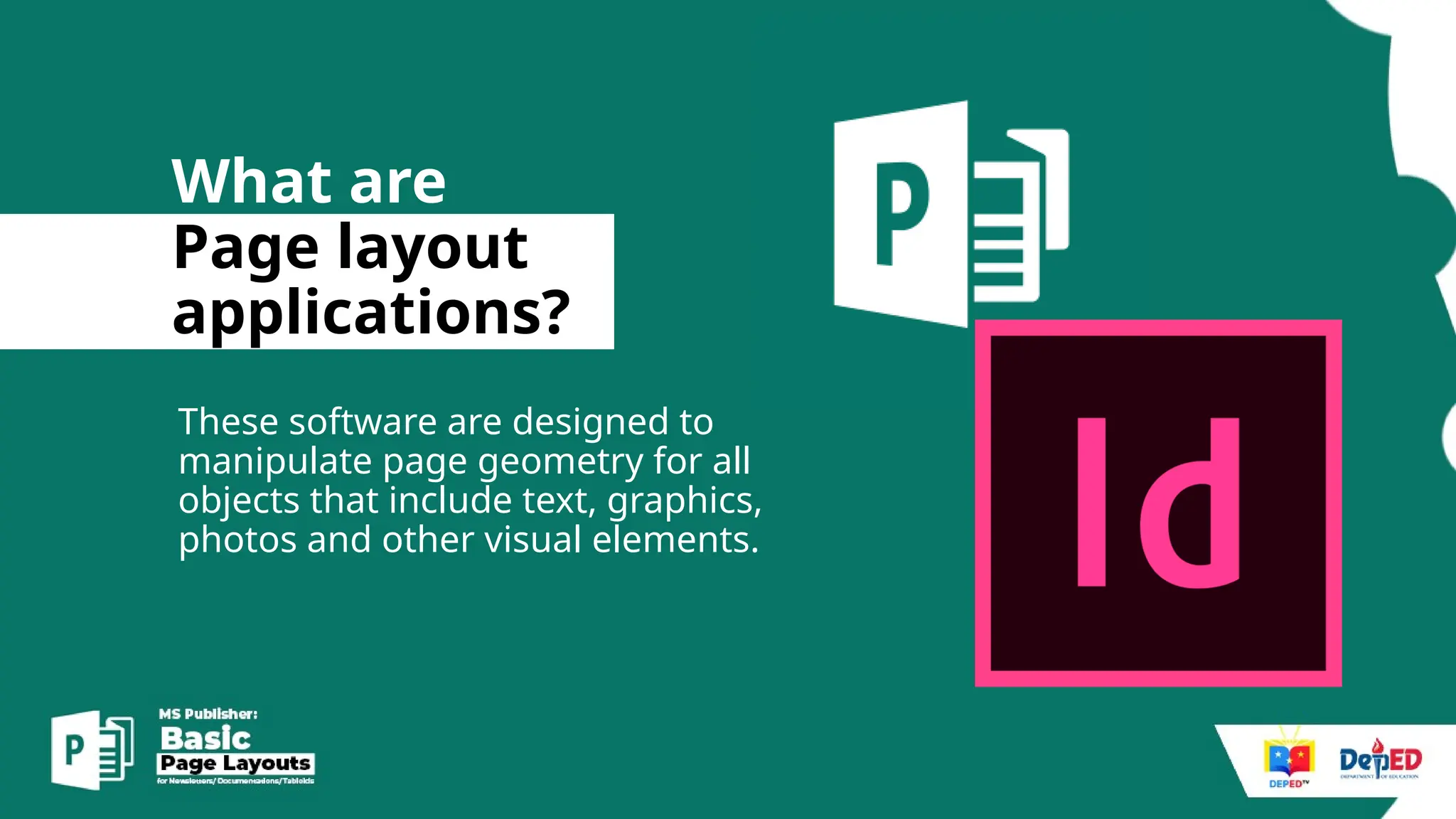
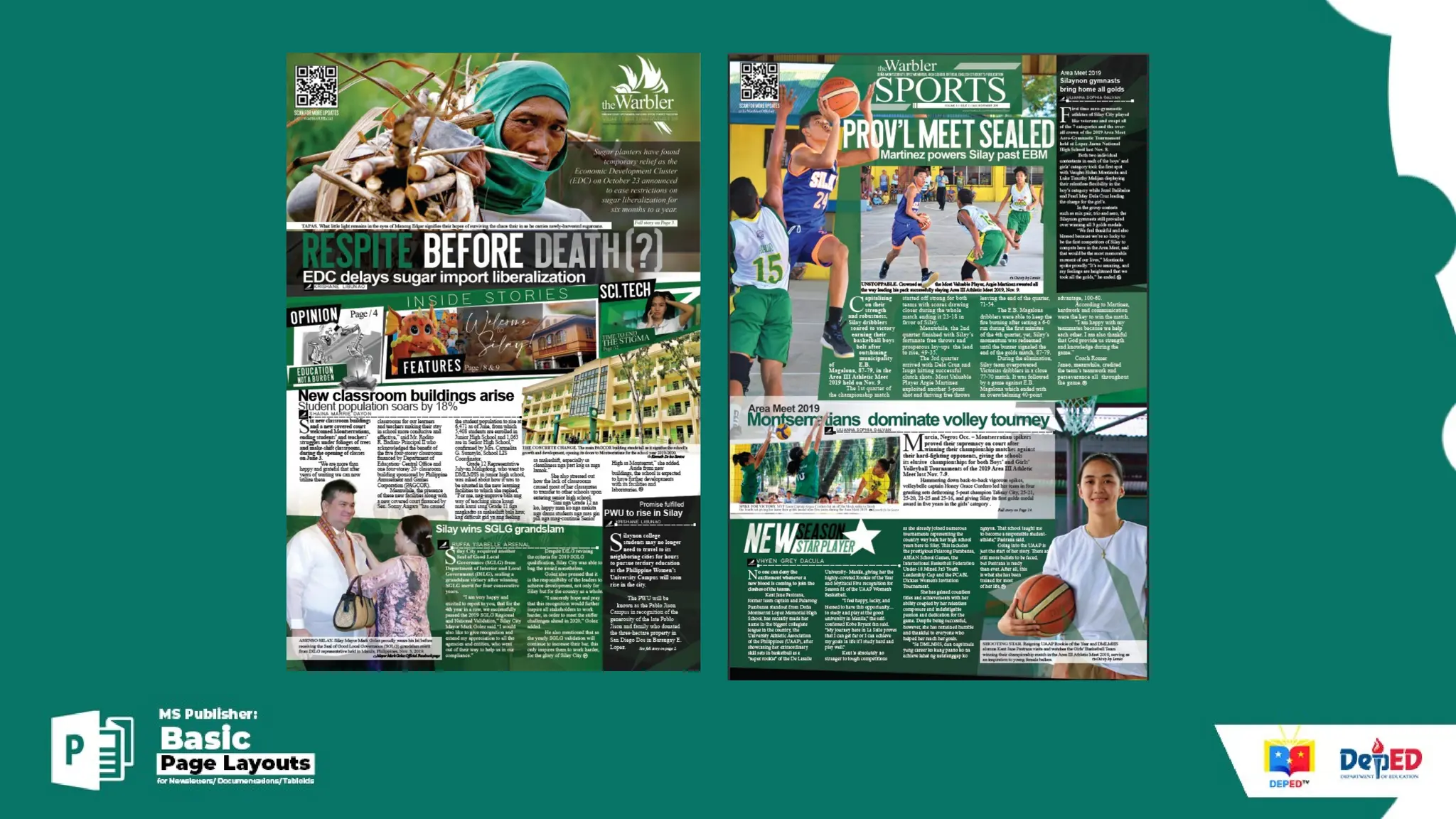
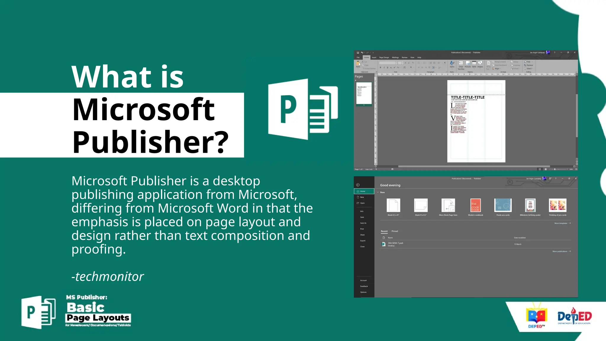
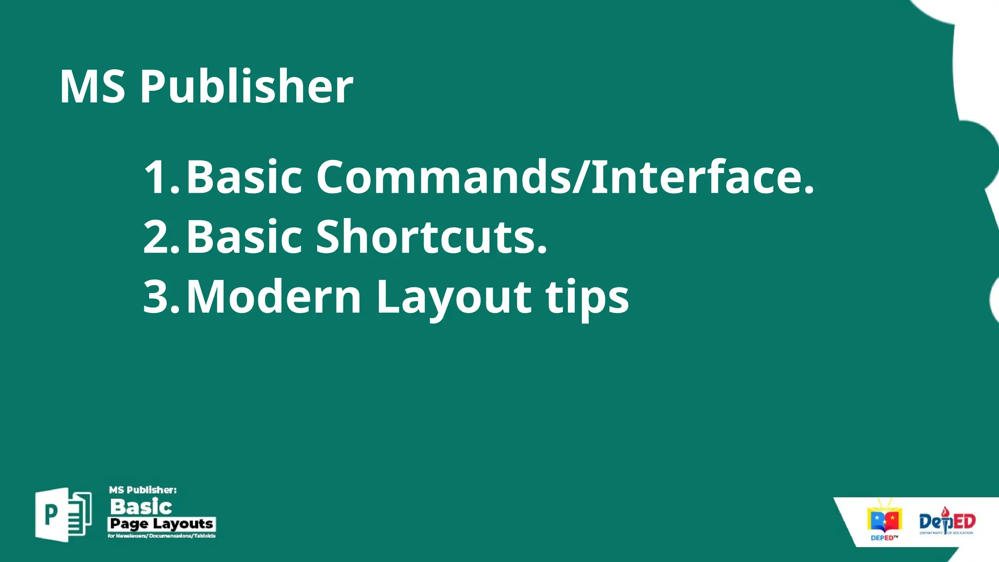
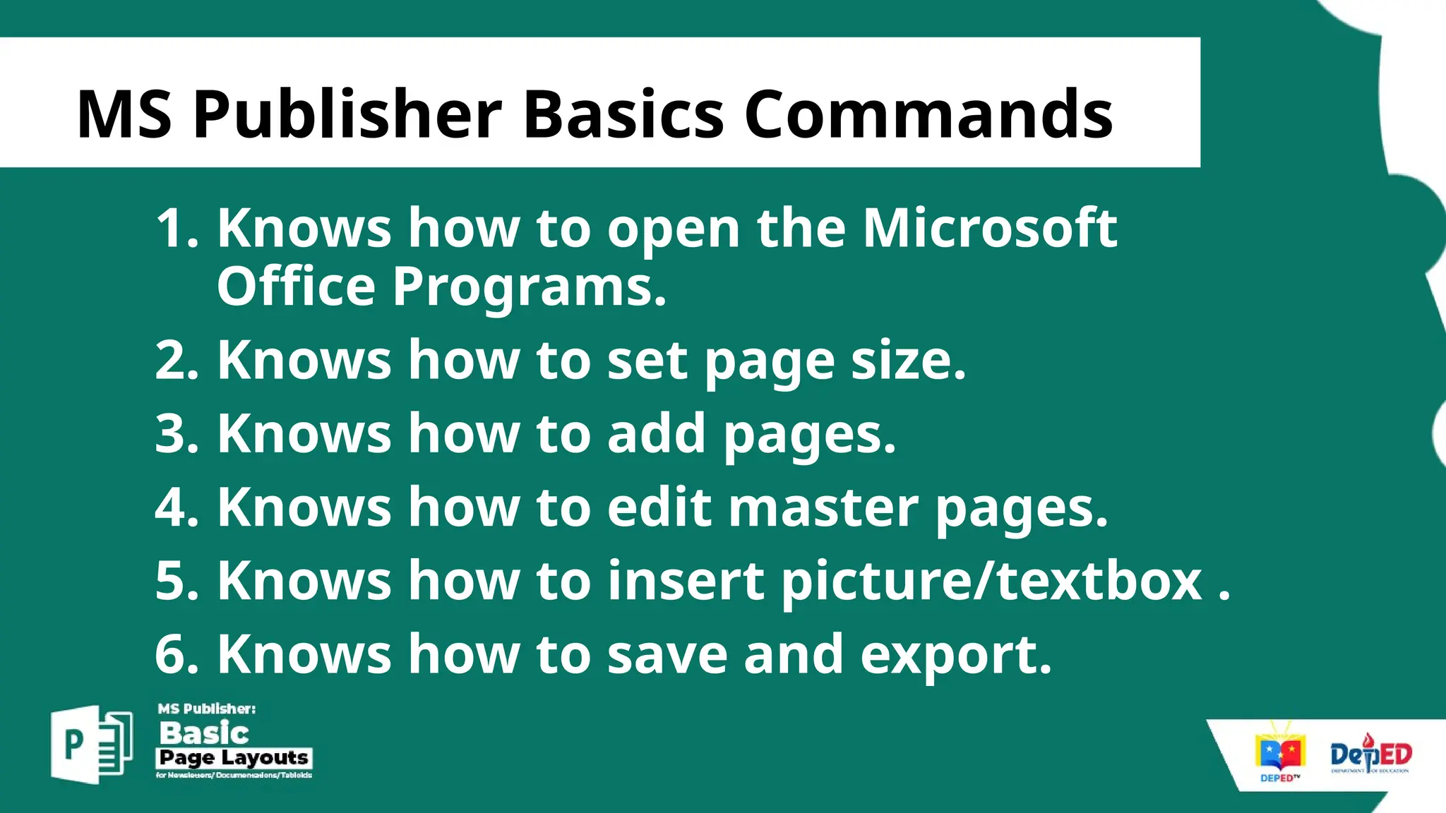
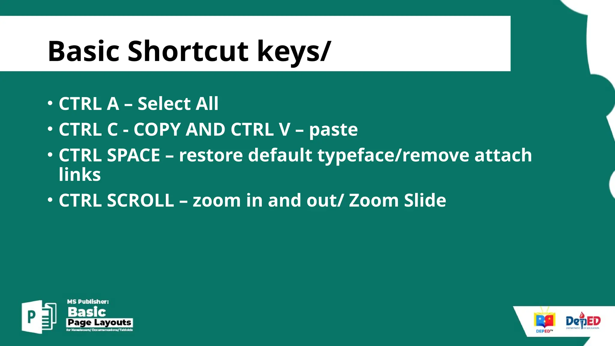
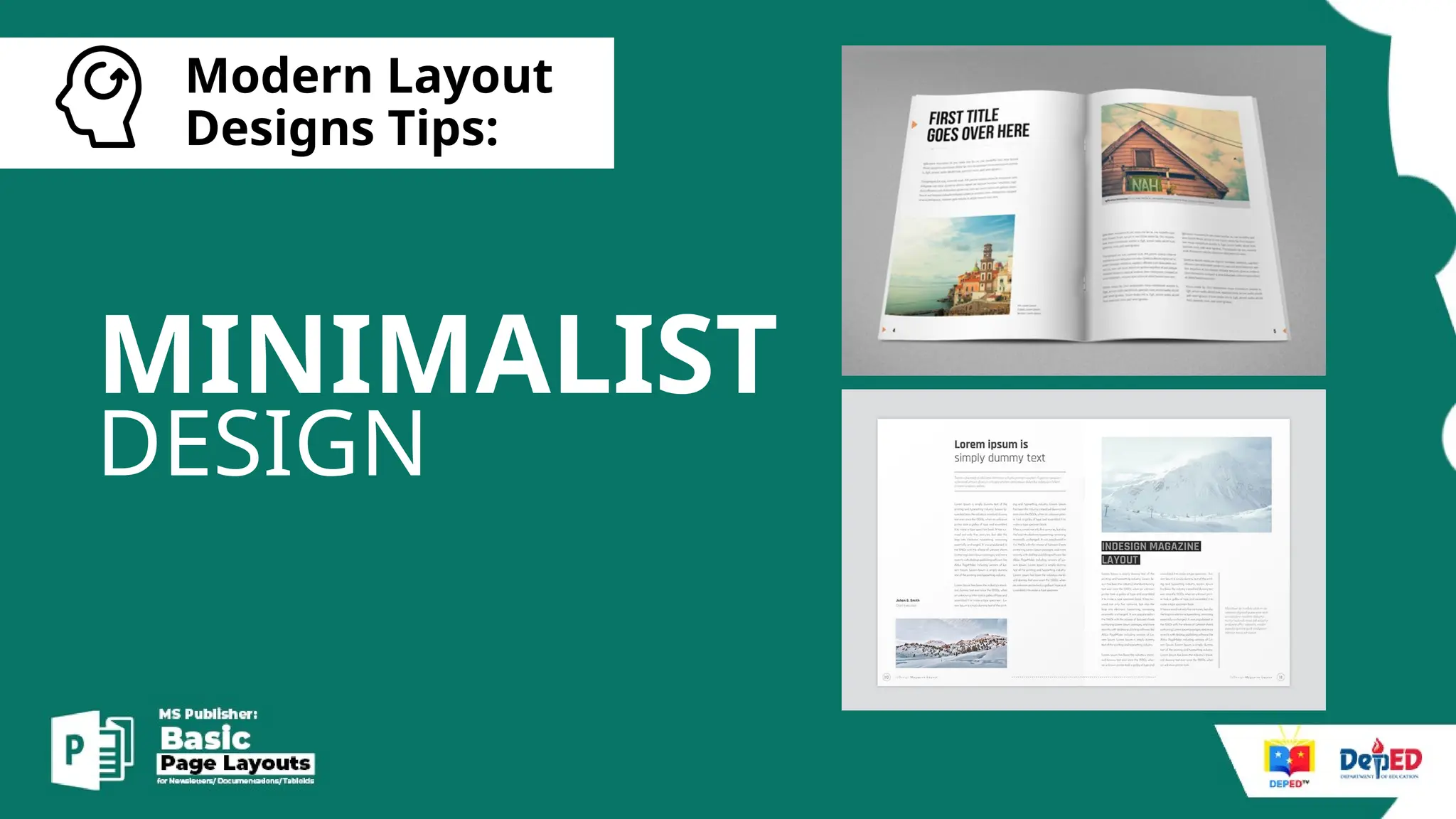
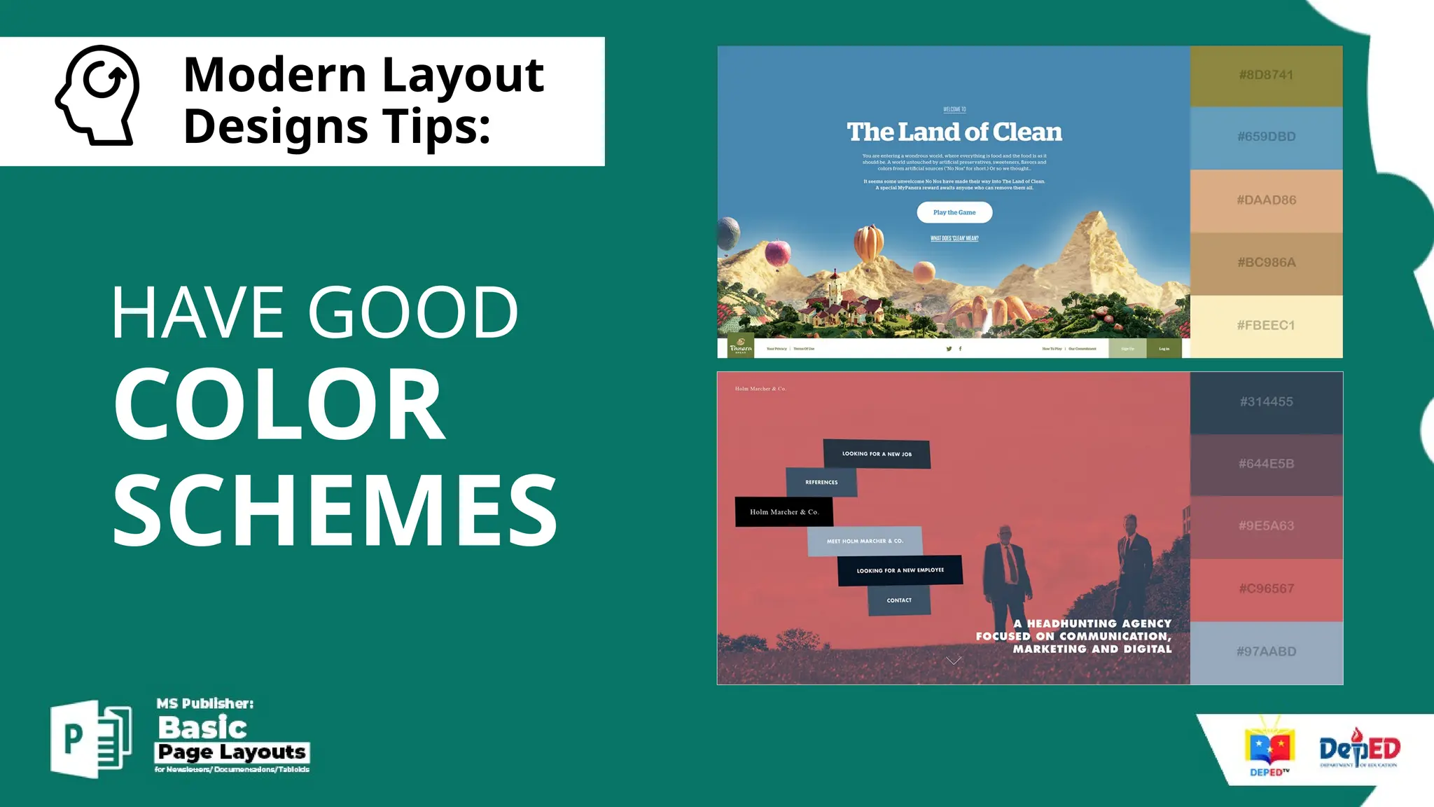
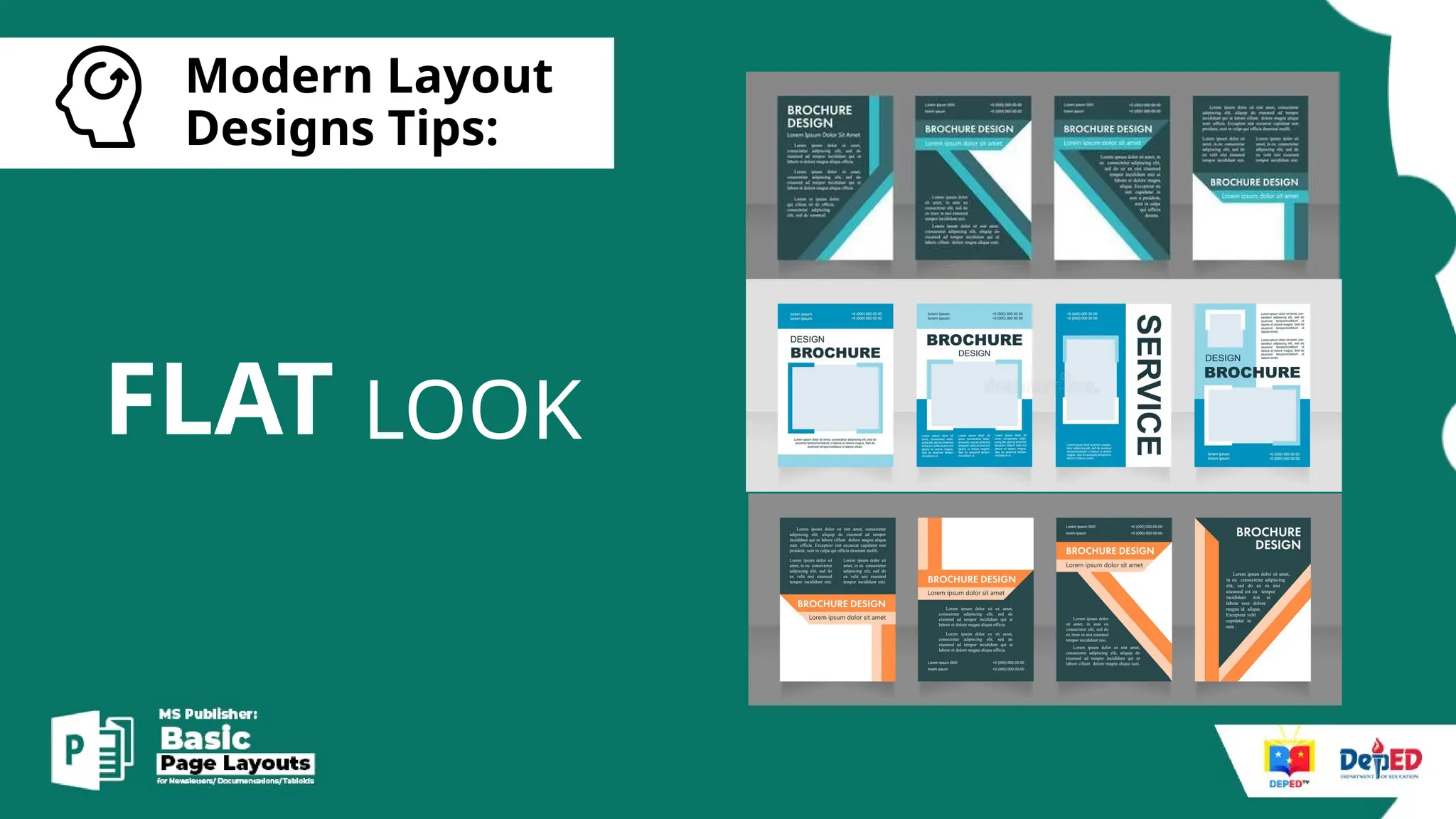
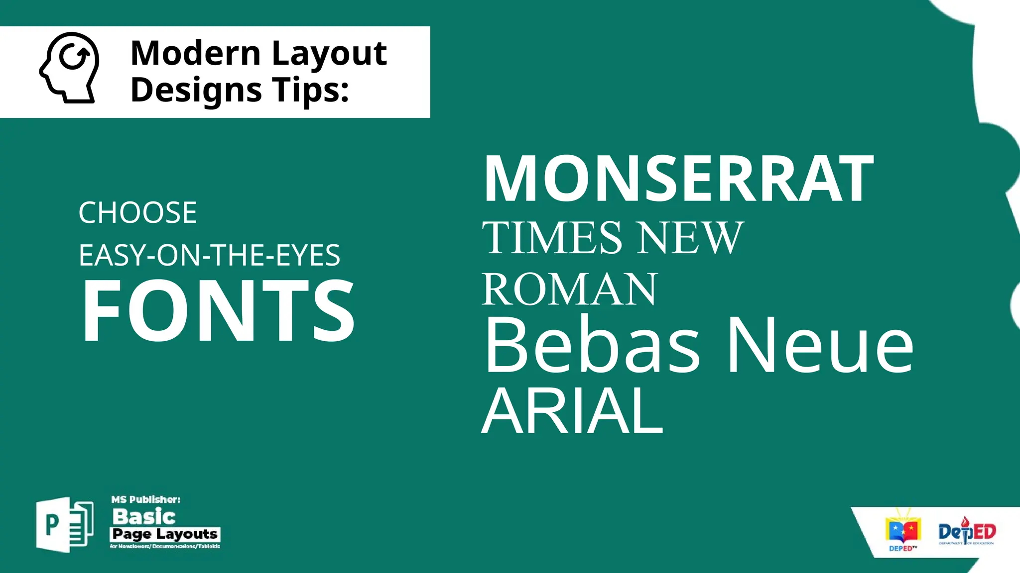
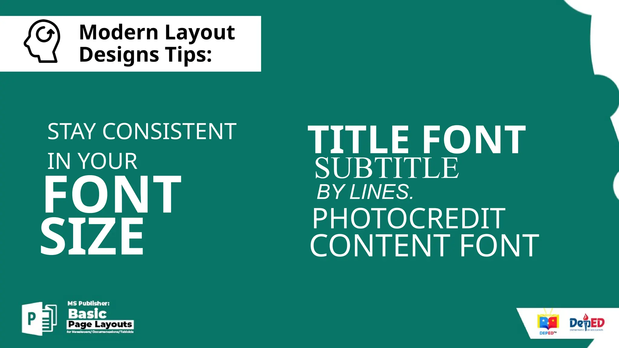
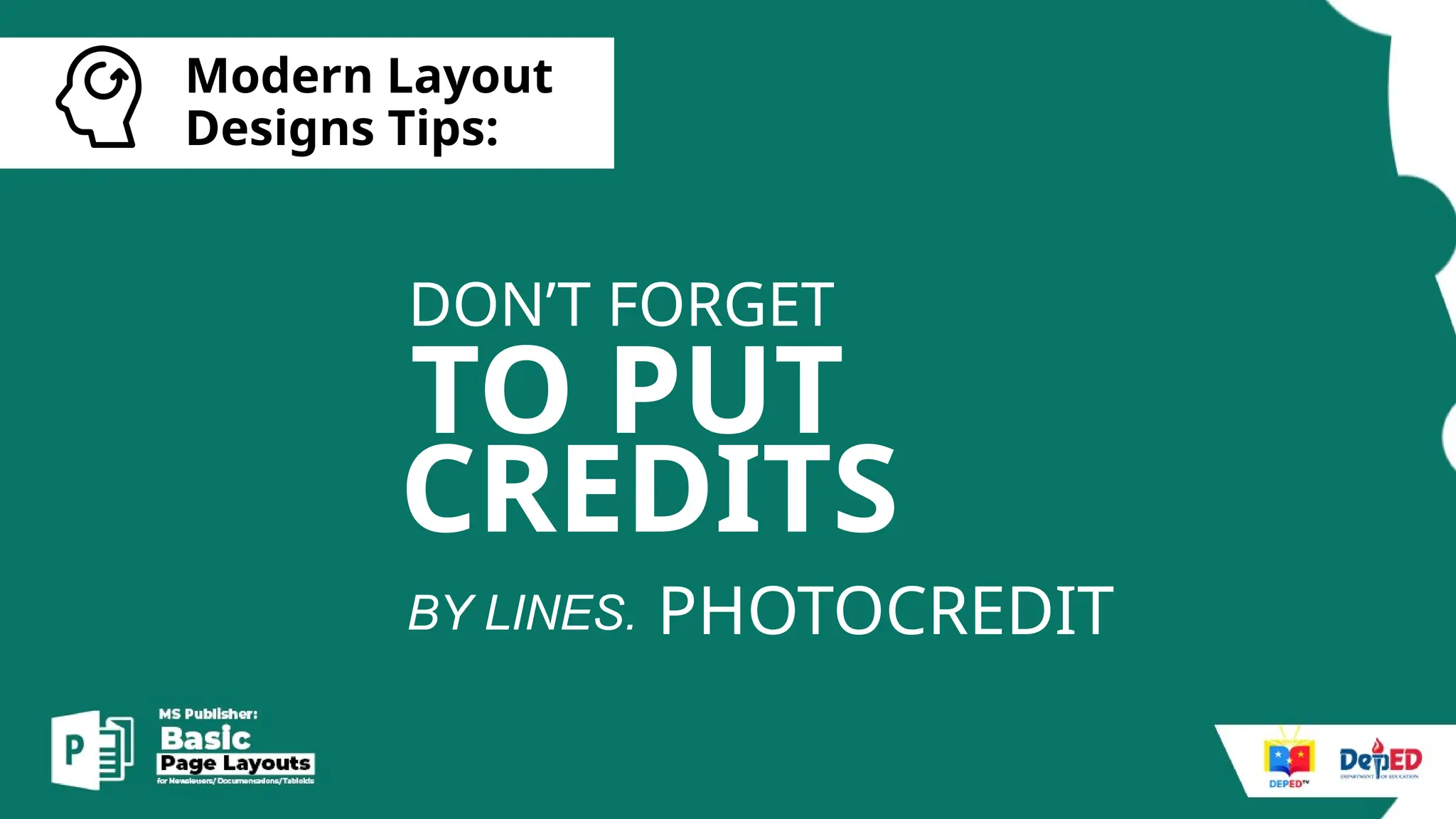
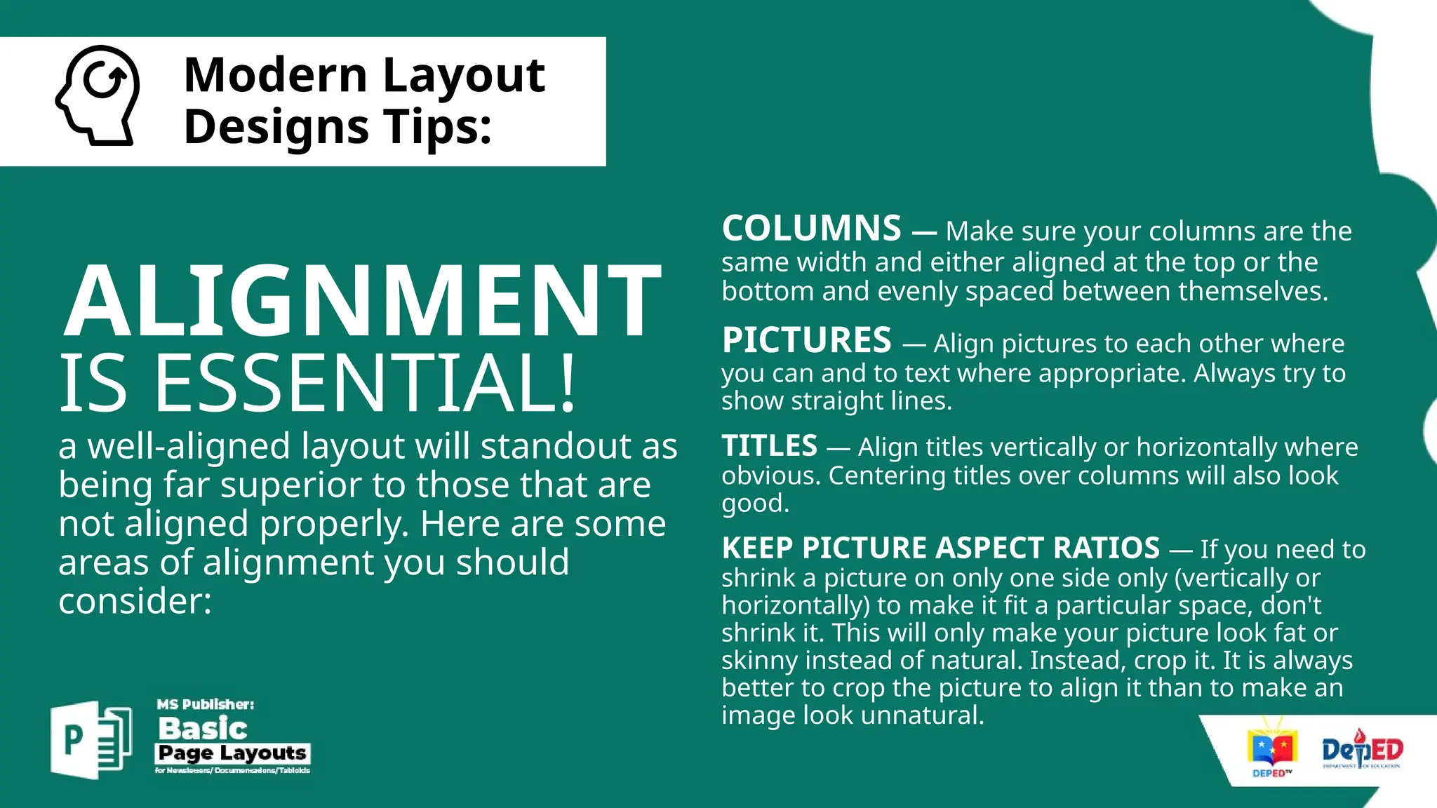
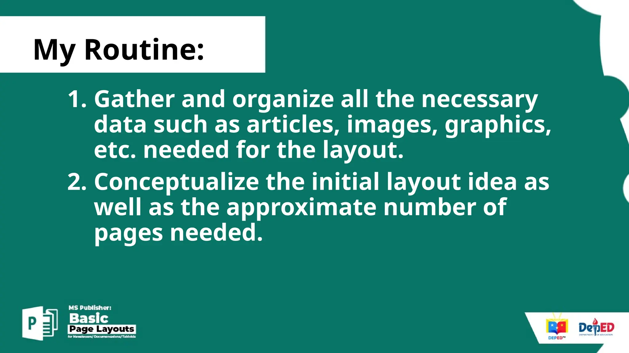
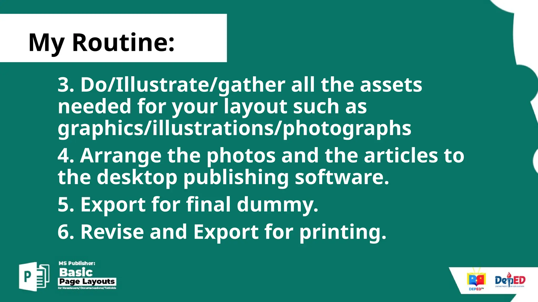
Basic
Things
TO REMEMBER
in graphic design
JAN ARGIE A. LUMAPAY
TEACHER II/ DEPED TV ILLUSTRATOR
DEPARTMENT OF EDUCATION
SCHOOLS DIVISION OF SILAY CITY
Basic
Things
TO REMEMBER
in graphic design
[
Basic things
to remember:
READABILITY
of everything
[
Basic things
to remember:
DESIGN
for everyone
[
Basic things
to remember:
LOGICAL
color combination
[
Basic things
to remember:
CONSISTENT
font combination
[
Basic things
to remember:
TITLE FONT
and CONTENT FONTS
[
Basic things
to remember:
STRETCHING
OF PHOTOS
[
Basic things
to remember:
EFFECTS
Limit the
[
Basic things
to remember:
HARMONY
Dos and
Don’ts
of Graphic Design
[
The Dos and Don'ts of Graphic Design
DO look around and see
what’s out there in the design
world. What’s “hot” right now?
Checking out what other
designers are doing is a great
way to get inspired!
[
The Dos and Don'ts of Graphic Design
DON'T steal work from other
designers. Just like you, these
people have gone through a
dry spell. They also have
worked really hard to get out
of it and put out an excellent
product.
[
The Dos and Don'ts of Graphic Design
DO use clean and
modern fonts so
that your typeface
is easy to read.
Title font
content font
[
The Dos and Don'ts of Graphic Design
DON'T use too many fonts
in one design. The viewer
may lose interest or get
overwhelmed if the design
is flooded with a mess of
fonts.
Title font
content font
[
The Dos and Don'ts of Graphic Design
DO venture into using more
stylized fonts. Maybe you’re
looking to have a more funky
design or a clean font may
not go well with the message
you are trying to get across.
Dafont.
DAFONT.
[
The Dos and Don'ts of Graphic Design
DON'T use comic sans or
crazy fonts that end up
being hard to read.
Remember you are a
designer and you want to
be taken seriously.
COMIC
SANS
COMIC SANS
[
The Dos and Don'ts of Graphic Design
DO implement images
into your design. The
image can stand out in
most cases and will grab
the attention of the
passerby.
[
The Dos and Don'ts of Graphic Design
DON'T use copyrighted images!
First off, you don’t own the rights
to those images. Second, often
times the images aren’t that
great of quality. You want to
make sure you have a
professional looking image that
you can alter and resize without
pixelation.
• PEXELS
• PIXABAY
• CREATIVE COMMONS
• CANVA
[
The Dos and Don'ts of Graphic Design
DO take time to choose your
color scheme. Giving the
colors the attention they
need will serve you well.
[
The Dos and Don'ts of Graphic Design
DON'T slap colors together
that don’t make sense with
the type of piece you are
designing. Different colors
spark different emotions in
people.
[
The Dos and Don'ts of Graphic Design
DON'T space your letters so far
apart that you almost could fit
another letter in between. On the
other end of the spectrum, don’t
make your letters so close
together that the word could be
mistaken for something else. If
you are using kerning to take up
space, look for an alternative such
as making the font a larger size.
[
The Dos and Don'ts of Graphic Design
DO pay attention to how
much white space is
between your letters. You
want to make sure that the
words are easily readable
so the view can
understand the message.
[
The Dos and Don'ts of Graphic Design
DO remember that you’re the
designer/the artist, not your client.
It is important to get clear details
from your client on what they want in
the design and what is expected of
you. However, it is also important for
the both of you to understand that
the end goal needs to be realistic for
the both of you.
[
The Dos and Don'ts of Graphic Design
DON'T have a negative
attitude towards your work
or others output.
page layouts
What is a
Page Layout?
Page layout is the part of graphic
design that deals in the
arrangement of visual elements
on a page. It generally involves
organizational principles of
composition to achieve specific
communication objectives.
applications
page layout
Desktop Publishing Software
What are
Page layout
applications?
These software are designed to
manipulate page geometry for all
objects that include text, graphics,
photos and other visual elements.
MS Publisher
Adobe Indesign
What is
Microsoft
Publisher?
Microsoft Publisher is a desktop
publishing application from Microsoft,
differing from Microsoft Word in that the
emphasis is placed on page layout and
design rather than text composition and
proofing.
-techmonitor
Basics.
MS Publisher
1.Basic Commands/Interface.
2.Basic Shortcuts.
3.Modern Layout tips
[
MS Publisher Basics Commands
1. Knows how to open the Microsoft
Office Programs.
2. Knows how to set page size.
3. Knows how to add pages.
4. Knows how to edit master pages.
5. Knows how to insert picture/textbox .
6. Knows how to save and export.
[
Basic Shortcut keys/
• CTRL A – Select All
• CTRL C - COPY AND CTRL V – paste
• CTRL SPACE – restore default typeface/remove attach
links
• CTRL SCROLL – zoom in and out/ Zoom Slide
MODERN
LAYOUT
TIPS.
[
Modern Layout
Designs Tips:
MINIMALIST
DESIGN
[
Modern Layout
Designs Tips:
COLOR
SCHEMES
HAVE GOOD
[
Modern Layout
Designs Tips:
FLAT LOOK
[
Modern Layout
Designs Tips:
FLAT LOOK
[
Modern Layout
Designs Tips:
FONTS
CHOOSE
EASY-ON-THE-EYES
MONSERRAT
TIMES NEW
ROMAN
Bebas Neue
ARIAL
[
Modern Layout
Designs Tips:
FONT
STAY CONSISTENT
IN YOUR
TITLE FONT
SUBTITLE
PHOTOCREDIT
BY LINES.
CONTENT FONT
SIZE
[
Modern Layout
Designs Tips:
TO PUT
DON’T FORGET
PHOTOCREDIT
BY LINES.
CREDITS
[
Modern Layout
Designs Tips:
ALIGNMENT
IS ESSENTIAL!
a well-aligned layout will standout as
being far superior to those that are
not aligned properly. Here are some
areas of alignment you should
consider:
COLUMNS — Make sure your columns are the
same width and either aligned at the top or the
bottom and evenly spaced between themselves.
PICTURES — Align pictures to each other where
you can and to text where appropriate. Always try to
show straight lines.
TITLES — Align titles vertically or horizontally where
obvious. Centering titles over columns will also look
good.
KEEP PICTURE ASPECT RATIOS — If you need to
shrink a picture on only one side only (vertically or
horizontally) to make it fit a particular space, don't
shrink it. This will only make your picture look fat or
skinny instead of natural. Instead, crop it. It is always
better to crop the picture to align it than to make an
image look unnatural.
[
Modern Layout
Designs Tips:
FONT
STAY CONSISTENT
IN YOUR
TITLE FONT
SUBTITLE
PHOTOCREDIT
BY LINES.
CONTENT FONT
SIZE
[
Basic things
to remember:
TIPS!
GET MORE
LET’S START
LAYOUTING.
[
My Routine:
1. Gather and organize all the necessary
data such as articles, images, graphics,
etc. needed for the layout.
2. Conceptualize the initial layout idea as
well as the approximate number of
pages needed.
[
My Routine:
3. Do/Illustrate/gather all the assets
needed for your layout such as
graphics/illustrations/photographs
4. Arrange the photos and the articles to
the desktop publishing software.
5. Export for final dummy.
6. Revise and Export for printing.
Activity.
• MS PUBLISHER
Basic Page Layouts for beginners - Deped

Basic Page Layouts for beginners - Deped

Editor's Notes

  • #48 Don't use too many colors. That just looks messy. Know what colors go well together and which ones clash. On a newspaper, colors will always print darker than what is on your computer screen so it is important to lighten up your colors. Learn which colors go well together.
  • #49 Try not to use 3D effects, bevels, or too many shadows. Those styles went out last decade when they were novelties at the time. It is the flat appearance that looks clean and stylish.
  • #50 Try not to use 3D effects, bevels, or too many shadows. Those styles went out last decade when they were novelties at the time. It is the flat appearance that looks clean and stylish.
  • #51 Try not to use 3D effects, bevels, or too many shadows. Those styles went out last decade when they were novelties at the time. It is the flat appearance that looks clean and stylish.
  • #52 Try not to use 3D effects, bevels, or too many shadows. Those styles went out last decade when they were novelties at the time. It is the flat appearance that looks clean and stylish.
  • #53 Try not to use 3D effects, bevels, or too many shadows. Those styles went out last decade when they were novelties at the time. It is the flat appearance that looks clean and stylish.
  • #55 Try not to use 3D effects, bevels, or too many shadows. Those styles went out last decade when they were novelties at the time. It is the flat appearance that looks clean and stylish.