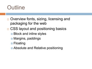
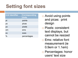
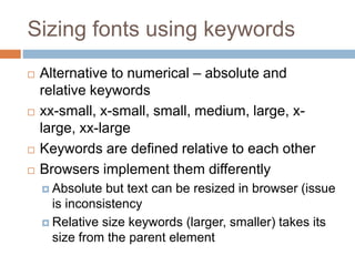
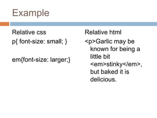
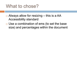
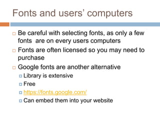
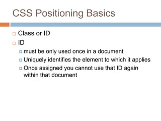
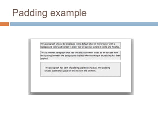
DESIGN WEBSITES
USING HTML & CSS
CSS Layouts
Outline
 Overview fonts, sizing, licensing and
packaging for the web
 CSS layout and positioning basics
 Block and inline styles
 Margins, paddings
 Floating
 Absolute and Relative positioning
Setting font sizes
Unit Identifier Corresponding
Units
pt points
pc picas
px pixels
em ems
ex exes
% percentages
 Avoid using points
and picas: print
design
 Pixels: consistent
text displays, but
cannot be resized
 Ems: relative font
measurement (ie
0.9em or 1.1em)
 Percentages: honor
users’ text size
Sizing fonts using keywords
 Alternative to numerical – absolute and
relative keywords
 xx-small, x-small, small, medium, large, x-
large, xx-large
 Keywords are defined relative to each other
 Browsers implement them differently
 Absolute but text can be resized in browser (issue
is inconsistency
 Relative size keywords (larger, smaller) takes its
size from the parent element
Example
Relative css
p{ font-size: small; }
em{font-size: larger;}
Relative html
<p>Garlic may be
known for being a
little bit
<em>stinky</em>,
but baked it is
delicious.
What to chose?
 Always allow for resizing – this is a AA
Accessibility standard
 Use a combination of ems (to set the base
size) and percentages within the document
Fonts and users’ computers
 Be careful with selecting fonts, as only a few
fonts are on every users computers
 Fonts are often licensed so you may need to
purchase
 Google fonts are another alternative
 Library is extensive
 Free
 https://fonts.google.com/
 Can embed them into your website
CSS Positioning Basics
 Class or ID
 ID
 must be only used once in a document
 Uniquely identifies the element to which it applies
 Once assigned you cannot use that ID again
within that document
CSS Positioning Basics
 Class
 Used as many times as you like within a document
 If there are features on the document you would like
to repeat – use a class
CSS positioning
Block level and in-line elements
 Elements are categorised as block or in-line,
this affects the default way they behave in
browsers
 This default display method can be changed
using the display property
 See example where we can see some HTML
elements, each describing their default display
(block or inline) with an example of what
happens if we change the display property on
that element
Block-level and inline elements
Inline Elements
 Only take up the space that it needs
 Ignore top and bottom margins if applied
 Disregard height and width properties
 Can be affected by the vertical-align property
 An inline element will become block-level if
you set the display property to block, or if you
float the element.
 Floated elements automatically become block
level and so height, width and all margins take
effect
Block-level Elements
 Will force a line break
 Drop to the next line in your document
 Expand to fill the parent element unless a
width has been given
 Respect all margin and padding properties
 Expand in height to fit everything they contain
 A div will expand to contain any amount of text
and images as long as the text and images are
not positioned or floated
 Not affected by vertical-align
Inline-block Elements
 If you set an element to display: in-line-block it
will behave like a block level element and
respect all margins, padding height and width
Margins and padding
 Margins – add space to the outside of an
element
 Set margins individually ie.,
 margin-top: 1em;
 margin-right: 2em
 margin-bottom: 0.5em;
 margin-left: 3em;
 Or
 margin: 1em 2em 0.5em 3em;
 Or if equal
 margin: 1em
Example: add margin to p
element
Padding
 Adds space inside the elements between
borders and its content
 Like margins, padding can be set individually
for the top, right, bottom, and left sides of the
element
 Using shorthand: padding: 1em 1.5em 0.5em
2em;
 Or equal: padding: 1em
Padding example

Css layouts-continued

  • 1.
    DESIGN WEBSITES USING HTML& CSS CSS Layouts
  • 2.
    Outline  Overview fonts,sizing, licensing and packaging for the web  CSS layout and positioning basics  Block and inline styles  Margins, paddings  Floating  Absolute and Relative positioning
  • 3.
    Setting font sizes UnitIdentifier Corresponding Units pt points pc picas px pixels em ems ex exes % percentages  Avoid using points and picas: print design  Pixels: consistent text displays, but cannot be resized  Ems: relative font measurement (ie 0.9em or 1.1em)  Percentages: honor users’ text size
  • 4.
    Sizing fonts usingkeywords  Alternative to numerical – absolute and relative keywords  xx-small, x-small, small, medium, large, x- large, xx-large  Keywords are defined relative to each other  Browsers implement them differently  Absolute but text can be resized in browser (issue is inconsistency  Relative size keywords (larger, smaller) takes its size from the parent element
  • 5.
    Example Relative css p{ font-size:small; } em{font-size: larger;} Relative html <p>Garlic may be known for being a little bit <em>stinky</em>, but baked it is delicious.
  • 6.
    What to chose? Always allow for resizing – this is a AA Accessibility standard  Use a combination of ems (to set the base size) and percentages within the document
  • 7.
    Fonts and users’computers  Be careful with selecting fonts, as only a few fonts are on every users computers  Fonts are often licensed so you may need to purchase  Google fonts are another alternative  Library is extensive  Free  https://fonts.google.com/  Can embed them into your website
  • 8.
    CSS Positioning Basics Class or ID  ID  must be only used once in a document  Uniquely identifies the element to which it applies  Once assigned you cannot use that ID again within that document
  • 9.
    CSS Positioning Basics Class  Used as many times as you like within a document  If there are features on the document you would like to repeat – use a class
  • 10.
    CSS positioning Block leveland in-line elements  Elements are categorised as block or in-line, this affects the default way they behave in browsers  This default display method can be changed using the display property  See example where we can see some HTML elements, each describing their default display (block or inline) with an example of what happens if we change the display property on that element
  • 11.
  • 12.
    Inline Elements  Onlytake up the space that it needs  Ignore top and bottom margins if applied  Disregard height and width properties  Can be affected by the vertical-align property  An inline element will become block-level if you set the display property to block, or if you float the element.  Floated elements automatically become block level and so height, width and all margins take effect
  • 13.
    Block-level Elements  Willforce a line break  Drop to the next line in your document  Expand to fill the parent element unless a width has been given  Respect all margin and padding properties  Expand in height to fit everything they contain  A div will expand to contain any amount of text and images as long as the text and images are not positioned or floated  Not affected by vertical-align
  • 14.
    Inline-block Elements  Ifyou set an element to display: in-line-block it will behave like a block level element and respect all margins, padding height and width
  • 15.
    Margins and padding Margins – add space to the outside of an element  Set margins individually ie.,  margin-top: 1em;  margin-right: 2em  margin-bottom: 0.5em;  margin-left: 3em;  Or  margin: 1em 2em 0.5em 3em;  Or if equal  margin: 1em
  • 16.
    Example: add marginto p element
  • 17.
    Padding  Adds spaceinside the elements between borders and its content  Like margins, padding can be set individually for the top, right, bottom, and left sides of the element  Using shorthand: padding: 1em 1.5em 0.5em 2em;  Or equal: padding: 1em
  • 18.

Editor's Notes

  • #4 Ems come from the typographical world where it relates to the letter M – usually the widest character in a font. In CSS, 1 em is seen to be equal to the user’s default font size. To display text at a size 10% smaller than the user’s default you can use this rule. % - 100% users default decreasing smaller