Download to read offline

![nth child & pseudo
selectors
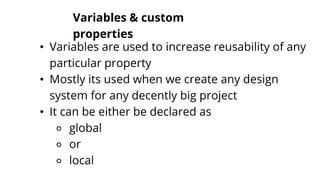
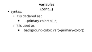
• We already know element selectors as
⚬ input {
⚬ display: block;
⚬ }
• Now to target any specific element we may use that
element's any attribute:
⚬ input[type='text'] {
⚬ display: block;
⚬ }
⚬](https://image.slidesharecdn.com/tutorial-3-210828155217/85/Web-development-basics-Part-2-21-320.jpg)
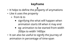


This document is a tutorial for building a simple responsive website, covering essential CSS topics such as visibility, z-index, flexbox, media queries, and various selectors. It provides insights into responsive design techniques and CSS properties, including the use of units like em, rem, vh, and vw. The tutorial also touches on animations, keyframes, and the importance of creating adaptable web applications to suit various device resolutions.