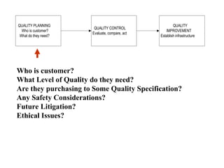
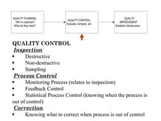
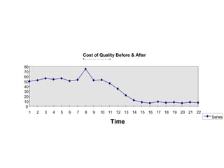
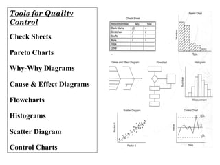
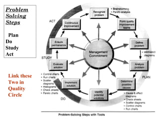
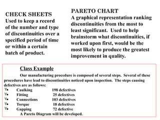
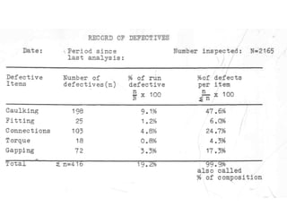
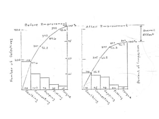
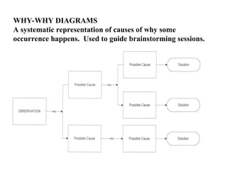
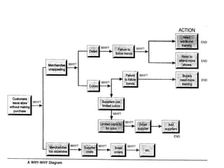
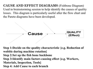
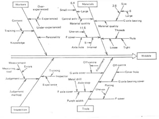
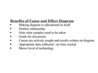
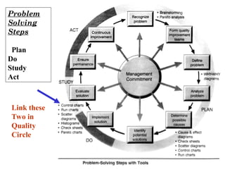
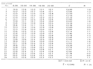
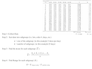
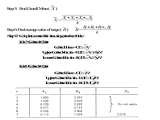
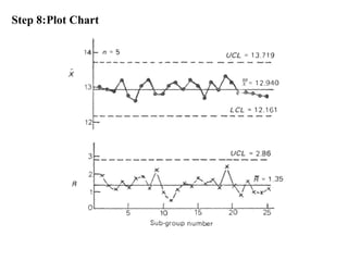
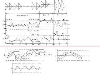
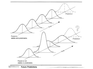
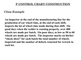
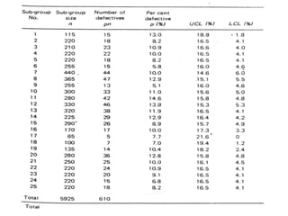
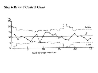
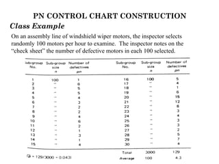
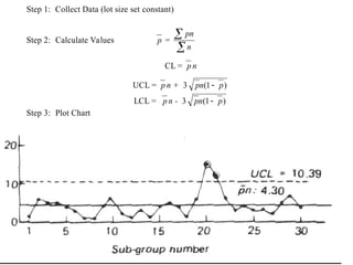
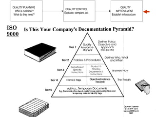
TOTAL QUALITY
MANAGEMENT
(Continuous Quality
Improvement)
QUALITY PLANNING
Who is customer?
What do they need?
QUALITY CONTROL
Evaluate, compare, act
QUALITY
IMPROVEMENT
Establish infrastructure
Who is customer?
What Level of Quality do they need?
Are they purchasing to Some Quality Specification?
Any Safety Considerations?
Future Litigation?
Ethical Issues?
QUALITY PLANNING
Who is customer?
What do they need?
QUALITY CONTROL
Evaluate, compare, act
QUALITY
IMPROVEMENT
Establish infrastructure
QUALITY CONTROL
Inspection
 Destructive
 Non-destructive
 Sampling
Process Control
 Monitoring Process (relates to inspection)
 Feedback Control
 Statistical Process Control (knowing when the process is
out of control)
Correction
 Knowing what to correct when process is out of control
Cost of Quality Before & After
Improvement
0
10
20
30
40
50
60
70
80
1 2 3 4 5 6 7 8 9 10 11 12 13 14 15 16 17 18 19 20 21 22
Time
Series
1
Tools for Quality
Control
Check Sheets
Pareto Charts
Why-Why Diagrams
Cause & Effect Diagrams
Flowcharts
Histograms
Scatter Diagram
Control Charts
Problem
Solving
Steps
Plan
Do
Study
Act
Link these
Two in
Quality
Circle
CHECK SHEETS
Used to keep a record
of the number and type
of discontinuities over a
specified period of time
or within a certain
batch of product.
PARETO CHART
A graphical representation ranking
discontinuities from the most to
least significant. Used to help
brainstorm what discontinuities, if
worked upon first, would be the
most likely to produce the greatest
improvement in quality.
Class Example
Our manufacturing procedure is composed of several steps. Several of these
procedures have lead to discontinuities noticed upon inspection. The steps causing
defectives are as follows:
 Caulking 198 defectives
 Fitting 25 defectives
 Connections 103 defectives
 Torque 18 defectives
 Gapping 72 defective
A Pareto Diagram will be developed.
WHY-WHY DIAGRAMS
A systematic representation of causes of why some
occurrence happens. Used to guide brainstorming sessions.
FLOW CHARTS
Flow charts are graphical representations of the steps involved
in a process. Constructing a flow chart helps give a better
understanding of the systems involved.
Process
Decision
Data
Process
Process
Terminator
Y
es
No
Control
transfer
CAUSE AND EFFECT DIAGRAMS (Fishbone Diagram)
Used in brainstorming session to help identify the causes of quality
losses. This diagram is particularly useful after the flow chart and
the Pareto diagrams have been developed.
QUALITY
(Effect)
Cause
Step 1:Decide on the quality characteristic {e.g. Reduction of
wobble during machine rotation}
Step 2:Set up the fish bone backbone
Step 3:Identify main factors causing effect {e.g. Workers,
Materials, Inspection, Tools}
Step 4: Add Cause to each branch
Benefits of Cause and Effect Diagram
 Making diagram is educational in itself
 Outline relationship
 Note what samples need to be taken
 Guide for discussion
 Causes are actively sought and results written on diagram
 Appropriate data collected - no time wasted
 Shows level of technology
Problem
Solving
Steps
Plan
Do
Study
Act
Link these
Two in
Quality
Circle
CONTROL CHARTS
 Used to test if the process is in control
 Used to see if significant changes have occurred in the
process over time
“Indiscreet” or
“Continuous Data
Chart” or “X-R Chart”
Measurement at time
intervals
Measurements compared -
control over time.
Examples:
Length (mm) Volume (cc)
Weight (gm) Power (kwh)
Time (sec) Pressure (psi)
“Discrete Data Charts” or
“pn-p charts”
Inspection on lot or batch
Note # good/defective
# of parts inspected in the lot = n
Fraction of defective in lot = p
Number of defectives = pn
- R CHART CONSTRUCTION
X
In the manufacturing process for this example parts are being
machined with a nominal diameter of 13 mm. Samples are
taken at the following times of day: 6:00, 10:00, 14:00, 18:00
and 22:00, for 25 consecutive days. The diameter
measurements from these samples are presented on the table
in the next slide.
Class Example
S te p 1 : C o lle c t D a ta
S te p 2 : S o rt d a ta in to su b g ro u p s (i.e . lo ts, o rd e r # , d a y s, e tc .)
n = size o f th e su b g ro u p { in th is e x a m p le 5 tim e s p e r d a y )
k = n u m b e r o f su b g ro u p s { in th is e x a m p le 2 5 d a y s}
S te p 3 : F in d th e m e a n fo r e a c h su b g ro u p ( X )
X =
X X X X
n
n
1 2 3
   .....
S te p 4 : F in d R a n g e fo r e a c h su b g ro u p ( R )
R = X la rg e s t v a lu e - X s m a lle s t v a lu e
S
te
p5
: F
in
dO
v
e
ra
llM
e
a
n( X )
X =
X X X X
k
k
1 2 3
  
...
S
te
p6
:F
in
da
v
e
ra
g
ev
a
lu
eo
fra
n
g
e( R) R=
R R R R
k
k
1 2 3
  
...
S
t
e
p
7
:C
o
m
p
l
e
t
e
c
o
n
t
r
o
l
l
i
m
i
t
s
u
s
i
n
g
a
t
t
a
c
h
e
d
t
a
b
l
e
F
o
r
X
C
o
n
t
r
o
l
C
h
a
r
t
C
e
n
t
r
a
l
L
i
n
e
-
C
L
=
X
U
p
p
e
r
C
o
n
t
r
o
l
L
i
m
i
t-
U
C
L
=
X
+
A
2
R
L
o
w
e
r
C
o
n
t
r
o
l
L
i
m
i
t-
L
C
R
=
X
-
A
2
R
F
o
r
R
C
o
n
t
r
o
l
C
h
a
r
t
C
e
n
t
r
a
l
L
i
n
e
-
C
L
=
R
U
p
p
e
r
C
o
n
t
r
o
l
L
i
m
i
t-
U
C
L
=
D
4
R
L
o
w
e
r
C
o
n
t
r
o
l
L
i
m
i
t-
L
C
R
=
D
3
R
Step 8:Plot Chart
P CONTROL CHART CONSTRUCTION
An inspector at the end of the manufacturing line for the
production of car wheel rims, at the end of each shift,
inspects the lot of wheel rims made during that shift. On
good days when the welder is running properly, over 400
wheels are made per batch. On poor days, as low as 50 to 60
wheels are made per batch. The inspector marks on his/her
“check sheet” for each batch the total number of wheels
inspected and the number of defects returned for rework in
each lot.
Class Example
Step 1: Collect Data
Step 2: Divide data into subgroups (usually days or lot). Subgroup size should be
greater than 50 units.
n = number in each subgroup
pn = number of defects in each subgroup
Step 3: Compute fraction of defectives (for %, multiply by 100)
p = pn/n
Step 4: Find the Average Fraction of Defectives ( p )
p =
( )
( )
total defectives
total inspected
=
pn
n


Step 5: Compute the Control Limits for each Lot
Central Line CL = p
Upper Control Limit UCL = p + 3
p p
n
( )
1 
Lower Control Limit LCR = p - 3
p p
n
( )
1 
Step 6:Draw P Control Chart
PN CONTROL CHART CONSTRUCTION
Class Example
On an assembly line of windshield wiper motors, the inspector selects
randomly 100 motors per hour to examine. The inspector notes on the
“check sheet” the number of defective motors in each 100 selected.
Step 1: Collect Data (lot size set constant)
Step 2: Calculate Values p =


n
pn
CL = p n
UCL = p n + 3 pn p
( )
1
LCL = p n - 3 pn p
( )
1
Step 3: Plot Chart
QUALITY PLANNING
Who is customer?
What do they need?
QUALITY CONTROL
Evaluate, compare, act
QUALITY
IMPROVEMENT
Establish infrastructure
ISO
9000
TOTAL QUALITY MANAGEMENT  (Continuous Quality Improvement)

TOTAL QUALITY MANAGEMENT (Continuous Quality Improvement)

  • 1.
  • 2.
    QUALITY PLANNING Who iscustomer? What do they need? QUALITY CONTROL Evaluate, compare, act QUALITY IMPROVEMENT Establish infrastructure Who is customer? What Level of Quality do they need? Are they purchasing to Some Quality Specification? Any Safety Considerations? Future Litigation? Ethical Issues?
  • 3.
    QUALITY PLANNING Who iscustomer? What do they need? QUALITY CONTROL Evaluate, compare, act QUALITY IMPROVEMENT Establish infrastructure QUALITY CONTROL Inspection  Destructive  Non-destructive  Sampling Process Control  Monitoring Process (relates to inspection)  Feedback Control  Statistical Process Control (knowing when the process is out of control) Correction  Knowing what to correct when process is out of control
  • 4.
    Cost of QualityBefore & After Improvement 0 10 20 30 40 50 60 70 80 1 2 3 4 5 6 7 8 9 10 11 12 13 14 15 16 17 18 19 20 21 22 Time Series 1
  • 5.
    Tools for Quality Control CheckSheets Pareto Charts Why-Why Diagrams Cause & Effect Diagrams Flowcharts Histograms Scatter Diagram Control Charts
  • 6.
  • 7.
    CHECK SHEETS Used tokeep a record of the number and type of discontinuities over a specified period of time or within a certain batch of product. PARETO CHART A graphical representation ranking discontinuities from the most to least significant. Used to help brainstorm what discontinuities, if worked upon first, would be the most likely to produce the greatest improvement in quality. Class Example Our manufacturing procedure is composed of several steps. Several of these procedures have lead to discontinuities noticed upon inspection. The steps causing defectives are as follows:  Caulking 198 defectives  Fitting 25 defectives  Connections 103 defectives  Torque 18 defectives  Gapping 72 defective A Pareto Diagram will be developed.
  • 10.
    WHY-WHY DIAGRAMS A systematicrepresentation of causes of why some occurrence happens. Used to guide brainstorming sessions.
  • 12.
    FLOW CHARTS Flow chartsare graphical representations of the steps involved in a process. Constructing a flow chart helps give a better understanding of the systems involved. Process Decision Data Process Process Terminator Y es No Control transfer
  • 13.
    CAUSE AND EFFECTDIAGRAMS (Fishbone Diagram) Used in brainstorming session to help identify the causes of quality losses. This diagram is particularly useful after the flow chart and the Pareto diagrams have been developed. QUALITY (Effect) Cause Step 1:Decide on the quality characteristic {e.g. Reduction of wobble during machine rotation} Step 2:Set up the fish bone backbone Step 3:Identify main factors causing effect {e.g. Workers, Materials, Inspection, Tools} Step 4: Add Cause to each branch
  • 15.
    Benefits of Causeand Effect Diagram  Making diagram is educational in itself  Outline relationship  Note what samples need to be taken  Guide for discussion  Causes are actively sought and results written on diagram  Appropriate data collected - no time wasted  Shows level of technology
  • 16.
  • 17.
    CONTROL CHARTS  Usedto test if the process is in control  Used to see if significant changes have occurred in the process over time “Indiscreet” or “Continuous Data Chart” or “X-R Chart” Measurement at time intervals Measurements compared - control over time. Examples: Length (mm) Volume (cc) Weight (gm) Power (kwh) Time (sec) Pressure (psi) “Discrete Data Charts” or “pn-p charts” Inspection on lot or batch Note # good/defective # of parts inspected in the lot = n Fraction of defective in lot = p Number of defectives = pn
  • 18.
    - R CHARTCONSTRUCTION X In the manufacturing process for this example parts are being machined with a nominal diameter of 13 mm. Samples are taken at the following times of day: 6:00, 10:00, 14:00, 18:00 and 22:00, for 25 consecutive days. The diameter measurements from these samples are presented on the table in the next slide. Class Example
  • 20.
    S te p1 : C o lle c t D a ta S te p 2 : S o rt d a ta in to su b g ro u p s (i.e . lo ts, o rd e r # , d a y s, e tc .) n = size o f th e su b g ro u p { in th is e x a m p le 5 tim e s p e r d a y ) k = n u m b e r o f su b g ro u p s { in th is e x a m p le 2 5 d a y s} S te p 3 : F in d th e m e a n fo r e a c h su b g ro u p ( X ) X = X X X X n n 1 2 3    ..... S te p 4 : F in d R a n g e fo r e a c h su b g ro u p ( R ) R = X la rg e s t v a lu e - X s m a lle s t v a lu e
  • 21.
    S te p5 : F in dO v e ra llM e a n( X) X = X X X X k k 1 2 3    ... S te p6 :F in da v e ra g ev a lu eo fra n g e( R) R= R R R R k k 1 2 3    ... S t e p 7 :C o m p l e t e c o n t r o l l i m i t s u s i n g a t t a c h e d t a b l e F o r X C o n t r o l C h a r t C e n t r a l L i n e - C L = X U p p e r C o n t r o l L i m i t- U C L = X + A 2 R L o w e r C o n t r o l L i m i t- L C R = X - A 2 R F o r R C o n t r o l C h a r t C e n t r a l L i n e - C L = R U p p e r C o n t r o l L i m i t- U C L = D 4 R L o w e r C o n t r o l L i m i t- L C R = D 3 R
  • 22.
  • 25.
    P CONTROL CHARTCONSTRUCTION An inspector at the end of the manufacturing line for the production of car wheel rims, at the end of each shift, inspects the lot of wheel rims made during that shift. On good days when the welder is running properly, over 400 wheels are made per batch. On poor days, as low as 50 to 60 wheels are made per batch. The inspector marks on his/her “check sheet” for each batch the total number of wheels inspected and the number of defects returned for rework in each lot. Class Example
  • 27.
    Step 1: CollectData Step 2: Divide data into subgroups (usually days or lot). Subgroup size should be greater than 50 units. n = number in each subgroup pn = number of defects in each subgroup Step 3: Compute fraction of defectives (for %, multiply by 100) p = pn/n Step 4: Find the Average Fraction of Defectives ( p ) p = ( ) ( ) total defectives total inspected = pn n   Step 5: Compute the Control Limits for each Lot Central Line CL = p Upper Control Limit UCL = p + 3 p p n ( ) 1  Lower Control Limit LCR = p - 3 p p n ( ) 1 
  • 28.
    Step 6:Draw PControl Chart
  • 29.
    PN CONTROL CHARTCONSTRUCTION Class Example On an assembly line of windshield wiper motors, the inspector selects randomly 100 motors per hour to examine. The inspector notes on the “check sheet” the number of defective motors in each 100 selected.
  • 30.
    Step 1: CollectData (lot size set constant) Step 2: Calculate Values p =   n pn CL = p n UCL = p n + 3 pn p ( ) 1 LCL = p n - 3 pn p ( ) 1 Step 3: Plot Chart
  • 31.
    QUALITY PLANNING Who iscustomer? What do they need? QUALITY CONTROL Evaluate, compare, act QUALITY IMPROVEMENT Establish infrastructure ISO 9000