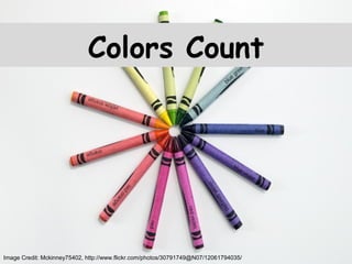
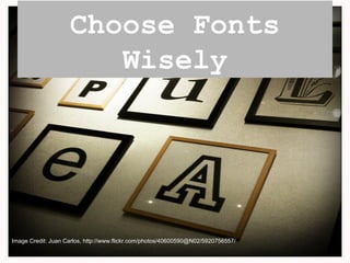
Top 10 Slide Tips
Article by Garr Reynolds
source: http://www.garrreynolds.com/preso-tips/design/
Image Credit: Larry, http://www.flickr.com/photos/41279311@N06/5317136709/
Keep it simple.
Image Credit: Jeremy Kunz, www.flickr.com/photos/68196771@N00/3630521571/
Limit Text and Bullets
Image Credit: Shinichi, http://www.flickr.com/photos/8052628@N05/1716201217/
Limit Effects
Image Credit: Live Life Happy, http://www.flickr.com/photos/78592755@N06/9189676262/
High Quality
Graphics
Image Credit: Webtreats, http://www.flickr.com/photos/44071822@N08/5949922924/
Avoid Tempting Templates
Image Credit: Shawn Carpenter, http://www.flickr.com/photos/14347196@N00/4557822128/
Suitability
Image Credit: DW 2002, http://www.flickr.com/photos/34005963@N04/5451586006/
Colors Count
Image Credit: Mckinney75402, http://www.flickr.com/photos/30791749@N07/12061794035/
Choose Fonts
Wisely
Image Credit: Juan Carlos, http://www.flickr.com/photos/40600590@N02/5920756557/
Media is
Useful
Image Credit: Sven, http://www.flickr.com/photos/46672954@N08/7132452145/
Organize Slides
Image Credit: Chris Blakeley, http://www.flickr.com/photos/61565201@N00/8671562129/

Top 10 Slide Tips

Editor's Notes

  • #2 In a well written and inciting article by Garr Reynolds, he makes note of ten tips. Ten tips that would ensure your next presentation is a success.
  • #3 Make the people want to listen to you and what you have to say. Ensure your the star of the show, not your powerpoint.
  • #4 Don’t bore the audience with loads of text and information. You may have no text at all at times- could make for the best slides of your presentation!
  • #5 Wipe Left-to-Right: Effective……. “Move” or “Fly”: Not so much. Slide after slide with crazy, eye throbbing transitions will bore your audience.
  • #6 High quality graphics are key. Never stretch, search for better, it’ll be worth it!
  • #7 Theme is key, template isn't so much. This likely won’t be your audiences first powerpoint presentation, so don’t bore them with templates they have all seen.
  • #8 Use the proper chart that will convey the proper amount of information. Don’t overload.
  • #9 Know your setting and ensure your presentation works well with it. You don’t need to be a color expert. Use correct colors, they could go a long way with enhancing your presentation.
  • #10 Choose fonts deliberately, they go a long way in conveying your message. Serif fonts.
  • #11 Use when appropriate. Avoid cheesy sounds (especially in transitions).
  • #12 Through organizing and sorting-- you review. Through reviewing, your presentation is refined and brought up to its pinnacle.