Top 10 
Slide Tips 
By Gabrielle DiSanto 
Article by Garr 
Reynolds 
Sources: http://www.garrreynolds.com/preso-tips/design/ Photo Credit - Ashley: https://www.flickr.com/photos/ashmashmash/5065252919
Simplicity is 
Key 
Photo Credit - Lee Morley: https://www.flickr.com/photos/spookman01/6170537299
Limit 
Text 
Photo Credit - Zach Stern: https://www.flickr.com/photos/zachstern
Limit Transitions 
Photo Credit - Universal Pop: https://www.flickr.com/photos/universalpops/14771260609/
Good Quality Images 
Photo Credit: Thirtyfootscrew: https://www.flickr.com/photos/thirtyfootscrew/3342231696
Visual Theme 
Photo Credit - EQUILOUD: https://www.flickr.com/photos/31659250@N08/7167462582
CHARTS
COLORS 
Photo Credit - Bernat Casero: https://www.flickr.com/photos/bernatcg/2233601787/
Fonts 
Photo Credit - Dani Sardà i Lizaran: https://www.flickr.com/photos/danisarda/2956328916/
Video 
Photo Credit - Jd Hancock: https://www.flickr.com/photos/jdhancock/7439512656
Slide Order 
Photo Credit: David Goehring: https://www.flickr.com/photos/carbonnyc/4975029554

Top 10 slide tips

  • 1.
    Top 10 SlideTips By Gabrielle DiSanto Article by Garr Reynolds Sources: http://www.garrreynolds.com/preso-tips/design/ Photo Credit - Ashley: https://www.flickr.com/photos/ashmashmash/5065252919
  • 2.
    Simplicity is Key Photo Credit - Lee Morley: https://www.flickr.com/photos/spookman01/6170537299
  • 3.
    Limit Text PhotoCredit - Zach Stern: https://www.flickr.com/photos/zachstern
  • 4.
    Limit Transitions PhotoCredit - Universal Pop: https://www.flickr.com/photos/universalpops/14771260609/
  • 5.
    Good Quality Images Photo Credit: Thirtyfootscrew: https://www.flickr.com/photos/thirtyfootscrew/3342231696
  • 6.
    Visual Theme PhotoCredit - EQUILOUD: https://www.flickr.com/photos/31659250@N08/7167462582
  • 7.
  • 8.
    COLORS Photo Credit- Bernat Casero: https://www.flickr.com/photos/bernatcg/2233601787/
  • 9.
    Fonts Photo Credit- Dani Sardà i Lizaran: https://www.flickr.com/photos/danisarda/2956328916/
  • 10.
    Video Photo Credit- Jd Hancock: https://www.flickr.com/photos/jdhancock/7439512656
  • 11.
    Slide Order PhotoCredit: David Goehring: https://www.flickr.com/photos/carbonnyc/4975029554

Editor's Notes

  • #3 The audiences participation is what should be the most important for your presentation, not what is on the slide. Do not let your slides become complicated, busy, or full. It is better to have more “white space” than clutter your slides with useless images and text that do not help with the audience understanding your topic. The less information on the slide the better
  • #4 Bullet points bore the audience, there is no benefit to reading your presentation when audience knows what you are going to say. What makes a good slide is little text (1 to 3 words) because it is better for you as the presenter to narrate the information you want to provide for the slide.
  • #5 Animations for bullet points should not be on every slide. It is ok to have some transition, but it should be done professionally. Limit to two to three different types of transitions and do not place transition between every slide.
  • #6 Whether it is using your own photographs, purchasing professional stock photos, or quality images online (creative commons), never use clip art provided by powerpoint. Your images should be high resolution in order to fit the layout.
  • #7 Have a consistent theme throughout, so do not use templates from powerpoint because it been seen before many times. Make it unique to help get your audience excited about your presentation
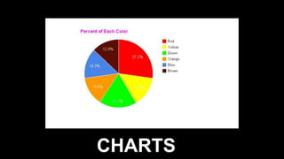
  • #8 Charts are a great way for displaying information in a simple organized form. Pie Charts: Be sure to used percentages for the data. Do not exceed 4-6 slices and contrast the most important slice either with color or by exploding the slice. Vertical Bar Charts: Help to show changes in quantity over time. Better to limit the 4-8 bars Horizontal Bar Charts: Also used to compare quantities, such as comparing sales figures among the four regions of the company. Line Charts: Helps to show trends, like for example, a line chart showing that sales have gone down every year. The trend is bad. .
  • #9 Certain colors can trigger emotions and feelings, and with the right colors it can help motivate and persuade the audience. Contrast the colors between background and text to help get the audiences attention.
  • #10 Choose your fonts deliberately in order to help convey your message. Use the same fonts throughout your slides.
  • #11 Only use when appropriate. Using video and audio clips can help engage the audience into “active cognitive processing”, which helps them learn. Avoid using sound effects the powerpoint provides, it is unprofessional.
  • #12 When determining the order for your presentation, the slides need to follow the information that you want to present. This order should be logical and clear to help the audience follow.