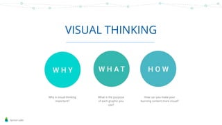
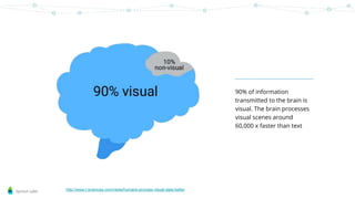
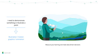
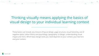
Sprout Labs
Thinking
Visually
Sprout Labs
VISUAL THINKING
Why is visual thinking
important?
What is the purpose
of each graphic you
use?
How can you make your
learning content more visual?
Sprout Labs
Sprout Labs
90% of information
transmitted to the brain is
visual. The brain processes
visual scenes around
60,000 x faster than text
http://www.t-sciences.com/news/humans-process-visual-data-better
Sprout Labs
‘Aesthetic usability effect’ –
good looking user interfaces
are perceived as easier to
use even if they are more
problematic to navigate
https://www.nngroup.com/articles/aesthetic-usability-effect/
Sprout Labs
Visuals increases engagement
with content - a graphic or image
is easier to remember than a
paragraph of text
To recap, the four types of directly observable
evidence of abstract learning are: what we do,
what we say what we make and what we
write.
When you visit a colleague’s classroom or are
observed yourself it is useful to remember
the focus is: What is the teacher doing, saying,
making and writing? What are the students
doing, saying, making and writing? What is
the nature of the task?
Sprout Labs
The eye craves order & visual
consistency - visual thinking is
also about using information
architecture to structure your
content
Sprout Labs
Sprout Labs
What problem are you trying to
solve?
Visuals must have a reason for being part of
your content – if they’re added just for
aesthetic reasons they will detract from your
content and be distracting for the learner.
Knowing the purpose of
the graphic will help you
decide what kind of
graphic it needs to be.
Sprout Labs
I need to demonstrate
something or illustrate a
point
Illustration / motion
graphics / animation
Measure your learning and make data-driven decisions
Sprout Labs
I want to engage my
learner more in a
section of content
infographic
Sprout Labs
I just need to provide
more structure to this
page or screen
Page furniture /
layout design
Sprout Labs
I’d like the learner to
empathise with what I’m
talking about
photography
Sprout Labs
This is just too text
heavy - I need to break
up the visual field
Flowchart /
layout design
Sprout Labs
Sprout Labs
Thinking visually means applying the basics of
visual design to your individual learning context
These basics can include any mixture of layout design, page structure, visual hierarchy, use of
negative space, colour theory and psychology, typography, UI design, understanding visual
impact and more. Which basic design tools you need depends on your context, your learners
and your content.
Sprout Labs
Use negative space around
content - don’t crowd too
much information in
Keep a consistent content
structure - e.g. 2 column layout,
with image spanning both
Use page furniture such as
divider lines to anchor content
and provide visual
differentiation to sections
Sprout Labs
Consider your target learners
before deciding on colour - the
psychology of colour is mostly
subconscious
Match your brand and
LMS colour palette to
visually connect them
Use a feature colour (such as the
yellow here) to draw attention to
key areas
Sprout Labs
Font choice matters.
Using serif / sans serif / display fonts
will give all your text either an
informal or formal feel to it and
subconsciously affect the learner
If using coloured text, or white text on
a coloured background, ensure your
colours meet accessibility standards
(high contrast is a good place to start)
https://www.novoamedia.com/blog/2016/5/24/design-humor-101
Sprout Labs
Use illustrations to tell a story or
explain a process visually
Use ‘journey lines’ to connect stages
of a process - maintain visual flow
and direct the eye
Ensure the tone of your graphics matches
your brand voice - is it formal, or friendly,
instructional etc?
Sprout Labs
Photography is visually intense - match
photographs with secondary rather than
primary colours, or transparencies /
greyscale
Balance the visual impact of your
images - especially important if you are
using stock photography
Sprout Labs
Use colour sparingly for page furniture - that way
you can draw attention to a call-to-action button
easily with a feature colour
How your User Interface (UI) is designed will
dictate how the learner uses it
Maintain consistent colour and
position of recurring UI elements
like navigation aids, buttons and
menus
Sprout Labs
www.sproutlabs.com.au/elearning-events/visual-design-for-learning-program
iona@sproutlabs.com.a
u
Iona Dierich
Lead visual designer -
Sprout Labs
Sprout Labs
Sprout Labs builds digital learning platforms that enable you and your
team to author, deliver and measure high impact digital learning
ecosystems.

Thinking visually

  • 1.
  • 2.
    Sprout Labs VISUAL THINKING Whyis visual thinking important? What is the purpose of each graphic you use? How can you make your learning content more visual?
  • 3.
  • 4.
    Sprout Labs 90% ofinformation transmitted to the brain is visual. The brain processes visual scenes around 60,000 x faster than text http://www.t-sciences.com/news/humans-process-visual-data-better
  • 5.
    Sprout Labs ‘Aesthetic usabilityeffect’ – good looking user interfaces are perceived as easier to use even if they are more problematic to navigate https://www.nngroup.com/articles/aesthetic-usability-effect/
  • 6.
    Sprout Labs Visuals increasesengagement with content - a graphic or image is easier to remember than a paragraph of text To recap, the four types of directly observable evidence of abstract learning are: what we do, what we say what we make and what we write. When you visit a colleague’s classroom or are observed yourself it is useful to remember the focus is: What is the teacher doing, saying, making and writing? What are the students doing, saying, making and writing? What is the nature of the task?
  • 7.
    Sprout Labs The eyecraves order & visual consistency - visual thinking is also about using information architecture to structure your content
  • 8.
  • 9.
    Sprout Labs What problemare you trying to solve? Visuals must have a reason for being part of your content – if they’re added just for aesthetic reasons they will detract from your content and be distracting for the learner. Knowing the purpose of the graphic will help you decide what kind of graphic it needs to be.
  • 10.
    Sprout Labs I needto demonstrate something or illustrate a point Illustration / motion graphics / animation Measure your learning and make data-driven decisions
  • 11.
    Sprout Labs I wantto engage my learner more in a section of content infographic
  • 12.
    Sprout Labs I justneed to provide more structure to this page or screen Page furniture / layout design
  • 13.
    Sprout Labs I’d likethe learner to empathise with what I’m talking about photography
  • 14.
    Sprout Labs This isjust too text heavy - I need to break up the visual field Flowchart / layout design
  • 15.
  • 16.
    Sprout Labs Thinking visuallymeans applying the basics of visual design to your individual learning context These basics can include any mixture of layout design, page structure, visual hierarchy, use of negative space, colour theory and psychology, typography, UI design, understanding visual impact and more. Which basic design tools you need depends on your context, your learners and your content.
  • 17.
    Sprout Labs Use negativespace around content - don’t crowd too much information in Keep a consistent content structure - e.g. 2 column layout, with image spanning both Use page furniture such as divider lines to anchor content and provide visual differentiation to sections
  • 18.
    Sprout Labs Consider yourtarget learners before deciding on colour - the psychology of colour is mostly subconscious Match your brand and LMS colour palette to visually connect them Use a feature colour (such as the yellow here) to draw attention to key areas
  • 19.
    Sprout Labs Font choicematters. Using serif / sans serif / display fonts will give all your text either an informal or formal feel to it and subconsciously affect the learner If using coloured text, or white text on a coloured background, ensure your colours meet accessibility standards (high contrast is a good place to start) https://www.novoamedia.com/blog/2016/5/24/design-humor-101
  • 20.
    Sprout Labs Use illustrationsto tell a story or explain a process visually Use ‘journey lines’ to connect stages of a process - maintain visual flow and direct the eye Ensure the tone of your graphics matches your brand voice - is it formal, or friendly, instructional etc?
  • 21.
    Sprout Labs Photography isvisually intense - match photographs with secondary rather than primary colours, or transparencies / greyscale Balance the visual impact of your images - especially important if you are using stock photography
  • 22.
    Sprout Labs Use coloursparingly for page furniture - that way you can draw attention to a call-to-action button easily with a feature colour How your User Interface (UI) is designed will dictate how the learner uses it Maintain consistent colour and position of recurring UI elements like navigation aids, buttons and menus
  • 23.
  • 24.
    Sprout Labs Sprout Labsbuilds digital learning platforms that enable you and your team to author, deliver and measure high impact digital learning ecosystems.