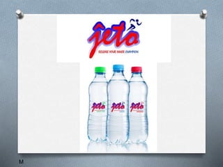
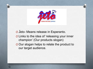
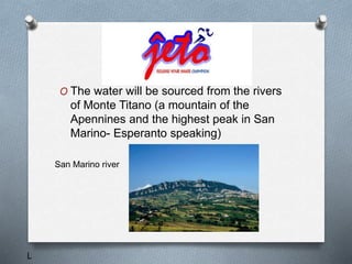
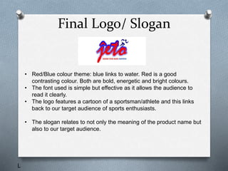
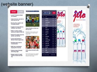
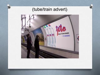
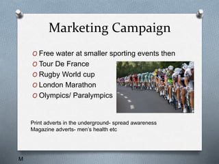
g
Who are we?
O An advertising company
O Specialises in helping new companies
O Advertise products in a unique way
O Founded in December
O Creative director: Georgia RT
O Art director: Matt Holley
O Cinematographer: Josh Brown
O Sales Director: Lily Curtis
g
Hydra/Ĵeto
M
M
Existing Products
J/L
Statistics
J
Effectiveness
Brands
Target Audience
J
Jeto
O Ĵeto- Means release in Esperanto.
O Links to the idea of ‘releasing your inner
champion’ (Our products slogan)
O Our slogan helps to relate the product to
our target audience.
G
O The water will be sourced from the rivers
of Monte Titano (a mountain of the
Apennines and the highest peak in San
Marino- Esperanto speaking)
San Marino river
L
Final Logo/ Slogan
• Red/Blue colour theme: blue links to water. Red is a good
contrasting colour. Both are bold, energetic and bright colours.
• The font used is simple but effective as it allows the audience to
read it clearly.
• The logo features a cartoon of a sportsman/athlete and this links
back to our target audience of sports enthusiasts.
• The slogan relates to not only the meaning of the product name but
also to our target audience.
L
(Print Advert):
(bus advert):
(website banner):
(tube/train advert):
(TV Advert)
Marketing Campaign
O Free water at smaller sporting events then
O Tour De France
O Rugby World cup
O London Marathon
O Olympics/ Paralympics
Print adverts in the underground- spread awareness
Magazine adverts- men’s health etc
M
G/L

The pitch

  • 1.
  • 2.
    Who are we? OAn advertising company O Specialises in helping new companies O Advertise products in a unique way O Founded in December O Creative director: Georgia RT O Art director: Matt Holley O Cinematographer: Josh Brown O Sales Director: Lily Curtis g
  • 3.
  • 4.
  • 5.
  • 6.
  • 7.
  • 8.
    Jeto O Ĵeto- Meansrelease in Esperanto. O Links to the idea of ‘releasing your inner champion’ (Our products slogan) O Our slogan helps to relate the product to our target audience. G
  • 9.
    O The waterwill be sourced from the rivers of Monte Titano (a mountain of the Apennines and the highest peak in San Marino- Esperanto speaking) San Marino river L
  • 10.
    Final Logo/ Slogan •Red/Blue colour theme: blue links to water. Red is a good contrasting colour. Both are bold, energetic and bright colours. • The font used is simple but effective as it allows the audience to read it clearly. • The logo features a cartoon of a sportsman/athlete and this links back to our target audience of sports enthusiasts. • The slogan relates to not only the meaning of the product name but also to our target audience. L
  • 12.
  • 13.
  • 14.
  • 15.
  • 16.
  • 17.
    Marketing Campaign O Freewater at smaller sporting events then O Tour De France O Rugby World cup O London Marathon O Olympics/ Paralympics Print adverts in the underground- spread awareness Magazine adverts- men’s health etc M
  • 18.