Download as PDF, PPTX
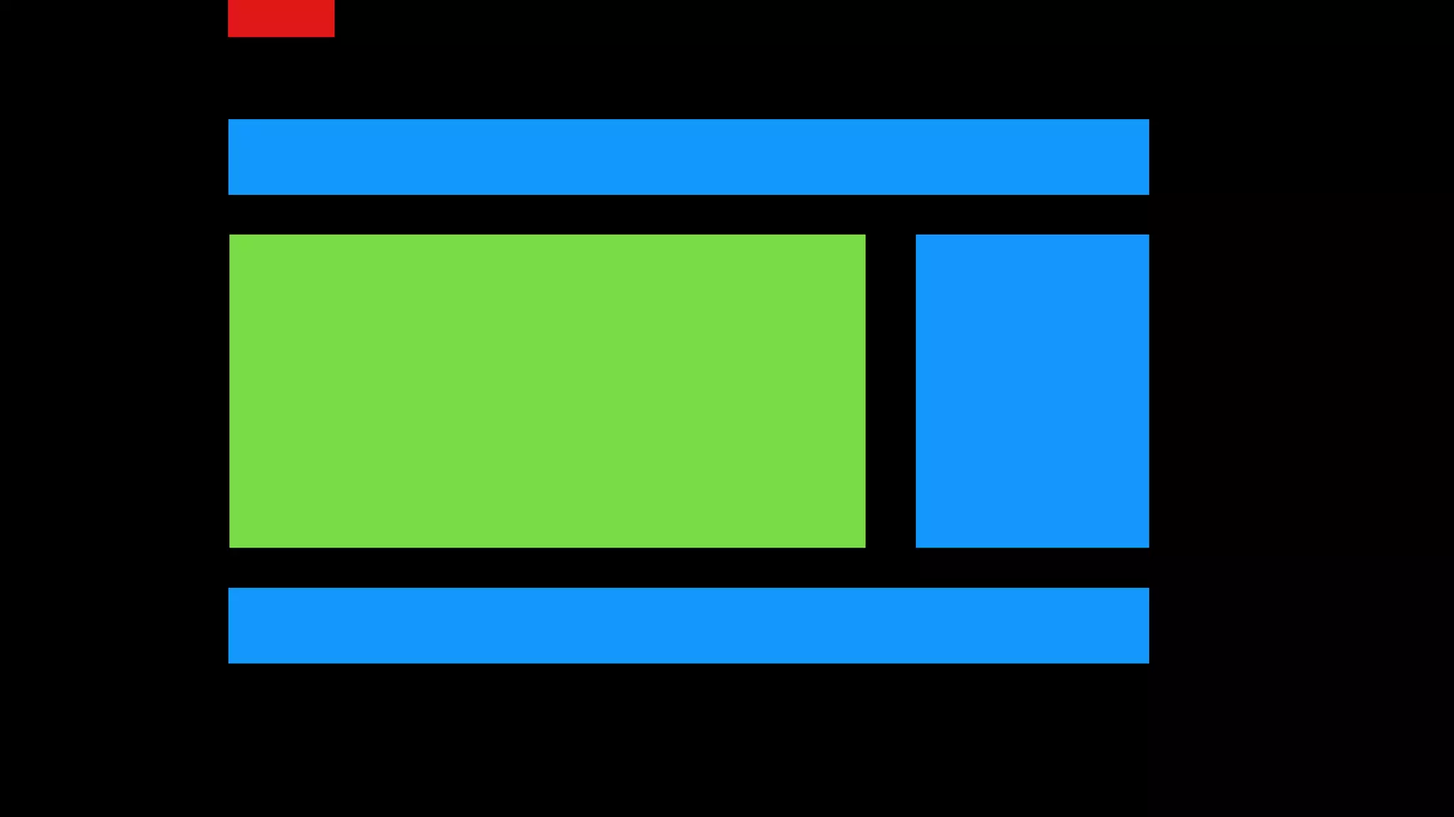
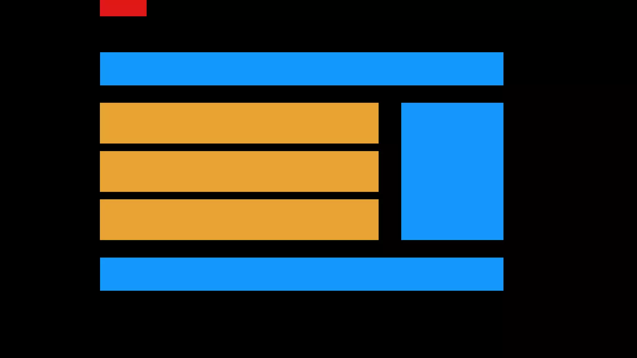
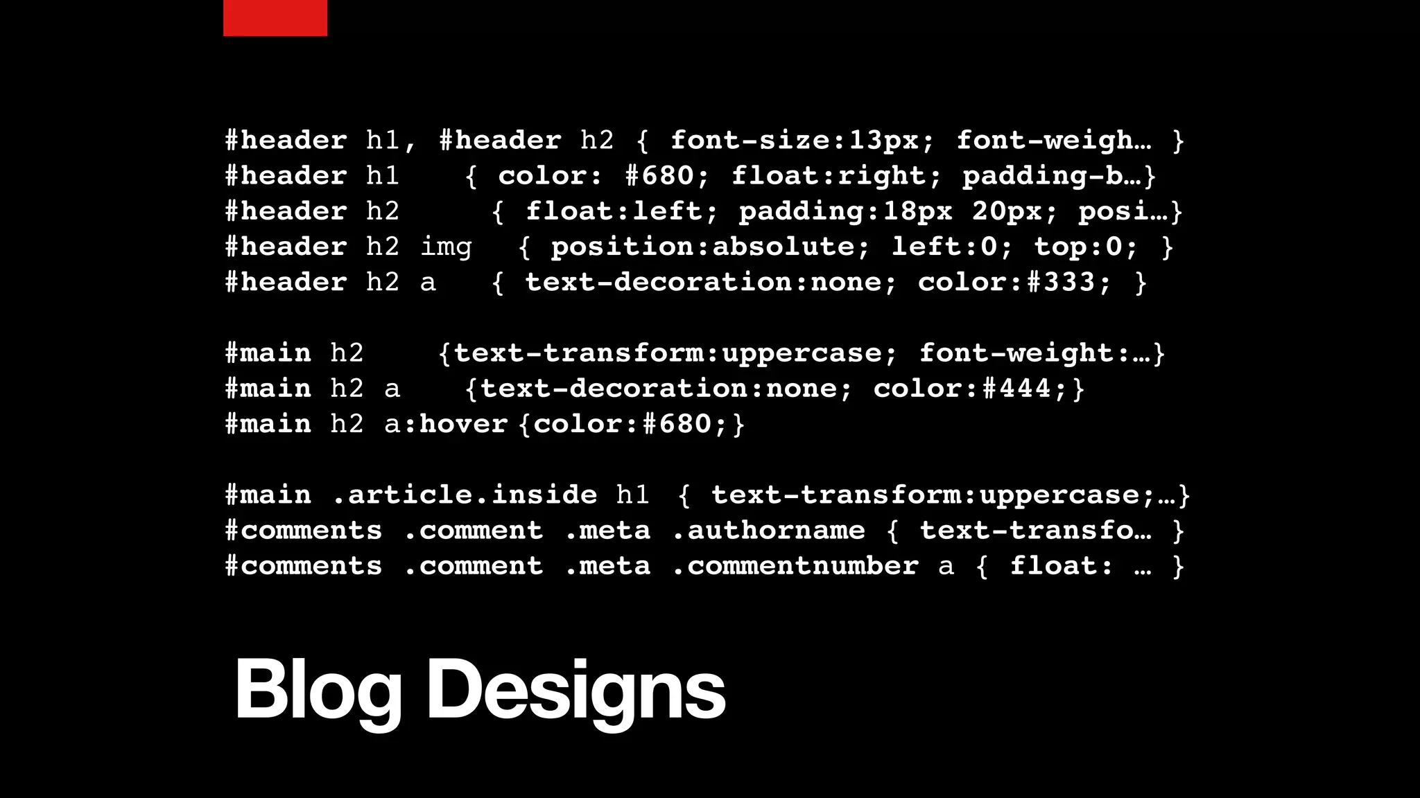
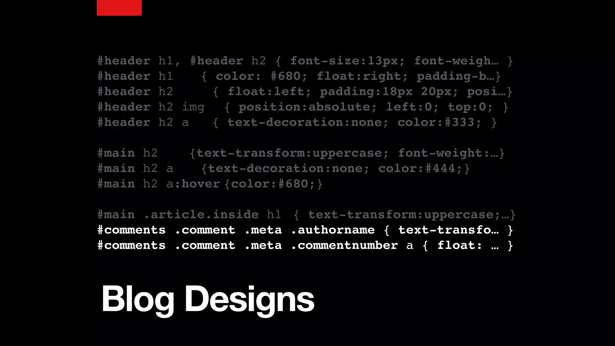
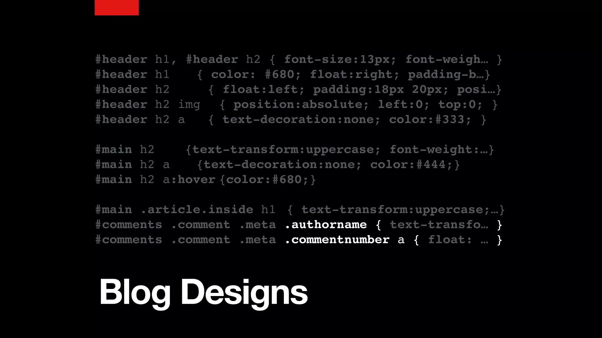


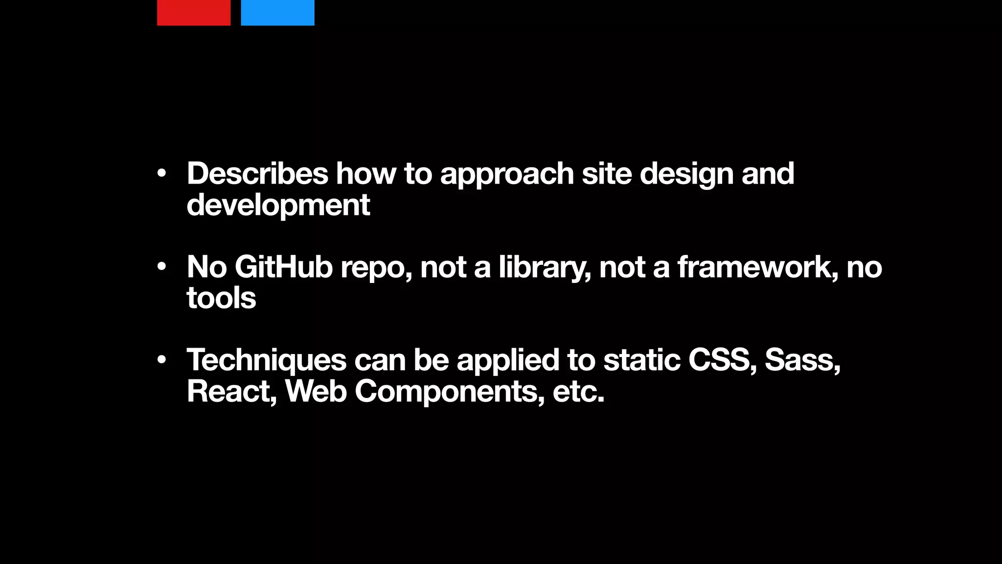

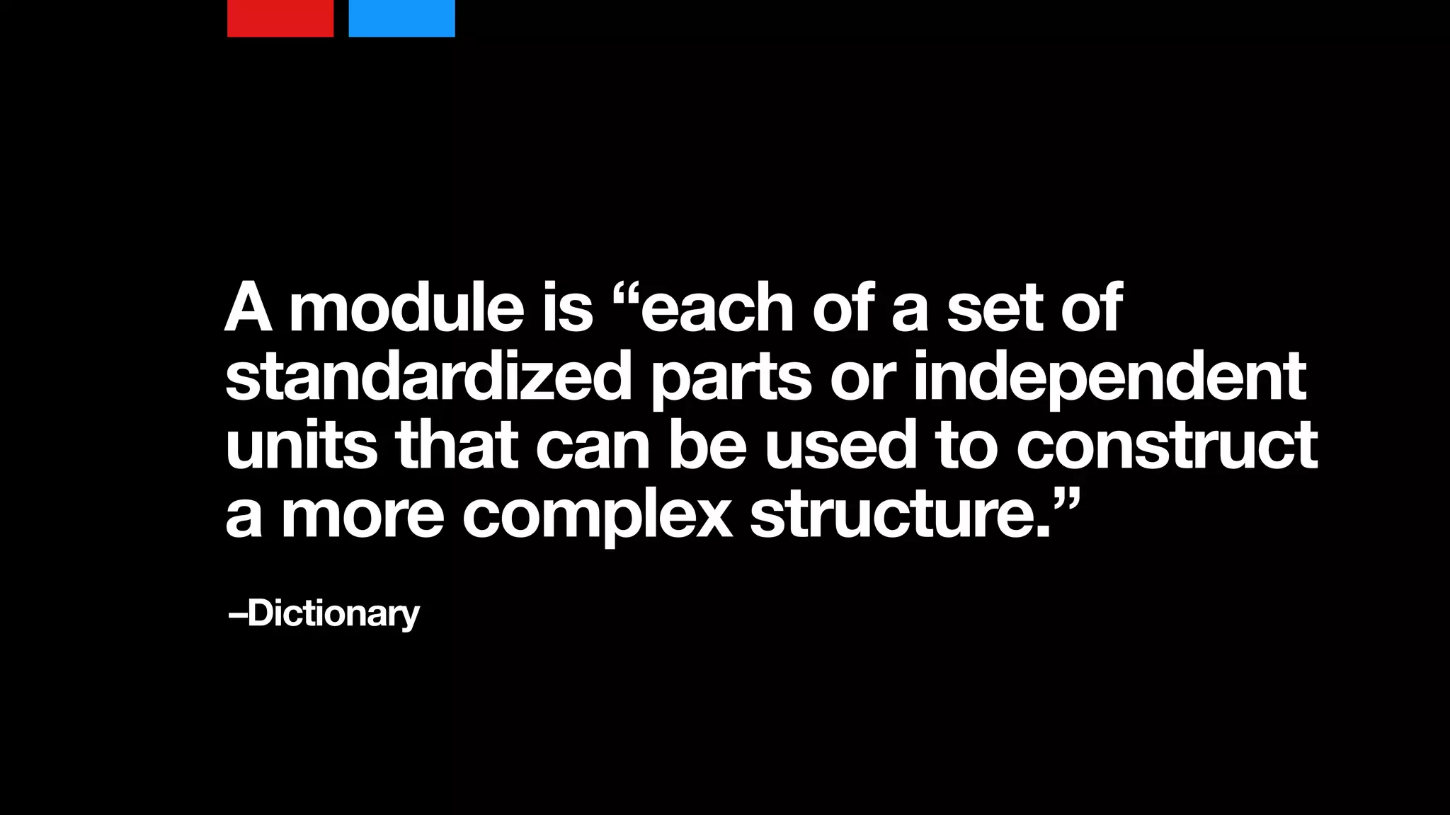
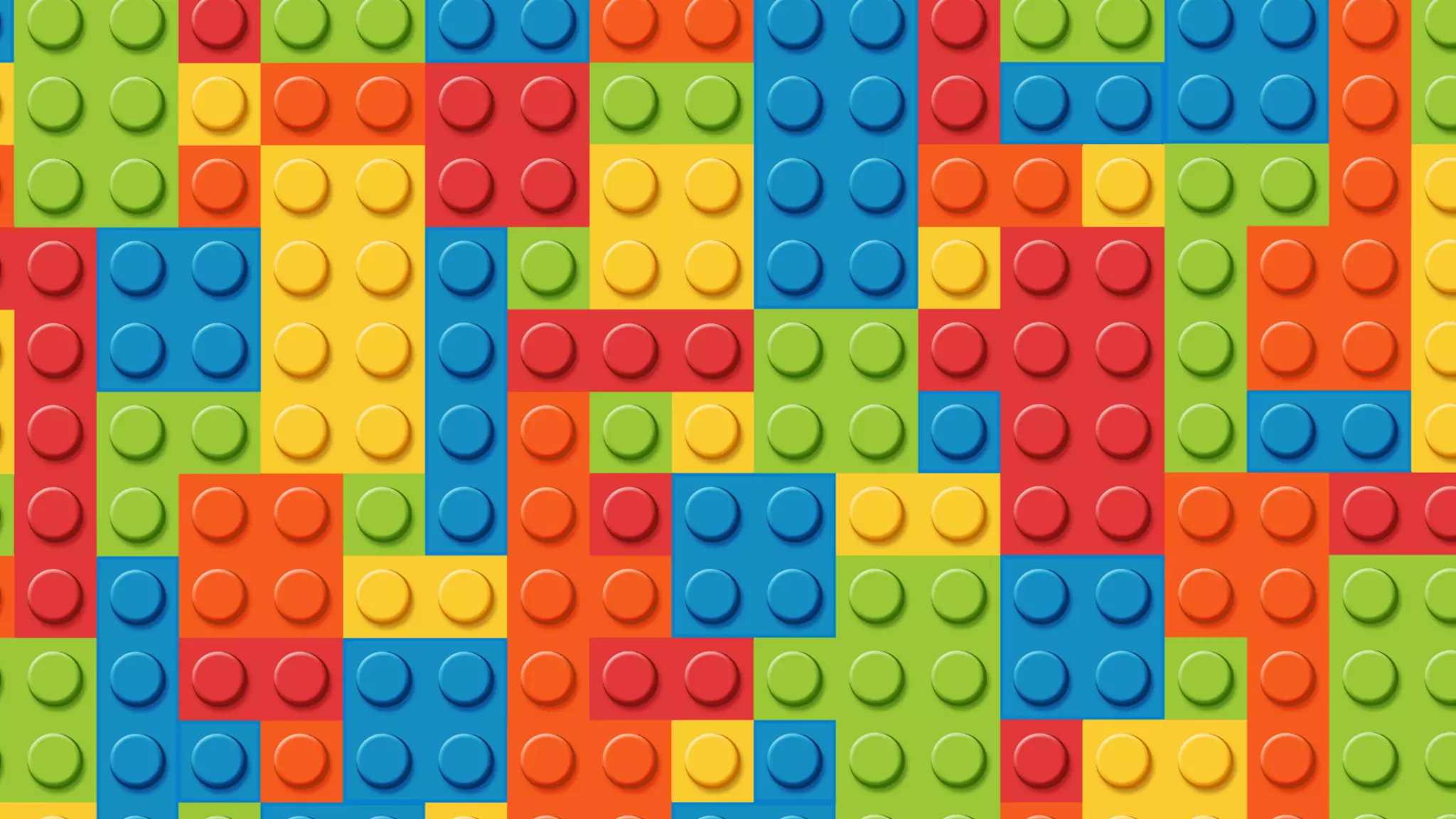


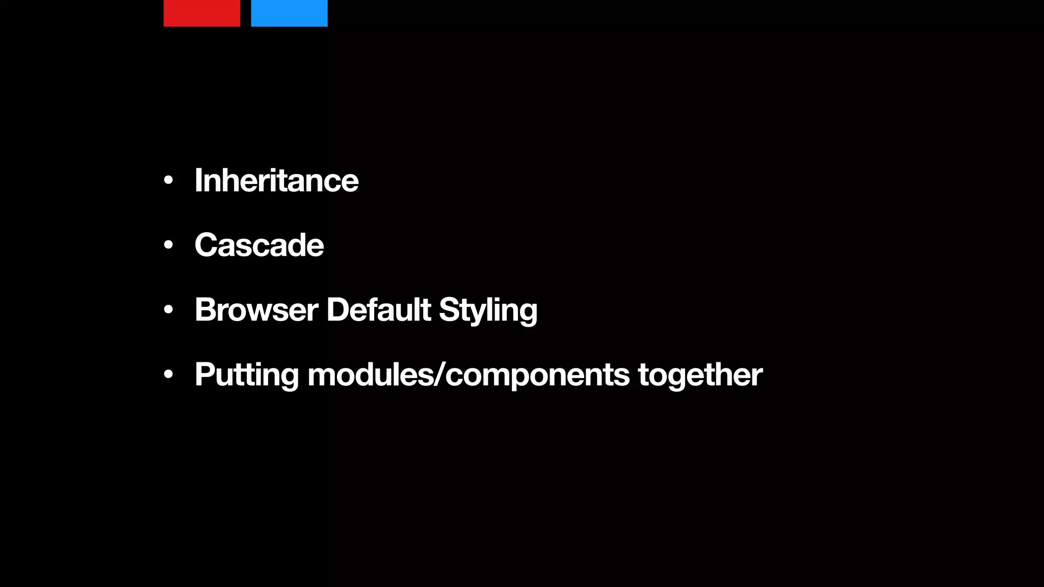

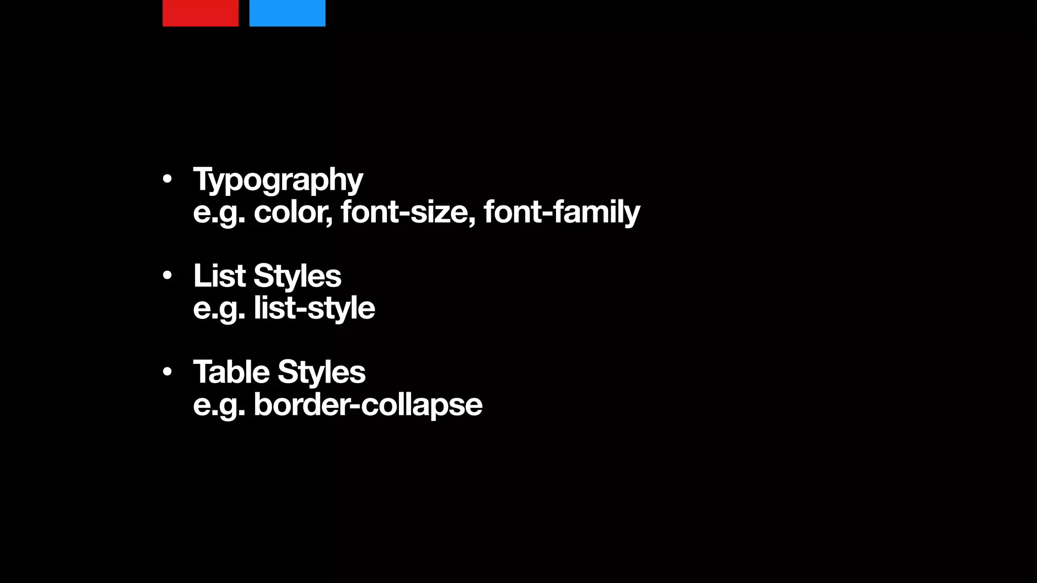

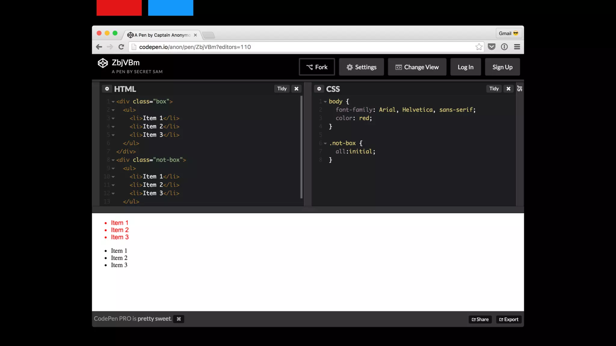
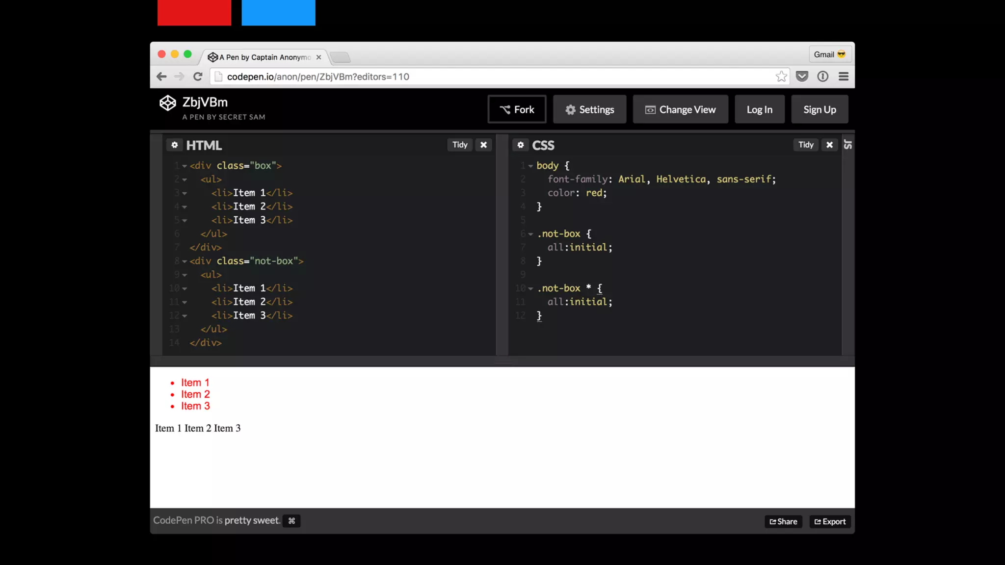
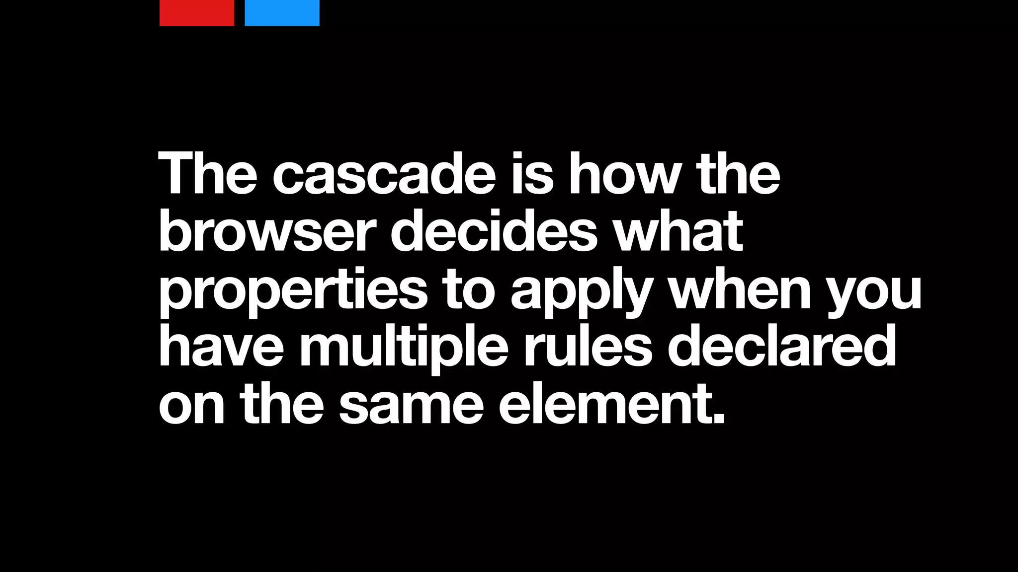
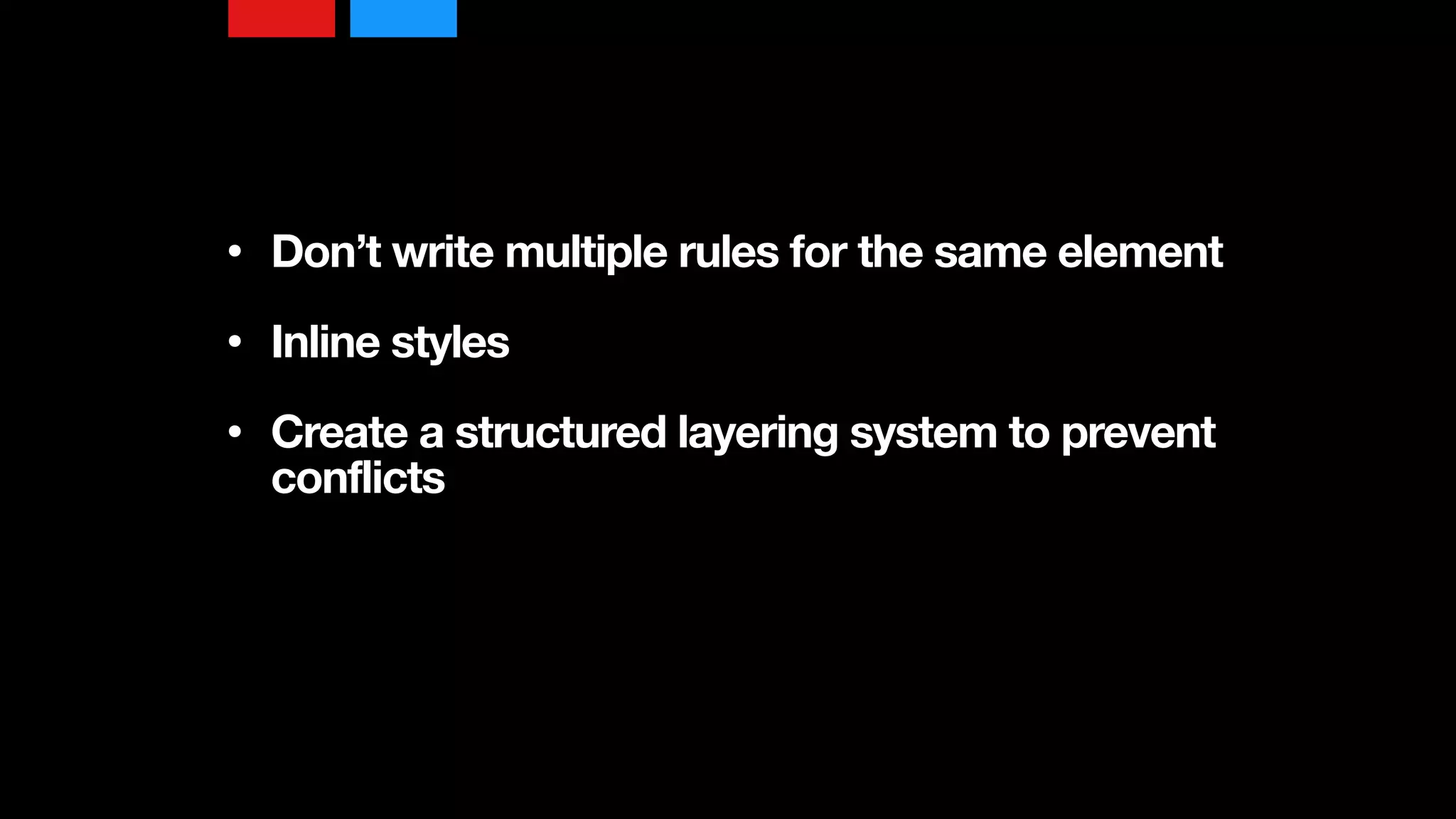

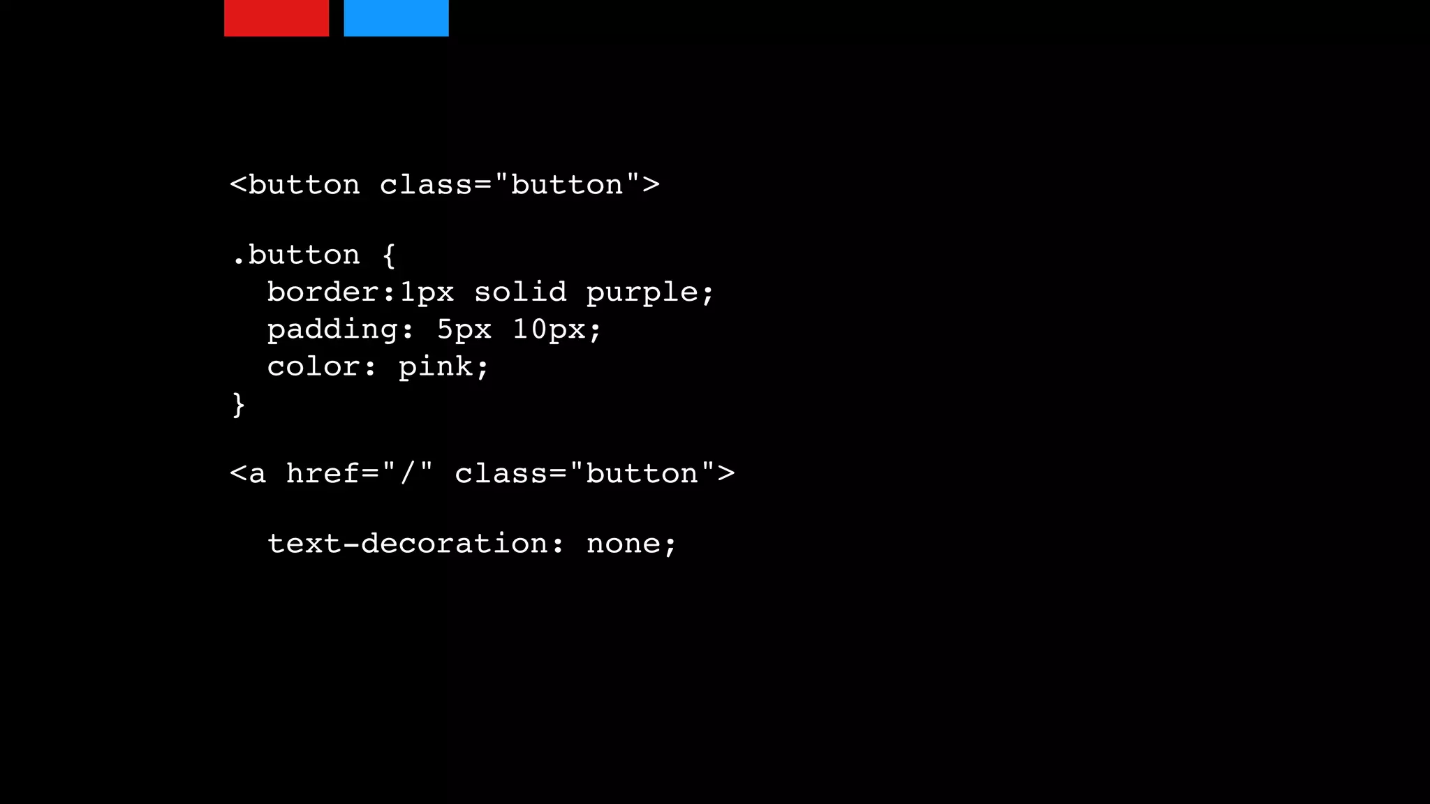
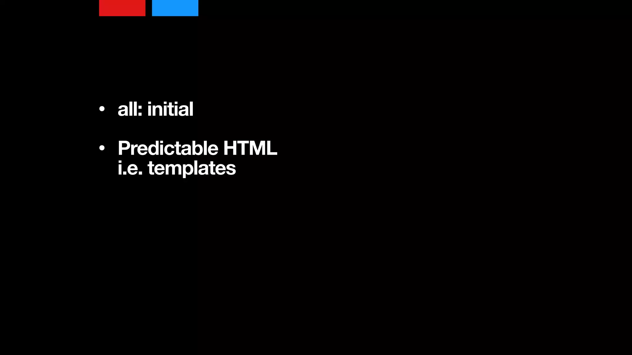


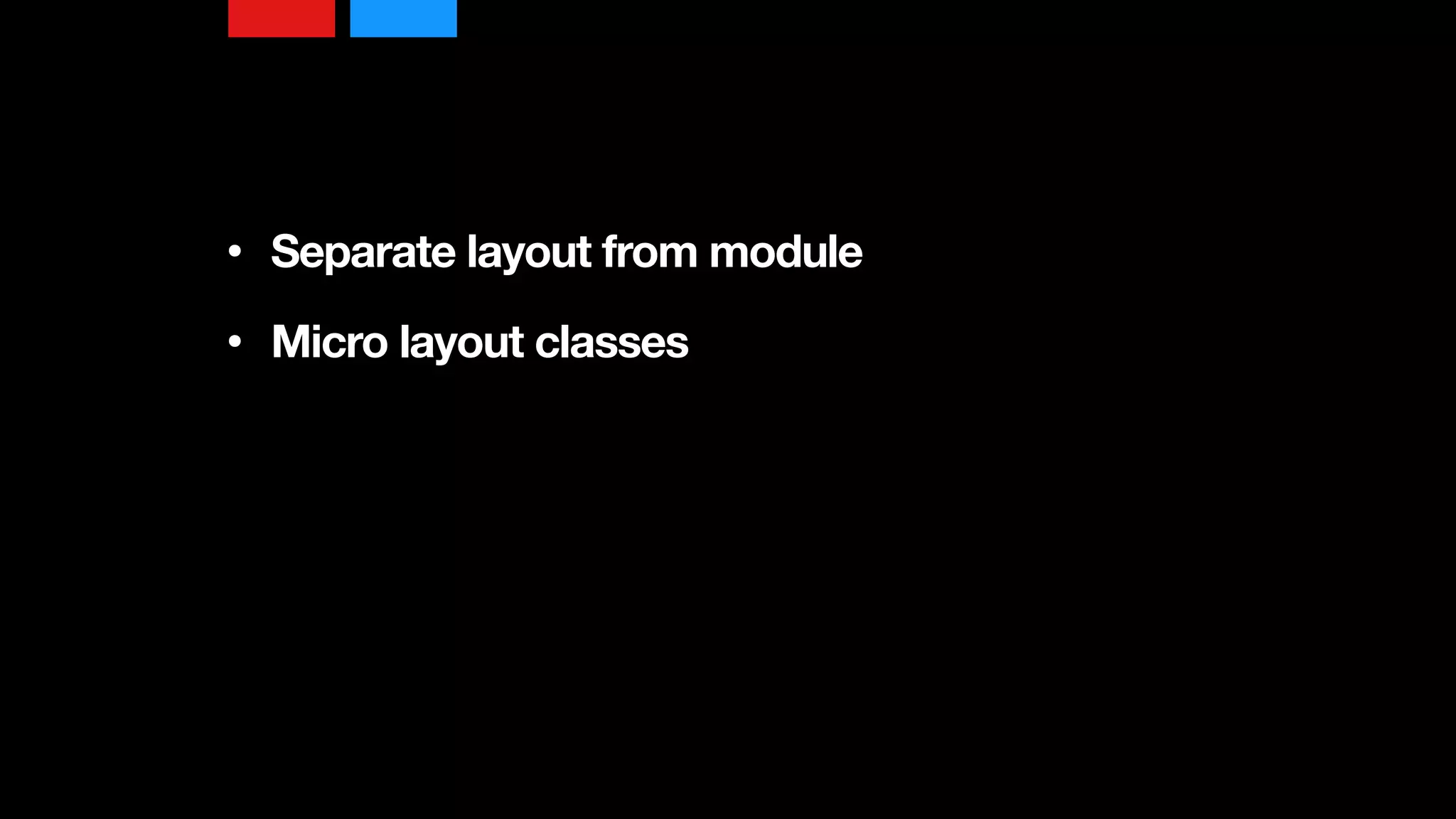
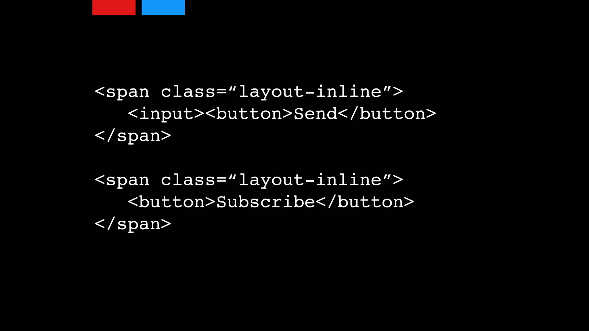
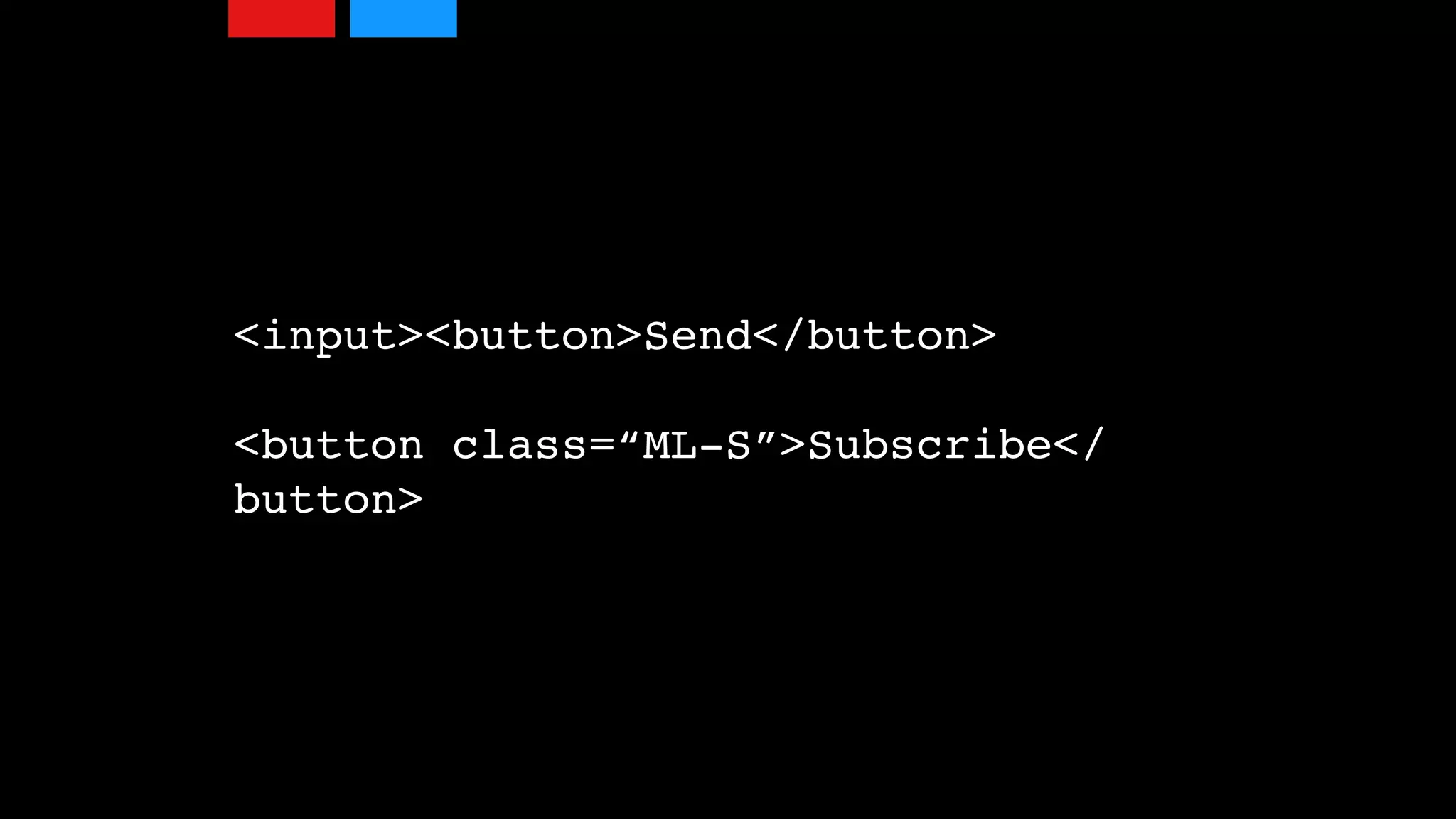

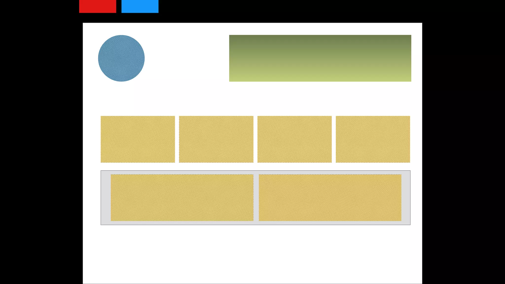
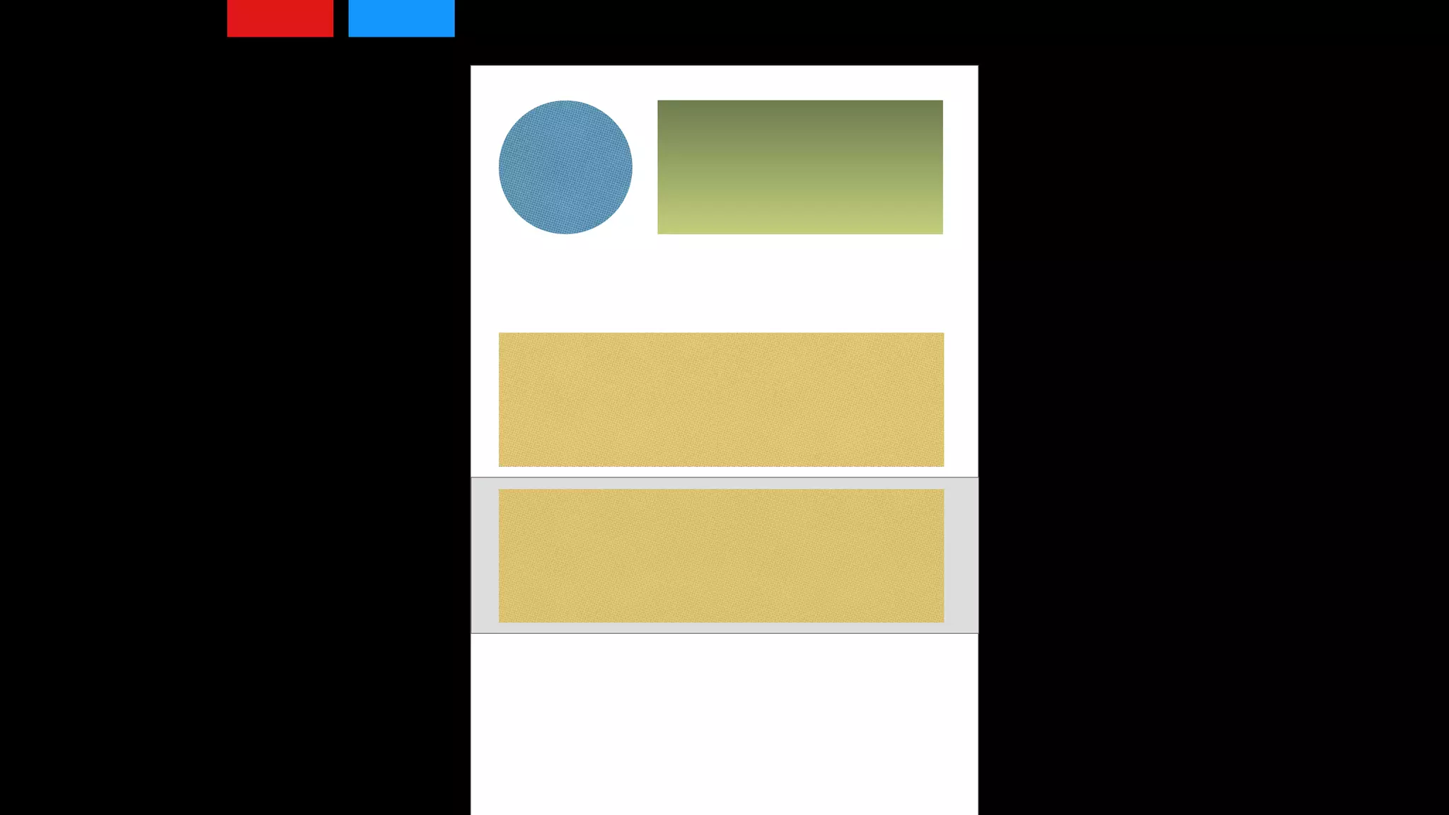


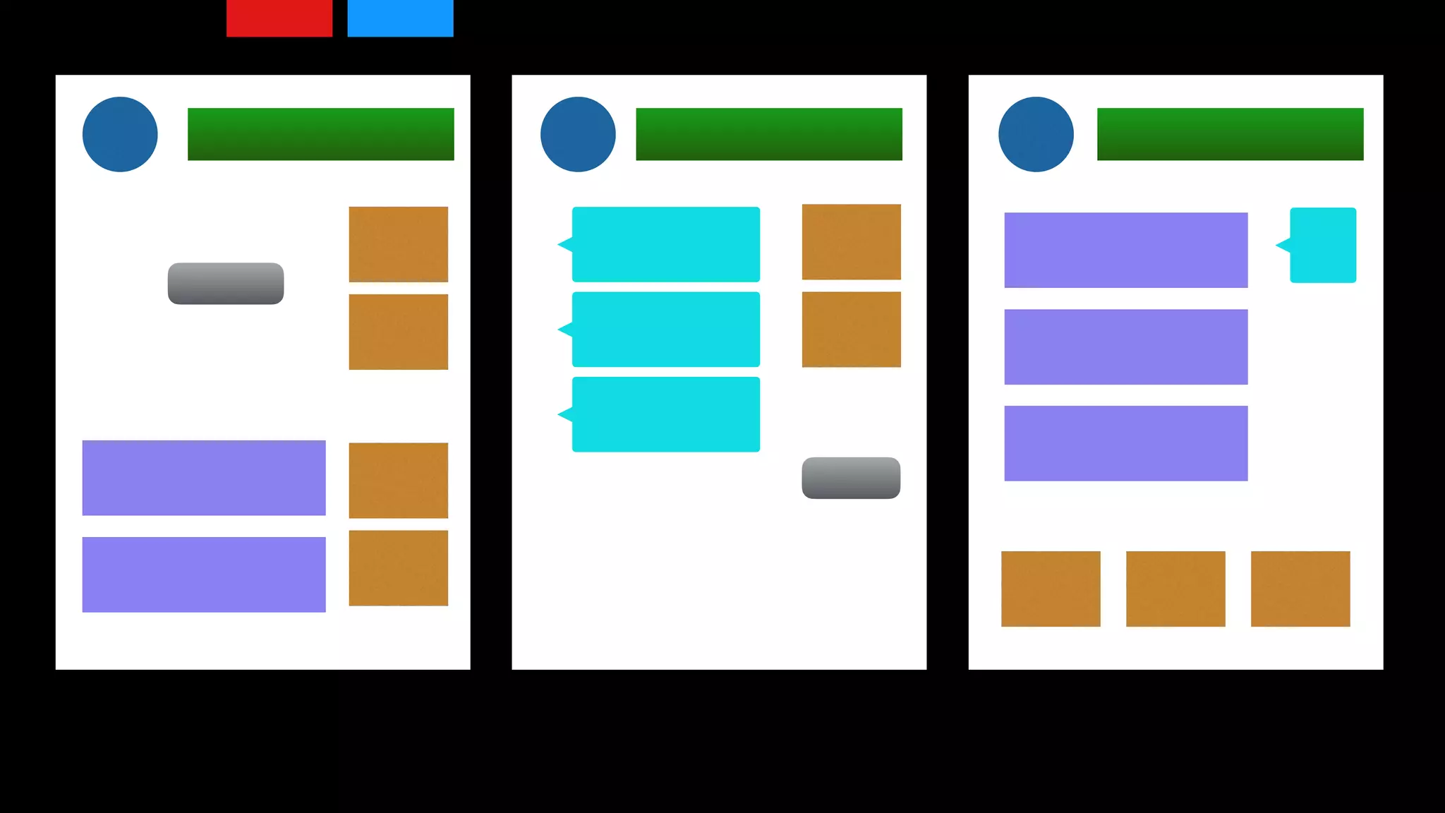
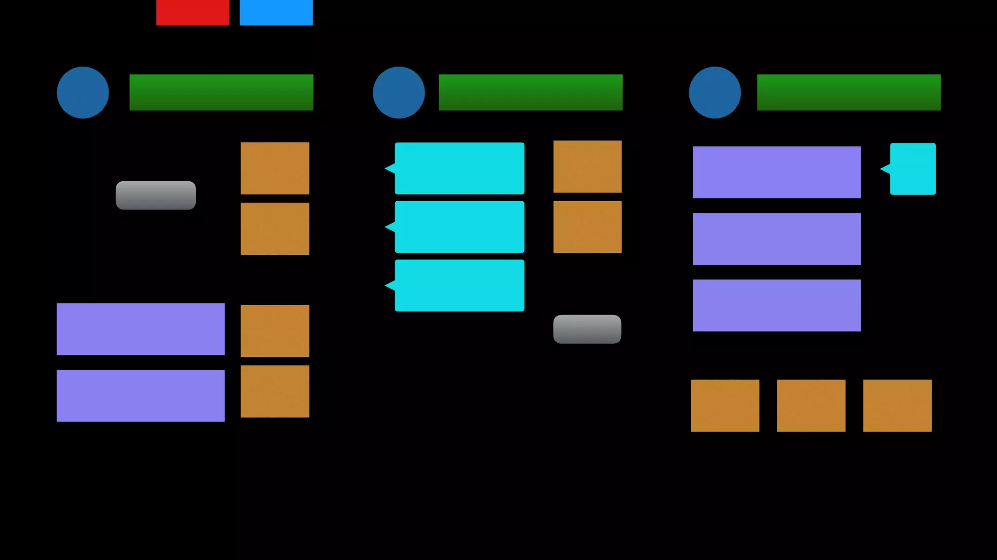
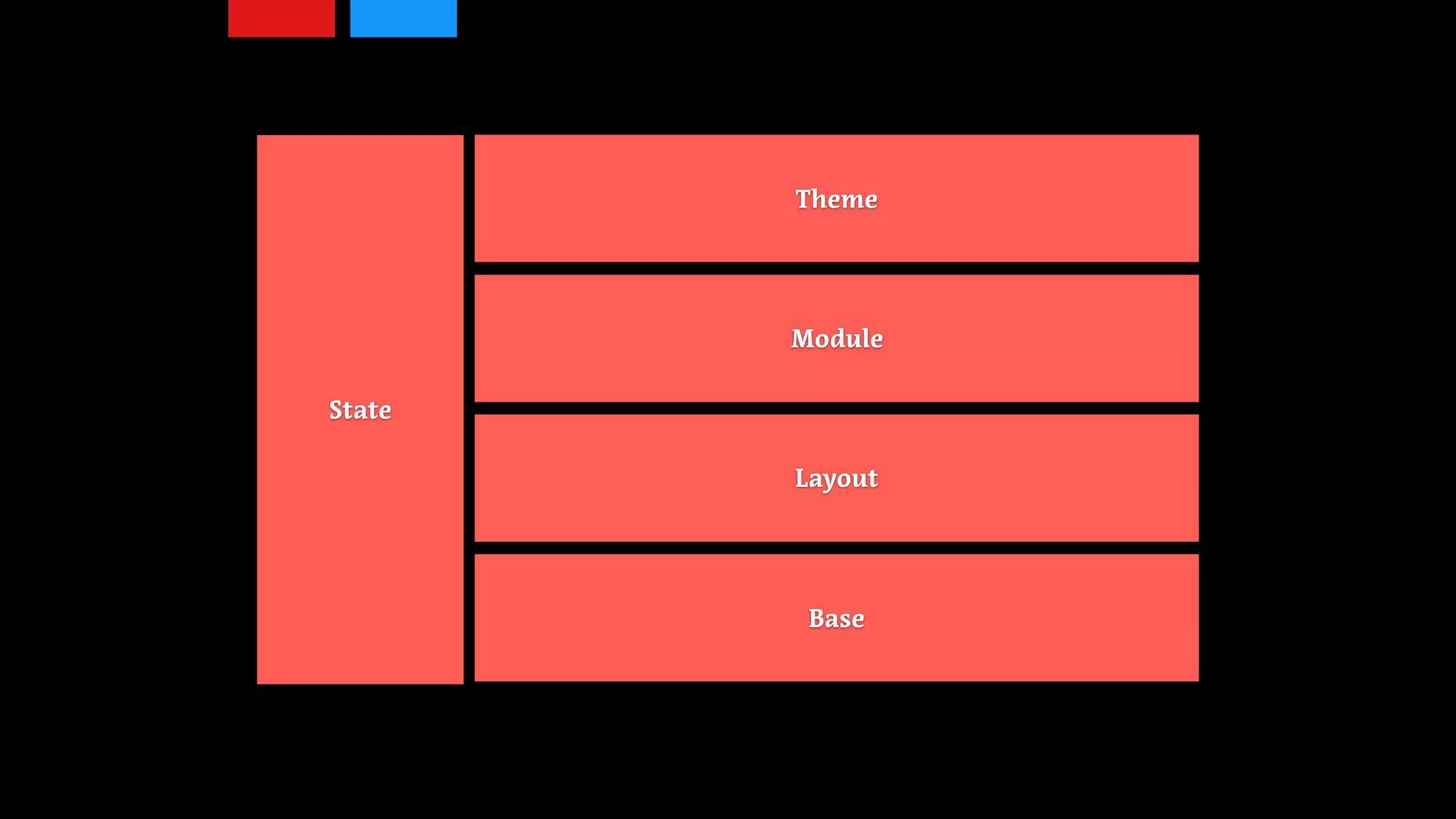
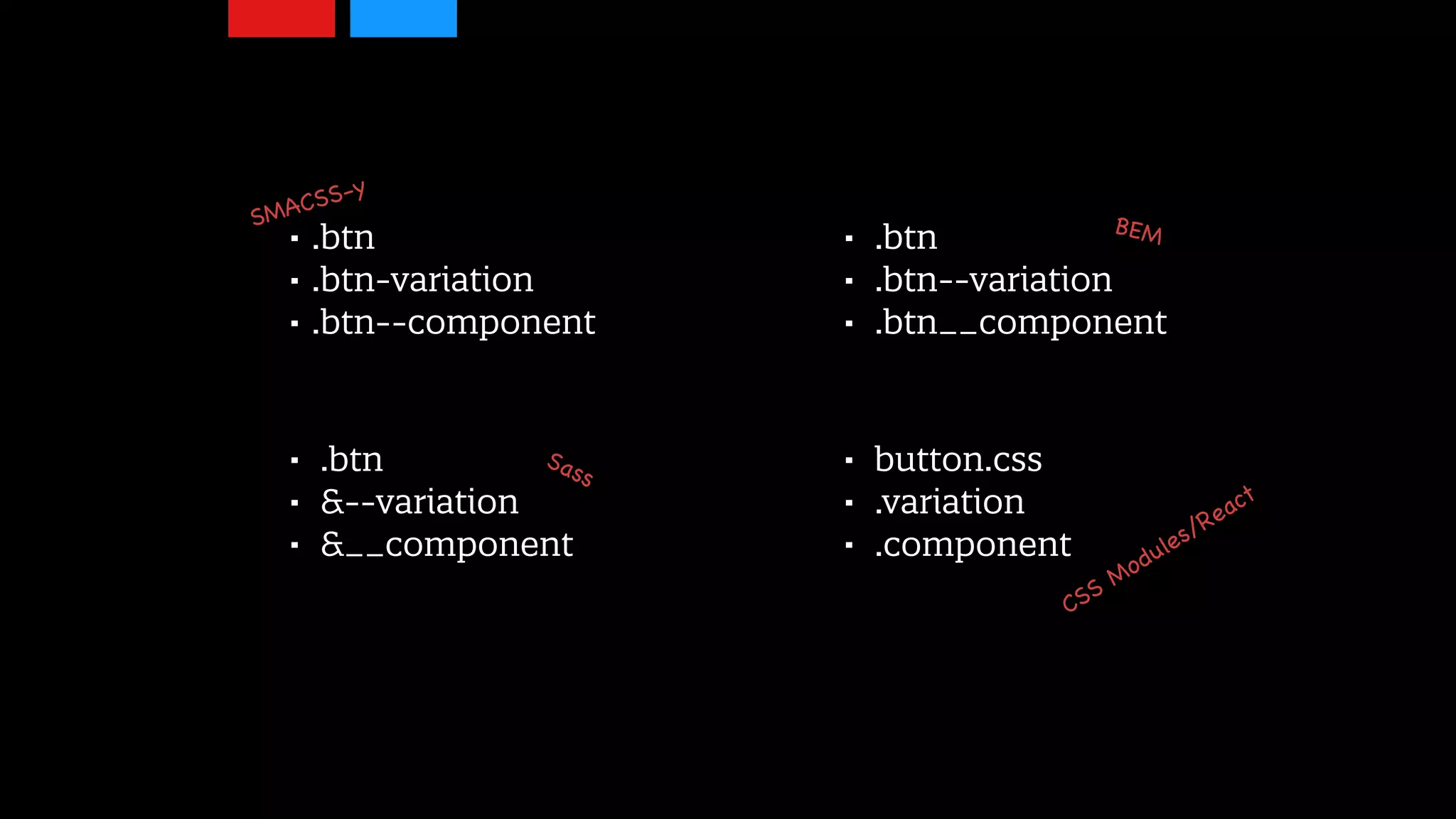


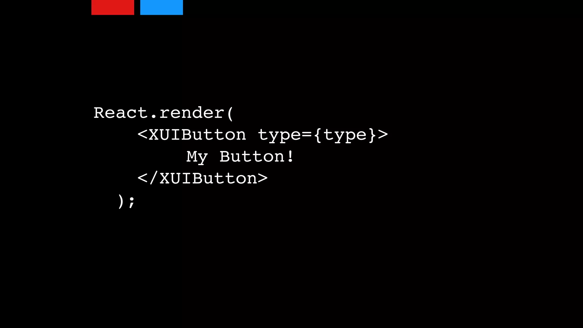
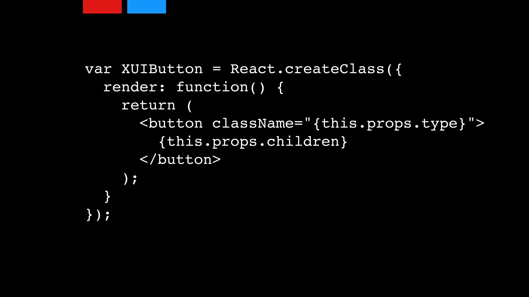
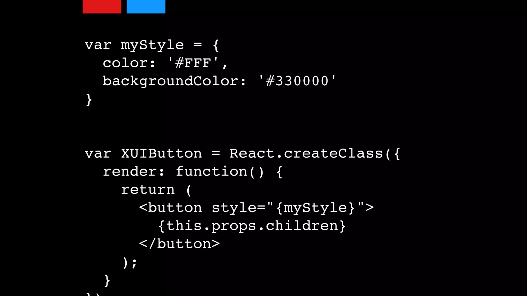
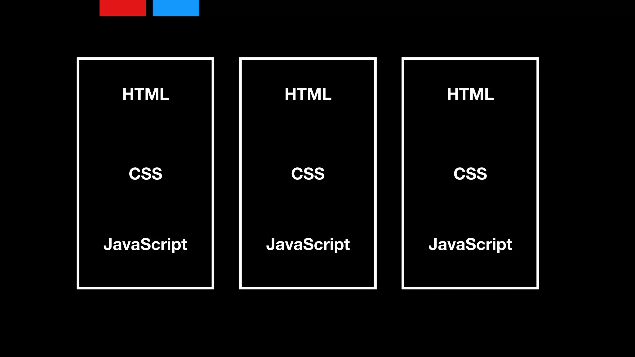
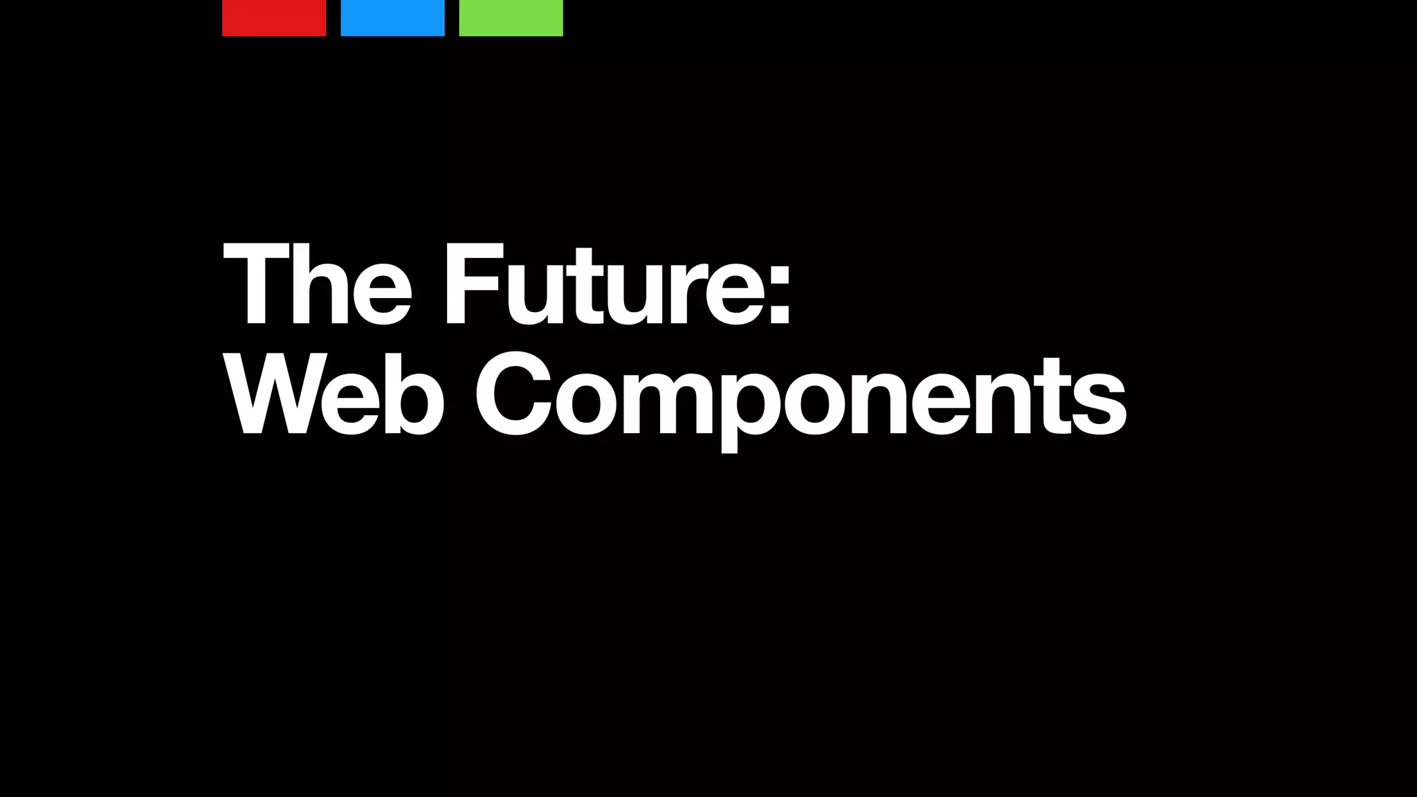
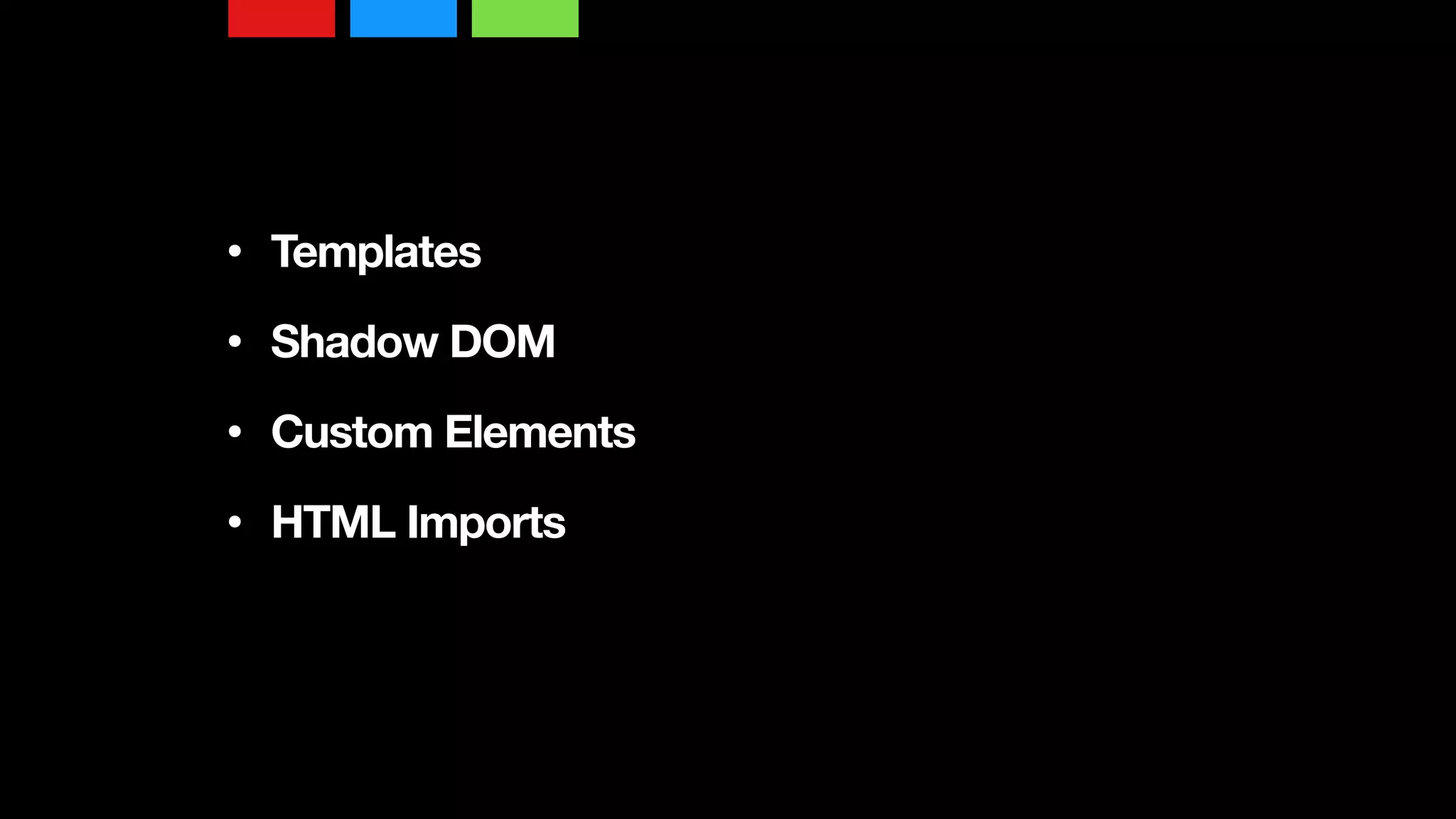
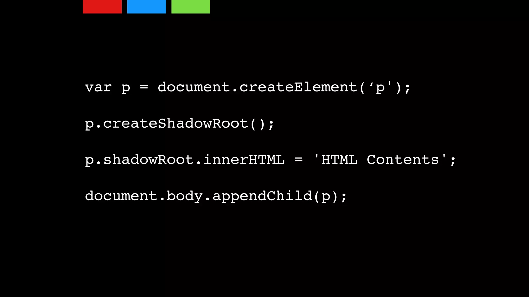
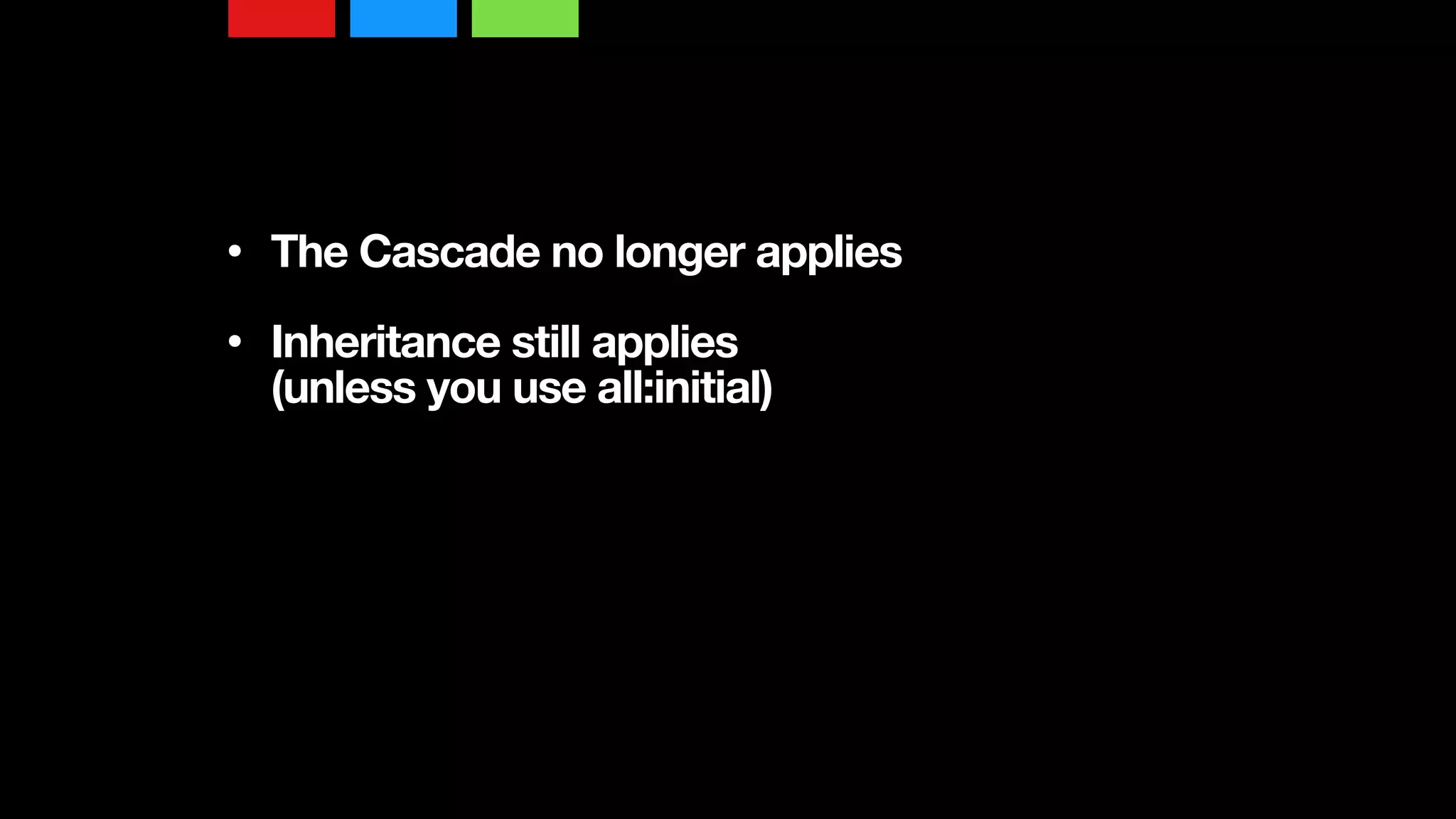
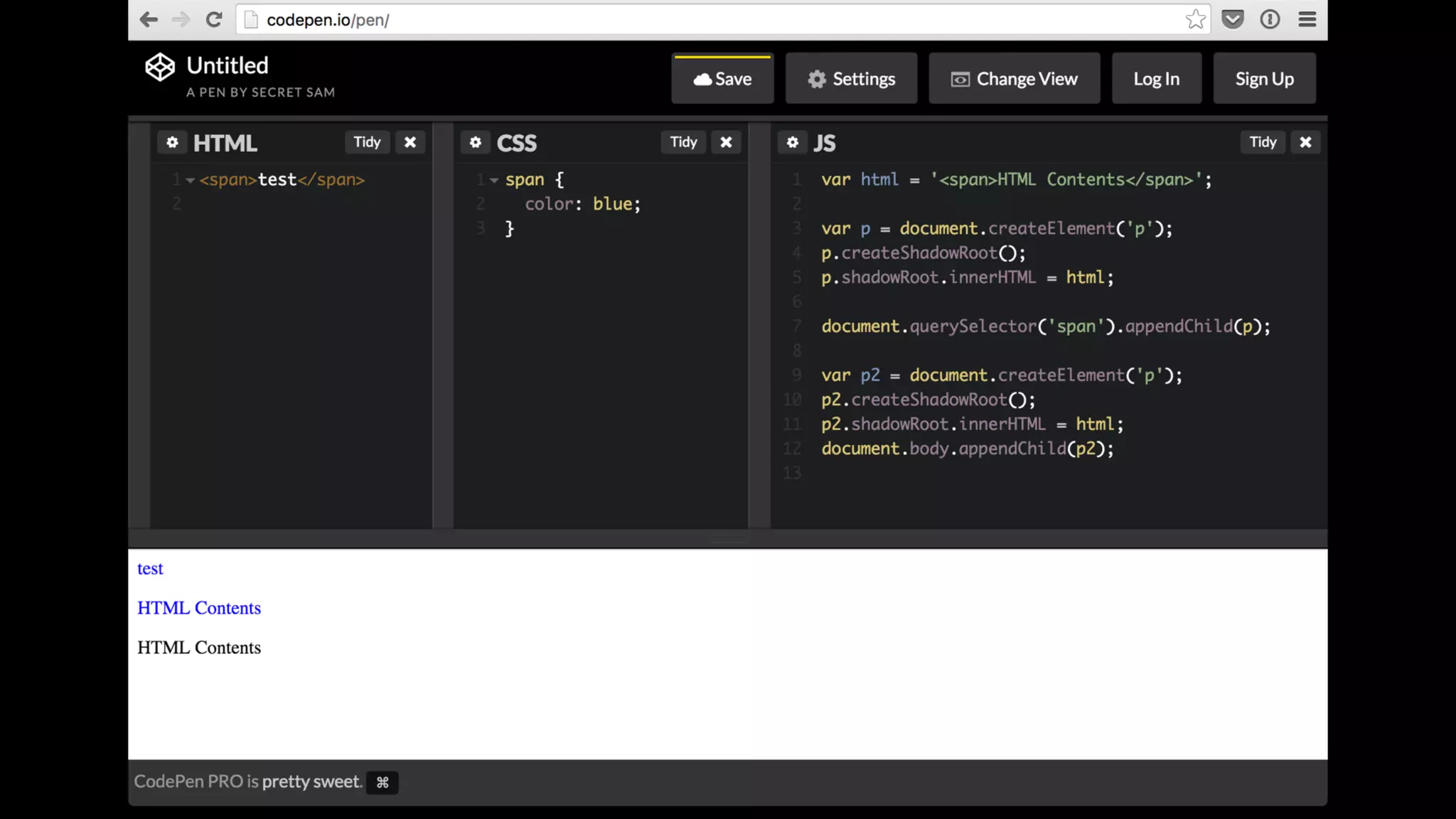
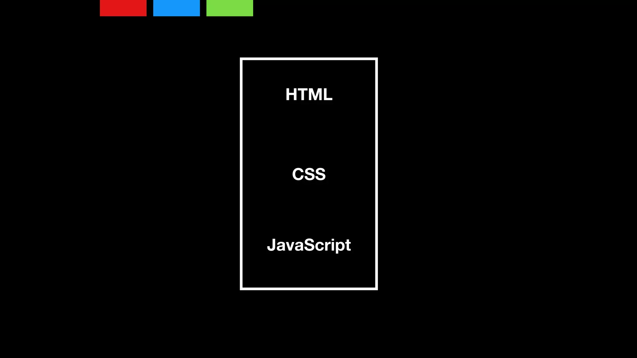
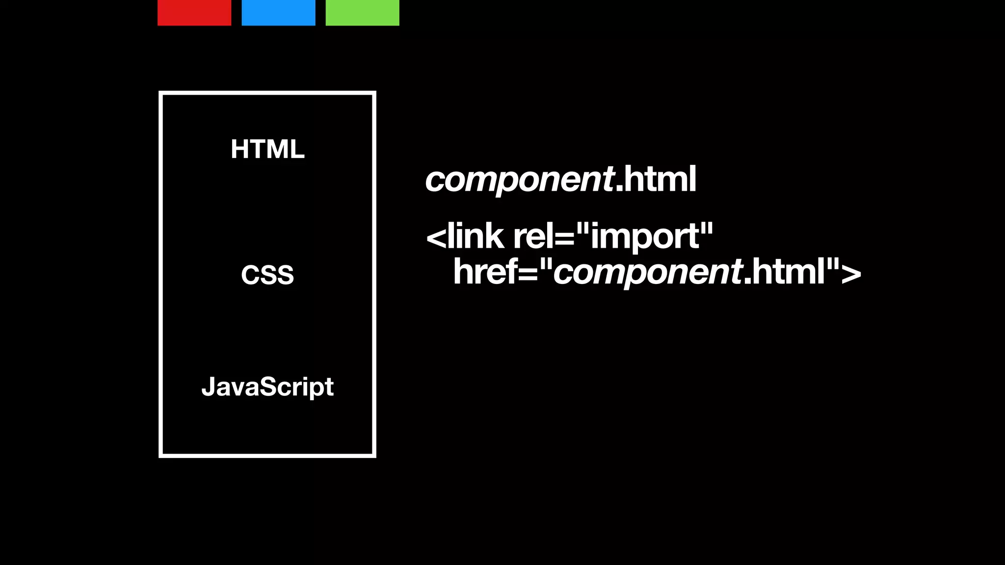
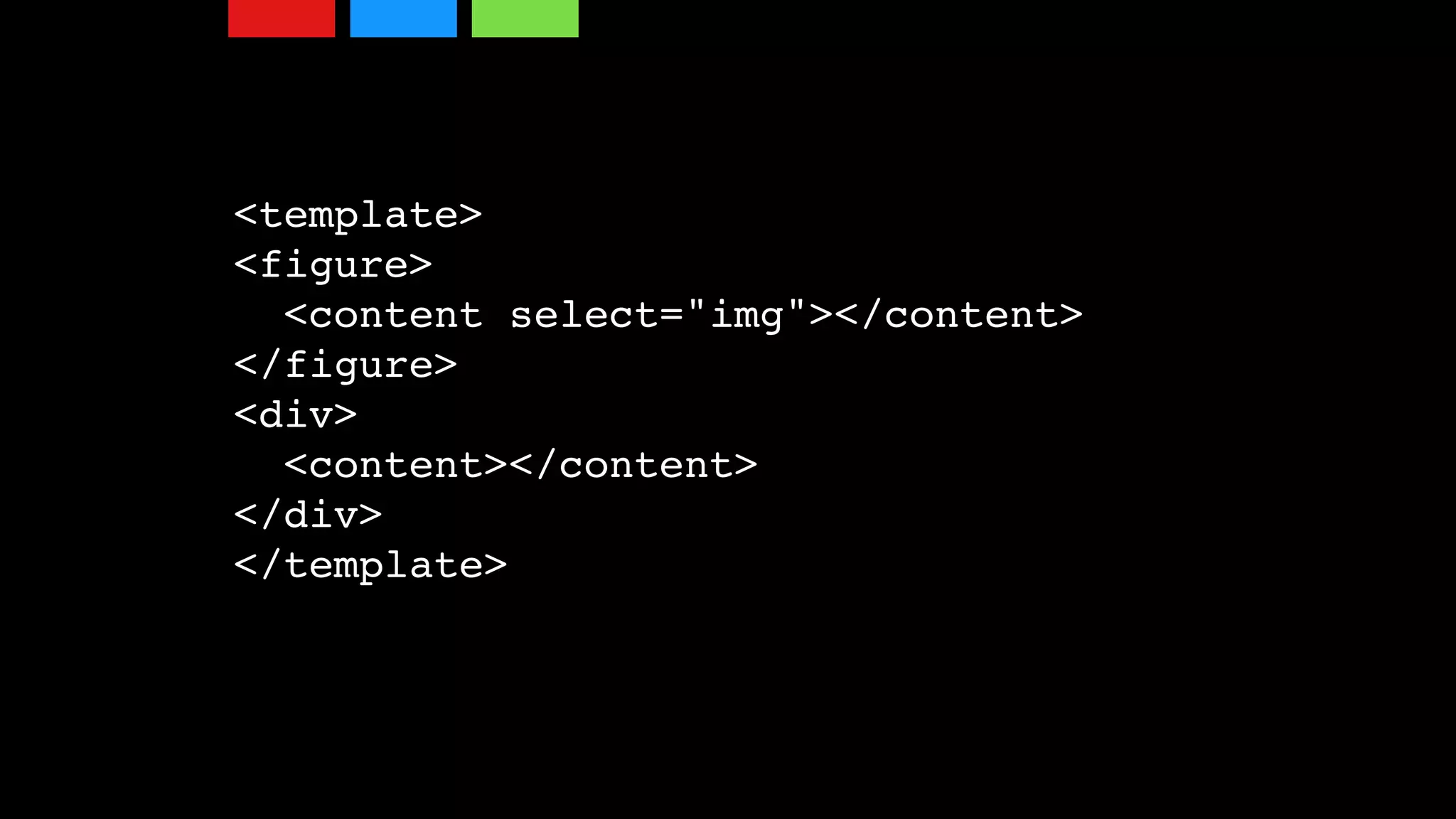
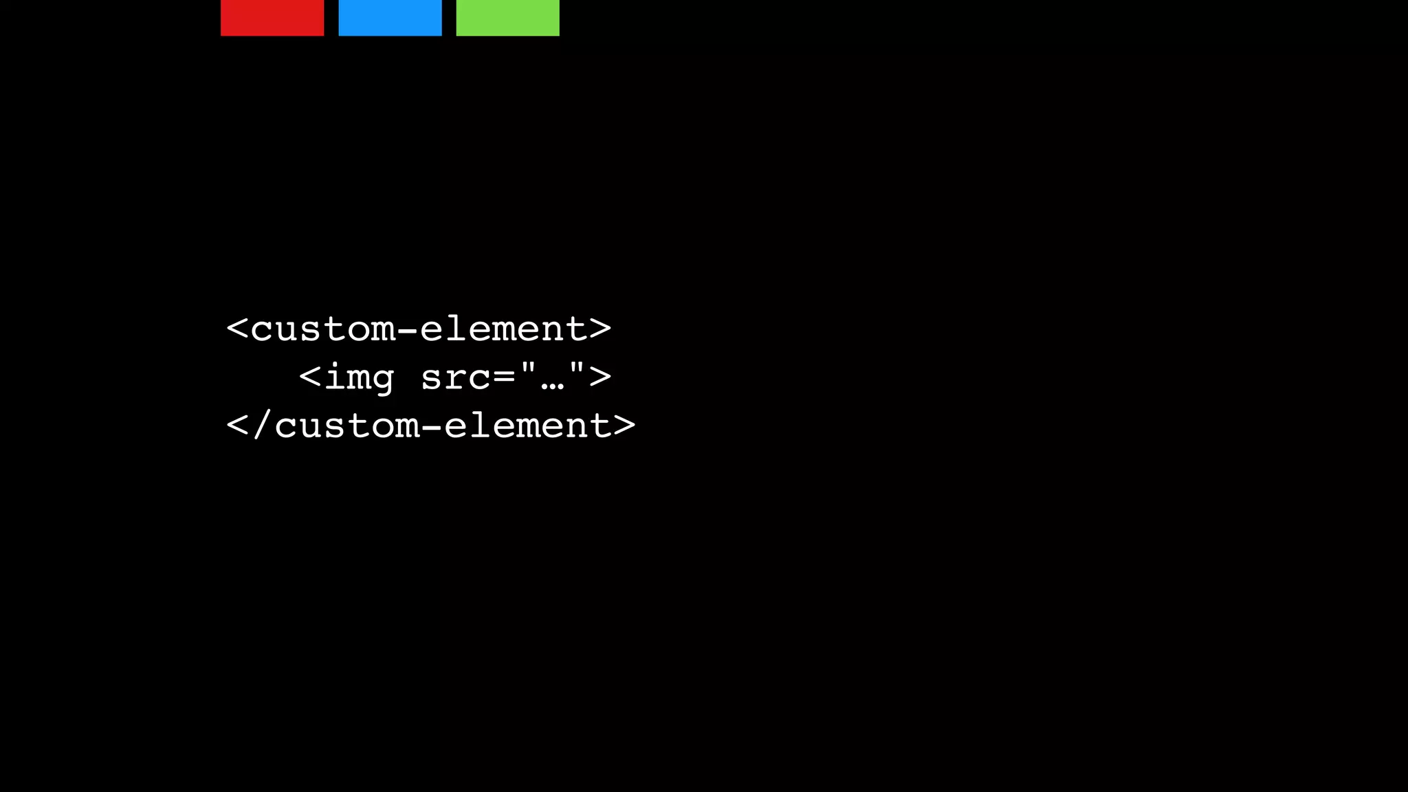
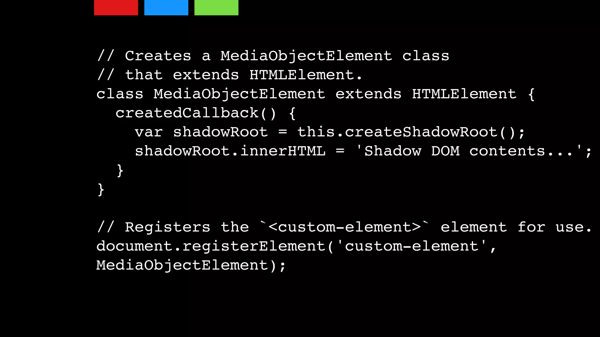
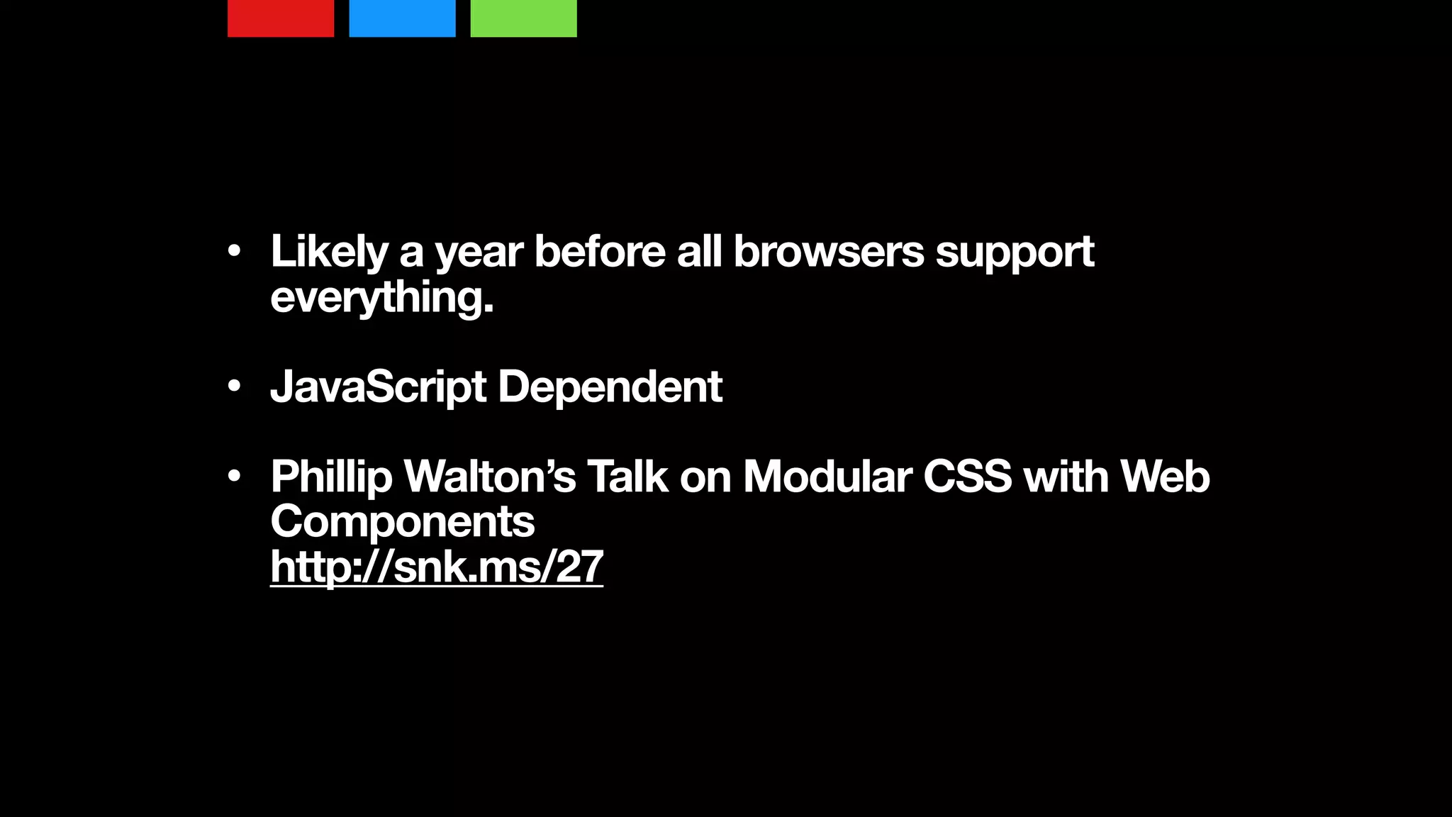
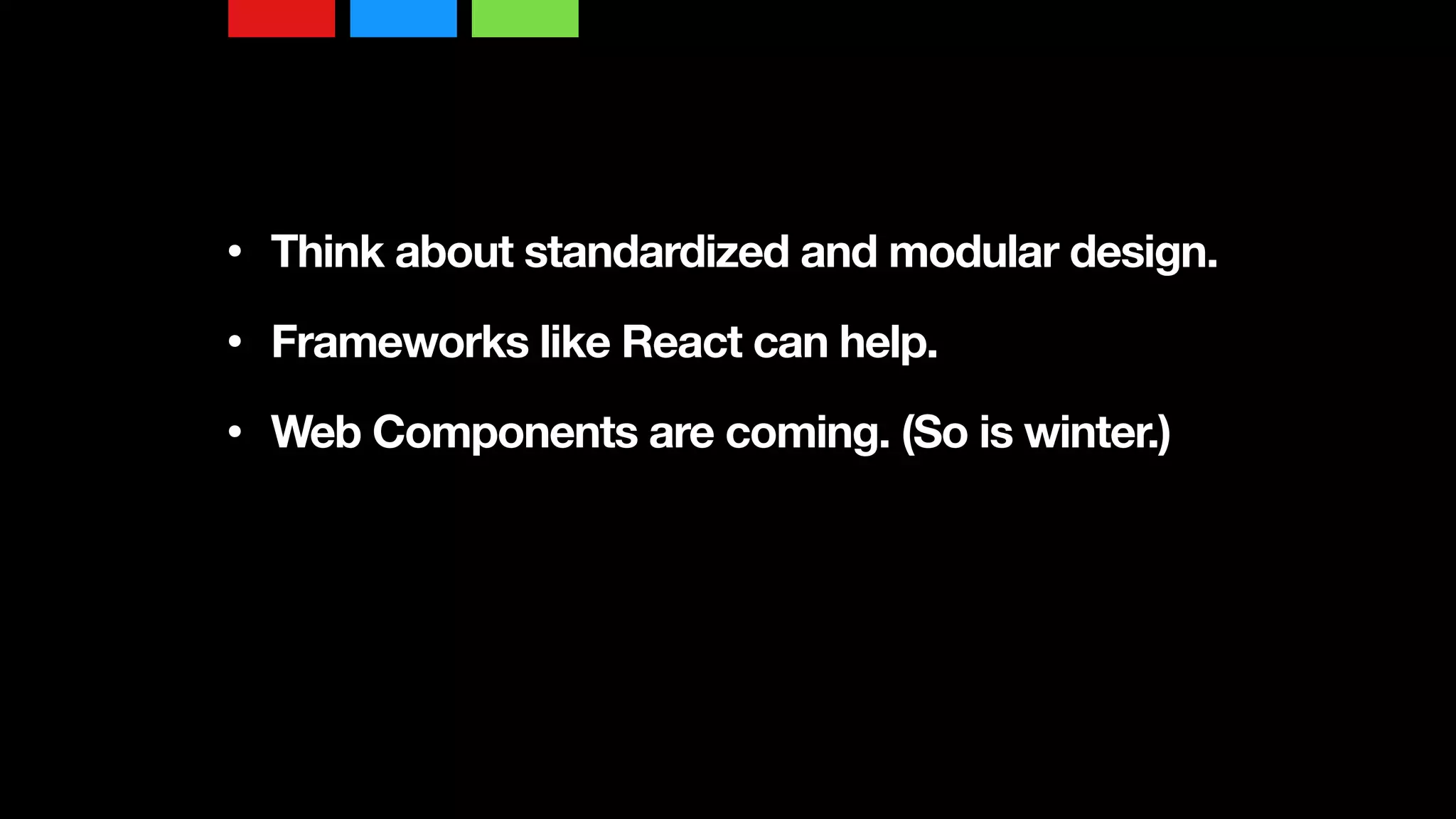


The document discusses SMACSS (Scalable and Modular Architecture for CSS), which provides a standardized approach to modular web design and development applicable across various technologies including CSS, SASS, and React. It emphasizes the importance of modular components, inheritance, and the browser cascade, as well as techniques for creating structured layouts and handling media queries. The future of web design is moving towards web components, with features like templates and shadow DOM that can help manage complexity in design.


![[Worskhop Summits] CSS3 Workshop](https://cdn.slidesharecdn.com/ss_thumbnails/schmitt-css3-v4-100114155033-phpapp02-thumbnail.jpg?width=640&height=640&fit=bounds)


![[BROCHURE] Italy Tour Project | @SlideON](https://cdn.slidesharecdn.com/ss_thumbnails/brochure8-251215152319-2805af68-thumbnail.jpg?width=640&height=640&fit=bounds)


![Chapt_4[1].ppt very interseting and important](https://cdn.slidesharecdn.com/ss_thumbnails/chapt41-251208222956-7cf5e0fa-thumbnail.jpg?width=640&height=640&fit=bounds)