Download to read offline


![Vanilla JS.
var products = document.querySelectorAll(‘.product’);
!
var featuredProduct = document.querySelector(‘.featured-product’);
!
[].forEach.call(products, function(product) {
// do something with each product
});
!
featuredProduct.classList.add(‘active’);
featuredProduct.classList.remove(‘active’);
featuredProduct.classList.contains(‘active’);](https://image.slidesharecdn.com/future-proofrwd-140226104407-phpapp01/75/Future-proof-rwd-38-2048.jpg)


![Gruntfile.js
files: {
// global JS
‘js/dist/global.js’: [
‘bower_components/raf.js/raf.min.js’,
‘bower_components/html5-polyfills/classList.js’,
‘bower_components/responsive-comments/responsive-comments.js’,
‘bower_components/anim/anim.min.js’,
‘bower_components/headroom.js/dist/headroom.js’,
‘js/src/global.js’
],
// global JS + page specific
‘js/dist/home.js’: [
‘bower_components/swiper/dist/idangerous.swiper.js’,
‘bower_components/eventEmitter/EventEmitter.min.js’,
‘bower_components/eventie/eventie.js’,
‘bower_components/imagesloaded/imagesloaded.js’,
‘js/dist/global.js’,
‘js/src/slider.js’,
‘js/src/home.js’
]
}
watch: {
scripts: {
files: [‘js/src/*.js’],
tasks: [‘uglify’],
options: {
spawn: false,
livereload: true
}
},
css: {
files: ‘sass/*.scss’,
tasks: [‘sass’],
options: {
livereload: true,
}
}
}](https://image.slidesharecdn.com/future-proofrwd-140226104407-phpapp01/75/Future-proof-rwd-42-2048.jpg)

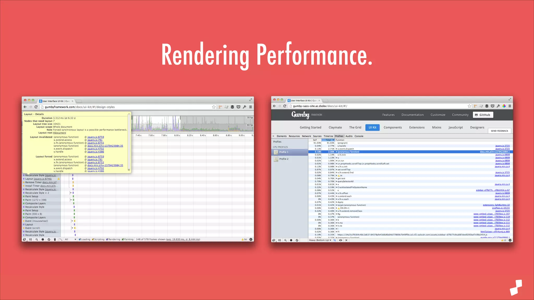


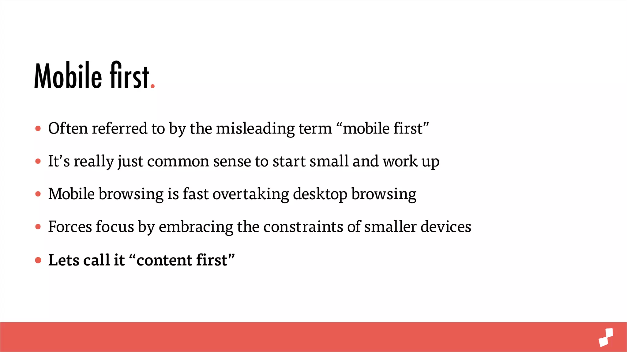
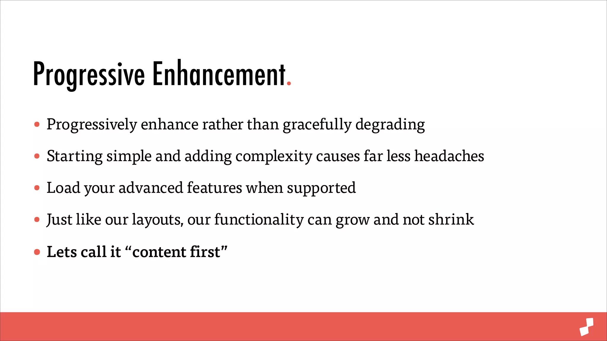
The document discusses best practices for future-proof responsive web design (RWD), emphasizing elastic layouts, mobile-first strategies, progressive enhancement, and modular CSS. It outlines the importance of relative sizing with 'em' and 'rem', using minimal frameworks, and efficient dependency management with tools like Bower and Grunt. Additionally, it highlights the necessity of optimizing rendering performance for client-side applications.


![PowerISO 9.2 Mac Crack + Serial Key Free Download 2026 [Latest] Software.pptx](https://cdn.slidesharecdn.com/ss_thumbnails/software-251207185653-5d5700e6-thumbnail.jpg?width=640&height=640&fit=bounds)
![Moho Pro 14.4 Crack for MacOS Works Until 2050 [Latest] pptx](https://cdn.slidesharecdn.com/ss_thumbnails/softwareoverview-251207192639-797289c4-thumbnail.jpg?width=640&height=640&fit=bounds)
![CleanMyMac X v5.2.8 Crack for MacOS Full Version [Latest] pptx](https://cdn.slidesharecdn.com/ss_thumbnails/softwareoverview-251207194121-a81f0142-thumbnail.jpg?width=640&height=640&fit=bounds)
![AnyTrans for iOS 8.9.14.20251127 With Crack for MacOS [Latest] pptx](https://cdn.slidesharecdn.com/ss_thumbnails/softwareoverview-251207190907-2316965f-thumbnail.jpg?width=640&height=640&fit=bounds)
![Soundtoys Mac v5.5.5.0 Crack for MacOS Full Version [Latest] pptx](https://cdn.slidesharecdn.com/ss_thumbnails/softwareoverview-251207193711-91d8ae6b-thumbnail.jpg?width=640&height=640&fit=bounds)


