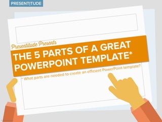
How much time do your employees and co-workers spend creating and updating PowerPoints every day? Is your PowerPoint template correctly defined or does it cause a lot of daily headache for users, contributing to organizational inefficiency? These are the five important parts of an efficient PowerPoint template.
WHAT IS GRAPHIC DESIGN? (Intro to GD, Wk 1)Shawn Calvert
Week 1, What Is GD
Presentation from Introduction to Graphic Design, Columbia College Chicago. Much of the content taken from readings, including the textbooks: Timothy Samara's "Design Elements" and "Design Evolution." Other references cited in presentation. Please note: many slides are intended for class discussion and might not make sense out of context.
Good (engaging) graphic design gets noticed and turns cold interest into hot sales.
Bad (ignored) graphic design is a waste of time & money.
I prefer option one,
Typography is an imperative, yet sometimes overlooked aspect of the design process. Educating yourself on the basics of type with the help of this SlideShare will give you some insight into the intricate world of typography, and give you some actionable tips on how to make your business stand out from the competition.
Typography is the art and technique of arranging type for legibility, readability, and beauty. While it sounds simple, like just choosing a font or two, there are typography rules, best practices, and subtle tricks that will elevate your design work to a higher level.
This is a very basic introduction to graphic design based on Robin Williams' book, "The Non-Designer's Design Book." It was created for grade 9 art students.
A video version is available here: http://www.youtube.com/watch?v=-eUhJ_jTrMQ
The typography by Fady El-Masry
Typography (from the Greek words τύπος (typos) = form and γραφή
(graphe) = writing) is the art and technique of arranging type in order to make
language visible. The arrangement of type involves the selection of typefaces,
point size, line length, leading (line spacing), adjusting the spaces between
groups of letters (tracking) and adjusting the space between pairs of letters
(kerning). Type design is a closely related craft, which some consider distinct
and others a part of typography; most typographers do not design typefaces,
and some type designers do not consider themselves typographers. In modern
times, typography has been put into motion — in film, television and online
broadcasts — to add emotion to mass communication.
Typography is performed by typesetters, compositors, typographers, graphic
designers, art directors, comic book artists, graffiti artists, clerical workers,
and anyone else who arranges type for a product. Until the Digital Age,
typography was a specialized occupation. Digitization opened up typography
to new generations of visual designers and lay users, and it has been said that
“typography is now something everybody does.
Want to learn how to take better photos? This article covers the top five photography tips, including advice on composition, light quality, and exposure.
How to use the color wheel to create colorful presentations Presentitude
The 12 colors in the color wheel can be combined in different ways when you create presentations. Some of the colors are considered warm, and some cold. Some are considered be complimentary in different ways. Colors next to each other are called analogous and using the same color and its tints tones and shades is called monochromatic. We can use these color combinations in the color wheel to create beautiful color schemes for presentations.
This is Part II in our series about color presentations. Part I (http://www.slideshare.net/Presentitude/basic-color-theoryforpresentationdesignpart1) covered basic color theory.
Presenting data-driven charts? Here are 5 secrets to delivering Presentation Charts and Graphs powerfully. Visit presentation-process.com for more such insights.
Learn more about "The Science of Memorable Presentations" by checking out the Ethos3 blog post on this topic: http://ethr.ee/1ULMrxy
Ethos3 is a presentation design agency with premier PowerPoint and presentation designers. We can create the perfect presentation for you: www.ethos3.com
If you need help creating professional presentations, email us at: info@ethos3.com
Six safe fonts to use in your presentationsPresentitude
When you are creating PowerPoints and choosing a font, you have to make your selection carefully. Not only because fonts are communicating a feeling and a mood for your presentation, but also for practical reasons. There are only 40-something fonts that are safe to use if you want your PowerPoint to show correctly on any computer or in any version of PowerPoint Six of these “safe” fonts are these six “C-fonts”.
10 things presentation designers are thankful forPresentitude
What does a presentation designer have to be thankful for this season? Except getting a few days break from screens, keyboards and presentation software? We have created a list of 10 things at least we are thankful for this year.
Happy Thanksgiving!
Read a more detailed description at www.presentitude.com/10-things-presentation-designers-are-thankful-for
What slide dimensions should you use for your presentations?Presentitude
When PowerPoint 2013 came along, the size of the default presentation changed from 4:3 to 16:9. So – what size should you use for your slides? This is a quick guide to choosing the right size – and a brief explanation of the difference between the sizes in different versions of PowerPoint.
Using icons is a great way to add visuals to your presentation. There are many ways to get icons online, some are even free. But if you need a specific icon that you can’t find or if you want a special spin to your icon (color, shadow etc) – you can use PowerPoint’s great (and somewhat hidden) “Merge Shapes” commands to create your own icons.
Using these commands you can combine basic shapes into other shapes. You can union and subtract shapes. You can intersect and combine. All while still working natively inside PowerPoint. Once you have created an icon you can change the color, filling and add shadows as needed.
It is just as fun as building with Lego blocks! Well, almost..
This is a guide in 15 steps showing you how you can use these commands to create your own icon - the example we are using is a calendar icon.
The yearly Presentation Summit conference takes place every fall. It is a four day retreat for all presentation designers alike. After participating you come back inspired, full of wisdom, a smile on your face and can't wait for it all to start over again next year. This year we concluded the Presentation Summit 2014 in a ABC guide.
How to make font transparent in PowerPointPresentitude
There are so many great, hidden (or at least not as known) functions in PowerPoint. Without even leaving PowerPoint you can add great effects to your slides.
This is a quick guide how to make text transparent using the ”Merge Shape” functions inside PowerPoint.
Merge away!
If you want to keep your corporate presentation easily editable and make sure it can travel outside your organization, you need to use “safe” fonts. Designing natively in PowerPoint will make things easier down the road (regardless of how you much you crave for those creative free fonts).
Using combos of safe fonts, letter spacing, converting text to objects you can come a long way with your typography using just PowerPoint.
We used two random designs as inspirations to show how you could use safe, standard fonts when creating slides.
All the examples were made directly in PowerPoint using fonts from the list ”44 safe fonts for PowerPoint” (www.presentitude.com/fonts).
How to create a presentation color theme from a photoPresentitude
Colors are all around us. A picture is worth more than a thousand words. Sometimes it’s the colors of a picture that speaks to us and resonates and tell a story. Maybe you want to capture that color story and use it in your next presentation. This is a guide in 5 steps on how to create a presentation color theme from a photo.
5 timeless color themes for presentationsPresentitude
Color preferences changes over time. Each decade collects its own set of colors to express emotions and attitudes. Inspired by the Pantone list "50 years of colors" we have made five, timeless, historical color themes for presentations. How about a psychedelic 1960s, earthy 1970s feel or a vibrant 1980s feel?
23 quick color themes for your presentationPresentitude
If you don’t have time to create your own color scheme for your next presentation – you can use one of the pre-installed color themes in PowerPoint. PowerPoint 2013 comes with 23 color themes ready be applied to your presentation and and your graphics, regardless of what presentation template you are using.
This is a quick guide of the PowerPoint 2013 color themes. Each page displays a color wheel with the accent colors around the dark and light background/text colors in the center and four small mockup slides with the color theme applied. All the color themes are shown on white and the mockup slides have the same light grey slide background for comparison.
0x01 - Newton's Third Law: Static vs. Dynamic AbusersOWASP Beja
f you offer a service on the web, odds are that someone will abuse it. Be it an API, a SaaS, a PaaS, or even a static website, someone somewhere will try to figure out a way to use it to their own needs. In this talk we'll compare measures that are effective against static attackers and how to battle a dynamic attacker who adapts to your counter-measures.
About the Speaker
===============
Diogo Sousa, Engineering Manager @ Canonical
An opinionated individual with an interest in cryptography and its intersection with secure software development.
Acorn Recovery: Restore IT infra within minutesIP ServerOne
Introducing Acorn Recovery as a Service, a simple, fast, and secure managed disaster recovery (DRaaS) by IP ServerOne. A DR solution that helps restore your IT infra within minutes.
This presentation, created by Syed Faiz ul Hassan, explores the profound influence of media on public perception and behavior. It delves into the evolution of media from oral traditions to modern digital and social media platforms. Key topics include the role of media in information propagation, socialization, crisis awareness, globalization, and education. The presentation also examines media influence through agenda setting, propaganda, and manipulative techniques used by advertisers and marketers. Furthermore, it highlights the impact of surveillance enabled by media technologies on personal behavior and preferences. Through this comprehensive overview, the presentation aims to shed light on how media shapes collective consciousness and public opinion.
Have you ever wondered how search works while visiting an e-commerce site, internal website, or searching through other types of online resources? Look no further than this informative session on the ways that taxonomies help end-users navigate the internet! Hear from taxonomists and other information professionals who have first-hand experience creating and working with taxonomies that aid in navigation, search, and discovery across a range of disciplines.
Sharpen existing tools or get a new toolbox? Contemporary cluster initiatives...Orkestra
UIIN Conference, Madrid, 27-29 May 2024
James Wilson, Orkestra and Deusto Business School
Emily Wise, Lund University
Madeline Smith, The Glasgow School of Art
This presentation by Morris Kleiner (University of Minnesota), was made during the discussion “Competition and Regulation in Professions and Occupations” held at the Working Party No. 2 on Competition and Regulation on 10 June 2024. More papers and presentations on the topic can be found out at oe.cd/crps.
This presentation was uploaded with the author’s consent.
2. Is your PowerPoint template
inefficient?
How much time do your employees
and co-workers spend creating and
updating PowerPoints every day?
Is your PowerPoint template
correctly defined or does it cause a
lot of daily headache for users,
contributing to organizational
inefficiency?
These are the five important parts of
an efficient PowerPoint template.
4. TEMPLATE
[noun] : a preset format for a document
or file, used so that the format does not
have to be recreated each time it is used.
5. A PowerPoint TEMPLATE
[noun] : a PowerPoint template file with
a defined Master slide, theme fonts,
them effects, a custom color scheme
and formatted slide layouts.
6. THE 5 PARTS OF A
PowerPoint TEMPLATE
FONTS COLORS SLIDELAYOUTSEFFECTSMASTER