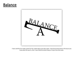
1. Balance
I have used the A to make a point for the L which does across like scales. I have the put the word on the top so you
know what the word is, then I have tilted the whole thing so it looks more like scales.
2. Avoid
I have wrote the word out but I have moved the D away because it then looks as thought it is avoiding the rest of
the word.
3. Bump
I have used the B to look as thought I is a bump in the path and the rest of the letters are going over it.
4. Crash
I have wrote two of the same word out and used them to symbolise two cars. I then bunched together some of the
letters and moved the words closer to make it look as though they have crashed together and because of the
impact the letters are moved closer.
5. Remove
I have wrote the word out ad took one of the letters and make the opacity very low so you can barley see it. I
didn’t get rid of it completely because I waned you to still be able to see what it was but I have made it look like
the letter has been removed.
6. Surround
I have placed the word bigger in the middle so you can see clearly what it says but then I have used smaller
versions of it and put a lot of them round the big word to make it look as though he big word is surrounded by all
the smaller ones.
7. Race
I have used the whole word and made it into a line which would be classed as the finishing line. I have then used
each letter to look as thought they are racing against each other to the finishing line.