The document provides a comprehensive guide on creating various types of navigation bars using the Material UI AppBar component in React. It discusses different variants such as the basic app bar, app bar with menus, search fields, and responsive designs, detailing their uses and implementation steps. Additionally, it offers real-world examples and technical code to help developers build intuitive navigation systems that enhance user experiences.

![2. Create a state variable to hold the anchor element for the menu:
const [anchorEl, setAnchorEl] = useState(null);
3. Create a function to handle the opening of the menu
const handleMenu = (event) => {
setAnchorEl(event.currentTarget);
};
4. Create a function to handle the closing of the menu:
const handleClose = () => {
setAnchorEl(null);
};
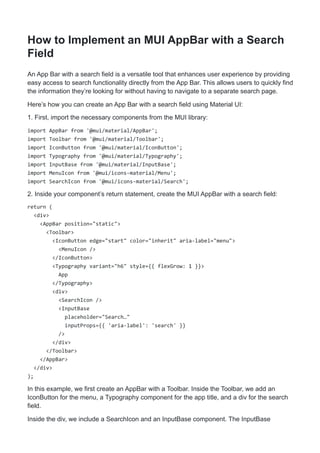
5. Inside your component’s return statement, create the App Bar with a menu:
return (
<div>
<AppBar position="static">
<Toolbar>
<IconButton edge="start" color="inherit" aria-label="menu" onClick={handleMenu}>
<MenuIcon />
</IconButton>
<Typography variant="h6">
App
</Typography>
<Menu
anchorEl={anchorEl}
open={Boolean(anchorEl)}
onClose={handleClose}
>
<MenuItem onClick={handleClose}>Option 1</MenuItem>
<MenuItem onClick={handleClose}>Option 2</MenuItem>
</Menu>
</Toolbar>
</AppBar>
</div>
);
In this example, we first create an AppBar with a Toolbar. Inside the Toolbar, we add an
IconButton that will trigger the opening of the menu when clicked. We also include a Typography
component to display the title of the app.
Next, we create a Menu component. The anchorEl prop is used to set the element that the
menu is positioned relative to, and the open prop determines whether the menu is open. The
onClose prop is used to handle the closing of the menu.
Finally, we add MenuItem components to the Menu. Each MenuItem includes an onClick prop to
close the menu when the item is clicked.
And that’s it! You now have an App Bar with a menu. The complete code would look like this:](https://image.slidesharecdn.com/muiappbar-240315125639-98701a1c/85/Creating-a-Great-Navigation-Bar-with-MUI-AppBar-Component-Blogs-6-320.jpg)
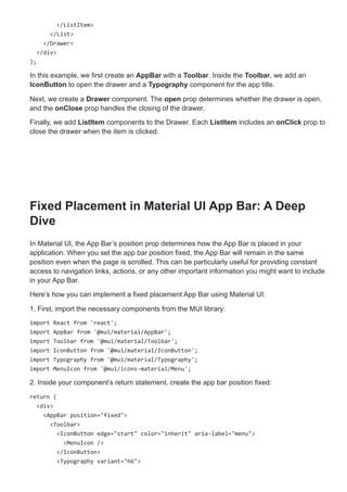
![import React from 'react';
import AppBar from '@mui/material/AppBar';
import Toolbar from '@mui/material/Toolbar';
import IconButton from '@mui/material/IconButton';
import Typography from '@mui/material/Typography';
import MenuIcon from '@mui/icons-material/Menu';
import MenuItem from '@mui/material/MenuItem';
import Menu from '@mui/material/Menu';
export default function AppBarMenu() {
const [anchorEl, setAnchorEl] = React.useState(null);
const handleMenu = (event) => {
setAnchorEl(event.currentTarget);
};
const handleClose = () => {
setAnchorEl(null);
};
return (
<div>
<AppBar position="static">
<Toolbar>
<IconButton edge="start" color="inherit" aria-label="menu" onClick=
{handleMenu}>
<MenuIcon />
</IconButton>
<Typography variant="h6">
App
</Typography>
<Menu
anchorEl={anchorEl}
open={Boolean(anchorEl)}
onClose={handleClose}
>
<MenuItem onClick={handleClose}>Option 1</MenuItem>
<MenuItem onClick={handleClose}>Option 2</MenuItem>
</Menu>
</Toolbar>
</AppBar>
</div>
);
}](https://image.slidesharecdn.com/muiappbar-240315125639-98701a1c/85/Creating-a-Great-Navigation-Bar-with-MUI-AppBar-Component-Blogs-7-320.jpg)

![Here’s how you can create a Responsive App Bar with a Drawer using Material UI:
1. First, import the necessary components from the MUI library:
import {useState} from 'react';
import AppBar from '@mui/material/AppBar';
import Toolbar from '@mui/material/Toolbar';
import IconButton from '@mui/material/IconButton';
import Typography from '@mui/material/Typography';
import MenuIcon from '@mui/icons-material/Menu';
import Drawer from '@mui/material/Drawer';
import ListItem from '@mui/material/ListItem';
import ListItemText from '@mui/material/ListItemText';
import List from '@mui/material/List';
2. Create a state variable to handle the opening and closing of the drawer:
const [open, setOpen] = useState(false);
3. Create functions to handle the opening and closing of the drawer:
const handleDrawerOpen = () => {
setOpen(true);
};
const handleDrawerClose = () => {
setOpen(false);
};
4. Inside your component’s return statement, create the App Bar and the Drawer:
return (
<div>
<AppBar position="static">
<Toolbar>
<IconButton edge="start" color="inherit" aria-label="menu" onClick=
{handleDrawerOpen}>
<MenuIcon />
</IconButton>
<Typography variant="h6">
App
</Typography>
</Toolbar>
</AppBar>
<Drawer open={open} onClose={handleDrawerClose}>
<List>
<ListItem button onClick={handleDrawerClose}>
<ListItemText primary="Option 1" />
</ListItem>
<ListItem button onClick={handleDrawerClose}>
<ListItemText primary="Option 2" />](https://image.slidesharecdn.com/muiappbar-240315125639-98701a1c/85/Creating-a-Great-Navigation-Bar-with-MUI-AppBar-Component-Blogs-10-320.jpg)

![<Fab color="secondary" size="small" aria-label="scroll back to top">
<KeyboardArrowUpIcon />
</Fab>
</ScrollTop>
<Container>
<Box sx={{ my: 2 }}>
{[...new Array(12)]
.map(
() => `Cras mattis consectetur purus sit amet fermentum.
Cras justo odio, dapibus ac facilisis in, egestas eget quam.
Morbi leo risus, porta ac consectetur ac, vestibulum at eros.
Praesent commodo cursus magna, screen titles vel scelerisque nisl consectetur et.`
)
.join('n')}
</Box>
</Container>
</div>
);
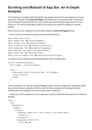
In this example, the Toolbar with an id of back-to-top-anchor is used as the anchor for the
back-to-top button. The ScrollTop component wraps a Fab (Floating Action Button) that serves
as the back-to-top button.
Now, when you scroll down, the App Bar will hide and elevate, and a back-to-top button will
appear. When you scroll up, the App Bar will show again.](https://image.slidesharecdn.com/muiappbar-240315125639-98701a1c/85/Creating-a-Great-Navigation-Bar-with-MUI-AppBar-Component-Blogs-17-320.jpg)