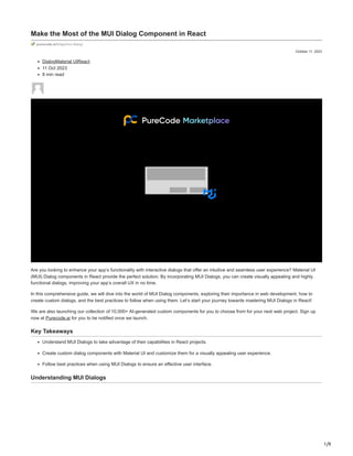
Make the Most of the MUI Dialog Component in React.pdf
1. 1/9
October 11, 2023
Make the Most of the MUI Dialog Component in React
purecode.ai/blogs/mui-dialog/
DialogMaterial UIReact
11 Oct 2023
8 min read
Are you looking to enhance your app’s functionality with interactive dialogs that offer an intuitive and seamless user experience? Material UI
(MUI) Dialog components in React provide the perfect solution. By incorporating MUI Dialogs, you can create visually appealing and highly
functional dialogs, improving your app’s overall UX in no time.
In this comprehensive guide, we will dive into the world of MUI Dialog components, exploring their importance in web development, how to
create custom dialogs, and the best practices to follow when using them. Let’s start your journey towards mastering MUI Dialogs in React!
We are also launching our collection of 10,000+ AI-generated custom components for you to choose from for your next web project. Sign up
now at Purecode.ai for you to be notified once we launch.
Key Takeaways
Understand MUI Dialogs to take advantage of their capabilities in React projects.
Create custom dialog components with Material UI and customize them for a visually appealing user experience.
Follow best practices when using MUI Dialogs to ensure an effective user interface.
Understanding MUI Dialogs
2. 2/9
Dialogs - Material Design
Dialogs – Material Design
MUI Dialogs, modal components that form a reliable basis for building dialogs, popovers, and other user interface elements, are integral in
modern web development. With Material UI, an extensive library of React components, you’ll also find a variety of lower-level constructs,
including:
Dialog
Drawer
Menu
Popover
Each component element comes with its unique styles applied to enhance your app functionality.
3. 3/9
Grasping the core concepts of MUI Dialogs and their interaction with other components is fundamental to maximizing their potential in your
React projects. That’s where we come in, guiding you through the process of creating and customizing MUI Dialog components like a pro.
What is a Dialog?
A Dialog is a modal component that appears in front of the web page’s content to provide essential information or solicit a decision from the
user. Its primary purpose is to obtain an action from the user, and it can contain various dialog children components. MUI Dialog components
are built upon the Material-UI library, which offers a comprehensive set of React components, including the react dialog component.
The DOM elements associated with the default Material-UI Dialog component are Backdrop, Container, and Paper, which together form the
body element of the dialog. The Modal component, a lower-level construct that enables the Dialog component, is also crucial. It provides
additional properties that are spread to the root element, allowing for further customization and enhancement of the Dialog component.
Importance of Dialogs in Web Development
Dialogs play a vital role in web development, offering a more intuitive way for users to interact with the application. They can be employed to
show information, request user input, or provide feedback. The MUI Dialog component, consisting of a modal window, container, and typically
several internal dialog components like DialogContent, provides a versatile solution for creating interactive dialogs that cater to different use
cases.
However, positioning the appropriate subcomponent within Dialog can be challenging, as the Dialog API does not provide a style prop for
every subcomponent. With Material-UI version 5, there were notable updates to their styling APIs, which can help developers overcome these
challenges and create visually appealing and functional dialogs.
Setting Up Your React Project
4. 4/9
React | Komodo Digital
Before exploring MUI Dialog components, ensure you have a ready-to-go React project set up. The create-react-app method provides a
straightforward way to generate a React app by executing a command in the terminal or command prompt. Once you have your React app
created, switch the directory into the project folder and initiate the app with “npm start.”
React is a free and open-source JavaScript library. It helps developers create user interfaces using UI components. A set-up React project
paves the way for the integration of MUI Dialog components, therefore boosting your app’s functionality.
Building an MUI Dialog Component in React
With your React project in place, you can now commence building an MUI Dialog component. The first step is to install Material-UI, which will
provide you with the necessary components and dependencies for creating custom dialogs.
Once Material-UI is installed, you can begin creating your custom dialog component, complete with a title, content, and action buttons to
interact with users. A step-by-step approach will guide you through building an MUI Dialog component, customizing its look and behavior, and
thereby crafting a seamless user experience within your React app.
5. 5/9
Installing Material-UI
To install Material-UI and its dependencies, execute the command npm install @material-ui/core in the terminal. This command will add
Material-UI to your React project, making it possible to start using MUI components in your application code.
Once the setup is complete, you can begin incorporating Material-UI components, such as the MUI Dialog component, into your React app.
This will lay the groundwork for creating custom dialogs that enhance app functionality and user experience.
Creating a Custom Dialog Component
With Material-UI installed, it’s time to create a custom MUI Dialog component. This component will consist of a title scroll body, content, and
action buttons to either decline or confirm a user action.
The primary container component for the dialog is the Dialog component itself, which houses:
DialogTitle component: serves as the title of the dialog
DialogContent component: holds the area for dialog content
DialogActions component: contains the actions or buttons for the dialog
To render the text for display, the Typography component is utilized within the DialogContent component.
Lastly, the DialogActions component provides buttons within the confirmation dialog that allow users to either decline or confirm the action.
Customizing MUI Dialog Components
6. 6/9
Dialogs - Material Design
Dialogs – Material Design
Customization is key to ensuring your MUI Dialog components meet your app’s needs and stand out. You have various options for:
Sizing
Positioning
Controlling behavior
Styling
your MUI Dialog components.
Comprehending and applying these customization techniques enables the creation of MUI Dialog components that are not only visually
pleasing but also engaging and user-friendly.
7. 7/9
Sizing and Positioning Dialogs
Sizing and positioning MUI Dialog components can be achieved using the following props:
fullScreen: This prop can be used to make the dialog take up the full screen.
fullWidth: This prop can be used to make the dialog take up the full width of its container.
maxWidth: This prop can be used to determine the max-width of the dialog while allowing the dialog width to grow with the size of the
screen. Keep in mind that maxWidth can be disabled by setting it to false.
The interaction between fullscreen width and max width props is also essential to consider. Although maxWidth prop takes string values that
resemble breakpoints (e.g., “sm”, “md”), enabling full width can affect the screen size in some cases. Additionally, the PaperProps provide an
alternative option for styling the Paper’s sx prop.
Controlling Dialog Behavior
Controlling MUI Dialog behavior can be achieved through the use of the following props:
onClose: Invokes a function that closes the dialog when the user clicks the backdrop.
disableEscapeKeyDown: Prevents the onClose callback from being activated when the escape key is pressed on the keyboard.
onBackdropClick: Invokes a function when the user clicks the backdrop.
The onBackdropClick prop is another useful feature, as it invokes a callback function that closes the dialog when the backdrop is clicked,
further enhancing user control over dialog behavior.
Styling MUI Dialog Components
Styling your MUI Dialog components is crucial for creating visually appealing and engaging dialogs. You can style the Dialog component using:
PaperProps: enables customization of the paper element
PaperComponent: serves as the paper component to render the body of the dialog
Custom CSS: allows for additional CSS styles and system overrides
By utilizing these styling options, you can create MUI Dialog components that not only function well but also look great, further elevating the
overall user experience.
Advanced MUI Dialog Features
Advanced features of MUI Dialog components are available to boost your app’s functionality. These features include scroll options and
alternative container elements, which can be utilized to create more sophisticated and interactive dialogs.
Comprehending and implementing these advanced features will enable the creation of MUI Dialog components that cater to diverse use cases
and deliver an exceptional user experience.
Scroll Options
Scroll options play a critical role in ensuring a smooth experience for users when the content displayed in a dialog exceeds the screen size.
MUI Dialog components offer different scroll options, such as scrolling within the paper or body element, to cater to varying content
requirements.
By incorporating appropriate scroll options, you can create MUI Dialog components that provide a seamless and user-friendly experience,
even when dealing with large amounts of content.
Alternative Container Elements
Alternative container elements, such as the backdrop component and slots.backdrop, for example, can be used to customize the appearance
of MUI Dialog components. These elements provide additional flexibility when designing your dialogs, allowing you to create unique and
visually appealing components.
Utilizing alternative container elements in your MUI Dialog components can lead to more engaging and interactive dialogs that cater to the
specific needs of your app and its users.
Comparing MUI Dialog with Other MUI Components
8. 8/9
MUI: The React component library you always wanted
MUI Dialog components can be compared to other MUI components like:
Menu: displays a list of options on a temporary surface
Popover: displays content atop another element
Drawer: provides access to app destinations
Modal: displays content that requires user interaction
Each of these components serves a different purpose and offers unique functionality.
Understanding the differences and use cases for each of these components, as well as their similarities with MUI Dialog components, can help
you make informed decisions when selecting the right component for your app.
Best Practices for Using MUI Dialogs in React
Following best practices is vital for maximizing the utility of MUI Dialogs in your React projects. These include:
Implementing dialogs to convey information to users regarding a task or displaying essential information
Creating reusable Dialog components using React Hooks
Customizing dialog boxes using Material UI styles
9. 9/9
Managing modal dialogs globally using React context.
Sticking to these best practices guarantees the creation of MUI Dialog components that are not only visually attractive but also highly
functional and user-friendly, leading to an overall better app experience.
Use MUI Dialog in Your Next Project
In conclusion, MUI Dialog components provide a powerful and versatile solution for creating interactive dialogs in your React apps. By
understanding their core concepts, customization options, and advanced features, you can create visually appealing and highly functional
dialogs that cater to a variety of use cases.
Embrace the power of MUI Dialog components and elevate your app’s functionality and user experience to new heights. With the right
knowledge and approach, you can master the art of creating captivating dialogs that keep your users engaged and informed.
Frequently Asked Questions
What is a dialog in MUI?
A Dialog is a type of modal window that appears in front of app content to provide critical information or ask for a decision. It disables all app
functionality when it appears, and remains on full screen until confirmed, dismissed, or a required action has been taken.
What is the difference between dialog and modal in material UI?
Dialog boxes allow users to interact with the page in the same way they would if no dialog box was present, while Modals block all page
interaction until explicitly closed.
What is dialog in React?
Dialog in React is a type of modal window that appears above all other page elements and is typically used to provide critical information or
ask for user input. It also supports features such as automatically focusing the dialog on mount for keyboard users.
What is the primary purpose of MUI Dialog components in React applications?
MUI Dialog components serve to provide essential information or solicit decisions from users, utilizing interactive dialogs and popovers for the
best user experience.
How can I customize the size and positioning of MUI Dialog components?
You can customize the size and positioning of MUI Dialog components by using fullScreen, fullWidth, and maxWidth props for maximum
control over the layout.
Andrea Chen
More