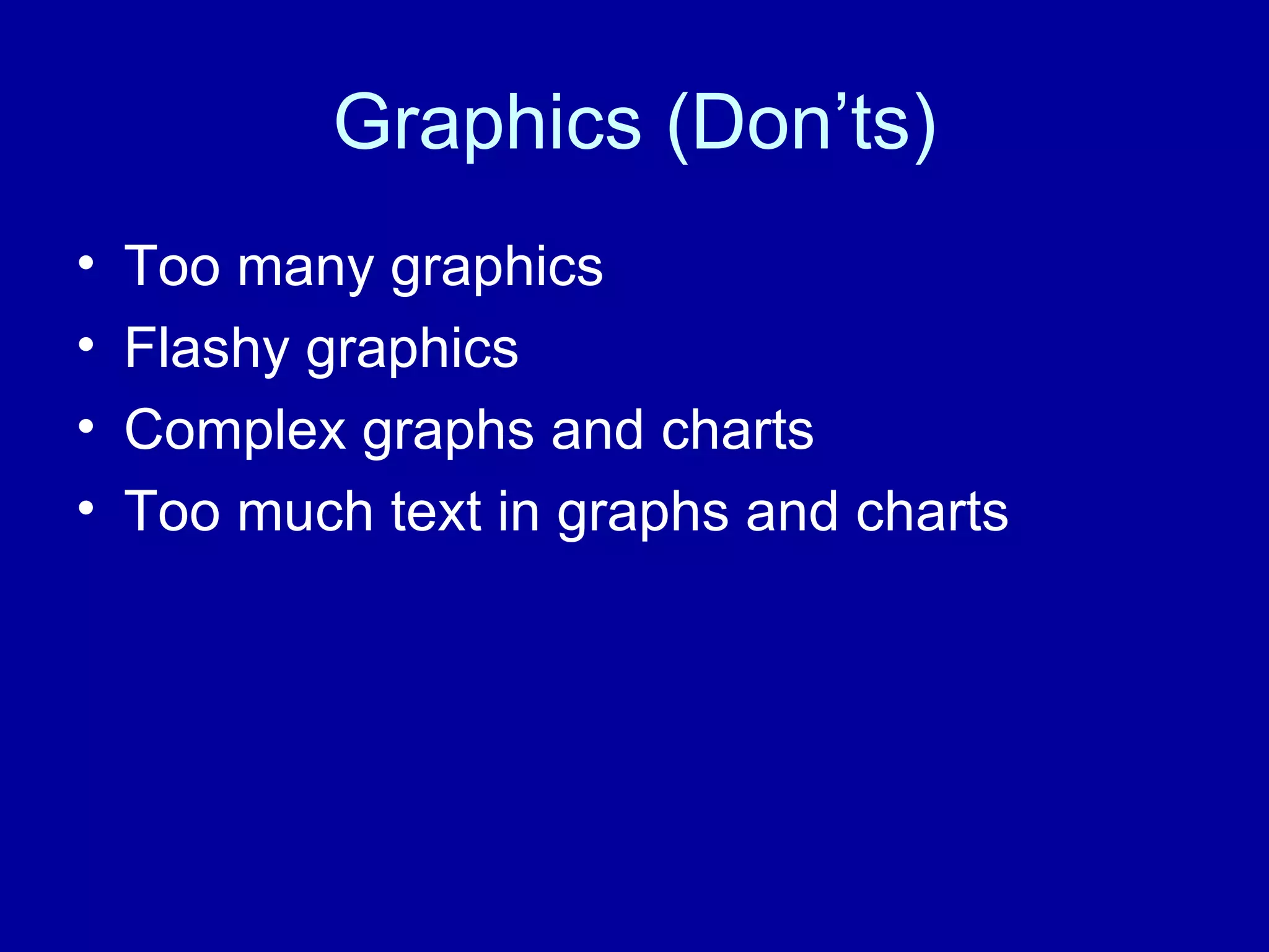
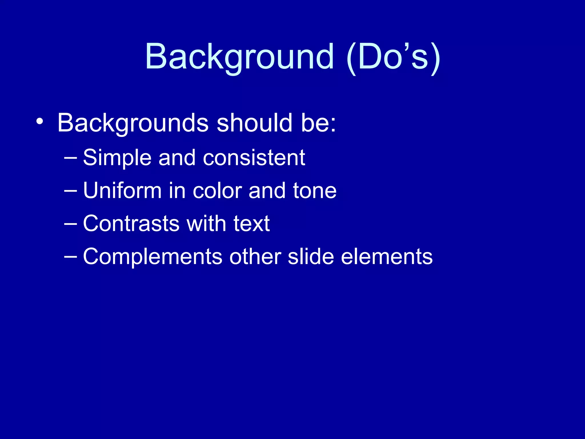
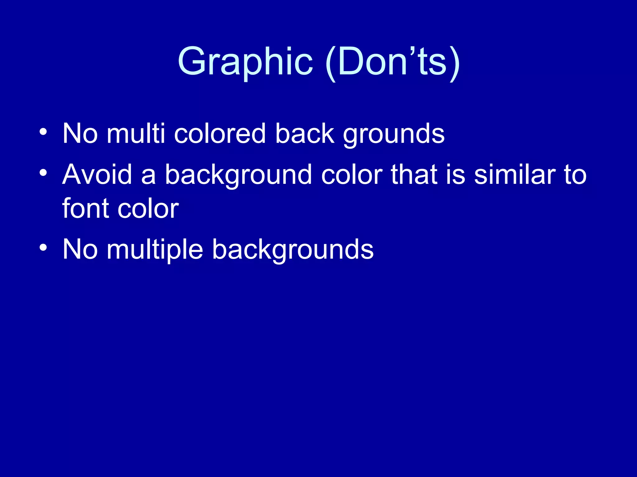
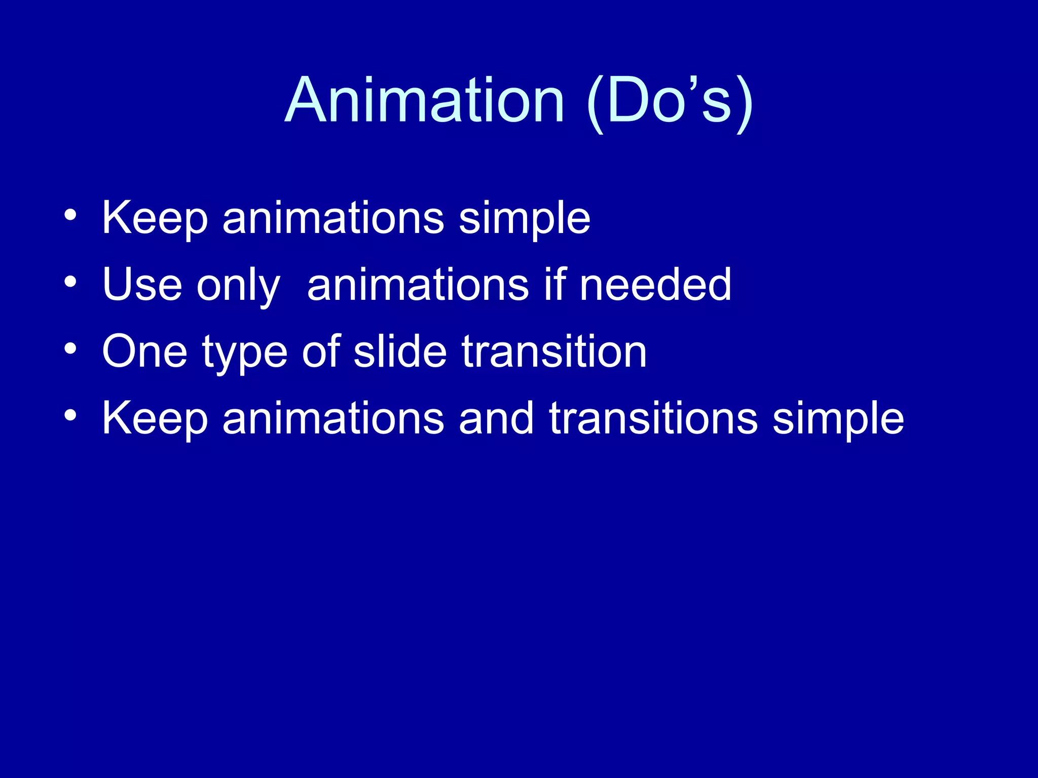
Successful Power points  By Omar Chavez
Text Guidelines (Do’s) Keep the text short and simple Each slide only has one idea Use lists to display key points 6 by 6 rule Font size at least 30 points Sans-serif fonts only No more then two types of fonts
Text Guidelines (Don'ts) Avoid using large blocks of texts  No fancy serif fonts Avoid italics  Avoid using small font that is not legible from a distance
Graphic (Do’s) Keep Graphics simple One graphic per slide Content related  Graphs and Charts  Simple and easy to understand One message per chart and graph Colors and shading are suitable and distinguishable
Graphics (Don’ts) Too many graphics Flashy graphics Complex graphs and charts  Too much text in graphs and charts
Background (Do’s) Backgrounds should be: Simple and consistent Uniform in color and tone Contrasts with text Complements other slide elements
Graphic (Don’ts) No multi colored back grounds  Avoid a background color that is similar to font color No multiple backgrounds
Animation (Do’s) Keep animations simple Use only  animations if needed One type of slide transition Keep animations and transitions simple
Animation (Don'ts) Avoid too many animations No flashy animations Do not use multiple slide transitions Avoid time consuming animations Avoid the accompanying sound effects

Successful Power Points

  • 1.
    Successful Power points By Omar Chavez
  • 2.
    Text Guidelines (Do’s)Keep the text short and simple Each slide only has one idea Use lists to display key points 6 by 6 rule Font size at least 30 points Sans-serif fonts only No more then two types of fonts
  • 3.
    Text Guidelines (Don'ts)Avoid using large blocks of texts No fancy serif fonts Avoid italics Avoid using small font that is not legible from a distance
  • 4.
    Graphic (Do’s) KeepGraphics simple One graphic per slide Content related Graphs and Charts Simple and easy to understand One message per chart and graph Colors and shading are suitable and distinguishable
  • 5.
    Graphics (Don’ts) Toomany graphics Flashy graphics Complex graphs and charts Too much text in graphs and charts
  • 6.
    Background (Do’s) Backgroundsshould be: Simple and consistent Uniform in color and tone Contrasts with text Complements other slide elements
  • 7.
    Graphic (Don’ts) Nomulti colored back grounds Avoid a background color that is similar to font color No multiple backgrounds
  • 8.
    Animation (Do’s) Keepanimations simple Use only animations if needed One type of slide transition Keep animations and transitions simple
  • 9.
    Animation (Don'ts) Avoidtoo many animations No flashy animations Do not use multiple slide transitions Avoid time consuming animations Avoid the accompanying sound effects