1. Green/black/white colour theme –
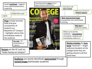
Simple masthead – Suggests Again reiterates sophistication
more sophisticated/mature Clothing fits with
readership colour scheme
Emphasises the fact it’s
a lifestyle magazine
Simple fonts used
stylish
Main shot/central image–
Plugs include semantic young black man, fashionable
clothing.
fields that give
connotations of Mid shot to
students e.g.. show his clothes
Repetition of “campus”
Allows us to see the
– highlights stories that textbooks – connotations
immediately relate to of students- students will
the audience immediately relate to it
Bar code – fits
conventions of Skyline includes the buzz
magazine word “exclusive” – Target
audience (students at the
Teasers on the FC such as: college) know they are
“make money on campus” getting relevant and first
hand news
Audience are clearly identified/ represented through
central image (fashionable students)
2. Central Image – Quite
Buzz words –
recognisably an
“No. 1 source”
American Football
player – Establishes
audience immediately Masthead – “college”
relates to target
Mode of address here audience immediately
if very simple –
including bullet points Colour scheme
and short sentences (white) matches that
of the central image
Addresses target and of the Plugs
audience who are
predominantly sports
fans and subsequently Simple colours attract
not looking for a high the right age range of
literacy levelled target audience (16+
magazine students) with mature
Bar code – very colour scheme
obvious/simple but
(suggested by the title
meets conventions of Graphic feature – Hints
“sporting news” and
magazines; making it at what is inside
Central Image)
a crucial feature