Download as PDF, PPTX
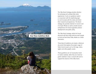
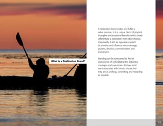
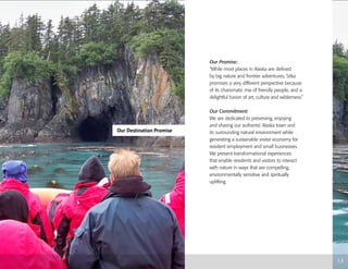
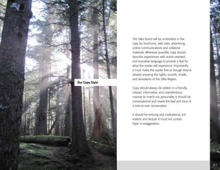
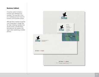
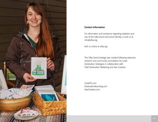

This document provides brand guidelines for Sitka, Alaska to create a unified visitor experience and brand identity. It establishes Sitka's destination promise to showcase the mix of art, culture, and wilderness through nature-based experiences. The guidelines describe the proper use of branding elements like logos, colors, fonts and photography to communicate the brand. Specific directions are given for applying the brand across different applications and ensuring consistent representation of Sitka's identity.


