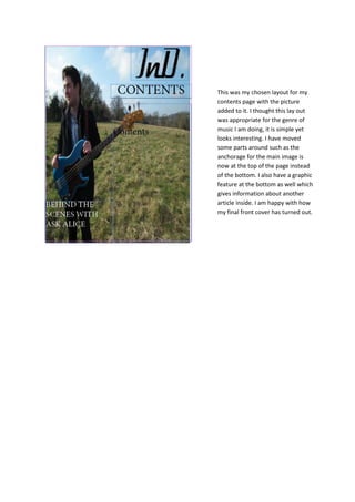
1. This was my chosen layout for my
contents page with the picture
added to it. I thought this lay out
was appropriate for the genre of
music I am doing, it is simple yet
looks interesting. I have moved
some parts around such as the
anchorage for the main image is
now at the top of the page instead
of the bottom. I also have a graphic
feature at the bottom as well which
gives information about another
article inside. I am happy with how
my final front cover has turned out.
2. This is the layout of my contents. I moved around the regular and features to see where
they looked best. I thought that the looked better split up (on the left) as it is clearer to
read and also makes the page stand out more. I stuck to the same font as I did on my
front cover. I used the red outline to stand out from the photo and catch the readers
eye so they could read what the contents are. I have used black and white page numbers
s they stand out better where they are placed. The anchorage for the main image also
looks better at the top of the page as it catches your eye as soon as you look at it and
clearly shows its about the image.
3. This is my final contents page. I have
included a graphic feature at the
bottom of the page as this is what
my double page spread is about
therefore it stands out more and
catches the readers eye. It also gives
slightly more information than the
rest of the anchorage. I am happy
with how my contents page has
turned out.