Download as PDF, PPTX


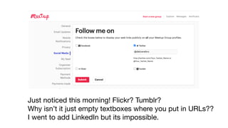


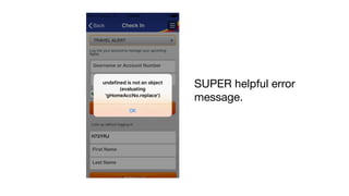


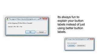
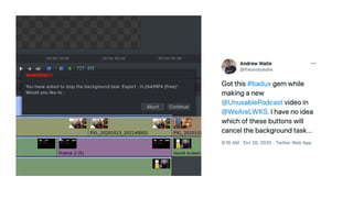
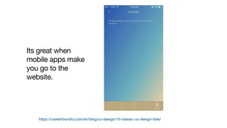

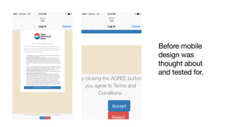

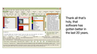


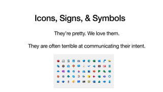


Mike Gallers shared examples of poor user experiences both in the digital world and physical world. In the digital world, examples included confusing websites, hard to use interfaces, and unclear error messages. In the physical world, examples included doors that did not clearly indicate if they should be pushed or pulled and signs/icons that did not effectively communicate their intended meaning. The overall message was that designers should put themselves in the user's perspective and thoroughly test designs to avoid frustrating, confusing, or unclear experiences.


