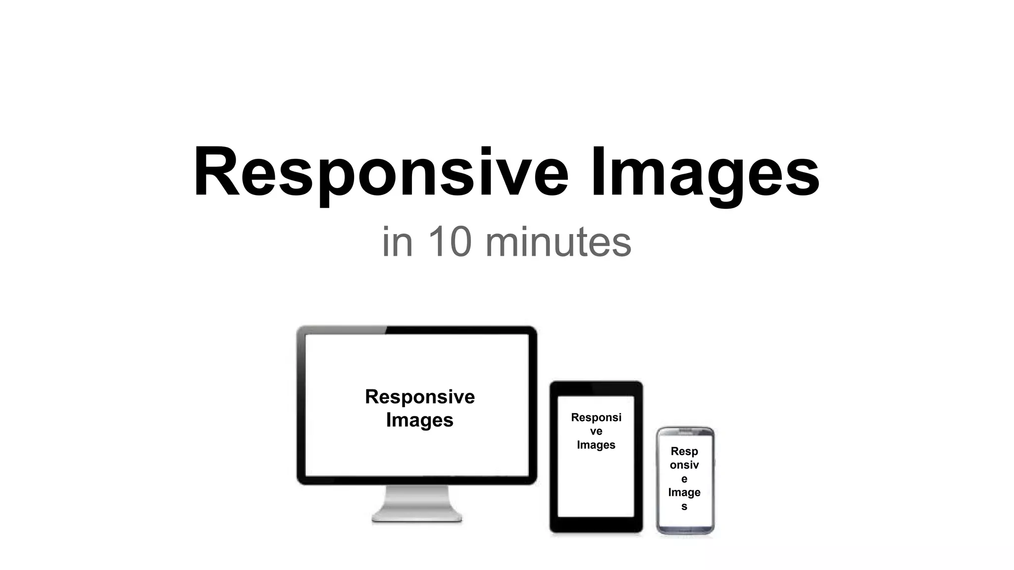
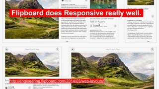
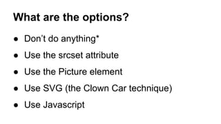
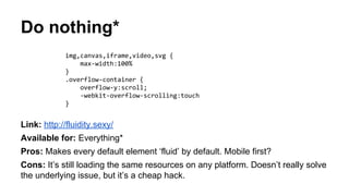
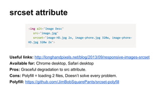
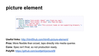
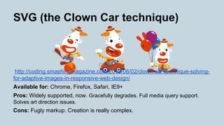
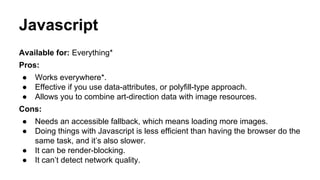
Responsive Images
in 10 minutes
Responsive
Images Responsi
ve
Images
Resp
onsiv
e
Image
s
Screen Size.
Pixel Density. Image Focus.
Layout.
Bonus: Art direction..
http://www.panmacmillan.com/
Flipboard does Responsive really well..
http://engineering.flipboard.com/2014/03/web-layouts/
What are the options?
● Don’t do anything*
● Use the srcset attribute
● Use the Picture element
● Use SVG (the Clown Car technique)
● Use Javascript
Do nothing*
Link: http://fluidity.sexy/
Available for: Everything*
Pros: Makes every default element ‘fluid’ by default. Mobile first?
Cons: It’s still loading the same resources on any platform. Doesn’t really solve
the underlying issue, but it’s a cheap hack.
img,canvas,iframe,video,svg {
max-width:100%
}
.overflow-container {
overflow-y:scroll;
-webkit-overflow-scrolling:touch
}
srcset attribute
Useful links: http://longhandpixels.net/blog/2013/09/responsive-images-srcset
Available for: Chrome desktop, Safari desktop
Pros: Graceful degradation to src attribute.
Cons: Polyfill = loading 2 files, Doesn’t solve every problem.
Polyfill: https://github.com/JimBobSquarePants/srcset-polyfill
picture element
Useful links: http://html5hub.com/html5-picture-element/
Pros: More flexible than srcset, taps directly into media queries
Cons: Spec isn’t final, so not production ready.
Polyfill: https://github.com/scottjehl/picturefill
SVG (the Clown Car technique)
http://coding.smashingmagazine.com/2013/06/02/clown-car-technique-solving-
for-adaptive-images-in-responsive-web-design/
Available for: Chrome, Firefox, Safari, IE9+
Pros: Widely supported, now. Gracefully degrades. Full media query support.
Solves art direction issues.
Cons: Fugly markup. Creation is really complex.
Javascript
Available for: Everything*
Pros:
● Works everywhere*.
● Effective if you use data-attributes, or polyfill-type approach.
● Allows you to combine art-direction data with image resources.
Cons:
● Needs an accessible fallback, which means loading more images.
● Doing things with Javascript is less efficient than having the browser do the
same task, and it’s also slower.
● It can be render-blocking.
● It can’t detect network quality.
So, the future.
Is the <picture> element.
Media queries & multiple sources,
without messy syntax.
But what about now?
Use srcset + polyfill
But avoid making multiple requests.
(consider using it only for desktop resolutions)
What about SVG?
If we could make them easier to manage,
I’d say use them all the time.
Responsive Icons
Iconic: SVG is really freakin’ cool.
https://useiconic.com/tour/

Responsive images in 10 minutes

  • 1.
    Responsive Images in 10minutes Responsive Images Responsi ve Images Resp onsiv e Image s
  • 2.
    Screen Size. Pixel Density.Image Focus. Layout.
  • 3.
  • 4.
    Flipboard does Responsivereally well.. http://engineering.flipboard.com/2014/03/web-layouts/
  • 5.
    What are theoptions? ● Don’t do anything* ● Use the srcset attribute ● Use the Picture element ● Use SVG (the Clown Car technique) ● Use Javascript
  • 6.
    Do nothing* Link: http://fluidity.sexy/ Availablefor: Everything* Pros: Makes every default element ‘fluid’ by default. Mobile first? Cons: It’s still loading the same resources on any platform. Doesn’t really solve the underlying issue, but it’s a cheap hack. img,canvas,iframe,video,svg { max-width:100% } .overflow-container { overflow-y:scroll; -webkit-overflow-scrolling:touch }
  • 7.
    srcset attribute Useful links:http://longhandpixels.net/blog/2013/09/responsive-images-srcset Available for: Chrome desktop, Safari desktop Pros: Graceful degradation to src attribute. Cons: Polyfill = loading 2 files, Doesn’t solve every problem. Polyfill: https://github.com/JimBobSquarePants/srcset-polyfill
  • 8.
    picture element Useful links:http://html5hub.com/html5-picture-element/ Pros: More flexible than srcset, taps directly into media queries Cons: Spec isn’t final, so not production ready. Polyfill: https://github.com/scottjehl/picturefill
  • 9.
    SVG (the ClownCar technique) http://coding.smashingmagazine.com/2013/06/02/clown-car-technique-solving- for-adaptive-images-in-responsive-web-design/ Available for: Chrome, Firefox, Safari, IE9+ Pros: Widely supported, now. Gracefully degrades. Full media query support. Solves art direction issues. Cons: Fugly markup. Creation is really complex.
  • 10.
    Javascript Available for: Everything* Pros: ●Works everywhere*. ● Effective if you use data-attributes, or polyfill-type approach. ● Allows you to combine art-direction data with image resources. Cons: ● Needs an accessible fallback, which means loading more images. ● Doing things with Javascript is less efficient than having the browser do the same task, and it’s also slower. ● It can be render-blocking. ● It can’t detect network quality.
  • 11.
  • 12.
    Is the <picture>element. Media queries & multiple sources, without messy syntax.
  • 13.
  • 14.
    Use srcset +polyfill But avoid making multiple requests. (consider using it only for desktop resolutions)
  • 15.
    What about SVG? Ifwe could make them easier to manage, I’d say use them all the time.
  • 16.
    Responsive Icons Iconic: SVGis really freakin’ cool. https://useiconic.com/tour/