Downloaded 100 times


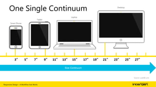


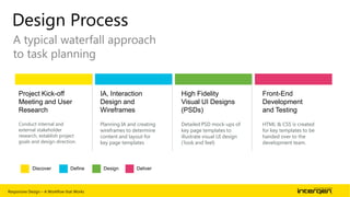


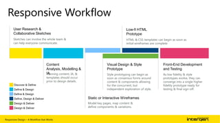


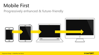


The document outlines a workflow for responsive web design that accommodates various devices including smartphones, tablets, and desktops. It emphasizes the importance of a flexible grid layout, media queries, and adaptive content to create a seamless user experience across diverse platforms. The author encourages challenging traditional processes and optimizing designs for mobile-first experiences to meet the evolving needs of users.