Responsive design UX intro
•
0 likes•1,879 views

This document discusses responsive design, which allows websites to automatically adapt to different screen sizes and devices. It covers the what, why and how of responsive design. Specifically, it explains that responsive design uses flexible grids, images and media queries (CSS) to respond to user needs and device capacities. The goal is to enhance the user experience across devices with less frustration for developers. It also discusses user experience perspectives like content strategy and navigation design for responsive sites.

Recommended
More Related Content
Viewers also liked
Viewers also liked (16)
Similar to Responsive design UX intro
Similar to Responsive design UX intro (20)
More from Dr. V Vorvoreanu
More from Dr. V Vorvoreanu (20)
Recently uploaded
Recently uploaded (20)
Responsive design UX intro
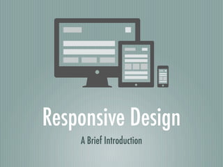
- 1. Responsive Design A Brief Introduction
- 2. A DEMO Flexible Grid Design On the Way to Responsive Design Responsive Design
- 3. WHAT Flexible, Fluid, and Adaptive Web Sites Respond to Users’ Needs Device Capacities
- 4. WHY Mobile-first Strategy Mobile Site VS. Mobile APP Enhanced user experience for users Less frustration for developers
- 5. HOW 3 Technical Ingredients (CSS): Fluid grids Flexible images Media Queries New Way of Thinking - UX Perspective Technical Ingredients New Thinkings
- 8. UX PERSPECTIVE Content Strategy - Goals Emphasize important content Make relationships clear Make it accessible on small screens Content Strategy - How Start with Contents: Content Inventory Categorize Contents Prioritize Contents Start from the Smallest Screen Size: Mobile First
- 9. UX PERSPECTIVE Content Strategy - Goals Emphasize important content Make relationships clear Make it accessible on small screens Content Strategy - How Start with Contents: Content Inventory Categorize Contents Prioritize Contents Start from the Smallest Screen Size: Mobile First
- 10. UX PERSPECTIVE Content Strategy Navigation Design
- 11. UX PERSPECTIVE Content Strategy Navigation Design Toogle
- 12. UX PERSPECTIVE Content Strategy Navigation Design Toogle Sliding
- 13. UX PERSPECTIVE Content Strategy Navigation Design Toogle Sliding Footer Anchor
- 14. UX PERSPECTIVE Content Strategy Navigation Design Context-specific Touchscreen VS. Cursor-based Interaction Geolocation API? Number Dialing? Instant Messaging?
- 15. UX PERSPECTIVE Content Strategy Navigation Design Context-specific Testing Responsive Design: e.g., Responsive.is, Mobitest
- 16. WHO IS DOING IT? Starbucks TIME TechCrunch
- 17. ACCESSIBILITY
- 18. ACCESSIBILITY Connection: Flexible Site Heavily Rely on Structured HTML and CSS