
Recommended
More Related Content
Similar to Editors Letter and Magazine Layout
Similar to Editors Letter and Magazine Layout (20)
More from lukewooder12
More from lukewooder12 (20)
Editors Letter and Magazine Layout
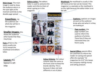
- 1. Editors Letter: The editors Masthead: the masthead is usually in the Main Image: The main letter is used to welcome the left hand corner but can be moved. This image is used to show reader and informs them of magazine is a example as the masthead is the audience who is in what is going on in the on the right because the editor letter is on the spot light at the magazine the left moment and links to the double page spread Coverlines: let Captions: captions on images the audience see are just so the audience what else will be in know who and what it is they are looking at the magazine Page number: the Smaller Images: this page numbers are shows the audience used to inform the other bands that they audience of articles. may know There fore if they are interested they can Font: all font is the find it easily same usually size 11/12 except the masthead and editors letter. Special Offers: special offers are used here to inform the reader on saving and special offers for example “12 Colour Scheme: the colour Layout: the magazines for £12” this keeps scheme stays the same as layout is set the company making money the front cover to keep the and selling products into brands identity. This is because it does not look different or out of place