Report
Share
Download to read offline
Recommended
Leftfield album cover analysis
The document analyzes the cover art of an album. It notes that the font used for the artist and album name suggests formality and uniformity while being in lowercase implies a low profile. The font also has no serifs, conveying a technological and futuristic theme fitting the electronic music genre. The color red represents power and energy but also violence, linking to themes of stealth. An image of samurai armor hints at power but also control and discipline, symbolizing the control of energy and representing something out of place in the modern world. The technological font combined with the old samurai armor creates a juxtaposition of new and old coming together.
Usv jsc indoc training
The USV-JSC provides military funeral honors and supplements federal, state, and local emergency response efforts. All members must complete indoctrination training on standards of conduct, ethics, equal opportunity, and uniforms. Training is conducted online and assessed through a multiple choice exam requiring a 90% pass rate. Members are expected to maintain physical fitness standards and participate in monthly training assemblies while avoiding improper political or financial activities that could discredit the organization.
Magazine production
The document describes the process of creating a magazine cover for a movie magazine using Adobe Photoshop CS3. Key details include analyzing examples from Total Film and Empire magazines, editing an image from a movie trailer, and designing the completed magazine cover with elements like the masthead, headings, bold fonts, and additional screenshots integrated. Design conventions from research like the website link, issue date, and exclamation of exclusive content were also included.
Q7
The author reflects on creating a music magazine and how it was an improvement over their previous college magazine. For the music magazine, the author planned out each step in more detail, learned new design tools like Photoshop, and put more effort into elements like photoshoots. The author feels they cared more about the quality of the music magazine and it shows in the final products when compared. The overall experience taught the author to plan out projects more deliberately and learn relevant technologies to achieve the desired end result.
Horror fonts
This document evaluates a typography for its suitability in different film genres, finding it well-suited for horror films due to features like scratched and faded lines conveying something evil, as well as its unsuspecting yet abstract and distorted lettering; it also notes the typography could work for cross-genre films or spoofs due to its alien, erotic, or apocalyptic atmospheric qualities.
My survey results pp presentation!
The author created a survey to get feedback on their music magazine. They received 20 responses after distributing the survey link on Facebook and via email. Most respondents were female. The majority said the magazine cover and style were great. While the intended genre was indie/rock, most saw it as targeting those aged 16-20 rather than the desired 20-35 range. Over half said they would possibly buy the magazine, and most felt a free giveaway was unnecessary. The front cover and double page spread were most people's favorite designs. The author was pleased with the positive feedback on the cover and genre matching their intentions.
R u mine – arctic monkeys
The video for "R U Mine" by Arctic Monkeys conforms to several conventions of the rock music genre identified by Goodwin's genre theory. It features a live band performance and close-ups of band members singing directly to the camera. While it does not focus on the female body, it includes a brief shot of a woman in provocative clothing walking toward the band. The black-and-white filming style, editing, costumes, and band persona portrayed reinforce expectations of the rock genre and Arctic Monkeys' brand. The narrative follows the band singing and dancing in a car before performing live, reflecting teenage rebellion and culture.
《莲花海》(5) 生死的奥秘-濒死体验的意义(5)-生死之光的产生原因-心的幻象-预言的真实性-啤吗哈尊金刚上师(着)-敦珠佛学会
《莲花海》(5) 生死的奥秘-濒死体验的意义(5)-生死之光的产生原因-心的幻象-预言的真实性-啤吗哈尊金刚上师(着)-敦珠佛学会
Media treatment
Sam, a 17-year-old whose younger sister Hollie went missing, suspects two men he sees near his house may be involved. He follows them and breaks into their house but finds nothing. However, he later sees a suspicious man and chases him to a remote house, where he hears screams. Sam breaks in and finds Hollie and another missing child locked in an upstairs room. When the kidnapper attacks Sam, they fall down the stairs. Sam wakes in the hospital having been injured but sees Hollie is now safe with his parents.
Sts blogs rubric
The document provides a rubric to evaluate projects on a scale of 3 to 10. It outlines criteria such as project completion, spelling and grammar, depth and breadth of content, originality, and overall score. For each criterion, it describes the expectations for a rating of Insufficient (3-5), Satisfactory (6-7), and Notable/Outstanding (8-10). For example, a project that receives a Satisfactory rating for depth and breadth of content will show sufficient knowledge of the topic and most ideas will be clear, while a Notable rating requires demonstrating extensive knowledge and clarity and depth of ideas.
Medios Virtuales Blog
Los medios de comunicación cambian junto con la sociedad. Los medios masivos tradicionales han sido reacomodados por los medios interactivos como Internet, que integran texto, audio e imágenes. La World Wide Web ha impulsado el desarrollo de Internet y ha masificado su uso. Aunque muchos medios masivos exploran el ciberespacio a través de sitios web, trasladar contenidos de la versión impresa a la versión en línea no basta y se deben aprovechar mejor los recursos hipertextuales e hipermediales.
Survey monkey charts
Based on feedback from 6 people on 10 photos taken at Old Trafford and Salford Quays:
- Photo 7 was most people's favorite, while photos 2, 4, 6, and 10 each received one vote. This shows the quality was consistent across photos.
- Photos 5 and 2 were considered the weakest, receiving 2 votes each.
- All felt the photos were near professional standard.
- All thought the brightness was just right.
- Most said the photos made them want to visit Salford Quays.
- All rated the photos a 4 out of 5 overall.
Basic conventions of documentary
Documentary films use different types of footage and editing techniques to tell a story. A-roll footage features interviews with subjects important to the topic, filmed with stable camera work and proper lighting and framing. B-roll footage supplements the interviews with additional imagery edited together. Cutaway shots, establishing shots, archive footage, still photos, and vox pops provide visual context for what is being discussed. A presenter or voiceover guides the viewer with a script and anchors the meaning of the images.
Presentation1 music magazine (4)
The document describes the process of creating a magazine cover and contents page. It discusses brainstorming name and design ideas, choosing a target audience, developing a house style, taking photos, and refining the layout. Several revisions are made to refine the visual design and ensure the magazine conveys the right genre. The finished products include a striking red cover featuring a pop artist, and a contents page with previews of articles linked to the "Obsessions" magazine name.
Siege of Gondor
The forces of Mordor laid siege to Gondor by shutting its gates, burning its fields and trees, and killing any people found outside. They dug deep trenches filled with fire and set up engines to cast missiles over the city walls. An evil power guided their efforts as flaming projectiles were cast down upon the city, marking the beginning of Gondor's siege.
Magazine front cover print screens
James O'Connell created magazine front covers to promote a fictional British social realism film called "The Temptation". For the first cover, he chose a realistic house as the background location. He added grain to give an eerie atmosphere consistent with the genre. The cover features the unknown main character's face, the BFI and Sight and Sound logos, the film title, and other typical magazine elements like subtitles and a barcode. The second cover also features the main character along with a natural background, logos, the film title, and standard magazine components. Both covers aim to realistically promote the fictional film using conventions of the genre and magazine format.
Screenplay
This 3-paragraph screenplay summary introduces a story of pursuit and conflict. A man is seen talking on the street while being watched by an unseen man in a hoodie. As the man walks through an alley and later down the street, the musical score builds suspense as the unseen man follows him. When they face each other on the street, a passing car interrupts the climax, and the unseen man disappears. The pursuing man's face darkens as he knows what must now happen, walking into a dark tunnel where screams are heard, leaving the empty street behind.
Codes and conventions of a digipack
The document describes the typical design and layout of a music album digipack. It has three compartments - the first holds a booklet, the second holds a CD, and the third holds a DVD. The front cover typically features the artist name and album title, along with an illustration. The back lists details like the barcode, copyright information, and track list. The inside flap and compartments continue the design's background print. Conventions include placement of barcodes, logos, credits, and discs to hold the music and additional content.
Calendario Metalcanario Mayo 2009
Este documento lista una serie de eventos musicales de rock y metal que tendrán lugar en diferentes lugares de las Islas Canarias durante el mes de mayo de 2009. Los eventos incluyen conciertos en bares, salas de conciertos y festivales al aire libre con bandas locales y algunas internacionales. Las fechas, lugares y precios de entrada varían para cada evento.
Unidad 1 linea de tiempo
Este documento presenta una propuesta para una actividad didáctica de línea de tiempo sobre la conquista del Perú. Los objetivos son identificar los eventos más importantes de este periodo e ubicarlos en un eje cronológico. Se detallan los contenidos conceptuales, procedimentales y actitudinales, así como los criterios de evaluación que incluyen la aplicación correcta de la técnica, los hechos considerados y la presentación creativa. Finalmente, se describe el desarrollo de la actividad que implica ver un video introductorio, aplicar las paut
Shot list
This shot list contains 15 shots for filming a scene. The shots include establishing shots, wide shots, over-the-shoulder shots, point-of-view shots, and close-ups filmed in various locations including a park, center, and alleyways using a 600D camera on a tripod. The shots involve people talking, sensing they are being followed, facing off, a car going by, a man vanishing and fighting with himself before making a decision and walking into an alley where he disappears.
Alt reader board
The document describes a rebellious girl who parties often and enjoys life to the fullest. She likely has piercings, smokes or takes drugs, and listens to rock bands like Lost Prophets, Muse, and You Me at Six. She dresses casually in jeans, hoodies, and customized clothing from brands like Vans, Dr. Martens, and shops at places like Topshop and vintage stores.
Alt reader board
The document describes a type of girl who is rebellious and enjoys living life to the fullest through partying, music, and unconventional fashion choices. She likely has piercings, smokes or takes drugs, and wears customized jeans and hoodies with spikes along with brands like Vans and Doc Martens. Her music tastes include Arctic Monkeys, Muse and You Me at Six.
Media image analysis 2
This document discusses image choices for different sections of a music magazine. For the front cover, the author chose an image of an artist performing that related to one of the cover stories and depicted typical music magazine concepts. For interior pages, images were chosen of the featured artists Lawson that portrayed them as humble, innocent, and vulnerable to appeal to the target audience. Images for opening spreads were also selected to represent the artists as dreamers and passionate about music in order to inspire readers. Throughout, the author aimed to use images that balanced genres and gender representation to be relatable.
More Related Content
Viewers also liked
Media treatment
Sam, a 17-year-old whose younger sister Hollie went missing, suspects two men he sees near his house may be involved. He follows them and breaks into their house but finds nothing. However, he later sees a suspicious man and chases him to a remote house, where he hears screams. Sam breaks in and finds Hollie and another missing child locked in an upstairs room. When the kidnapper attacks Sam, they fall down the stairs. Sam wakes in the hospital having been injured but sees Hollie is now safe with his parents.
Sts blogs rubric
The document provides a rubric to evaluate projects on a scale of 3 to 10. It outlines criteria such as project completion, spelling and grammar, depth and breadth of content, originality, and overall score. For each criterion, it describes the expectations for a rating of Insufficient (3-5), Satisfactory (6-7), and Notable/Outstanding (8-10). For example, a project that receives a Satisfactory rating for depth and breadth of content will show sufficient knowledge of the topic and most ideas will be clear, while a Notable rating requires demonstrating extensive knowledge and clarity and depth of ideas.
Medios Virtuales Blog
Los medios de comunicación cambian junto con la sociedad. Los medios masivos tradicionales han sido reacomodados por los medios interactivos como Internet, que integran texto, audio e imágenes. La World Wide Web ha impulsado el desarrollo de Internet y ha masificado su uso. Aunque muchos medios masivos exploran el ciberespacio a través de sitios web, trasladar contenidos de la versión impresa a la versión en línea no basta y se deben aprovechar mejor los recursos hipertextuales e hipermediales.
Survey monkey charts
Based on feedback from 6 people on 10 photos taken at Old Trafford and Salford Quays:
- Photo 7 was most people's favorite, while photos 2, 4, 6, and 10 each received one vote. This shows the quality was consistent across photos.
- Photos 5 and 2 were considered the weakest, receiving 2 votes each.
- All felt the photos were near professional standard.
- All thought the brightness was just right.
- Most said the photos made them want to visit Salford Quays.
- All rated the photos a 4 out of 5 overall.
Basic conventions of documentary
Documentary films use different types of footage and editing techniques to tell a story. A-roll footage features interviews with subjects important to the topic, filmed with stable camera work and proper lighting and framing. B-roll footage supplements the interviews with additional imagery edited together. Cutaway shots, establishing shots, archive footage, still photos, and vox pops provide visual context for what is being discussed. A presenter or voiceover guides the viewer with a script and anchors the meaning of the images.
Presentation1 music magazine (4)
The document describes the process of creating a magazine cover and contents page. It discusses brainstorming name and design ideas, choosing a target audience, developing a house style, taking photos, and refining the layout. Several revisions are made to refine the visual design and ensure the magazine conveys the right genre. The finished products include a striking red cover featuring a pop artist, and a contents page with previews of articles linked to the "Obsessions" magazine name.
Siege of Gondor
The forces of Mordor laid siege to Gondor by shutting its gates, burning its fields and trees, and killing any people found outside. They dug deep trenches filled with fire and set up engines to cast missiles over the city walls. An evil power guided their efforts as flaming projectiles were cast down upon the city, marking the beginning of Gondor's siege.
Magazine front cover print screens
James O'Connell created magazine front covers to promote a fictional British social realism film called "The Temptation". For the first cover, he chose a realistic house as the background location. He added grain to give an eerie atmosphere consistent with the genre. The cover features the unknown main character's face, the BFI and Sight and Sound logos, the film title, and other typical magazine elements like subtitles and a barcode. The second cover also features the main character along with a natural background, logos, the film title, and standard magazine components. Both covers aim to realistically promote the fictional film using conventions of the genre and magazine format.
Screenplay
This 3-paragraph screenplay summary introduces a story of pursuit and conflict. A man is seen talking on the street while being watched by an unseen man in a hoodie. As the man walks through an alley and later down the street, the musical score builds suspense as the unseen man follows him. When they face each other on the street, a passing car interrupts the climax, and the unseen man disappears. The pursuing man's face darkens as he knows what must now happen, walking into a dark tunnel where screams are heard, leaving the empty street behind.
Codes and conventions of a digipack
The document describes the typical design and layout of a music album digipack. It has three compartments - the first holds a booklet, the second holds a CD, and the third holds a DVD. The front cover typically features the artist name and album title, along with an illustration. The back lists details like the barcode, copyright information, and track list. The inside flap and compartments continue the design's background print. Conventions include placement of barcodes, logos, credits, and discs to hold the music and additional content.
Calendario Metalcanario Mayo 2009
Este documento lista una serie de eventos musicales de rock y metal que tendrán lugar en diferentes lugares de las Islas Canarias durante el mes de mayo de 2009. Los eventos incluyen conciertos en bares, salas de conciertos y festivales al aire libre con bandas locales y algunas internacionales. Las fechas, lugares y precios de entrada varían para cada evento.
Unidad 1 linea de tiempo
Este documento presenta una propuesta para una actividad didáctica de línea de tiempo sobre la conquista del Perú. Los objetivos son identificar los eventos más importantes de este periodo e ubicarlos en un eje cronológico. Se detallan los contenidos conceptuales, procedimentales y actitudinales, así como los criterios de evaluación que incluyen la aplicación correcta de la técnica, los hechos considerados y la presentación creativa. Finalmente, se describe el desarrollo de la actividad que implica ver un video introductorio, aplicar las paut
Shot list
This shot list contains 15 shots for filming a scene. The shots include establishing shots, wide shots, over-the-shoulder shots, point-of-view shots, and close-ups filmed in various locations including a park, center, and alleyways using a 600D camera on a tripod. The shots involve people talking, sensing they are being followed, facing off, a car going by, a man vanishing and fighting with himself before making a decision and walking into an alley where he disappears.
Viewers also liked (18)
More from ChelseaHowsin1994
Alt reader board
The document describes a rebellious girl who parties often and enjoys life to the fullest. She likely has piercings, smokes or takes drugs, and listens to rock bands like Lost Prophets, Muse, and You Me at Six. She dresses casually in jeans, hoodies, and customized clothing from brands like Vans, Dr. Martens, and shops at places like Topshop and vintage stores.
Alt reader board
The document describes a type of girl who is rebellious and enjoys living life to the fullest through partying, music, and unconventional fashion choices. She likely has piercings, smokes or takes drugs, and wears customized jeans and hoodies with spikes along with brands like Vans and Doc Martens. Her music tastes include Arctic Monkeys, Muse and You Me at Six.
Media image analysis 2
This document discusses image choices for different sections of a music magazine. For the front cover, the author chose an image of an artist performing that related to one of the cover stories and depicted typical music magazine concepts. For interior pages, images were chosen of the featured artists Lawson that portrayed them as humble, innocent, and vulnerable to appeal to the target audience. Images for opening spreads were also selected to represent the artists as dreamers and passionate about music in order to inspire readers. Throughout, the author aimed to use images that balanced genres and gender representation to be relatable.
Media evaluation
The document discusses the ways in which the media product conforms to and challenges conventions of music magazines. It conforms by using taglines, announcing tours and albums, and including a barcode. However, it challenges conventions by adding a gold color and Polaroid photos. Additional challenges include a non-traditional masthead color and size, and including a competition. The product develops conventions by using a high-angle shot on the cover page, atypical for music magazines. Overall, the document examines how the product both adheres to common magazine structures while also innovating in its design and content choices.
Magazine planning
The document summarizes the key design elements of a magazine front cover, contents page, and double page spread for an indie/rock music magazine. For the front cover, conventions like the masthead, date, issue number, and main cover image were used along with a red, black, white, and gold color scheme associated with indie/rock magazines. The contents page drew inspiration from NME magazine and used pictures and numbers creatively across the page to display content listings. For the double page spread, conventional elements like images, pull quotes, column writing, and bold text were implemented, and creative backgrounds like Polaroid and puzzle piece templates were incorporated.
Media preliminary task flat plans
The document describes the design and layout of a school newsletter created to follow conventions of the genre while appealing to a target audience of sixth form students. Key elements included a title, date, issue number, school logo and motto on the front cover. The contents page listed topics in a quirky, fun font with smiley faces and bubble numbers. A double page spread included related articles and images to engage the target audience. The creator aimed to balance conventions with unconventional, creative elements to appeal to sixth form readers.
Media evaluation
My media product challenges some conventions of music magazines while conforming to others. It challenges conventions through using a different colored and sized masthead on the contents page and boxing information about artists at the bottom left of pages. However, it conforms to conventions by including features like a band index, photos relating to cover stories, and issues of address and formality in artist profiles. The product aims to be creative while still relating to audiences through both conforming and challenging typical magazine conventions.
First draft front cover analysis
The document provides an analysis of the front cover design for a magazine media product. It summarizes how the cover design both conforms to and challenges conventions of real music magazines. It conforms by using colors and layout elements typical of indie/rock magazines like NME. However, it also challenges conventions by using a less crowded layout between the styles of two example NME covers. The cover is meant to represent and attract teenage audiences interested in music and culture through the image of a teenage girl and use of music-related language.
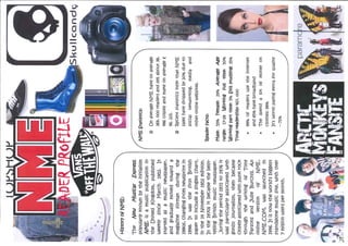
Magazine reader profile
A genuine reader of unzipped is described as someone who likely has tattoos and piercings, smokes or takes drugs, and parties often. They are rebellious and creative, either writing music or playing in a band. They believe in pursuing success and dreams through living life to the fullest and having fun. Their style includes jeans, hoodies, and customized clothing with spikes and studs. Favorite brands are Vans, Dr. Martens, creepers, Topshop, and vintage shops. Their music tastes include bands like Lost Prophets, Arctic Monkeys, Muse, and You Me at Six.
Magazine reader profile
The document describes a genuine reader of unzipped as someone who has tattoos and piercings, likely smokes and parties a lot, and either writes or plays music. They are described as rebellious and believing in living life to the fullest. It notes their clothing includes jeans, hoodies customized with spikes, and brands like Vans, Dr. Martens, creepers, Topshop, and vintage shops. Their music tastes include bands like Lostprophets, Muse, and You Me at Six.
Magazine reader profile
A genuine reader of unzipped is described as a rebellious girl who has piercings, parties often, plays music, and believes in living life to the fullest. She likely smokes and takes drugs. Her style includes jeans, hoodies, and clothing customized with spikes. She shops at brands like Vans, Dr. Martens, Topshop, and vintage shops. Her music tastes include Arctic Monkeys, Muse, and You Me at Six.
Preliminary task evaluation
This document contains the responses to pre-production questions about a media product. [1] The responses indicate that the media product uses conventions of real magazines like a masthead and cover lines, but challenges conventions with its color scheme and layout. [2] The product represents indie social groups through its cover image and masthead. [3] The target audience is identified as people interested in music, indie lifestyle, and freedom of expression. [4] The document reflects on how the product aims to attract this audience through its cover image, unconventional design, and focus on music tours.
Lilly allen double page spread analysis copy
The document summarizes a magazine double page spread about artist Lilly Allen. The large pull quote grabs readers' attention with its newspaper-like style in the magazine's typical colors of red, black, and white. The main image of Allen conveys her rebellious attitude through her pose and tattoos. The language used in the article is casual to relate to the young readership and capture Allen's personality. Color and fonts are consistently used to match the artist's style and maintain magazine conventions.
Nme double page spread florence and the machine analysis
This article is about Florence + the Machine and appeals primarily to American readers. The main image dominates the page and sexually objectifies Florence by showing her dressed in black and high heels. The composition is intelligently laid out to force readers to look at the article. A basic color palette of red and black is used to make Florence stand out from other artists and relate to the target NME audience. The language directly addresses Florence's single to establish a personal connection with readers. The font captures readers' eyes in a way conventional for music magazines.
Nme content page analysis
The document provides a general overview of an NME magazine contents page layout. It notes that the header conveys the magazine's logo to identify the publisher. The layout is conventional and sectioned to clearly separate different stories and images. The color palette of red, black, white, and yellow follows NME's house colors for consistency. The main feature uses bold colors and text to draw the reader's eye to the headline story.
Nme the wombts front cover analysis
The document summarizes the layout and design elements of a music magazine cover featuring the band The Wombats. It analyzes the use of a bright yellow tag line to attract attention, a close-up image of the band members staring directly at the viewer to create a personal feel. It also notes the use of bold primary colors that make the text pop off the page and draw the eye, with the main cover line in a contrasting yellow color to stand out from the blue cover lines. The overall layout follows a conventional masthead, image, tagline and lines format expected of magazine covers.
Media analysis of prliminary task
The document analyzes and evaluates a student magazine titled "PMS Gossip Sheet". It discusses the title choice and use of the school's colors in the design. The main image on the cover is analyzed for how it represents key themes. Further evaluation comments that adding the school logo would help identify the magazine. An overview concludes that the magazine has a clear consistent layout but lacks creativity and individuality.
More from ChelseaHowsin1994 (20)
Nme double page spread florence and the machine analysis
Nme double page spread florence and the machine analysis