‘Ray Gun 1992’
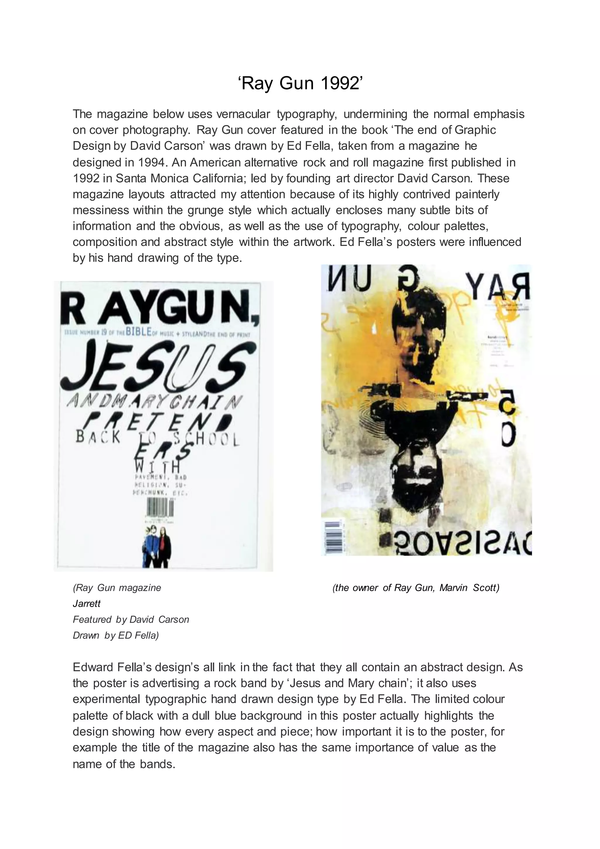
The magazine below uses vernacular typography, undermining the normal emphasis
on cover photography. Ray Gun cover featured in the book ‘The end of Graphic
Design by David Carson’ was drawn by Ed Fella, taken from a magazine he
designed in 1994. An American alternative rock and roll magazine first published in
1992 in Santa Monica California; led by founding art director David Carson. These
magazine layouts attracted my attention because of its highly contrived painterly
messiness within the grunge style which actually encloses many subtle bits of
information and the obvious, as well as the use of typography, colour palettes,
composition and abstract style within the artwork. Ed Fella’s posters were influenced
by his hand drawing of the type.
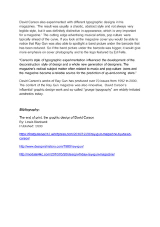
(Ray Gun magazine (the owner of Ray Gun, Marvin Scott)
Jarrett
Featured by David Carson
Drawn by ED Fella)
Edward Fella’s design’s all link in the fact that they all contain an abstract design. As
the poster is advertising a rock band by ‘Jesus and Mary chain’; it also uses
experimental typographic hand drawn design type by Ed Fella. The limited colour
palette of black with a dull blue background in this poster actually highlights the
design showing how every aspect and piece; how important it is to the poster, for
example the title of the magazine also has the same importance of value as the
name of the bands.
David Carson also experimented with different typographic designs in his
magazines. ‘The result was usually a chaotic, abstract style and not always very
legible style, but it was definitely distinctive in appearance, which is very important
for a magazine.’ The cutting edge advertising musical artists, pop culture were
typically ahead of the curve. If you look at the magazine cover you would be able to
notice that Ray Gun was also able to spotlight a band picture under the barcode that
has been reduced. So if the band picture under the barcode was bigger, it would give
more emphasis on cover photography and to the logo featured by Ed Fella.
“Carson's style of typographic experimentation influenced the development of the
deconstruction style of design and a whole new generation of designers. The
magazine's radical subject matter often related to music and pop culture icons and
the magazine became a reliable source for the prediction of up-and-coming stars.”
David Carson’s works of Ray Gun has produced over 70 issues from 1992 to 2000.
The content of the Ray Gun magazine was also innovative. David Carson’s
influential graphic design work and so-called “grunge typography” are widely-imitated
aesthetics today.
Bibliography:
The end of print: the graphic design of David Carson
By: Lewis Blackwell
Published: 2000
https://firatgunalva312.wordpress.com/2010/12/28/ray-gun-magazine-by-david-
carson/
http://www.designishistory.com/1980/ray-gun/
http://modular4kc.com/2010/05/28/design-friday-ray-gun-magazine/

Ray gun blogging

  • 1.
    ‘Ray Gun 1992’ Themagazine below uses vernacular typography, undermining the normal emphasis on cover photography. Ray Gun cover featured in the book ‘The end of Graphic Design by David Carson’ was drawn by Ed Fella, taken from a magazine he designed in 1994. An American alternative rock and roll magazine first published in 1992 in Santa Monica California; led by founding art director David Carson. These magazine layouts attracted my attention because of its highly contrived painterly messiness within the grunge style which actually encloses many subtle bits of information and the obvious, as well as the use of typography, colour palettes, composition and abstract style within the artwork. Ed Fella’s posters were influenced by his hand drawing of the type. (Ray Gun magazine (the owner of Ray Gun, Marvin Scott) Jarrett Featured by David Carson Drawn by ED Fella) Edward Fella’s design’s all link in the fact that they all contain an abstract design. As the poster is advertising a rock band by ‘Jesus and Mary chain’; it also uses experimental typographic hand drawn design type by Ed Fella. The limited colour palette of black with a dull blue background in this poster actually highlights the design showing how every aspect and piece; how important it is to the poster, for example the title of the magazine also has the same importance of value as the name of the bands.
  • 2.
    David Carson alsoexperimented with different typographic designs in his magazines. ‘The result was usually a chaotic, abstract style and not always very legible style, but it was definitely distinctive in appearance, which is very important for a magazine.’ The cutting edge advertising musical artists, pop culture were typically ahead of the curve. If you look at the magazine cover you would be able to notice that Ray Gun was also able to spotlight a band picture under the barcode that has been reduced. So if the band picture under the barcode was bigger, it would give more emphasis on cover photography and to the logo featured by Ed Fella. “Carson's style of typographic experimentation influenced the development of the deconstruction style of design and a whole new generation of designers. The magazine's radical subject matter often related to music and pop culture icons and the magazine became a reliable source for the prediction of up-and-coming stars.” David Carson’s works of Ray Gun has produced over 70 issues from 1992 to 2000. The content of the Ray Gun magazine was also innovative. David Carson’s influential graphic design work and so-called “grunge typography” are widely-imitated aesthetics today. Bibliography: The end of print: the graphic design of David Carson By: Lewis Blackwell Published: 2000 https://firatgunalva312.wordpress.com/2010/12/28/ray-gun-magazine-by-david- carson/ http://www.designishistory.com/1980/ray-gun/ http://modular4kc.com/2010/05/28/design-friday-ray-gun-magazine/