Downloaded 133 times

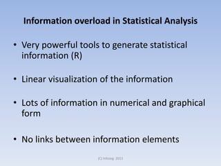
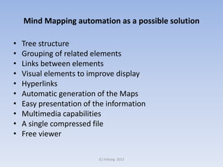
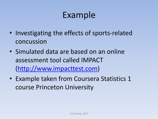

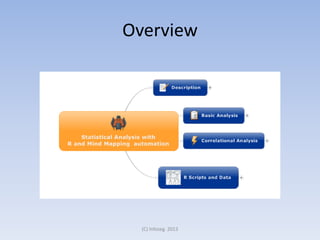
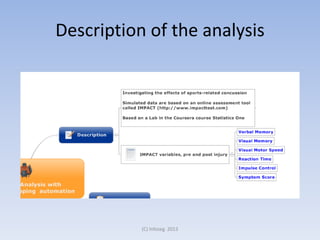
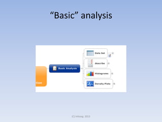
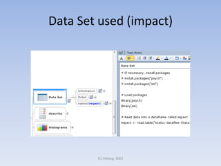
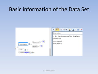
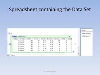
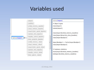
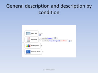
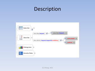
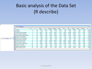
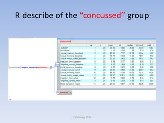
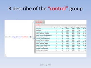
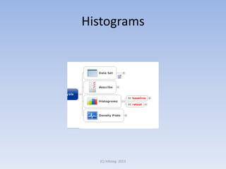
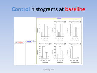
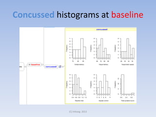
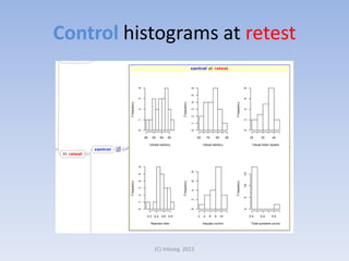
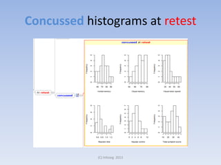
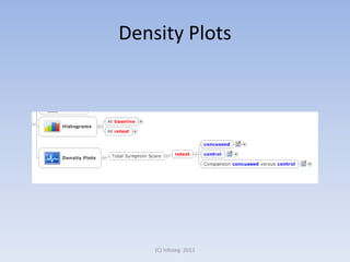
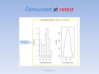
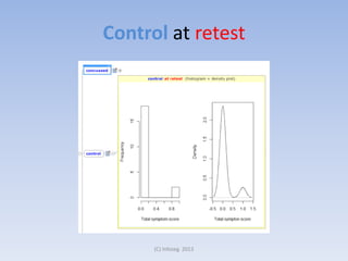
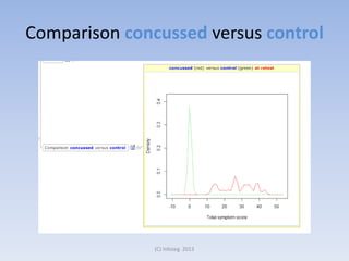
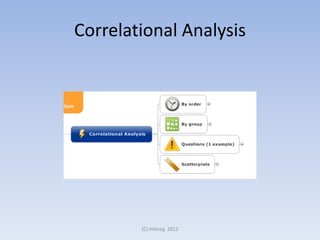
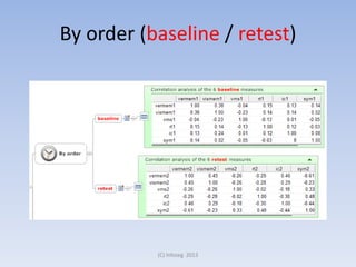
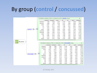
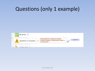

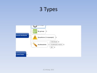
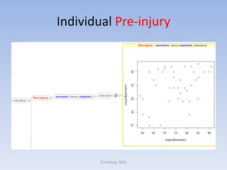
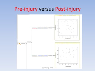
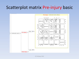
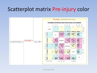
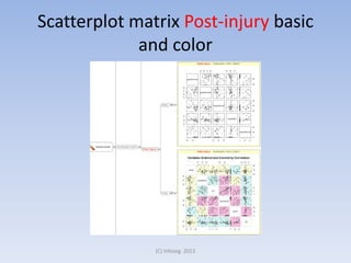
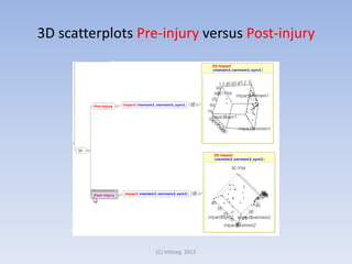
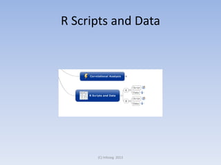
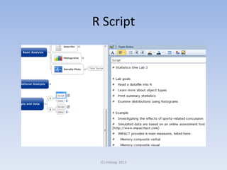
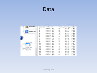
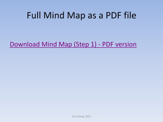

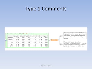
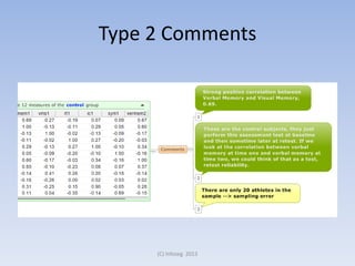


This document discusses using mind mapping to visualize statistical analysis results from R. Mind mapping creates a tree structure that groups related elements and links information for improved visualization over linear formats. An example analyzes sports-related concussion data using R and presents the results in an automatically generated mind map containing histograms, density plots, correlations, scatterplots and other analyses. The mind map can then be commented on by teachers or researchers. The document concludes that while mind maps can be created manually, automated mind mapping is preferable for visualizing complex statistical analyses.